

Quick Start Hive Plots#
This page serves as a quick reference for generating and visualizing hive plots using the HivePlot class.
Note: this notebook requires that Hiveplotlib be installed with extra packages, which can be done by running:
pip install hiveplotlib[networkx,bokeh]
[1]:
import matplotlib.pyplot as plt
import networkx as nx
from flexitext import flexitext
from hiveplotlib import HivePlot
from hiveplotlib.converters import networkx_to_nodes_edges
Before Plotting: Nodes, Edges, Node Partition, and Node Sorting Variables#
Before we can visualize anything, we need to gather up:
A
hiveplotlib.NodeCollectionof node data.A
hiveplotlib.Edgesinstance of edge data,A means of partitioning nodes onto each axis.
A means of sorting node placement within each axis.
Below, we will create a toy example using a Stochastic Block Model with networkx. This model allows us to generate multiple “cliques” and assign probabilities that decide the extent to which these cliques interact with each other.
[2]:
G = nx.stochastic_block_model(
    sizes=[10, 10, 10],
    p=[
        [0.1, 0.5, 0.5],
        [0.05, 0.1, 0.2],
        [0.05, 0.2, 0.1],
    ],
    directed=True,
    seed=0,
)
Above, we have generated 3 cliques of equal size (10 per clique) with the following properties:
Within-group communication is only 10% (
0.1on the diagonal).Group 1 is very social with Groups 2 and 3 (
0.5), but Groups 2 and 3 aren’t very social with Group 1 (0.05).Group 2 and Group 3 are relatively social with each other (
0.2).
Let’s first set up our hiveplotlib-compatible nodes and edges from the NetworkX graph.
Normally, we would need to create a hiveplotlib.NodeCollection instance of node data and a hiveplotlib.Edges instance of edge data, essentially pandas dataframes of node and edge data with some helper methods for incorporating into hive plots.
For more discussion on the NodeCollection class, see the NodeCollection gallery examples.
For more discussion on the Edges class, see the Edges gallery examples.
When working with a networkx graph, however, we can quickly convert it to nodes and edges via hiveplotlib.converters.networkx_to_nodes_edges().
[3]:
nodes, edges = networkx_to_nodes_edges(G)
[4]:
nodes
[4]:
hiveplotlib.NodeCollection of 30 nodes and unique ID column 'unique_id'.
[5]:
nodes.data.head()
[5]:
| unique_id | block | |
|---|---|---|
| 0 | 0 | 0 |
| 1 | 1 | 0 |
| 2 | 2 | 0 |
| 3 | 3 | 0 |
| 4 | 4 | 0 |
[6]:
edges
[6]:
hiveplotlib.Edges of 169 edges.
[7]:
edges.data.head()
[7]:
| from | to | |
|---|---|---|
| 0 | 0 | 10 |
| 1 | 0 | 12 |
| 2 | 0 | 13 |
| 3 | 0 | 14 |
| 4 | 0 | 15 |
Next, we need to set our partition variable for the node data to place our nodes on separate axes in the eventual hive plot.
We will base this on the block column. Although we could already partition based on this column, our values will dictate our eventual axis names, so we will set up some more interpretable block names as opposed to just integers using the hiveplotlib.NodeCollection.create_partition_variable() method.
For more on this method, see the Create a Partition Variable page.
[8]:
partition_variable = nodes.create_partition_variable(
    data_column="block",
    cutoffs=3,  # split into our 3 groups
    labels=["Group 1", "Group 2", "Group 3"],
)
Below, we can see we’ve created a more human-readable column corresponding to block names.
[9]:
nodes.data.sample(n=5, random_state=0)
[9]:
| unique_id | block | partition_0 | |
|---|---|---|---|
| 2 | 2 | 0 | Group 1 |
| 28 | 28 | 2 | Group 3 |
| 13 | 13 | 1 | Group 2 |
| 10 | 10 | 1 | Group 2 |
| 26 | 26 | 2 | Group 3 |
Lastly, we need a scalar value for each node to dictate the placement the nodes on each axis.
For this example, we will use node degree. Hiveplotlib can compute supported graph metrics for us during hive plot initialization via the node_graph_metrics parameter, so we don’t need to compute degree manually. We’ll request it on the HivePlot initialization below and see it appear as a column on hp.nodes.data.
For more on Hiveplotlib-supported graph metrics, see the Computing Graph Metrics page.
Base Hive Plot Visualization#
With setup now complete, we can begin to generate hive plots. Let’s start with the simplest visualization, following defaults.
[10]:
hp = HivePlot(
    nodes=nodes,
    edges=edges,
    partition_variable=partition_variable,
    sorting_variables="degree",
    node_graph_metrics="degree",  # request degree on init
)
[11]:
fig, ax = hp.plot()
ax.set_title(
    "Stochastic Block Model, Baseline Hive Plot Visualization",
    y=1.05,
    size=20,
)
plt.show()
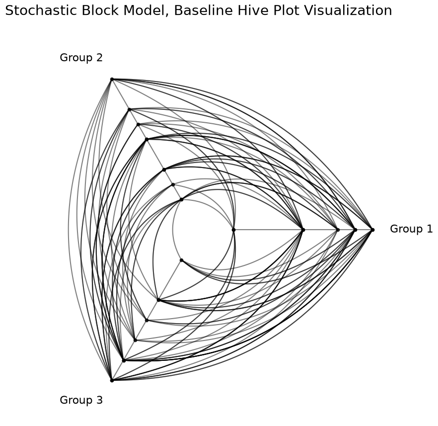
From this baseline visualization, we cannot yet see any of the 3 main relationships we contrived.
To see the relationships we predetermined when constructing our Stochastic Block Model, we need to take advantage of some additional flexibility in the HivePlot class.
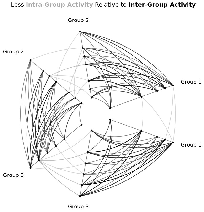
Repeat Axes#
First, we can’t see our within-group relationships with this figure. To see these, we need to draw repeat axes for the above figure. This capability is nicely exposed with the repeat_axes parameter when instantiating a HivePlot, or we can call the set_repeat_axes() method as we do below.
Furthermore, we can distinguish intra-group edges from inter-group edges in the visualization using the repeat_edge_kwargs parameter on hive plot instantiation to highlight the intra-group edges.
Below, we domonstrate how to change the repeat axis edge kwargs on an existing hive plot, instead using the update_edge_plotting_keyword_arguments() method.
[12]:
# turning repeat axes on for all 3 groups
hp.set_repeat_axes(True)

# update edge colors
hp.update_edge_plotting_keyword_arguments(
    edge_kwarg_setting="repeat_edge_kwargs",
    color="darkgrey",
)

fig, ax = hp.plot()

# embed legend in the title
flexitext(
    x=0.55,
    y=0.95,
    s="<size:18>Less <color:darkgray, weight: bold>Intra-Group Activity</> "
    "Relative to <weight:bold>Inter-Group Activity</></>",
    xycoords="figure fraction",
    ha="center",
)
plt.show()
Highlighting Differences in Inter-Group Behavior#
With the relatively limited intra-group activity now exposed, we turn next to the visualization of specific inter-group behaviors.
To visually draw out this asymmetric relationship between groups, we will highlight the edges from Group 1 to Groups 2 and 3 differently than the other inter-group edges.
The easiest way to do that will be to modify those edge kwargs directly with the update_edges() method.
Below, we will first set the non-repeat axis edge kwargs to orange using the update_edge_plotting_keyword_arguments() method.
Since we only want to highlight the relationships from Group 1, we will then overwrite the edge kwargs for the edges originating from Group 1 using the update_edges() method. To add these directed edge kwargs, we will include p2_to_p1=False, signifying that we are only modifying edges from partition_id_1 to partition_id_2 and not the other direction in the update_edges() calls below.
[13]:
# update non-repeat edge colors to orange
#  make more opaque
hp.update_edge_plotting_keyword_arguments(
    edge_kwarg_setting="non_repeat_edge_kwargs",
    color="darkorange",
    alpha=1,
)

# overwrite Group 1 *from* edges to blue
#  make more transparant (lots of edges)
#  and place these edges *behind* orange edges (zorder)
hp.update_edges(
    partition_id_1="Group 1",
    partition_id_2="Group 2",
    p2_to_p1=False,
    color="royalblue",
    alpha=0.6,
    zorder=-1,
)
hp.update_edges(
    partition_id_1="Group 1",
    partition_id_2="Group 3",
    p2_to_p1=False,
    color="royalblue",
    alpha=0.6,
    zorder=-1,
)

fig, ax = hp.plot()

# embed legend in the title
flexitext(
    x=0.55,
    y=1.15,
    s="<size:18><color:royalblue, weight: bold>Group 1</> is "
    "asymmetrically social with "
    "<color:darkorange, weight:bold>Groups 2 and 3</>\n\n"
    "<color:darkorange, weight:bold>Groups 2 and 3</> "
    "are relatively social with each other\n\n"
    "<color:darkgray, weight:bold>Intra-Group activity</> "
    "is minimal for all groups</>",
    ha="center",
    ax=ax,
)

plt.show()
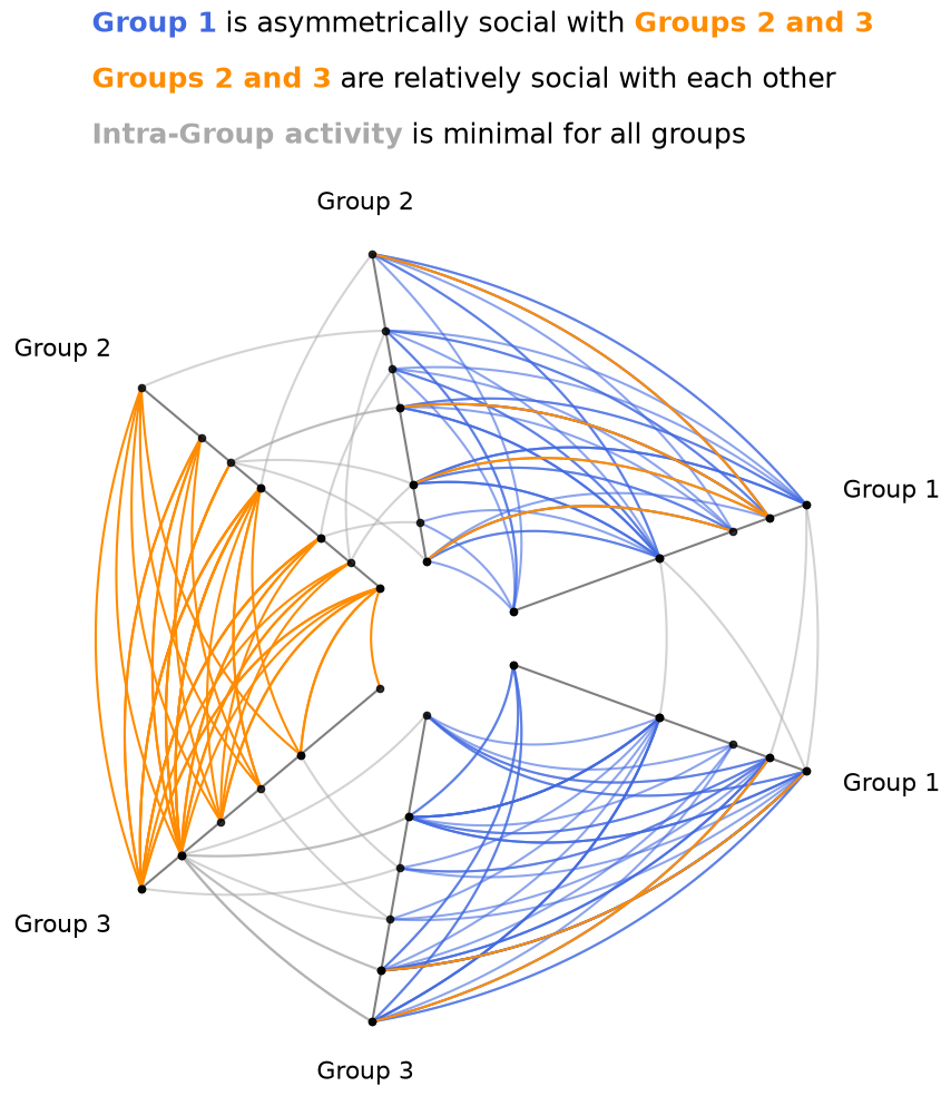
Now we can see that the overwhelming majority of edges between Group 1 and Groups 2 and 3 are coming from Group 1, with only a few orange edges going to Group 1. Furthermore, we can see that there is still an abundance of orange edges between Groups 2 and 3, further emphasizing the discrepancy of communication between the groups.
Changing the Visualization Back End#
We can change the visualization back end to any of the hiveplotlib-supported options either on initialization with the via the backend parameter, or we can update an existing HivePlot instance with the HivePlot.set_viz_backend() method.
We just need to make sure that all provided edge viz keyword arguments are compatible with the chosen back end. For existing hive plots, this likely requires updating the names of some keyword arguments, and maybe even the elimination of other keyward arguments.
Below, we demonstrate showing the same plot from above, but visualized interactively in bokeh. This requires updating the kwarg names of color to line_color and alpha to line_alpha. bokeh also has no equivalent to the matplotlib parameter zorder, so we will remove that parameter by setting its new name to None. This can be done via the HivePlot.rename_edge_kwargs() method.
[14]:
from bokeh.plotting import output_notebook, show

output_notebook()

hp.set_viz_backend("bokeh")

hp.rename_edge_kwargs(
    zorder=None,  # no zorder in bokeh
    color="line_color",
    alpha="line_alpha",
)

fig = hp.plot()
show(fig)
Your choice of back end depends on many user-specific circumstances:
User Familiarity - We recommend using a back end you’re familiar with.
Size of Network - Interactive back ends scale poorly to large networks, but they are fantastic for in-depth exploration of smaller networks, especially with their hover information capabilties. The best back end for larger networks is datashader.
Package-Specific Capabilities - Each visualization back end unavoidably has its idiosyncrasies. In the above hive plot, for example, the
matplotlibparameterzorderallows us to render the small number of orange edges on top of the blue edges, whereas the equivalent bokeh behavior is too low-level to robustly handle inhiveplotlibplotting tools. No one back end is perfect for every case, so users should weigh these trade-offs as needed for their hive plots.
For a high-level overview of the supported visualization back ends, see the Hive Plots Using Other Visualization Libraries notebook.
For more detailed discussions of the nuances of each visualization back end, see the Visualization gallery examples.
Comparing Network Subgroups#
What about exploring behavior between different subgroups of a network in a single hive plot? For more on this use case, see our toy example in the Comparing Network Subgroups notebook.
A Note On Edge Keyword Argument Flexibility#
This notebook only scratches the surface on the flexibility users have for changing edge-plotting keyword arguments.
For more on these options, see the Changing Edge Keyword Arguments notebook.