

Zachary’s Karate Club#
Note: this notebook requires that Hiveplotlib be installed with extra packages, which can be done by running:
pip install hiveplotlib[networkx]
[1]:
import matplotlib.pyplot as plt
import networkx as nx
from flexitext import flexitext
from hiveplotlib import HivePlot
from matplotlib.lines import Line2D
Background#
From 1970-1972, Wayne W. Zachary observed a karate club split into two factions, those that supported the officers, referred to as “Officer,” and those that supported one of the instructors, referred to as “Mr. Hi.” Eventually, the two factions formally split into two clubs.
This frequently-used dataset contains 34 club members (nodes) and a record of who socialized with whom outside of the class (edges) right before the formal split of the club.
The Data#
Grabbing this dataset is convenient through networkx
[2]:
G = nx.karate_club_graph()
Visualization#
This network is commonly visualized both in the original paper and through networkx as a circular graph
[3]:
# color the nodes by faction
color = []
for node in G.nodes():
    if G.nodes.data()[node]["club"] == "Mr. Hi":
        color.append("royalblue")
    else:
        color.append("darkorange")

fig, ax = plt.subplots(figsize=(10, 10))
plt.axis("equal")
nx.draw_circular(
    G,
    with_labels=True,
    node_color=color,
    ax=ax,
    font_color="white",
    node_size=1000,
)
ax.set_title("Zachary's Karate Club\nCircular Network Plot", fontsize=20)

# legend
officer_legend = Line2D(
    [],
    [],
    markerfacecolor="darkorange",
    markeredgecolor="darkorange",
    marker="o",
    linestyle="None",
    markersize=10,
)

mr_hi_legend = Line2D(
    [],
    [],
    markerfacecolor="royalblue",
    markeredgecolor="royalblue",
    marker="o",
    linestyle="None",
    markersize=10,
)

ax.legend(
    [mr_hi_legend, officer_legend],
    ["Mr. Hi", "Officer"],
    loc="upper left",
    bbox_to_anchor=(1, 1),
    title="Faction",
)
plt.show()
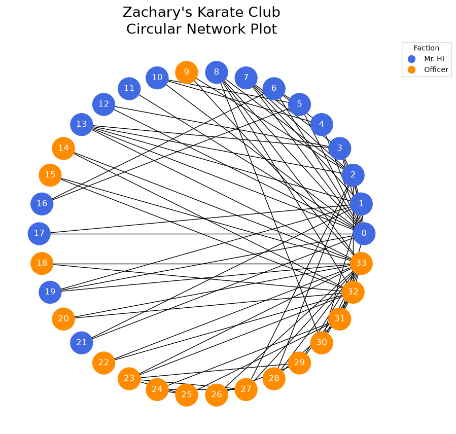
Conclusions from the Circular Graph#
One clear and unsurprising conclusion from this graph is that Mr. Hi (0) and Officer (33) were popular, but it’s hard to conclude much else.
Look at this graph for roughly 10 seconds, then ask yourself the following questions:
How socially separated are the two factions? How long does it take to confirm there exists a connection between blue and orange?
Are the connections between the two groups from people who are generally more social?
To answer the first question, we could certainly be more careful in ordering these nodes in our plot, partitioning orange from blue, but the second question would still be difficult.
An Alternative: Hive Plots#
Hive Plots allow us to carefully choose both the axes on which to place nodes and how to align the nodes on those axes.
There is thus a lot of necessary declaration, but with the payoff of a far more interpretable network visualization.
To answer our above questions, we will structure our Hive Plot in the following way:
We will construct a total of 4 axes. 2 axes for the Officer faction, and 2 axes for the Mr. Hi Faction. This use of repeat axes allows us to see the intra-faction behavior in a well-defined way in our resulting visualization.
We will look at 3 sets of edges. Edges within the Officer faction, edges within the Mr. Hi faction, and edges between the two factions. This will give us a clear answer to our first question above.
We will sort our axes for each faction by node degree. This allows us to nicely answer our second question above, but more on this later.
Let’s build the hive plot. We can pass a networkx graph directly to HivePlot() via the graph parameter, requesting degree as a graph metric on initialization via the node_graph_metrics parameter. For more on Hiveplotlib-supported graph metrics, see the Computing Graph Metrics page.
[4]:
hp = HivePlot(
    graph=G,
    partition_variable="club",
    sorting_variables="degree",
    node_graph_metrics="degree",
    repeat_axes=True,
    non_repeat_edge_kwargs={"color": "darkgray"},
)

# color intra-faction edges to match color of nodes in circular viz above
hp.update_edges("Mr. Hi", "Mr. Hi", color="royalblue")
hp.update_edges("Officer", "Officer", color="darkorange")

# only show the repeat edges on one end of the hive plot
hp.reset_edges(axis_id_1="Mr. Hi_repeat", axis_id_2="Officer")
[5]:
hp.nodes.data.head()
[5]:
| unique_id | club | degree | |
|---|---|---|---|
| 0 | 0 | Mr. Hi | 16 |
| 1 | 1 | Mr. Hi | 9 |
| 2 | 2 | Mr. Hi | 10 |
| 3 | 3 | Mr. Hi | 6 |
| 4 | 4 | Mr. Hi | 3 |
[6]:
hp.edges.data.head()
[6]:
| from | to | weight | |
|---|---|---|---|
| 0 | 0 | 1 | 4 |
| 1 | 0 | 2 | 5 |
| 2 | 0 | 3 | 3 |
| 3 | 0 | 4 | 3 |
| 4 | 0 | 5 | 3 |
As an extension of the hiveplotlib visualization, we will also pull out the Officer and Mr. Hi node placements to plot them in different colors in the final figure.
[7]:
# pull out the location of the Officer and Mr. Hi nodes for visual emphasis
officer_degree_locations = hp.axes["Officer_repeat"].node_placements
officer_node = (
    officer_degree_locations.loc[
        officer_degree_locations.loc[:, "unique_id"] == 33, ["x", "y"]
    ]
    .to_numpy()
    .flatten()
)

mr_hi_degree_locations = hp.axes["Mr. Hi"].node_placements
mr_hi_node = (
    mr_hi_degree_locations.loc[
        mr_hi_degree_locations.loc[:, "unique_id"] == 0, ["x", "y"]
    ]
    .to_numpy()
    .flatten()
)
Visualizing the Hive Plot#
Once the decisions are made above, all that remains is visualizing the Hive Plot.
[8]:
fig, ax = hp.plot()

# highlight Mr. Hi and Officer on the degree axes
ax.scatter(
    officer_node[0],
    officer_node[1],
    facecolor="red",
    edgecolor="black",
    s=150,
    lw=2,
    zorder=5,
)
ax.scatter(
    mr_hi_node[0],
    mr_hi_node[1],
    facecolor="gold",
    edgecolor="black",
    s=150,
    lw=2,
    zorder=5,
)

# embed legend in the title
flexitext(
    x=0.4,
    y=0.73,
    s="<size:20>Zachary's Karate Club Hive Plot\n</>"
    "<size:14><color:gold, weight: bold>Mr. Hi</> and "
    "<color:red, weight:bold>Officer</> most connected (highest node degree)</>\n"
    "<size:14>Some <color:darkgray, weight: bold>inter-faction communication</>\n"
    "But more connections <style:italic>within</> the "
    "<color:royalblue, weight: bold>Mr. Hi faction</> / "
    "<color:darkorange, weight:bold>Officer faction</></>",
    xycoords="figure fraction",
    ha="center",
)
plt.show()
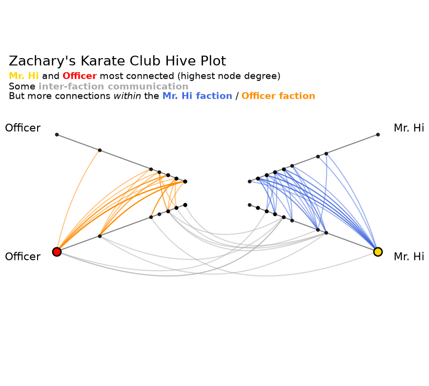
Let’s revisit our questions from earlier:
How socially separated are the two factions? How long does it take to confirm there exists a connection between blue and orange?
From this figure, there appear to be far more intra-faction connections than inter-faction connections, but we can clearly see inter-faction connections in gray.
Are the connections between the two groups from people who are generally more social?
There does not appear to be a particularly strong correlation between inter-faction connections and general sociability. Otherwise, there would be gray connections only between nodes high on each axis.
The setup costs are of course higher to generate this Hive Plot visualization than the circular layout. We had to make the axes and sorting decisions. As a reward, however, we can generate unambiguous visualizations that can serve as first steps in answering genuine research questions.
References#
Zachary W. (1977). An information flow model for conflict and fission in small groups. Journal of Anthropological Research, 33, 452-473.