

Hive Plot Matrix: from_tags#
This notebook covers the features and options of HivePlotMatrix.from_tags, which builds one cell per edge tag so that different relationship types can be compared across the same axis layout.
For additional discussion motivating Hive Plot Matrices (HPMs) and the different HPM options, see the Hive Plot Matrices tutorial.
Note: this notebook requires that Hiveplotlib be installed with extra packages, which can be done by running:
pip install hiveplotlib[bokeh,datashader,networkx]
[1]:
import matplotlib.pyplot as plt
from hiveplotlib import HivePlotMatrix
from hiveplotlib.datasets import example_hpm_nodes_and_edges
from matplotlib.cm import ScalarMappable
from matplotlib.colors import Normalize
We will base this discussion on the following toy dataset:
[2]:
nodes, edges = example_hpm_nodes_and_edges(
    edge_structure={"social": "intragroup", "informal": "intergroup"},
    drop_duplicate_edges=True,
)
[3]:
nodes.data.head()
[3]:
| unique_id | group | value1 | value2 | value3 | |
|---|---|---|---|---|---|
| 0 | 0 | A | 2.579853 | 7.447622 | 8.894677 |
| 1 | 1 | A | 1.462928 | 9.675097 | 8.236987 |
| 2 | 2 | A | 2.861993 | 3.258254 | 8.550787 |
| 3 | 3 | A | 2.324560 | 3.704597 | 9.216663 |
| 4 | 4 | A | 0.313924 | 4.695558 | 8.782394 |
[4]:
edges
[4]:
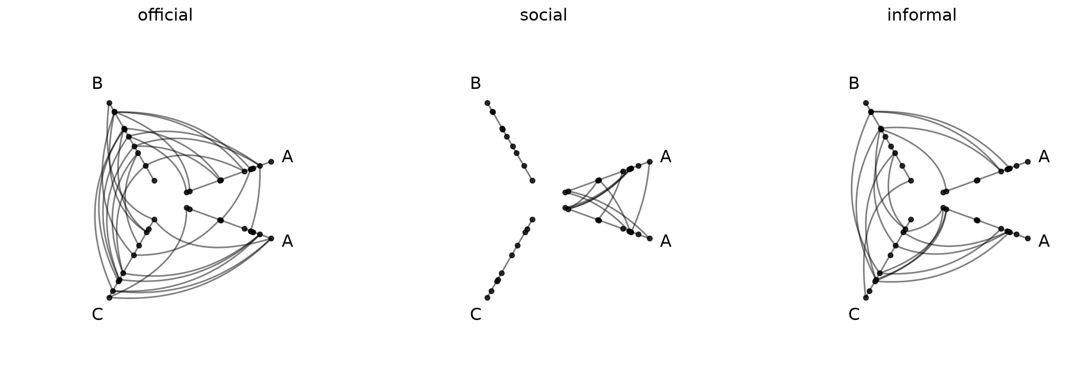
hiveplotlib.Edges of 85 edges across 3 tags.
The three edge tags have different patterns in intragroup / intergroup communication: official, social, and informal.
Auto-Detecting Tags#
from_tags auto-detects all tags from the Edges object and produces one cell per tag:
[5]:
hpm = HivePlotMatrix.from_tags(
    nodes=nodes,
    edges=edges,
    partition_variable="group",
    sorting_variables="value1",
    repeat_axes=True,
)
hpm
[5]:
hiveplotlib.HivePlotMatrix (1 x 3), 3 populated cells, type='from_tags', backend='matplotlib'
[6]:
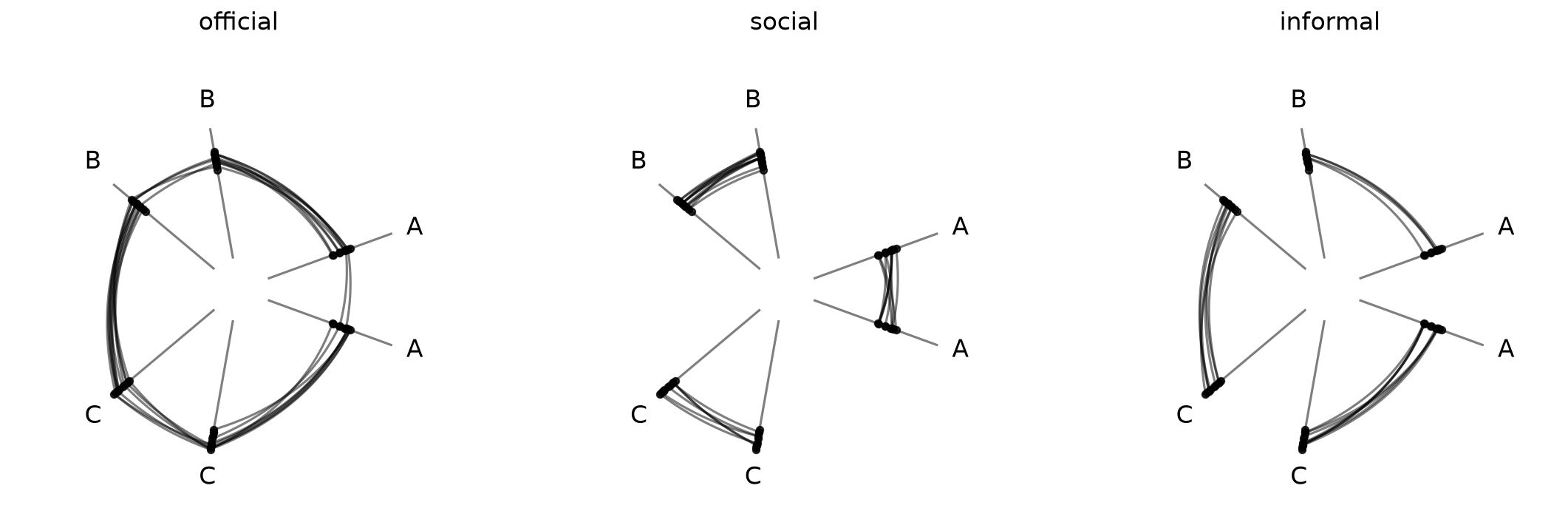
fig, axes = hpm.plot()
plt.show()
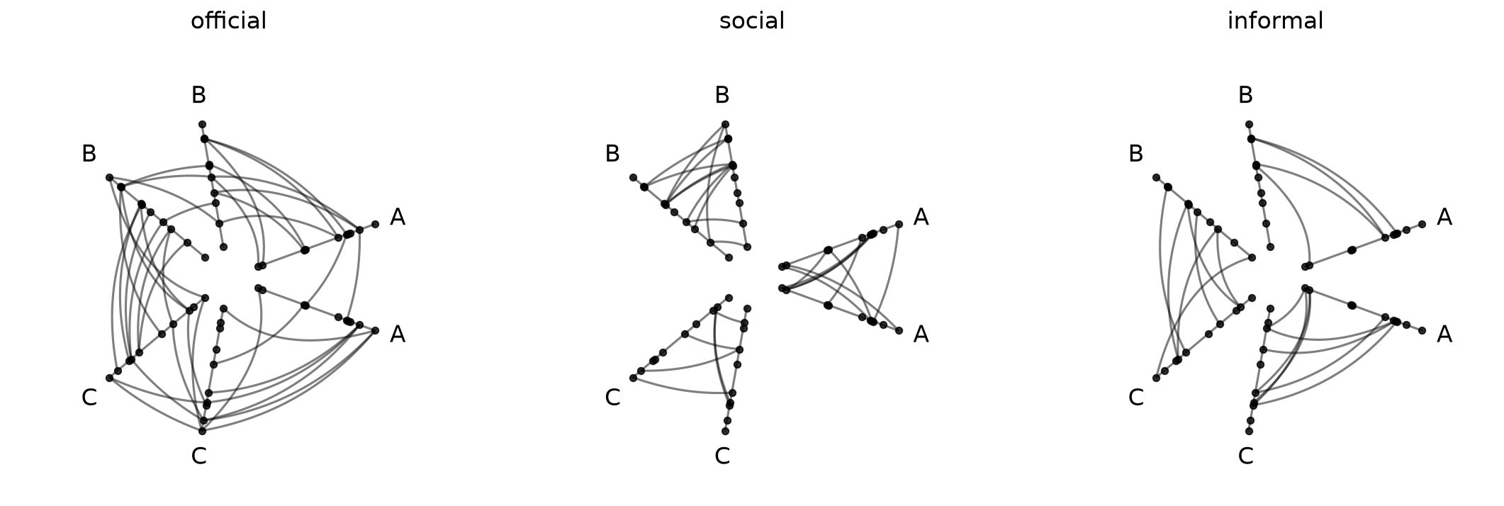
In this presentation, we can clearly see that official connections are both intragroup and intergroup while social connections are only intragroup and informal connections are only intergroup.
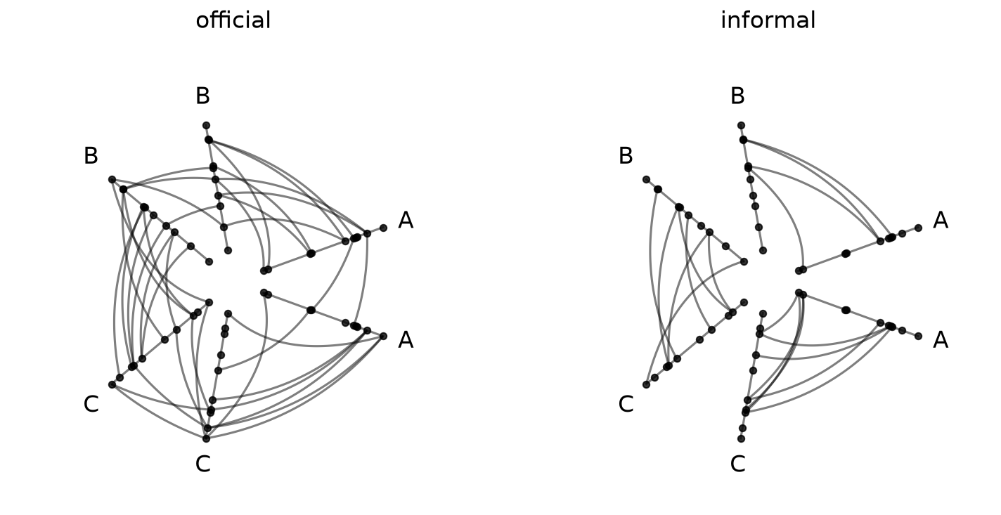
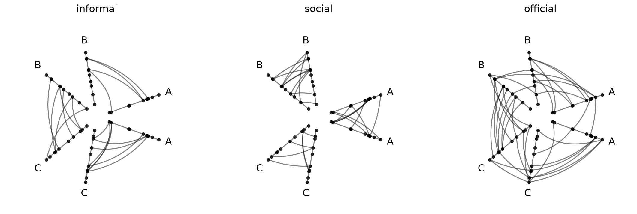
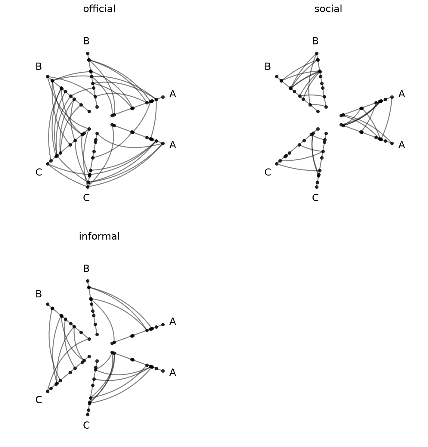
Controlling Tag Selection and Order#
What if we only want a subset of tags, or want to change the display order? The tags parameter lets us do both:
[7]:
hpm_subset = HivePlotMatrix.from_tags(
    nodes=nodes,
    edges=edges,
    partition_variable="group",
    sorting_variables="value1",
    tags=["official", "informal"],
    repeat_axes=True,
)
fig, axes = hpm_subset.plot()
plt.show()
[8]:
hpm_reordered = HivePlotMatrix.from_tags(
nodes=nodes,
edges=edges,
partition_variable="group",
sorting_variables="value1",
tags=["informal", "social", "official"],
repeat_axes=True,
)
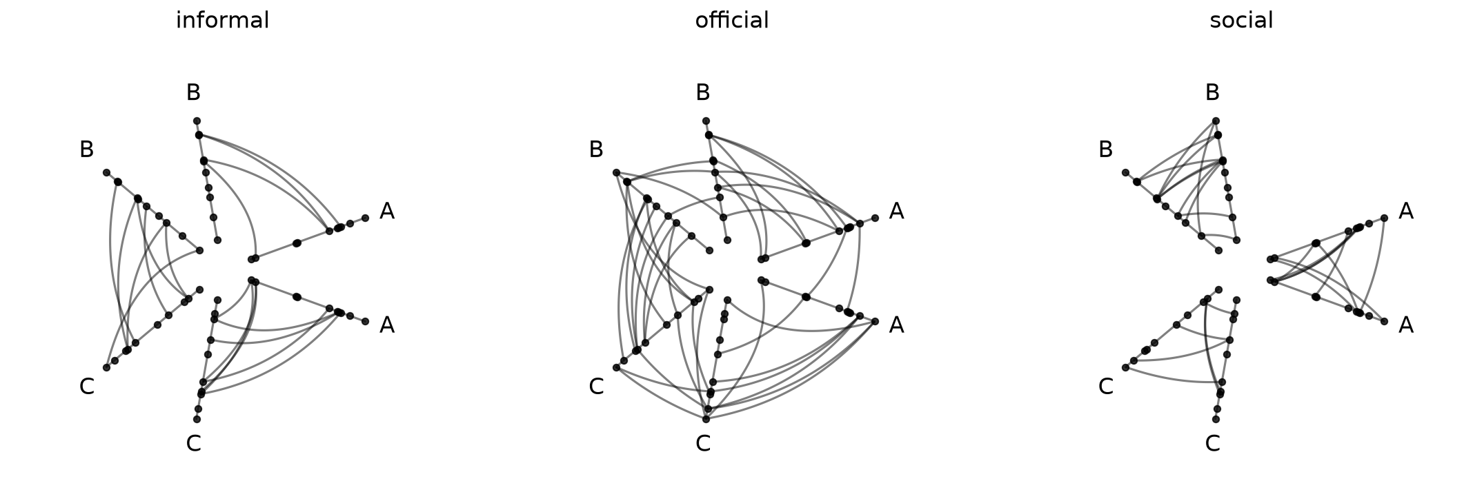
fig, axes = hpm_reordered.plot()
plt.show()
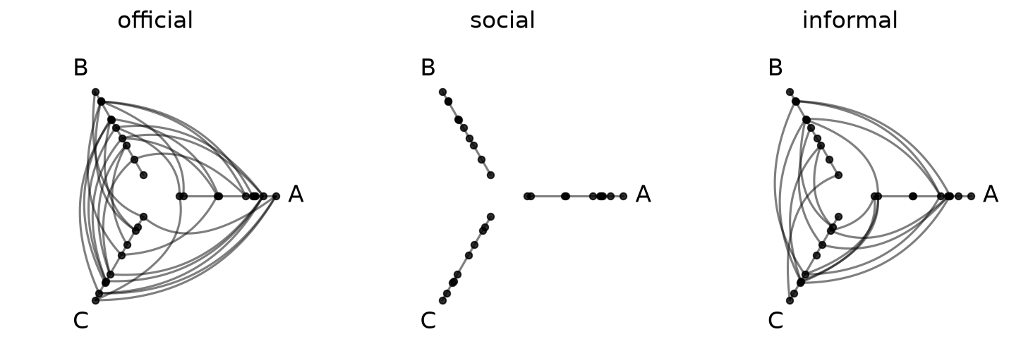
Repeat Axes#
By default (repeat_axes=False), each hive plot shows only intergroup edges.
[9]:
# default intergroup edges only (repeat_axes=False)
hpm_no_repeat = HivePlotMatrix.from_tags(
    nodes=nodes,
    edges=edges,
    partition_variable="group",
    sorting_variables="value1",
)
fig, axes = hpm_no_repeat.plot()
plt.show()
Setting repeat_axes=True, as we did in the examples above, adds a repeat axis for every group, exposing all intragroup edges as well:
[10]:
hpm_repeat = HivePlotMatrix.from_tags(
    nodes=nodes,
    edges=edges,
    partition_variable="group",
    sorting_variables="value1",
    repeat_axes=True,
)
fig, axes = hpm_repeat.plot()
plt.show()

We can also pass a specific group name (or list of names) to add repeat axes selectively:
[11]:
hpm_partial = HivePlotMatrix.from_tags(
    nodes=nodes,
    edges=edges,
    partition_variable="group",
    sorting_variables="value1",
    repeat_axes="A",
)
fig, axes = hpm_partial.plot()
plt.show()
See the Adding Repeat Axes page for more information.
Wrapping with ncols#
For longer tag lists, ncols wraps the 1D row into a 2D grid:
[12]:
hpm_grid = HivePlotMatrix.from_tags(
    nodes=nodes,
    edges=edges,
    partition_variable="group",
    sorting_variables="value1",
    repeat_axes=True,
    ncols=2,
)
hpm_grid
[12]:
hiveplotlib.HivePlotMatrix (2 x 2), 3 populated cells, type='from_tags', backend='matplotlib'
[13]:
fig, axes = hpm_grid.plot()
plt.show()
With three cells wrapping into two columns, the last position is None (empty).
Pre-Styling Tags#
Styling applied to Edges tags before HPM construction propagates automatically to each cell in the final HPM. This lets us assign a distinct color, for example, to each relationship type before calling from_tags:
[14]:
edges_styled = edges.copy()
edges_styled.update_edge_viz_kwargs(
    tag="official", color="royalblue", linewidth=1.0
)
edges_styled.update_edge_viz_kwargs(
    tag="social", color="darkorange", linewidth=1.0
)
edges_styled.update_edge_viz_kwargs(
    tag="informal", color="darkgray", linewidth=1.0
)

hpm_styled = HivePlotMatrix.from_tags(
    nodes=nodes,
    edges=edges_styled,
    partition_variable="group",
    sorting_variables="value1",
    repeat_axes=True,
)
fig, axes = hpm_styled.plot()
plt.show()
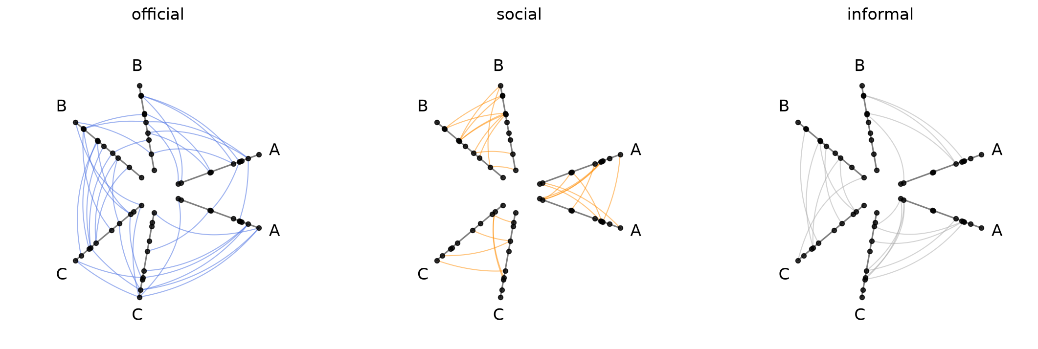
For more on edge styling, see the Multiple Tags of Edge Data and Updating Edges Instance Viz Kwargs pages.
Drilling Down on a Single Hive Plot in an HPM#
We can take a copy of a hive plot cell and explore further changes without disrupting the existing HPM. For example, we can switch to an interactive Hiveplotlib-supported back end like bokeh.
Note, however, that most of the hive plot viz back ends (excluding datashader) plot ALL tags by default, so we also need to set the `tags` parameter when plotting below.
[15]:
from bokeh.io import output_notebook
from bokeh.plotting import show
from bokeh.resources import INLINE

output_notebook(resources=INLINE)

tag_hp = hpm[0, 1].copy()
tag_hp.set_viz_backend("bokeh")
show(
    tag_hp.plot(
        tags="social",  # must specify `tags` here to plot single tag!
    ),
)
Once we spot anomalous nodes or edges, for example, we can use the hover tool support with the bokeh back end to find the relevant node or edge IDs.
Unified Axis Scaling with unify_axes#
By default, each hive plot axis auto-scales to the data range of the nodes assigned to it by setting unify_axes=False. Since different axes correspond to different partition groups, it is almost certainly true that different axes have different absolute ranges. Since all cells share the same nodes and axis layout, though, the range of a single axis across hive plots will be consistent (e.g. axis A has the same range on all of the previous hive plots we’ve seen above).
Although this default behavior can be useful, especially if we want to use the full range of each axis to place nodes, it requires careful interpretation across axes. Here, if we see an edge from high A values to high C values, “high” is only within group.
If we want the relative position of nodes across axes to matter, we can pass unify_axes=True to auto-compute a single global vmin / vmax from all node data and apply it to each axis.
[16]:
hpm_fixed_axes = HivePlotMatrix.from_tags(
    nodes=nodes,
    edges=edges,
    partition_variable="group",
    sorting_variables="value1",
    unify_axes=True,
    repeat_axes=True,
)
fig, axes = hpm_fixed_axes.plot()
plt.show()
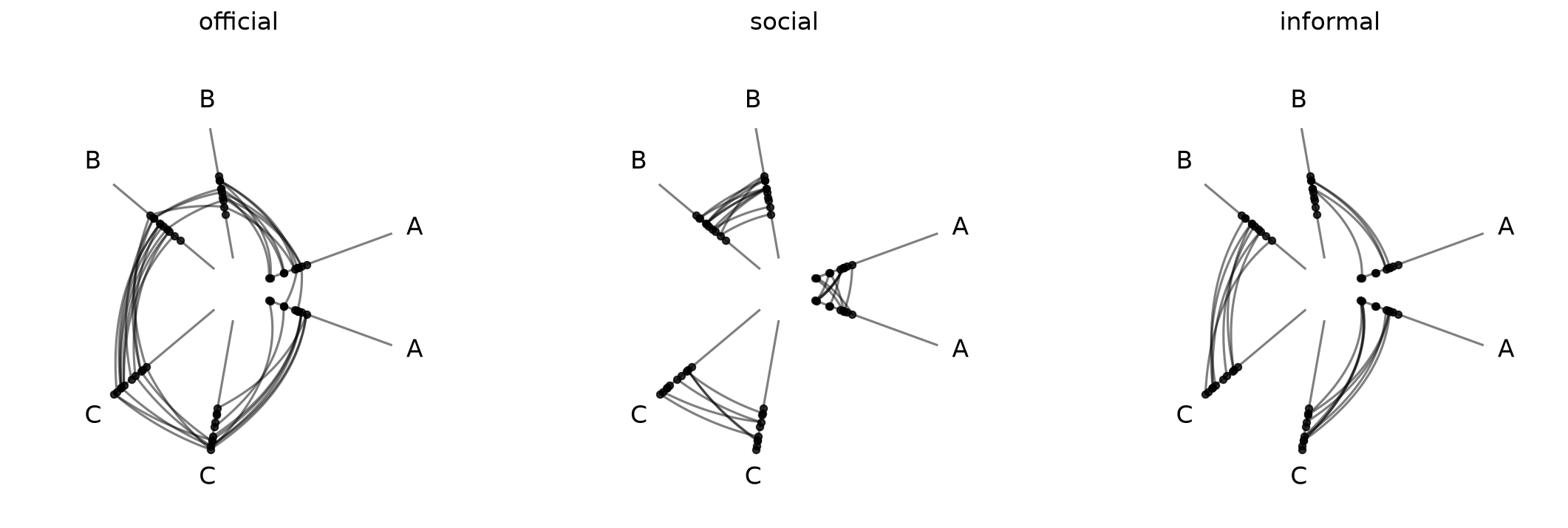
Here we can see that nodes on the A axis with high within-group values according to the current sorting variable actually have low values relative to the rest of the network (e.g. the C axis nodes).
Set a Specific Range for Unified Axes#
To force a specific range instead of auto-computing, we can pass a dictionary with vmin and / or vmax. Missing keys are auto-computed to the global min / max of the data.
This can be helpful if there are outliers or if there are important threshold values for a given sorting variable.
[17]:
# pin vmin to -10, auto-compute vmax from the data
hpm_fixed_axes = HivePlotMatrix.from_tags(
    nodes=nodes,
    edges=edges,
    partition_variable="group",
    sorting_variables="value1",
    repeat_axes=True,
    unify_axes={"vmin": -10},
)
fig, axes = hpm_fixed_axes.plot()
plt.show()
Building Multi-tag Edges from a NetworkX Graph#
Unlike HivePlotMatrix.from_partition and HivePlotMatrix.from_variable_sweep, from_tags does not accept a networkx graph directly via a graph parameter shortcut.
Tags are a property of the Edges object, not of NetworkX graphs, and by the time we call HivePlotMatrix.from_tags, we need to have already decided which edges belong to which named group (the keys on edges.data).
Users coming in with a networkx graph (and some per-edge attribute identifying the tag) need to assemble multi-tag Edges manually. This can be done via:
Run the NetworkX graph through
hiveplotlib.converters.networkx_to_nodes_edges. This returns aNodeCollectionand a single-tagEdgeswhose.dataDataFrame carries every edge attribute as a column.Split that DataFrame into one DataFrame per tag value (
df_0,df_1, …).Create the tag-friendly
Edgesinstance viaEdges(data={tag_0: df_0, tag_1: df_1, ...})and pass it plus theNodeCollectiongenerated in step 1 toHivePlotMatrix.from_tags.
To stick with the same example we’ve been using throughout this discussion, we’ll first use the low-level Hiveplotlib converter nodes_edges_to_networkx() to get the equivalent NetworkX graph, and then we’ll proceed with the steps above.
[18]:
from hiveplotlib import Edges
from hiveplotlib.converters import (
    networkx_to_nodes_edges,
    nodes_edges_to_networkx,
)

# build a NetworkX graph from the same toy nodes / edges
# (`nodes_edges_to_networkx` writes the tag as an edge attribute named 'tag')
graph = nodes_edges_to_networkx(nodes=nodes, edges=edges)

# 1. convert to hiveplotlib structures (single-tag Edges, tag carried as a column)
nodes_from_nx, edges_flat = networkx_to_nodes_edges(graph)
edges_df = edges_flat.data  # single-tag, so .data is a DataFrame

# 2. split the DataFrame into one DataFrame per tag value
tag_buckets = {
    tag: sub.drop(columns="tag").reset_index(drop=True)
    for tag, sub in edges_df.groupby("tag")
}

# 3. wrap as multi-tag Edges and feed to from_tags()
edges_multi_tag = Edges(data=tag_buckets)

hpm_from_nx = HivePlotMatrix.from_tags(
    nodes=nodes_from_nx,
    edges=edges_multi_tag,
    partition_variable="group",
    sorting_variables="value1",
    repeat_axes=True,
)
fig, axes = hpm_from_nx.plot()
plt.show()
Computing Graph Metrics During Construction#
Node metrics like node degree are often useful as sorting_variables. Edge metrics like edge betweenness centrality can drive data-driven edge styling.
Rather than computing these metrics by hand and merging them onto our node and edge data structures, we can instead request Hiveplotlib-supported metrics directly via the node_graph_metrics and edge_graph_metrics parameters at construction time. Below, we sort each per-tag axis by node degree over the union of all tagged edges and color edges by their betweenness centrality:
[19]:
hpm_degree = HivePlotMatrix.from_tags(
    nodes=nodes,
    edges=edges,
    partition_variable="group",
    sorting_variables="degree",  # use the to-be-computed metric
    node_graph_metrics="degree",  # request degree on initialization
    edge_graph_metrics="edge_betweenness_centrality",  # request an edge metric too
    repeat_axes=True,
)

edge_coloring_kwargs = {
    "cmap": "cividis",
    "clim": (0, 0.06),
    "alpha": 1,
}

# data-driven edge styling must be done per hive plot
for _, _, hp in hpm_degree.iter_populated_cells():
    hp.update_edge_plotting_keyword_arguments(
        array="edge_betweenness_centrality",
        **edge_coloring_kwargs,
    )

fig, axes = hpm_degree.plot()

# horizontal colorbar spanning the row of cells
fig.colorbar(
    ScalarMappable(
        norm=Normalize(*edge_coloring_kwargs["clim"]),
        cmap=edge_coloring_kwargs["cmap"],
    ),
    orientation="horizontal",
    ax=axes,
    label="Edge Betweenness Centrality",
    extend="max",
    shrink=0.7,
)

plt.show()
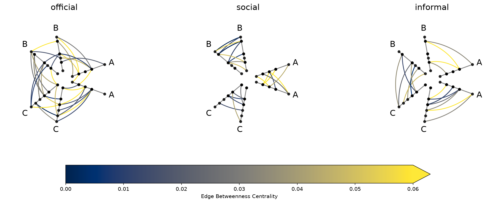
Note that data-driven edge styling must be set on each individual hive plot, as opposed to directional edge styling, which can be set at the HPM level. We discuss directional edge styling in the next section.
The requested degree metric is now a column on every populated cell’s underlying nodes. Degree is computed once over the union of all tags, so the values are identical across cells:
[20]:
hpm_degree[0, 0].nodes.data.head()
[20]:
| unique_id | group | value1 | value2 | value3 | degree | |
|---|---|---|---|---|---|---|
| 0 | 0 | A | 2.579853 | 7.447622 | 8.894677 | 5 |
| 1 | 1 | A | 1.462928 | 9.675097 | 8.236987 | 4 |
| 2 | 2 | A | 2.861993 | 3.258254 | 8.550787 | 6 |
| 3 | 3 | A | 2.324560 | 3.704597 | 9.216663 | 6 |
| 4 | 4 | A | 0.313924 | 4.695558 | 8.782394 | 6 |
Similarly, the requested edge_betweenness_centrality metric is now a column on the per-tag edge DataFrames of every populated cell:
[21]:
# .edges.data is a dict keyed by tag; pick one tag to inspect
hpm_degree[0, 0].edges.data["official"].head()
[21]:
| from | to | edge_betweenness_centrality | |
|---|---|---|---|
| 0 | 2 | 23 | 0.017222 |
| 1 | 19 | 13 | 0.077184 |
| 2 | 12 | 25 | 0.029636 |
| 3 | 2 | 20 | 0.012261 |
| 4 | 6 | 2 | 0.099981 |
For more information about requesting and using graph metrics, which graph metrics are available, or discretizing node graph metrics to use as partition variables, see the Computing Graph Metrics page.
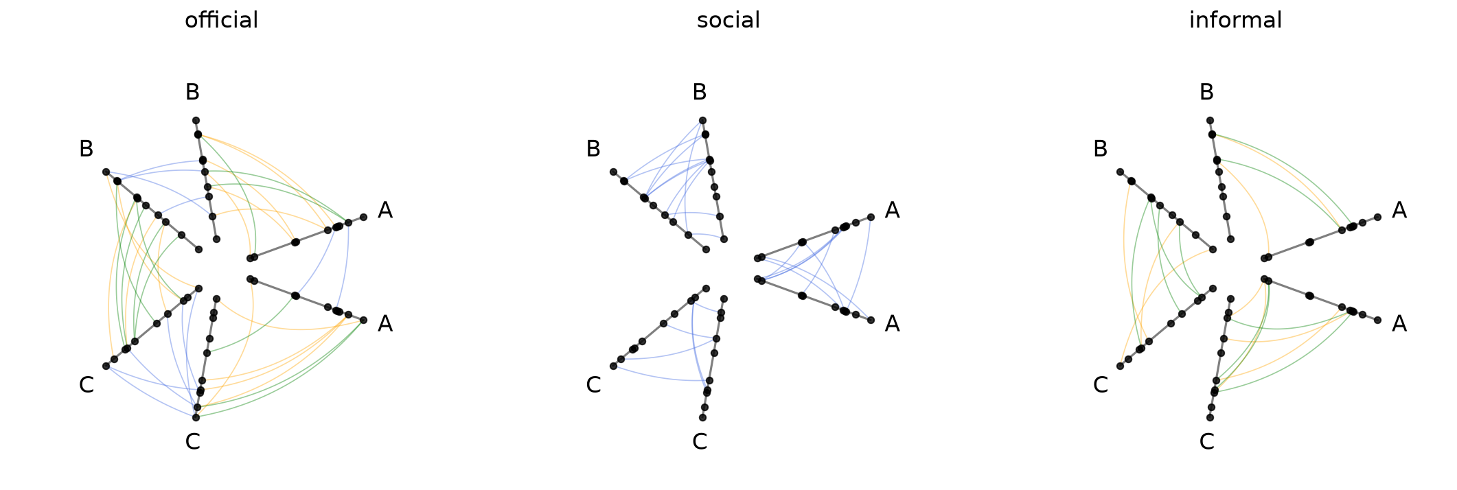
Styling Directed Edges#
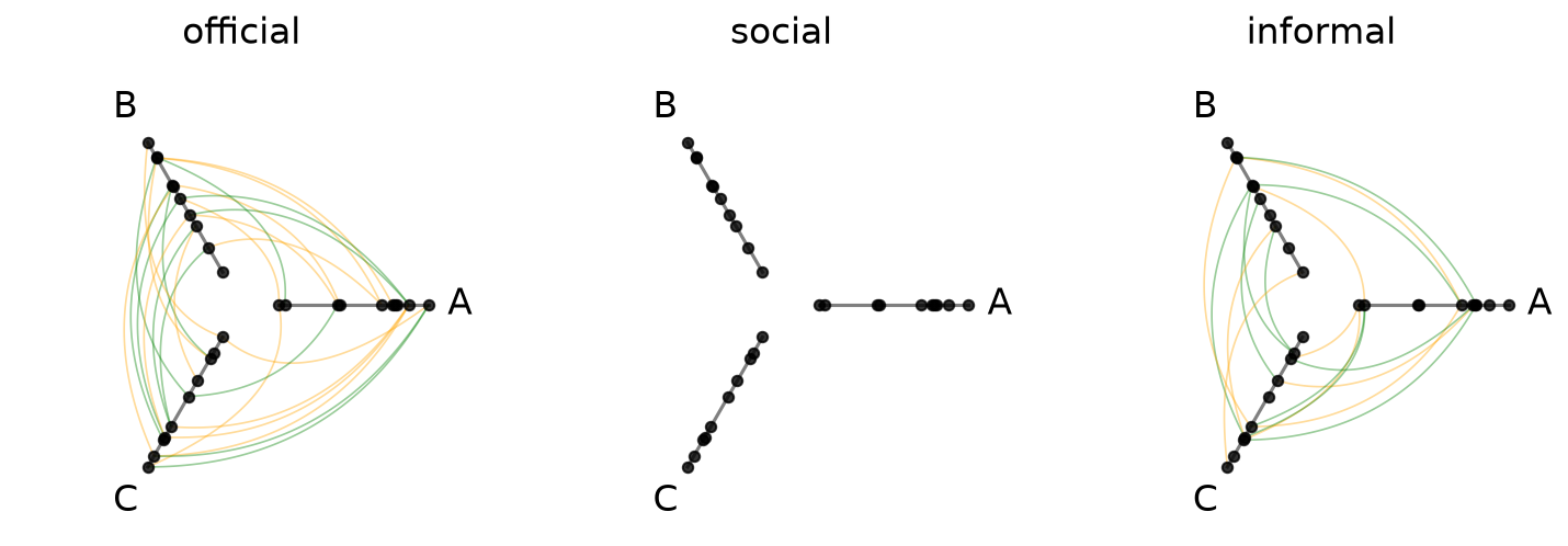
If we are working with a directed network (e.g. an edge from \(i\) to \(j\) is not the same as an edge from \(j\) to \(i\)), then clockwise_edge_kwargs / counterclockwise_edge_kwargs allow us to see edges by direction:
[22]:
hpm_directed = HivePlotMatrix.from_tags(
    nodes=nodes,
    edges=edges,
    partition_variable="group",
    sorting_variables="value1",
    all_edge_kwargs={"alpha": 0.4},
    clockwise_edge_kwargs={"color": "orange", "linewidth": 0.8},
    counterclockwise_edge_kwargs={"color": "green", "linewidth": 0.8},
)
fig, axes = hpm_directed.plot()
plt.show()
Repeat Edge Styling#
repeat_edge_kwargs targets intragroup edges, which have no meaningful directionality since both endpoints belong to the same group:
[23]:
hpm_directed_repeat = HivePlotMatrix.from_tags(
    nodes=nodes,
    edges=edges,
    partition_variable="group",
    sorting_variables="value1",
    repeat_axes=True,
    all_edge_kwargs={"alpha": 0.4},
    clockwise_edge_kwargs={"color": "orange", "linewidth": 0.8},
    counterclockwise_edge_kwargs={"color": "green", "linewidth": 0.8},
    repeat_edge_kwargs={"color": "royalblue", "linewidth": 0.8},
)
fig, axes = hpm_directed_repeat.plot()
plt.show()
For more on the full hierarchy of edge kwarg options and how they take precedence, see the Changing Edge Keyword Arguments page.
Uniform Node and Edge Rendering#
node_kwargs and all_edge_kwargs apply rendering options uniformly across every cell at construction time. Node and edge kwargs can also be passed to .plot() to override them at render time.
[24]:
hpm_uniform = HivePlotMatrix.from_tags(
    nodes=nodes,
    edges=edges,
    partition_variable="group",
    sorting_variables="value1",
    repeat_axes=True,
    node_kwargs={"s": 40, "color": "steelblue"},
    all_edge_kwargs={"color": "salmon", "alpha": 0.5},
)
fig, axes = hpm_uniform.plot()
plt.show()
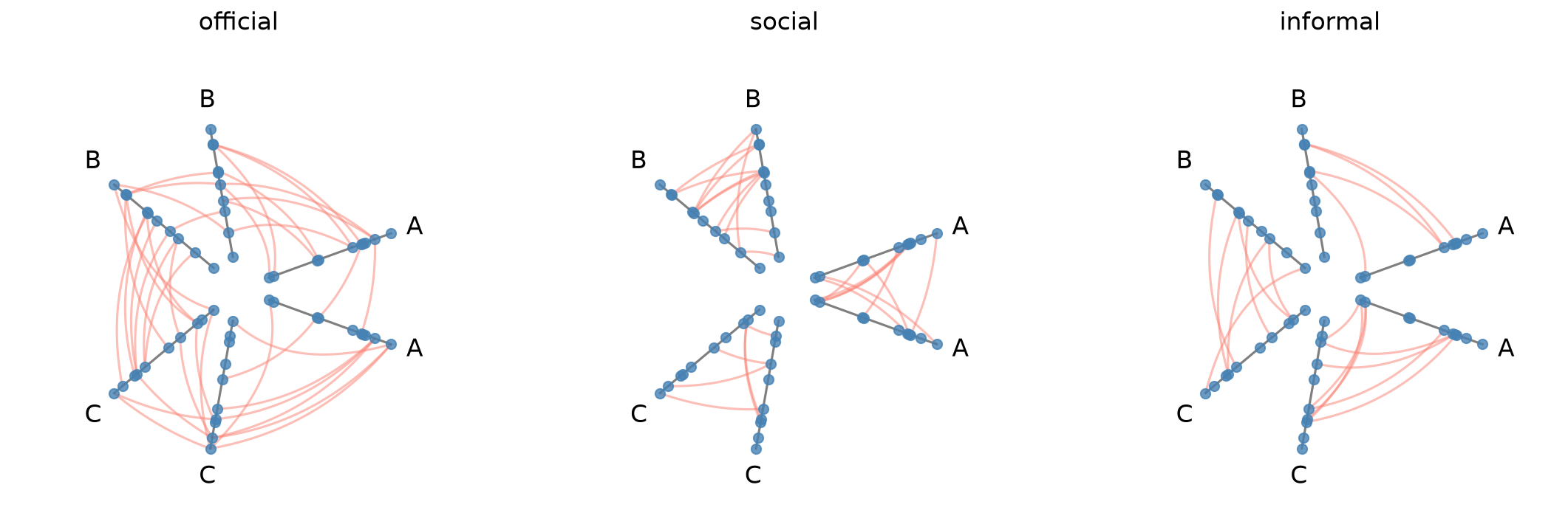
For more on how all_edge_kwargs interacts with more targeted overrides like clockwise_edge_kwargs and repeat_edge_kwargs, see the Changing Edge Keyword Arguments page.
Plot Options#
The plot() method accepts several keyword arguments to control figure appearance. For example, we could change the figure size:
[25]:
# figsize: override the default auto-computed size
fig, axes = hpm.plot(figsize=(6, 3))
plt.show()
Visualization Back Ends#
Two visualization back ends are supported with HPMs: matplotlib (default) and datashader. The back end is set at construction time via the backend parameter.
[26]:
print("Current back end:", hpm.backend)
Current back end: matplotlib
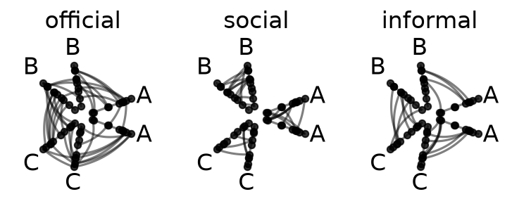
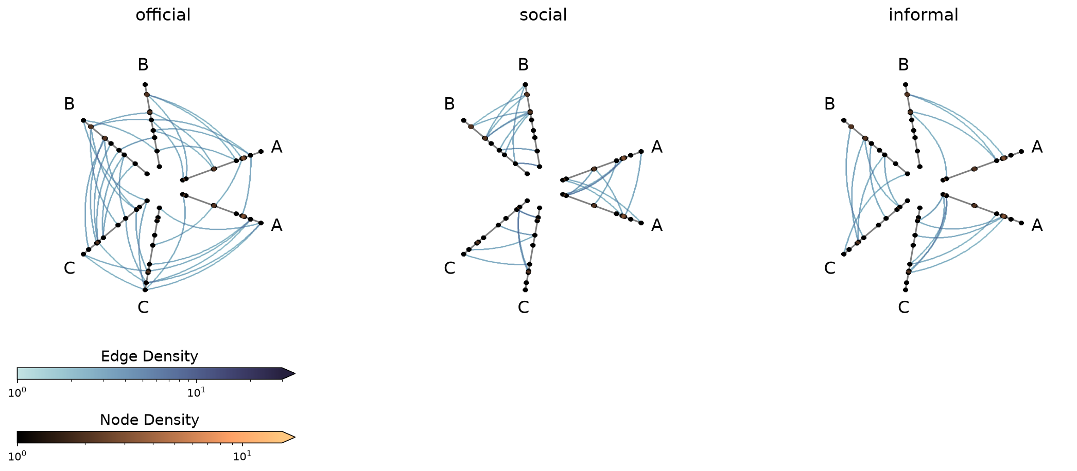
Datashader Back End#
Datashader renders rasterized density images with shared colorbars across all cells.
For more on constructing hive plots with datashader, see the Hive Plots for Large Networks and Datashader pages.
Note that while the matplotlib back end only returns the figure and axes, here the plot() call also returns the node / edge rasterizations.
[27]:
hpm_ds = HivePlotMatrix.from_tags(
    nodes=nodes,
    edges=edges,
    partition_variable="group",
    sorting_variables="value1",
    repeat_axes=True,
    backend="datashader",
)
# datashader plot also returns node / edge rasterizations
fig, axes, im_nodes, im_edges = hpm_ds.plot()
plt.show()
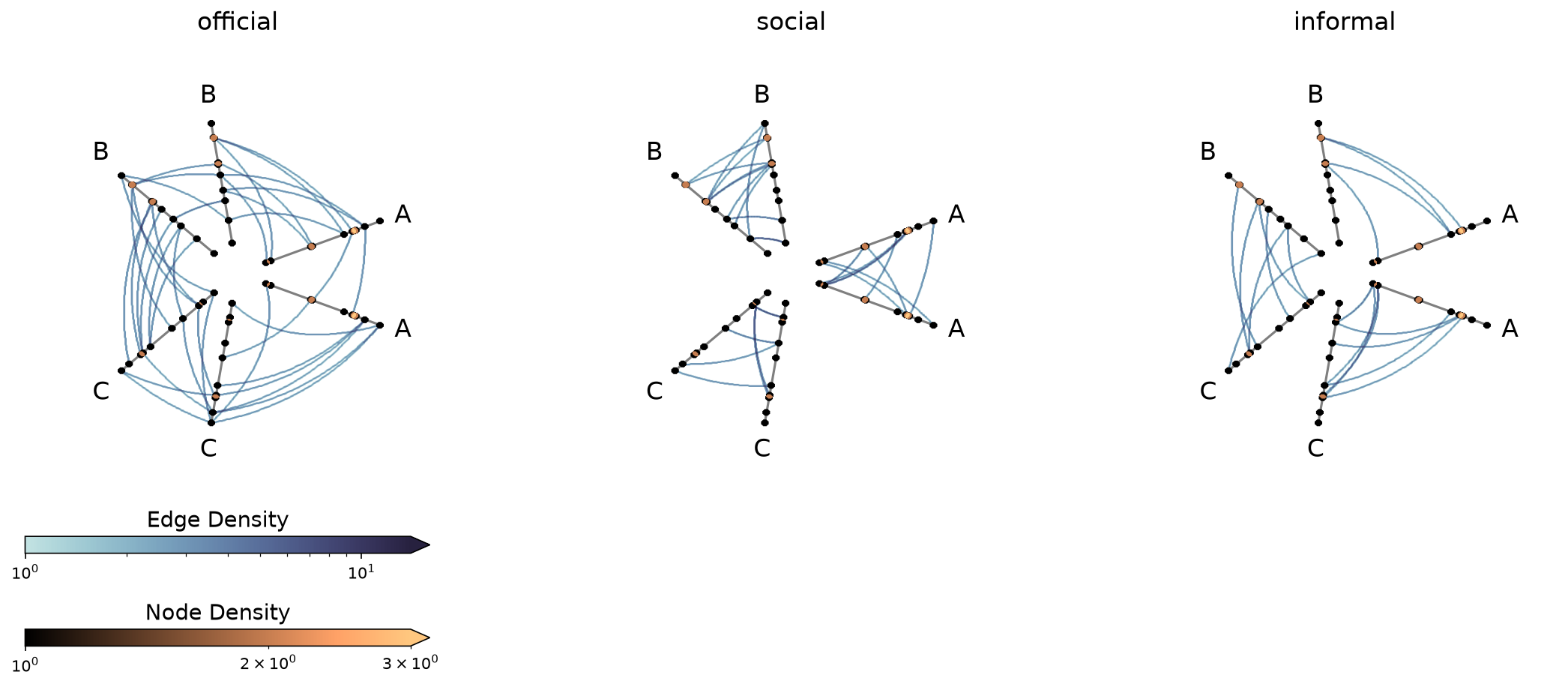
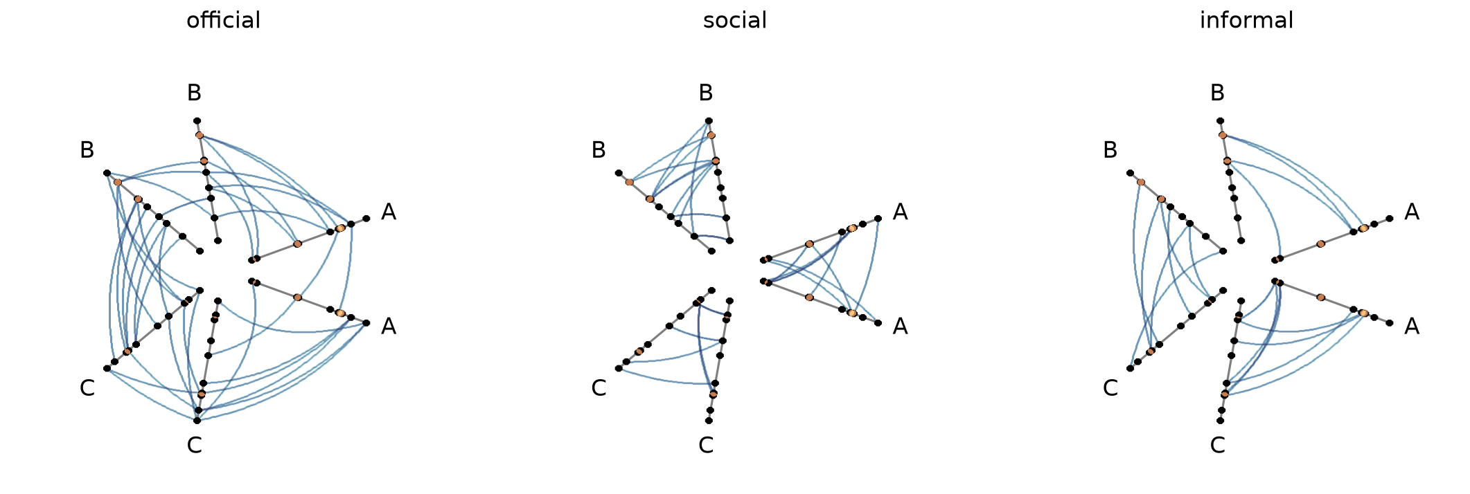
Setting Explicit Density Cutoffs with Datashader#
The node and edge density colormaps and color range will be the same for all hive plots in the HPM.
By default, the max color range for each will top out at the maximum density value over all of the hive plots.
If preferred, users can set vmax_nodes and vmax_edges to fix the shared density max across all cells to a specific level. This can be useful when one cell is much denser than the others or if users have preferred, more-interpretable cutoffs.
[28]:
fig, axes, im_nodes, im_edges = hpm_ds.plot(vmax_nodes=15, vmax_edges=30)
plt.show()
Turn Off Density Colorbars with Datashader#
Users can turn off one or both node / edge colorbars that show up by default by setting show_node_colorbar / show_edge_colorbar to False (both default to True).
[29]:
fig, axes, im_nodes, im_edges = hpm_ds.plot(
    show_node_colorbar=False,
    show_edge_colorbar=False,
)
plt.show()
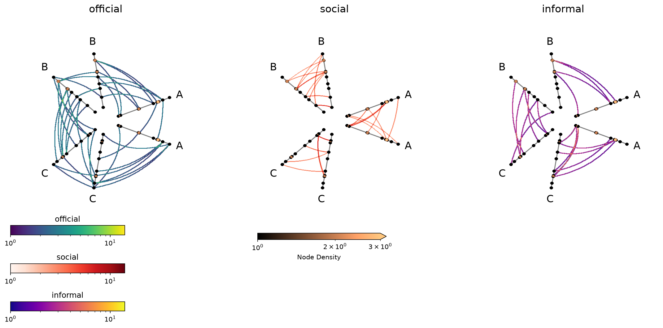
Changing Per-tag Datashader Colormaps#
With the per_tag_plot_kwargs parameter, users can update color parameters for each tag of edges.
In this situation, the automatic edges colorbar won’t fill in (since there will no longer be one colorbar representing all edges in the same way), but we can still manually make the colorbars, as we demonstrate below.
[30]:
tag_list = edges.tags
cmaps = ["viridis", "Reds", "plasma"]

hpm_per_tag = HivePlotMatrix.from_tags(
    nodes=nodes,
    edges=edges,
    partition_variable="group",
    sorting_variables="value1",
    repeat_axes=True,
    backend="datashader",
    per_tag_plot_kwargs={
        tag: {"cmap_edges": cmap}
        for tag, cmap in zip(tag_list, cmaps, strict=True)
    },
)
fig, axes, im_nodes_dict, im_edges_dict = hpm_per_tag.plot()

# custom colorbars for each tag
ax0 = axes[0, 0]
for i, tag in enumerate(tag_list):
    cax = ax0.inset_axes(
        [0, -0.1 - 0.2 * i, 0.6, 0.05], transform=ax0.transAxes
    )
    cb = fig.colorbar(im_edges_dict[0, i], cax=cax, orientation="horizontal")
    cb.ax.set_title(tag)

plt.show()
For a deeper dive into other Hive Plot Matrix convenience methods, see the HivePlotMatrix Gallery Examples.