Comparing Network Subgroups#
[1]:
import matplotlib.pyplot as plt
import numpy as np
import pandas as pd
import seaborn as sns
from flexitext import flexitext
from hiveplotlib import Edges, HivePlot, HivePlotMatrix, NodeCollection
from matplotlib.colors import ListedColormap
from matplotlib.lines import Line2D
Motivation#
The discussion of hive plots often focuses on variability solely between groups of nodes separated by axes. This is a perfectly valid and interesting means of comparison; however, there’s nothing stopping us from considering additional variability. In this notebook, we contemplate one specific form of variability:
What if we want to compare multiple subgroups embedded in 1 network?
In this notebook, we discuss whether to make one or multiple hive plots (e.g. 1 plot per subgroup). Although the multi-hive plot approach could be accomplished simply by making 1 HivePlot instance per subgroup, here we explore using tags to split the data into subgroups and then generate multiple visualizations. We also demonstrate distinguishing different subgroups via edge keyword arguments.
Toy Example: Employee Interactions#
Let’s consider a toy example. Suppose say we have 3 divisions of employees, D1, D2, D3, and we are interested in focusing on the interactions between employees with respect to their seniority at the company.
We will contrive a problem at this company: employees generally only interact with employees of similar seniority.
[2]:
def seniority_example_data(
    divisions: int = 3,
    seniority_range: tuple[float, float] = (2, 10),
    num_nodes_per_division: int = 50,
    num_edges: int = 200,
    seniority_diff_threshold: float = 1,
    starting_index: int = 0,
    random_seed: int = 0,
) -> tuple[NodeCollection, Edges]:
    """
    Toy example of node and edge data.

    Generate node and edge data of interactions over several divisions of employees.

    Interaction (edges) between employees is a function of comparable seniority.

    :param divisions: number of divisions.
    :param num_nodes_per_division: how many employees in each division.
    :param num_edges: how many interactions between employees to create.
    :param seniority_diff_threshold: only add interactions (edges) between individuals
        with a seniority difference below this threshold. If ``np.inf``, randomly choose
        node index value between 0 and the max possible value.
    :param starting_index: starting index to use for assigning unique IDs to nodes
    :param random_seed: random seed to use to sample toy data.
    :return: node and edge data.
    """
    # generating toy example
    rng = np.random.default_rng(random_seed)

    # random uniform value for seniority at company
    division_seniorities = rng.uniform(
        low=seniority_range[0],
        high=seniority_range[1],
        size=(num_nodes_per_division, divisions),
    )

    seniority_data = pd.DataFrame(
        division_seniorities, columns=[f"D{i + 1}" for i in range(divisions)]
    )
    node_data = seniority_data.melt(
        var_name="division", value_name="seniority"
    )
    node_data["index_values"] = (
        np.arange(num_nodes_per_division * divisions) + starting_index
    )

    nodes = NodeCollection(data=node_data, unique_id_column="index_values")

    # produce edges where each node is close in seniority
    start_edges = rng.choice(nodes.data.index_values, size=num_edges)

    stop_edges = []
    for e in start_edges:
        # no seniority constraints, pick from all node values 0 to max node index value
        if seniority_diff_threshold == np.inf:
            stop_edges.append(rng.choice(np.max(node_data["index_values"])))

        # try edge endpoints but only keep when sufficiently close in seniority
        else:
            start_seniority = nodes.data.seniority.to_numpy()[
                e - starting_index
            ]
            while True:
                proposed_stop_edge = rng.choice(nodes.data.index_values)
                stop_seniority = nodes.data.seniority.to_numpy()[
                    proposed_stop_edge - starting_index
                ]
                seniority_diff = np.abs(stop_seniority - start_seniority)
                if seniority_diff <= seniority_diff_threshold:
                    break
            stop_edges.append(proposed_stop_edge)

    edge_data = pd.DataFrame(
        np.column_stack([start_edges, stop_edges]),
        columns=["from", "to"],
    )

    edges = Edges(data=edge_data)

    return nodes, edges
[3]:
nodes, edges = seniority_example_data()
[4]:
hp = HivePlot(
    nodes=nodes,
    edges=edges,
    partition_variable="division",
    sorting_variables="seniority",
    repeat_axes=True,
    rotation=-30,
)

fig, ax = hp.plot(figsize=(6, 6))

ax.set_title(
    "Employees With at Least 2 Years Experience\n"
    "Only Interact with People of Similar Seniority",
    y=1.15,
    size=16,
    loc="left",
)
plt.show()
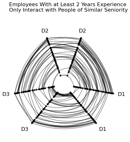
In the above figure, the “concentric circles” look of edges is to be expected from our toy setup: if all axes are sorted on seniority, and these employees only interact with people of similar seniority, then edges should connect nodes at similar positions on each axis.
Considering a Subgroup in the Same Figure#
Suppose there had been a successful revision to the training program 2 years ago that encouraged more communication throughout the company regardless of seniority.
By distinguishing each group with distinct edge keyword arguments, we can visualize these two network subgroups via a single HivePlot instance.
Below, we generate a second group of nodes and edges and put the two subgroups into a single hive plot instance.
[5]:
nodes_newer, edges_newer = seniority_example_data(
    seniority_range=(0, 2),
    num_nodes_per_division=10,
    num_edges=50,
    seniority_diff_threshold=np.inf,  # talk to anyone
    starting_index=150,  # keep index values distinct from older employees
)
With all our node and edge data generated, we can now concatenate the data together, then make our hiveplotlib data structures.
[6]:
# aggregate a single pandas dataframe of node data
node_data = pd.concat([nodes.data, nodes_newer.data])

# reset dataframe index to have unique IDs
node_data = node_data.reset_index(drop=True)

nodes = NodeCollection(data=node_data, unique_id_column="index_values")
nodes.data
[6]:
| division | seniority | index_values | |
|---|---|---|---|
| 0 | D1 | 7.095693 | 0 |
| 1 | D1 | 2.132221 | 1 |
| 2 | D1 | 6.853086 | 2 |
| 3 | D1 | 9.480579 | 3 |
| 4 | D1 | 8.859234 | 4 |
| ... | ... | ... | ... |
| 175 | D3 | 1.082922 | 175 |
| 176 | D3 | 0.056639 | 176 |
| 177 | D3 | 1.294379 | 177 |
| 178 | D3 | 1.994420 | 178 |
| 179 | D3 | 1.300919 | 179 |
180 rows × 3 columns
[7]:
# set subgroups of edges with a dictionary structure
edge_data = {"Older": edges.data, "Newer": edges_newer.data}

edges = Edges(data=edge_data)
edges
[7]:
hiveplotlib.Edges of 250 edges across 2 tags.
[8]:
# specify how we want to style edges of each group in the final plot
older_employee_kwargs = {
    "color": "royalblue",
    "alpha": 0.4,
}
newer_employee_kwargs = {
    "color": "darkorange",
    "alpha": 0.7,
}

# propagate edge kwargs into each dataframe of edge data
for tag, kwargs in zip(
    ["Older", "Newer"],
    [older_employee_kwargs, newer_employee_kwargs],
    strict=True,
):
    edges.update_edge_viz_kwargs(tag=tag, **kwargs)
[9]:
hp = HivePlot(
    nodes=nodes,
    edges=edges,
    partition_variable="division",
    sorting_variables="seniority",
    repeat_axes=True,
    rotation=-30,
)

fig, ax = hp.plot(figsize=(6, 6))

# embed legend in the title
flexitext(
    x=0.1,
    y=1.15,
    s="<size:18><color:royalblue, weight: bold>Older Employees</> talk to limited seniorities\n"
    "<color:darkorange, weight: bold>Newer Employees</> talk to all seniorities</>",
)

plt.show()
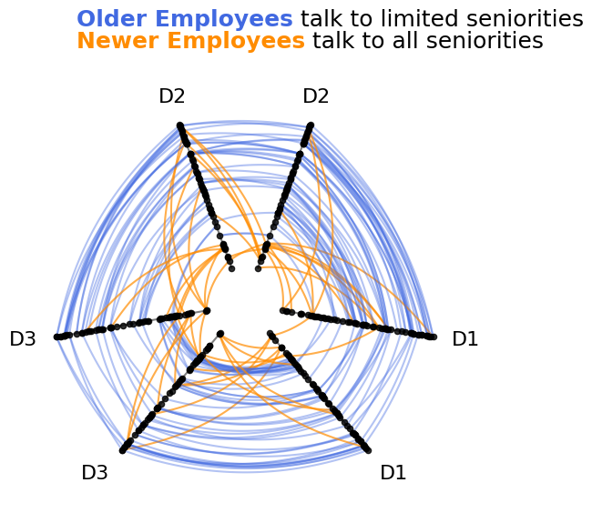
In the above figure, we can clearly see that the newer employee interactions (orange) do not obey the concentric circle structure followed by older employee interactions (blue). Unlike older employees, newer employees choose to interact with employees of varying seniorities.
We have thus visualized the heterogeneous behavior between two sets of nodes in a single network on one set of axes.
Scaling to Large Networks#
As we scale to larger networks, our ability to compose different network subgroups into a single hive plot visualization still works as expected computationally, but there are a couple of changes we should make to ensure our visualizations don’t hide information from us let alone actively mislead us.
Note: this section of the notebook requires that hiveplotlib be installed with the datashader package, which can be done by running:
pip install hiveplotlib[datashader].
Oversaturation Concerns#
The many overlapping lines of a hive plot risks oversaturation issues, which could mislead us if we were to try to draw conclusions from exploratory visualizations.
To demonstrate, let’s take the above example and see what happens when we scale up the dataset.
We will first leave kwargs unchanged from above, but then we’ll choose kwargs given our knowledge of the ground truth story that we designed into our data. Specifically, we will change the matplotlib zorder kwarg.
[10]:
nodes, edges = seniority_example_data(
    num_nodes_per_division=500,
    num_edges=20000,
)

nodes_newer, edges_newer = seniority_example_data(
    seniority_range=(0, 2),
    num_nodes_per_division=100,
    num_edges=5000,
    seniority_diff_threshold=np.inf,  # talk to anyone
    starting_index=1500,  # keep index values distinct from older employees
)

node_data = pd.concat([nodes.data, nodes_newer.data])

# reset dataframe index to have unique IDs
node_data = node_data.reset_index(drop=True)

nodes = NodeCollection(data=node_data, unique_id_column="index_values")

edge_data = {"Older": edges.data, "Newer": edges_newer.data}

edges = Edges(data=edge_data)

# specify how we want to style edges of each group in the final plot
older_employee_kwargs = {
    "color": "royalblue",
    "alpha": 0.1,
}
newer_employee_kwargs = {
    "color": "darkorange",
    "alpha": 0.2,
}

# propagate edge kwargs into each dataframe of edge data
for tag, kwargs in zip(
    ["Older", "Newer"],
    [older_employee_kwargs, newer_employee_kwargs],
    strict=True,
):
    edges.update_edge_viz_kwargs(tag=tag, **kwargs)
[11]:
hp = HivePlot(
    nodes=nodes,
    edges=edges,
    partition_variable="division",
    sorting_variables="seniority",
    repeat_axes=True,
    rotation=-30,
)

fig, axes = plt.subplots(1, 2, figsize=(10, 5))

hp.plot(figsize=(6, 6), fig=fig, ax=axes[0])

# redraw hive plot with strategic edge zorder
hp.edges.update_edge_viz_kwargs(tag="Older", zorder=2)
hp.edges.update_edge_viz_kwargs(tag="Newer", zorder=3)

hp.plot(figsize=(6, 6), fig=fig, ax=axes[1])

axes[0].text(
    x=0.1,
    y=-0.1,
    s=f"{len(edges.data['Older']):,} Older Employee Edges.\n"
    f"{len(edges.data['Newer']):,} Newer Employee Edges.",
    size=9,
    color="gray",
    ha="left",
    transform=axes[0].transAxes,
)

fig.suptitle(
    "Same example as above, but with more nodes and edges",
    x=0.125,
    y=1.1,
    size=18,
    ha="left",
)

axes[0].set_title(
    "Order matters!\nThis plot is hiding new employee edges",
    y=1.1,
    size=11,
    loc="left",
    color="gray",
)

axes[1].set_title(
    "Well-chosen zorder shows all newer employee lines, but\n"
    "we cannot see the behavior of older employees underneath",
    y=1.1,
    size=11,
    x=0.0,
    ha="left",
    color="gray",
)

# custom legend
custom_lines = [
    Line2D([0], [0], color=older_employee_kwargs["color"]),
    Line2D([0], [0], color=newer_employee_kwargs["color"]),
]
axes[1].legend(
    custom_lines,
    ["Older", "Newer"],
    title="Employees",
    loc="upper left",
    bbox_to_anchor=(1, 1),
)

plt.show()
When plotting so many lines, we create several notable problems:
We are basically plotting filled polygons of data on top of each other. This makes comparing overlapping areas essentially impossible with one tag of data often hiding another overlapping tag’s edges.
The order in which we plot things (i.e.
zorder) can be misleading. In the left plot of the above figure, we lose one direction of the intergroup newer employee edges underneath older employee edges, implying a nonexistent asymmetry of edges.
Although we of course still want to see these two tags of data on one figure to better compare them, we can protect ourselves against these issues with small multiples by plotting each tag separately as well. This is quick to do by using our HivePlotMatrix.from_tags() construction, which you can read more about on the Hive Plot Matrix From Tags page.
[12]:
matrix = HivePlotMatrix.from_tags(
    nodes=nodes,
    edges=edges,
    partition_variable="division",
    sorting_variables="seniority",
    tags=["Older", "Newer"],
    repeat_axes=True,
    node_kwargs={"alpha": 0},  # hiding nodes for this viz
    hive_plot_kwargs={"rotation": -30},
    unify_axes=True,  # unify axis ranges across cells for honest comparison
)

fig, axes = matrix.plot()

axes[0, 0].text(
    x=0.0,
    y=-0.15,
    s=f"{len(edges.data['Older']):,} Older Employee Edges.\n"
    f"{len(edges.data['Newer']):,} Newer Employee Edges.",
    size=9,
    color="gray",
    ha="left",
    transform=axes[0, 0].transAxes,
)

fig.suptitle(
    "Small multiples allows for intergroup comparison\n"
    "without hiding overlapping information",
    x=0.125,
    y=1.1,
    size=18,
    ha="left",
)

fig.subplots_adjust(wspace=0.5)

# custom legend
custom_lines = [
    Line2D([0], [0], color=older_employee_kwargs["color"]),
    Line2D([0], [0], color=newer_employee_kwargs["color"]),
]
axes[0, 1].legend(
    custom_lines,
    ["Older", "Newer"],
    title="Employees",
    loc="upper left",
    bbox_to_anchor=(1.1, 1),
)

plt.show()
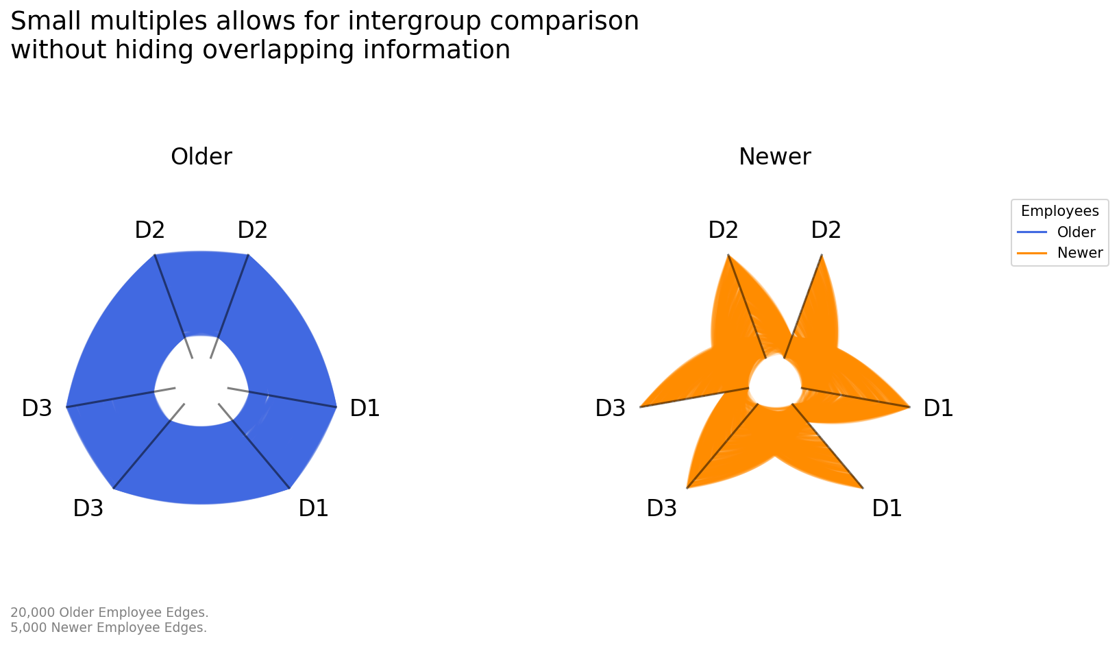
The unify_axes=True parameter ensures that every axis in every cell uses the same display range, computed automatically from the data. This is critical for an honest small-multiples comparison here. Otherwise each axis will auto scale to its own data range, making it impossible to safely make comparisons between axes or subplots.
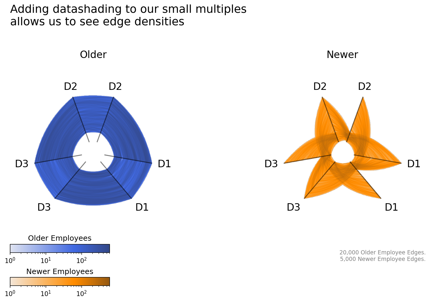
Datashading to Show Edge Density#
Discussed in greater detail in the Hive Plots for Large Networks notebook, datashading allows for us to better visualize the relative density of edges on a figure regardless of the size of our network while also taking away the trial-and-error of playing with linewidth and alpha values.
To keep our figures consistent with past figures, below we first generate color maps for each tag of data based on their single color values above. Once we have those color maps, we can extend our small multiples visualization to datashade the edges.
[13]:
color = "darkorange"
light = sns.light_palette(color, as_cmap=True)
dark = sns.dark_palette(color, reverse=True, as_cmap=True)

orange_cmap = ListedColormap(
    sns.color_palette(light(np.linspace(0.1, 1, int(0.9 / 1.4 * 256))))
    + sns.color_palette(dark(np.linspace(0, 0.5, int(0.5 / 1.4 * 256)))),
    name="Orange Color Map for Newer Employees",
)

color = "royalblue"
light = sns.light_palette(color, as_cmap=True)
dark = sns.dark_palette(color, reverse=True, as_cmap=True)

blue_cmap = ListedColormap(
    sns.color_palette(light(np.linspace(0.1, 1, int(0.9 / 1.4 * 256))))
    + sns.color_palette(dark(np.linspace(0, 0.5, int(0.5 / 1.4 * 256)))),
    name="Blue Color Map for Older Employees",
)
[14]:
matrix = HivePlotMatrix.from_tags(
    nodes=nodes,
    edges=edges,
    partition_variable="division",
    sorting_variables="seniority",
    tags=["Older", "Newer"],
    backend="datashader",
    repeat_axes=True,
    hive_plot_kwargs={"rotation": -30},
    node_kwargs={"alpha": 0},  # hiding nodes for this viz
    unify_axes=True,  # unify axis ranges across cells for honest comparison
    per_tag_plot_kwargs={  # use the new cmaps for each tag
        "Older": {"cmap_edges": blue_cmap},
        "Newer": {"cmap_edges": orange_cmap},
    },
)

fig, axes, im_nodes_dict, im_edges_dict = matrix.plot(
    show_node_colorbar=False,  # hide node colorbar
)
ax_older, ax_newer = axes[0, 0], axes[0, 1]
blue_im = im_edges_dict[0, 0]
orange_im = im_edges_dict[0, 1]

ax_newer.text(
    x=1.0,
    y=-0.15,
    s=f"{len(edges.data['Older']):,} Older Employee Edges.\n"
    f"{len(edges.data['Newer']):,} Newer Employee Edges.",
    size=9,
    color="gray",
    ha="right",
    transform=ax_newer.transAxes,
)

fig.suptitle(
    "Adding datashading to our small multiples\nallows us to see edge densities",
    x=0.125,
    y=1.05,
    size=18,
    ha="left",
)

fig.subplots_adjust(wspace=0.5)

# custom tag colorbars
cax_blue = ax_older.inset_axes(
    [0, -0.1, 0.6, 0.05], transform=ax_older.transAxes
)
cb = fig.colorbar(blue_im, cax=cax_blue, orientation="horizontal")
cb.ax.set_title("Older Employees")

cax_orange = ax_older.inset_axes(
    [0, -0.3, 0.6, 0.05], transform=ax_older.transAxes
)
cb = fig.colorbar(orange_im, cax=cax_orange, orientation="horizontal")
cb.ax.set_title("Newer Employees")

plt.show()