Networkx Examples#
On this page, we visualize several examples of networkx graphs as hive plots.
Note: this notebook requires that Hiveplotlib be installed with extra packages, which can be done by running:
pip install hiveplotlib[networkx]
[1]:
import matplotlib.pyplot as plt
import networkx as nx
import numpy as np
from flexitext import flexitext
from hiveplotlib import HivePlot
from hiveplotlib.converters import networkx_to_nodes_edges
Tripartite Graph#
By definition, a multipartite graph should not have any connections within a group. This is easy to visualize by drawing a hive plot with repeat axes.
We use NodeCollection.create_partition_variable() below to relabel the resulting groups for the hive plot. For more on this method, see the Create a Partition Variable page.
[2]:
G = nx.complete_multipartite_graph(10, 10, 10)
[3]:
nodes, edges = networkx_to_nodes_edges(G)

# split node IDs into separate lists based on which "subset" they're in
partition_variable = nodes.create_partition_variable(
    data_column="subset",
    cutoffs=3,  # split into our 3 groups
    labels=["Group 1", "Group 2", "Group 3"],
)

# not concerned with on-axis patterns, place nodes on axes randomly
rng = np.random.default_rng(0)
nodes.data["val"] = rng.uniform(size=len(nodes.data))
[4]:
hp = HivePlot(
    nodes=nodes,
    edges=edges,
    partition_variable=partition_variable,
    sorting_variables="val",
    repeat_axes=True,
)
[5]:
fig, ax = hp.plot(color="C0")
ax.set_title(
    "By definition, a multipartite graph has no within-group connections",
    y=1.1,
    size=20,
    x=0,
    ha="left",
)
plt.show()

Ring of Cliques#
By construction, the ring of cliques graph is fully connected among nodes within each group, with a single connection between each group.
[6]:
rng = np.random.default_rng(0)
G = nx.ring_of_cliques(num_cliques=3, clique_size=10)
[7]:
nodes, edges = networkx_to_nodes_edges(G)

# not concerned with on-axis patterns, place nodes on axes randomly
rng = np.random.default_rng(0)
nodes.data["val"] = rng.uniform(size=len(nodes.data))
networkx generates the groups in order, so the first 10 node IDs are in the first clique, then the next 10 are in the second clique, and the last 10 are in the third clique. There is no underlying data in the resulting nodes generated by the networkx graph for us to split on, so we will manually generate the separate lists of node IDs with numpy.
[8]:
partition_variable = nodes.create_partition_variable(
    data_column="unique_id",
    cutoffs=3,  # split into our 3 groups
    labels=["Group 1", "Group 2", "Group 3"],
)
[9]:
hp = HivePlot(
    nodes=nodes,
    edges=edges,
    partition_variable=partition_variable,
    sorting_variables="val",
    repeat_axes=True,
    non_repeat_edge_kwargs={"color": "royalblue", "lw": 4, "alpha": 1},
    repeat_edge_kwargs={"color": "darkgrey", "lw": 1},
)
[10]:
fig, ax = hp.plot()

# embed legend in the title
flexitext(
    x=0.55,
    y=0.95,
    s="<size:18>By construction, each clique is connected by "
    "<color:royalblue, weight: bold>a single edge</></>",
    xycoords="figure fraction",
    ha="center",
)

plt.show()

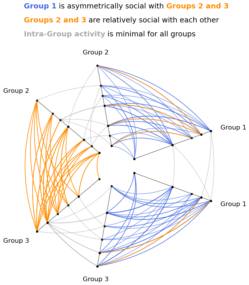
Stochastic Block Model#
Asymmetric relationships between groups can be well-represented with hive plots.
Note, we cover this example in more detail in the Quick Hive Plots notebook.
We will sort axes by node degree, computed for us on initialization via the node_graph_metrics parameter. For more on Hiveplotlib-supported graph metrics, see the Computing Graph Metrics page.
[11]:
G = nx.stochastic_block_model(
    sizes=[10, 10, 10],
    p=[
        [0.1, 0.5, 0.5],
        [0.05, 0.1, 0.2],
        [0.05, 0.2, 0.1],
    ],
    directed=True,
    seed=0,
)
Above, we have generated 3 cliques of equal size (10 per clique) with the following properties:
Within-group communication is only 10% (
0.1on the diagonal).Group 1 is very social with Groups 2 and 3 (
0.5), but Groups 2 and 3 aren’t very social with Group 1 (0.05).Group 2 and Group 3 are relatively social with each other (
0.2).
[12]:
nodes, edges = networkx_to_nodes_edges(G)

partition_variable = nodes.create_partition_variable(
    data_column="block",
    cutoffs=3,  # split into our 3 groups
    labels=["Group 1", "Group 2", "Group 3"],
)

hp = HivePlot(
    nodes=nodes,
    edges=edges,
    partition_variable=partition_variable,
    sorting_variables="degree",
    node_graph_metrics="degree",  # request degree on init
    repeat_axes=True,
    non_repeat_edge_kwargs={"color": "darkorange", "alpha": 1},
    repeat_edge_kwargs={"color": "darkgrey"},
)

# update Group 1 *from* edges to blue
#  make more transparant (lots of edges)
#  and place these edges *behind* orange edges (zorder)
hp.update_edges(
    partition_id_1="Group 1",
    partition_id_2="Group 2",
    p2_to_p1=False,
    color="royalblue",
    alpha=0.6,
    zorder=-1,
)
hp.update_edges(
    partition_id_1="Group 1",
    partition_id_2="Group 3",
    p2_to_p1=False,
    color="royalblue",
    alpha=0.6,
    zorder=-1,
)
[13]:
fig, ax = hp.plot()

# embed legend in the title
flexitext(
    x=0.55,
    y=1.15,
    s="<size:18><color:royalblue, weight: bold>Group 1</> is "
    "asymmetrically social with "
    "<color:darkorange, weight:bold>Groups 2 and 3</>\n\n"
    "<color:darkorange, weight:bold>Groups 2 and 3</> "
    "are relatively social with each other\n\n"
    "<color:darkgray, weight:bold>Intra-Group activity</> "
    "is minimal for all groups</>",
    ha="center",
    ax=ax,
)

plt.show()