

Hive Plots for Large Networks#
hiveplotlib scales well when it comes to constructing hive plots thanks to its numpy-based backend (with optional Numba JIT acceleration when available), but as we scale the size of the network, we need to address a separate concern about how one can visualize a dense, edge- and node-heavy hive plot in a way that shows meaningful nuance for exploration.
This notebook explores the datashader-based solution to this visualization challenge implemented in hiveplotlib.
Note: this notebook requires that hiveplotlib be installed with the datashader and networkx dependencies, which can be done by running:
pip install hiveplotlib[datashader,networkx].
[1]:
import zipfile
from copy import copy
from io import BytesIO

import matplotlib.pyplot as plt
import numpy as np
import pandas as pd
import requests
import seaborn as sns
from flexitext import flexitext
from hiveplotlib import Edges, HivePlot, NodeCollection
from hiveplotlib.viz import axes_viz
from hiveplotlib.viz.datashader import datashade_edges_mpl
from matplotlib.patches import Rectangle
from scipy.signal import convolve2d
Data (Wikipedia Squirrel Pages)#
We will use a dataset of Wikipedia pages, which is introduced in Rozemberczki, Allen, and Sarkar (2021) as:
“Wikipedia page-page networks on three topics: chameleons, crocodiles and squirrels. Nodes represent articles from the English Wikipedia (December 2018), edges reflect mutual links between them. Node features indicate the presence of particular nouns in the articles and the average monthly traffic (October 2017 - November 2018). The regression task is to predict the log average monthly traffic (December 2018).”
We will focus solely on the dataset of squirrel pages, pulling from the Stanford Network Analysis Project (SNAP) website.
[2]:
%%time

zip_file_path = "https://snap.stanford.edu/data/wikipedia.zip"

squirrel_edges_path = "wikipedia/squirrel/musae_squirrel_edges.csv"
squirrel_nodes_path = "wikipedia/squirrel/musae_squirrel_target.csv"

response = requests.get(zip_file_path, stream=True)
response.raise_for_status()  # raise an exception for bad status codes

# read the content into an in-memory binary stream
zip_content = BytesIO(response.content)

with zipfile.ZipFile(zip_content, "r") as zf:
    with zf.open(squirrel_nodes_path) as f:
        node_df = pd.read_csv(f)
    with zf.open(squirrel_edges_path) as f:
        edge_df = pd.read_csv(f)
CPU times: user 48.5 ms, sys: 28.5 ms, total: 77 ms
Wall time: 2.55 s
[3]:
nodes = NodeCollection(
    data=node_df,
    unique_id_column="id",
)
nodes
[3]:
hiveplotlib.NodeCollection of 5201 nodes and unique ID column 'id'.
[4]:
edges = Edges(
    data=edge_df,
    from_column_name="id1",
    to_column_name="id2",
)
edges
[4]:
hiveplotlib.Edges of 217073 edges.
To partition the node data, we will take the continuous node data variable target and discretize it into equal bins using the NodeCollection.create_partition_variable() method (for more on this method, see the Create a Partition Variable page):
[5]:
node_partition_variable = nodes.create_partition_variable(
    data_column="target",
    cutoffs=5,
    labels=[0, 1, 2, 3, 4],
)
We will break out just three of these discrete labels to make a more traditional, three-axis hive plot for this example, with nodes sorted by degree on each axis.
We request degree directly on the HivePlot initialization via the node_graph_metrics parameter. For more on Hiveplotlib-supported graph metrics, see the Computing Graph Metrics page.
[6]:
# keep just 3 labels
labels_to_keep = [0, 2, 4]

hp = HivePlot(
    nodes=nodes,
    edges=edges,
    partition_variable=node_partition_variable,
    sorting_variables="degree",
    node_graph_metrics="degree",  # request degree on init
    axes_order=labels_to_keep,
)
Visualization Challenges in Pure Matplotlib#
Although the default hiveplotlib visualization back end (matplotlib) scales pretty well computationally to plot larger HivePlot instances fast, the resulting visualizations with a dataset this big obscure a lot of information.
Below, we demonstrate some attempts to make this form of visualization viable before pivoting to a solution using a different hiveplotlib visualization back end (datashader).
Default Hiveplotlib Kwargs#
First, we will plot using all the visualization defaults for nodes and edges.
[7]:
# count how many edges go in our final plot
total_edges = 0
for g1 in hp.hive_plot_edges:
    for g2 in hp.hive_plot_edges[g1]:
        total_edges += hp.hive_plot_edges[g1][g2][0]["ids"].shape[0]

total_edges_str = f"{total_edges:,}"
[8]:
%%time
fig, ax = hp.plot()

flexitext(
    x=0.1,
    y=1.05,
    s=f"<size:18>Wikipedia Network of Squirrel Pages ({total_edges_str} Edges)</>\n"
    f"<size:14, color:gray>Default hiveplotlib kwargs wash out any nuance</>",
)
plt.show()
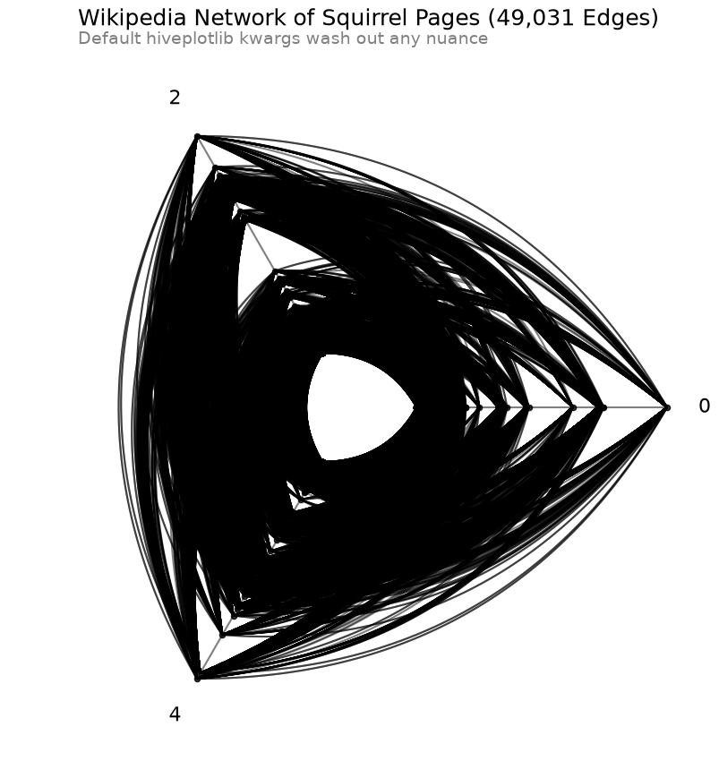
CPU times: user 1.47 s, sys: 75.7 ms, total: 1.54 s
Wall time: 1.54 s
Lower the Alpha Value#
The above figure suffers from severe oversaturation. One way we can attempt to tackle this is by lowering the alpha value of both lines and edges in our hive plot.
[9]:
%%time
fig, ax = hp.plot(
    node_kwargs={
        "color": "C1",
        "alpha": 0.01,
    },
    alpha=1 / 256,  # set almost transparent edges
)

flexitext(
    x=0.1,
    y=1.05,
    s="<size:18>Wikipedia Network of Squirrel Pages</>\n"
    "<size:14, color:gray>Alpha solution has both oversaturation and undersaturation\n"
    "even using the smallest possible alpha value in matplotlib</>",
)
plt.show()
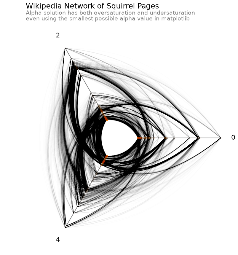
CPU times: user 1.63 s, sys: 104 ms, total: 1.73 s
Wall time: 1.73 s
Even when lowering the alpha value as low as possible in matplotlib, some areas on the plot still appear to be oversaturated. Furthermore, we’ve now created a problem of undersaturation in other parts of the figure, especially with the outermost nodes on each axis, which have all but disappeared.
Thinner Lines#
Another option is to make the lines thinner, which can also reduce oversaturation (as multiple lines become unlikely to overlap each other), but we still suffer from undersaturation on relatively isolated lines.
[10]:
%%time
fig, ax = hp.plot(
    node_kwargs={
        "color": "C1",
        "alpha": 0.01,
    },
    alpha=0.8,
    linewidth=0.0005,  # set thin edges
)

flexitext(
    x=0.1,
    y=1.05,
    s="<size:18>Wikipedia Network of Squirrel Pages</>\n"
    "<size:14, color:gray>Thinner line solution can solve oversaturation issues\n"
    "but at the cost of severe undersaturation</>",
)
plt.show()
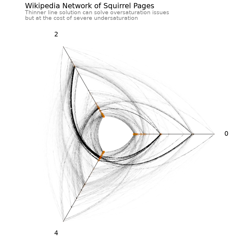
CPU times: user 1.29 s, sys: 67.8 ms, total: 1.36 s
Wall time: 1.36 s
Datashading#
By pulling in the capabilities of datashader, we can look at the density of our edges and nodes in our figure with nonlinear scaling.
The datashader back end in hiveplotlib includes the ability to datashade nodes and edges. Here, we demonstrate datashading both nodes and edges via changing the active plotting back end to datashader.
Below, we remake the above hive plot of Wikipedia squirrel pages using these datashading capabilities.
[11]:
%%time

hp.set_viz_backend("datashader")

fig, ax, im_nodes, im_edges = hp.plot()

cax_edges = ax.inset_axes([0.85, 0.25, 0.2, 0.01], transform=ax.transAxes)
cb_edges = fig.colorbar(
    im_edges, ax=ax, cax=cax_edges, orientation="horizontal"
)
cb_edges.ax.set_title("Edge Density")

cax_nodes = ax.inset_axes([0.85, 0.15, 0.2, 0.01], transform=ax.transAxes)
cb_nodes = fig.colorbar(
    im_nodes, ax=ax, cax=cax_nodes, orientation="horizontal"
)
cb_nodes.ax.set_title("Node Density")

flexitext(
    x=0.1,
    y=1.05,
    s="<size:18>Wikipedia Network of Squirrel Pages</>\n"
    "<size:14, color:gray>Datashader solution shows log(density) for both nodes and edges\n"
    "which avoids trading off oversaturation with undersaturation</>",
)

ax.text(
    x=0.1,
    y=-0.1,
    s=f"Subset of Wikipedia data. Looking at 3 of 5 groups of pages about squirrels. "
    f"{total_edges:,} edges in total.\n"
    "An edge corresponds to mutual linking between two pages. "
    "Nodes placed on each axis sorted by degree.\n"
    "Data from: https://graphmining.ai/datasets/ptg/wiki\n"
    "Reference: https://arxiv.org/abs/1909.13021",
    size=9,
    color="gray",
    ha="left",
    transform=ax.transAxes,
)

plt.show()
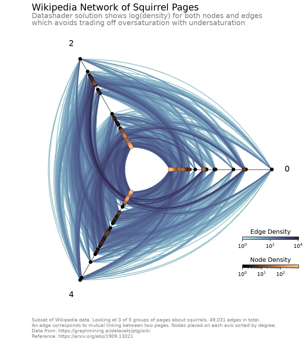
CPU times: user 3.55 s, sys: 448 ms, total: 3.99 s
Wall time: 4 s
The ability for us to look at the log(density) allows us to see the full range of density values for nodes and edges without washing out any of the differences in density at the low-density end.
pixel_spread Fixes Discontinuous Binned Lines#
matplotlib.pyplot.imshow() tends to lose smaller, more subtle pixel features when the pixels in the final figure are sufficiently small. For our use case, e.g. a 2d histogram of edges, this would lead to some lines looking choppy / discontinuous. This is highly likely to become an issue for datashading with hive plots for users making smaller figures.
The solution essentially is to make our pixel features less subtle by spreading them out to span more pixels.
Below, we demonstrate the choppiness that shows up in the raw output of our datashaded edges from our example hive plot above.
[12]:
fig, ax = plt.subplots(
    1, 2, figsize=(10, 6), gridspec_kw={"width_ratios": [6, 4]}, dpi=150
)

axes_viz(hp, fig=fig, ax=ax[0], axes_labels_fontsize=10)

_, _, im = datashade_edges_mpl(
    hp,
    figsize=(6, 6),
    pixel_spread=0,  # this will create the choppiness in the figure
    fig=fig,
    ax=ax[0],
)

rect = Rectangle(
    (0.5, -4),
    width=1,
    height=2,
    facecolor="None",
    edgecolor="red",
    alpha=0.8,
    ls="--",
)
ax[0].add_patch(copy(rect))

cb = fig.colorbar(im, ax=ax[0], shrink=0.7, pad=0.15, orientation="horizontal")
cb.ax.set_title("Count")

ax[0].set_title("Matplotlib imshow\nbreaks apart thin features...", loc="left")

axes_viz(hp, fig=fig, ax=ax[1], show_axes_labels=False)

_, _, im = datashade_edges_mpl(
    hp,
    figsize=(6, 6),
    pixel_spread=0,
    fig=fig,
    ax=ax[1],
)

ax[1].add_patch(copy(rect))

boundary_rect = Rectangle(
    (0.5, -4.1),
    width=1.0,
    height=2.2,
    facecolor="None",
    edgecolor="red",
    alpha=0.8,
    ls="--",
)
extent = np.array(boundary_rect.get_bbox())
ax[1].set_xlim(*extent[:, 0])
ax[1].set_ylim(*extent[:, 1])
ax[1].set_title(
    "...even though, when zooming in,\nlines are in fact complete", loc="left"
)
plt.show()
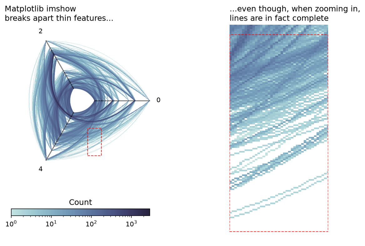
The thinner, more isolated line densities show up as visually discontinuous (left), even though the underlying 2d histogram shows the expected continuity when we zoom in (right).
The way we handle this as exposed in the hiveplotlib.viz.datashader module is with the pixel_spread parameter. This makes a call to the datashader.transfer_functions.spread() function, which essentially will thicken up the lines before binning.
The resulting thicker lines solves this imshow() false visual discontinuities issue, as demonstrated below.
[13]:
fig, ax = plt.subplots(
    1, 2, figsize=(10, 6), gridspec_kw={"width_ratios": [6, 4]}, dpi=150
)

axes_viz(hp, fig=fig, ax=ax[0], axes_labels_fontsize=10)

_, _, im = datashade_edges_mpl(
    hp,
    figsize=(6, 6),
    pixel_spread=1,  # this will resolve the choppiness
    fig=fig,
    ax=ax[0],
)

rect = Rectangle(
    (0.5, -4),
    width=1,
    height=2,
    facecolor="None",
    edgecolor="red",
    alpha=0.8,
    ls="--",
)
ax[0].add_patch(copy(rect))

cb = fig.colorbar(im, ax=ax[0], shrink=0.7, pad=0.15, orientation="horizontal")
cb.ax.set_title("Count")

ax[0].set_title("`pixel_spread` fixes `imshow` issues...", loc="left")

axes_viz(hp, fig=fig, ax=ax[1], show_axes_labels=False)

_, _, im = datashade_edges_mpl(
    hp,
    figsize=(6, 6),
    pixel_spread=2,
    fig=fig,
    ax=ax[1],
)

ax[1].add_patch(copy(rect))

boundary_rect = Rectangle(
    (0.5, -4.1),
    width=1.0,
    height=2.2,
    facecolor="None",
    edgecolor="red",
    alpha=0.8,
    ls="--",
)
extent = np.array(boundary_rect.get_bbox())
ax[1].set_xlim(*extent[:, 0])
ax[1].set_ylim(*extent[:, 1])
ax[1].set_title("...by generating thicker lines", loc="left")
plt.show()
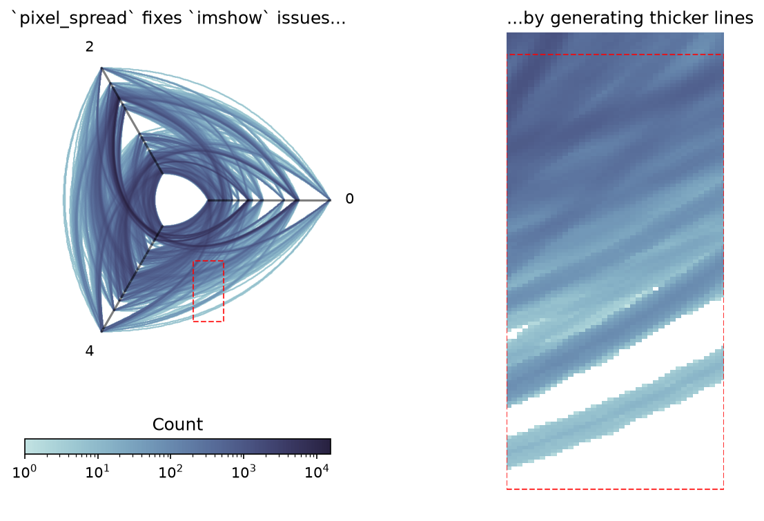
Beware pixel_spread Affecting Bin Counts When Comparing Hive Plots#
Although our second picture comes out much cleaner, note that these thicker lines lead to different bin counts, as exhibited by the different scales on each colorbar corresponding to the two previous figures with different pixel_spread values. There is nothing wrong with this, but one must be careful when visually comparing two datashaded hive plots:
When comparing multiple hive plots, if one wants to compare relative counts, one must be sure to use equivalent bin sizes and
pixel_spreadvalues.
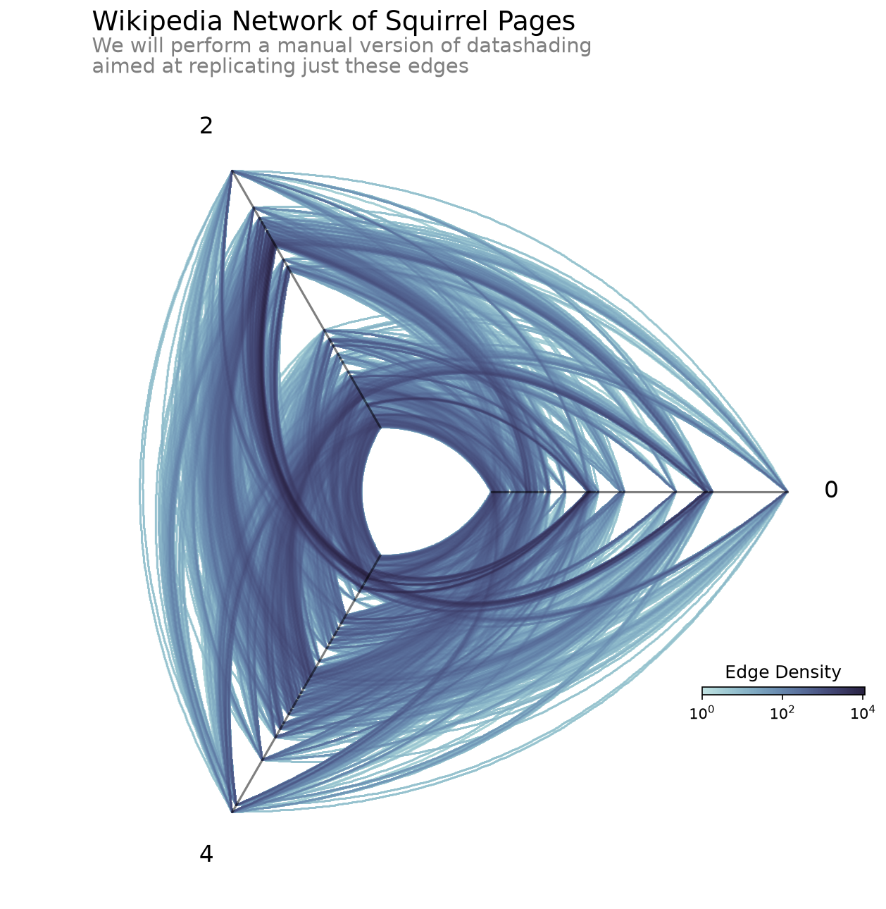
Motivation Behind Datashading#
To better motivate a lot of what the hiveplotlib.viz.datashader module (and the concepts behind datashader) does on our behalf, we will perform a more explicit, less-elegant version of these calculations manually for the edges of our hive plot example:
[14]:
%%time

fig, ax, im_edges = datashade_edges_mpl(hp)

axes_viz(hp, fig=fig, ax=ax)

cax_edges = ax.inset_axes([0.85, 0.25, 0.2, 0.01], transform=ax.transAxes)
cb_edges = fig.colorbar(
    im_edges, ax=ax, cax=cax_edges, orientation="horizontal"
)
cb_edges.ax.set_title("Edge Density")

flexitext(
    x=0.1,
    y=1.05,
    s="<size:18>Wikipedia Network of Squirrel Pages</>\n"
    "<size:14, color:gray>We will perform a manual version of datashading\n"
    "aimed at replicating just these edges</>",
)

plt.show()
CPU times: user 577 ms, sys: 71.8 ms, total: 649 ms
Wall time: 648 ms
Right-Skewed Overlap of Edges#
Regardless of how much we try to resolve the oversaturation / undersaturation tradeoff with solutions using alpha and linewidth, those solutions will tend to cause issues of underutilized range, that is, we will either be unable to distinguish the relative difference in frequency among the areas with less lines or among the areas with more lines.
This comes from the skewing of the distribution of edge density values. Since the density of edges on the figure can’t be less than 0 (we can’t have a negative number of edges anywhere in our figure), but we can have arbitrarily large numbers of edges overlapping in one area, this visualization challenge tends to be inherently right-skewed.
This is particularly common with large datasets, as more values increase the chance of more overlap, but we are still likely to have areas with minimal overlap as well. The only time we would not expect a problem is when the variables visualized are entirely uncorrelated with each other, thus having an even density throughout the figure. In other words, we hope to have a problem of right-skewed density if we expect to visualize any patterns with our network edges.
Binning the Data#
The first step to making our datashader-esque visualization is the rasterization of the data. This requires breaking the 2-dimensional space spanned by the edges of the hive plot into a 2-dimensional histogram.
Below, we first bin the edges into a 2d histogram. We then plot both the distribution of the counts of those bins, as well as the 2d histogram itself with colors spanning the full range of bin counts.
Note: below we also do a proxy for “spreading” of the pixels via 2d convolution. This is not equivalent to what the datashader backend to the hiveplotlib.viz.datashader module performs, but it will be sufficient for this proof-of-concept. For more on how the hiveplotlib.viz.datashader module performs this task, see the pixel_spread
section from earlier in the notebook.
[15]:
# grab the range of the above figure
#  we will bin along the same range
xlim = ax.get_xlim()
ylim = ax.get_ylim()
[16]:
all_curves = [
    hp.hive_plot_edges[i][j][t]["curves"]
    for i in hp.hive_plot_edges
    for j in hp.hive_plot_edges[i]
    for t in hp.hive_plot_edges[i][j]
]

all_curves = np.vstack(all_curves)

hist, _, _ = np.histogram2d(
    all_curves[:, 1], all_curves[:, 0], bins=500, range=[xlim, ylim]
)

fig, ax = plt.subplots(
    1, 2, figsize=(10, 3), gridspec_kw={"width_ratios": [6, 4]}
)

ax[0].hist(
    np.ma.masked_where(hist == 0, hist).flatten(), 50, edgecolor="black"
)

ax[0].set_title("Distribution of bin counts is right-skewed", loc="left")

# proxy for `pixel_spread` to clean up picture
# see the `pixel_spread` section for how this is actually done
#  in the `hiveplotlib.viz.datashader` code
hist_spread = convolve2d(hist, np.ones((4, 4)))

im = ax[1].imshow(
    np.ma.masked_where(hist_spread == 0, hist_spread),
    cmap=sns.color_palette("ch:start=.2,rot=-.3", as_cmap=True),
    origin="lower",
    extent=[*xlim, *ylim],
)
axes_viz(hp, fig=fig, ax=ax[1], axes_labels_fontsize=8, alpha=0.2)
cb = fig.colorbar(im, ax=ax, shrink=0.7, pad=0.1, ticks=[])
cb.ax.set_title("Count")
ax[1].axis("off")
ax[1].set_title(
    "Outlier high-count bins restrict\ncolor range for low-count bins",
    loc="left",
)
plt.show()
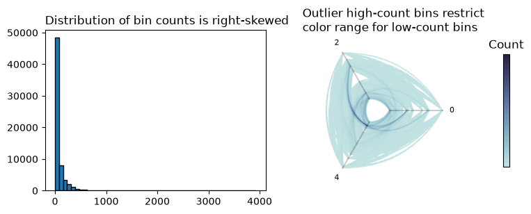
In the above picture, we can see on the left that we have a small number of high-count bins. On the right, we see a familiar result caused by plotting those outliers without oversaturation: we have restricted the range of colors available to the vast majority of the edges to less than 1/4 of the colorbar, which washes out any relative count information among the low-count bins.
The question then becomes: how can we modify our color values without washing out the relative density information on the high or low end?
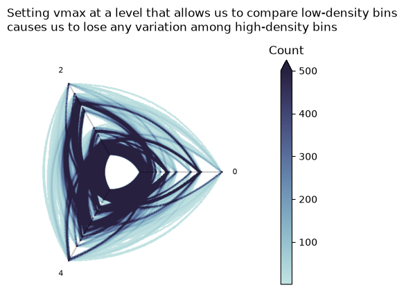
Changing vmax#
One way to tackle this is to cap all values at or above a value to be the same maximum color of our color map, (vmax in matplotlib).
Although this can be productive in some cases, it is first and foremost a highly-manual and data-dependent fix. Second, one still risks losing the relative count information among the high-density or low-density values with a poor choice of vmax.
For our example, we have enough high outlier values that by setting a vmax appropriate to tease apart the low-density values, we lose the nuance amongst the high-density values, as shown below.
[17]:
fig, ax = plt.subplots(figsize=(6, 6))

im = ax.imshow(
    np.ma.masked_where(hist_spread == 0, hist_spread),
    extent=[*xlim, *ylim],
    cmap=sns.color_palette("ch:start=.2,rot=-.3", as_cmap=True),
    origin="lower",
    vmax=500,
)

axes_viz(hp, fig=fig, ax=ax, axes_labels_fontsize=8, alpha=0.2)

cb = fig.colorbar(im, shrink=0.7, extend="max", pad=0.15)

cb.ax.set_title("Count")
ax.axis("off")
ax.set_title(
    "Setting vmax at a level that allows us to compare low-density bins\n"
    "causes us to lose any variation among high-density bins",
    loc="left",
    y=1.1,
)
plt.show()
Logarithmic Color Scale#
Now that we are visualizing from a 2d histogram of data rather than a collection of lines, we can apply a function over that histogram. In this case, we will use a popular function for right-skewed data—taking the logarithm of the data.
Below, we repeat the earlier figure, plotting the distribution of bin counts plus the 2d histogram plot, only this time, we use the \(log_{10}\) histogram values.
[18]:
# clean up warnings, we aren't actually dividing by zero as we mask 0 vals
np.seterr(divide="ignore")

fig, ax = plt.subplots(
    1,
    2,
    figsize=(10, 3),
    gridspec_kw={"width_ratios": [6, 4]},
)
ax[0].hist(
    np.log10(np.ma.masked_where(hist == 0, hist).flatten()),
    50,
    edgecolor="black",
)
ax[0].set_title("Log(bin counts) is much less skewed", loc="left")

im = ax[1].imshow(
    np.log10(np.ma.masked_where(hist_spread == 0, hist_spread)),
    cmap=sns.color_palette("ch:start=.2,rot=-.3", as_cmap=True),
    origin="lower",
    extent=[*xlim, *ylim],
)
axes_viz(hp, fig=fig, ax=ax[1], axes_labels_fontsize=8, alpha=0.2)
cb = fig.colorbar(im, ax=ax, shrink=0.7, pad=0.1)
cb.ax.set_title("Log(Count)", size=8)
ax[1].axis("off")
ax[1].set_title(
    "Outlier high counts visible\nwithout losing low counts", loc="left"
)
plt.show()
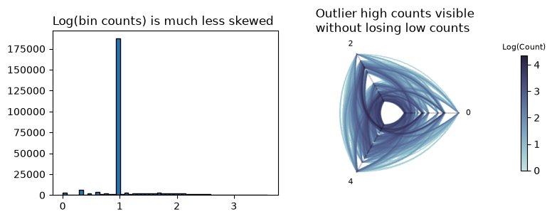
Not only is our log(bin counts) plot not skewed, but also, as one would thus expect, we can now view the unrestricted range of bin counts while still seeing relative edge density both among the low-density and high-density areas of the figure.
References#
Rozemberczki, Benedek, Carl Allen, and Rik Sarkar. “Multi-scale attributed node embedding.” Journal of Complex Networks 9.2 (2021): cnab014.