

Hiveplotlib v0.26.0#
The next release of Hiveplotlib is coming soon! We’ve added major improvements in flexibility and usability of the HivePlot class, more pandas-friendly data wrangling, additional visualization capabilities, and a refreshing of the documentation. These improvements, however, required some breaking changes and deprecations.
This article is an overview of all these revisions.
(Last updated in correspondence with the 0.26.0b0 release.)
What’s New#
The upcoming 0.26.0 release comes with several notable improvements:
The New HivePlot Class#
The new HivePlot class comes with major improvements for user-friendly, object-oriented modifiability.
New flexibility here includes:
A quick-access
plot()method.The ability to quickly change the visualization back end to any of the supported
hiveplotlibback ends.Setting a partition variable to dictate the axes.
Choosing sorting variables for all / specific axes.
The new gallery examples demonstrate this improved functionality.
Our previous documentation examples have also been adapted to use the new HivePlot class on the Tutorials page.
Additionally, we’ve added a reference document for existing users about migrating to this new HivePlot class when upgrading from previous versions of Hiveplotlib.
The New NodeCollection and Edges Classes#
The original Node class effectively required users to convert large tables of node data into individual dictionaries. The new NodeCollection class allows users to create hive plots using tabular data (e.g. pandas DataFrames). For more on the NodeCollection class, see the NodeCollection gallery examples.
Previously, there was no way to handle edge metadata, with hiveplotlib only understanding an (n, 2) numpy array of edge data. The new Edges class allows users to track edges with metadata by holding a pandas DataFrame of edge data. For more on the Edges class, see the Edges gallery examples.
We demonstrate generating hive plots using tabular data and the new NodeCollection and Edges classes in the Creating Hive Plots from Pandas example notebook.
Incorporating Node / Edge Metadata Into Hive Plot Viz#
With the new and improved storage of both node and edge metadata, we extended hiveplotlib’s visualization capabilities to use node / edge metadata in visualizations, e.g. changing the size / color of nodes or edges based on specific parameters stored in a NodeCollection or Edges instance.
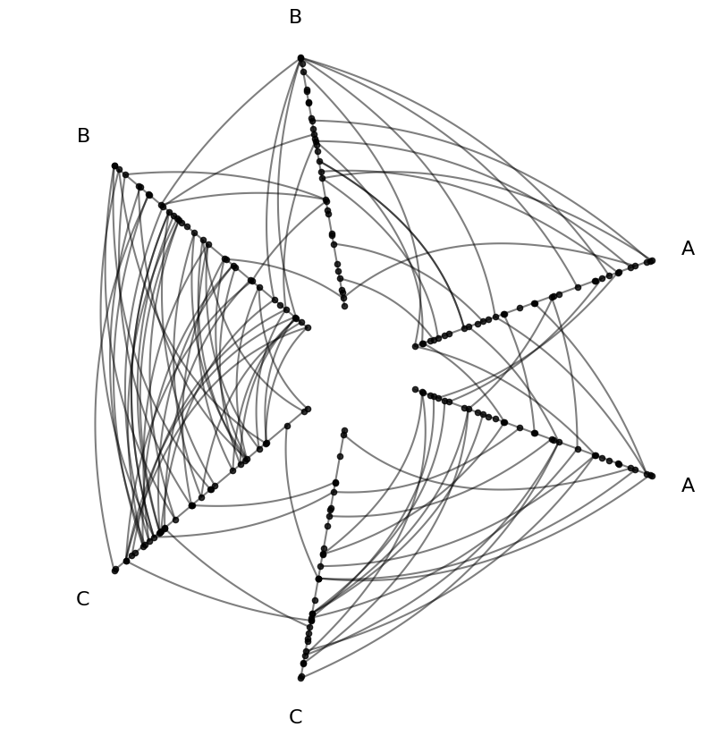
We can demonstrate this capability using an example hive plot new to the 0.26.0 release:
[1]:
from hiveplotlib.datasets import example_hive_plot

hp = example_hive_plot(repeat_axes=True)
hp.plot();
Customize Node Viz With Node Data#
Let’s take a look at the underlying node data that ships with this example:
[2]:
hp.nodes.data
[2]:
| unique_id | low | med | high | partition_0 | |
|---|---|---|---|---|---|
| 0 | 0 | 6.363247 | 14.795079 | 23.193620 | B |
| 1 | 1 | 2.695169 | 12.321405 | 21.873202 | A |
| 2 | 2 | 0.409326 | 18.010787 | 26.718541 | A |
| 3 | 3 | 0.165111 | 19.226066 | 21.949123 | A |
| 4 | 4 | 8.124570 | 12.658641 | 25.771102 | C |
| ... | ... | ... | ... | ... | ... |
| 95 | 95 | 9.562530 | 15.708242 | 25.857141 | C |
| 96 | 96 | 1.486152 | 10.064025 | 21.225680 | A |
| 97 | 97 | 9.716562 | 17.718766 | 29.328351 | C |
| 98 | 98 | 8.890456 | 19.772874 | 26.833664 | C |
| 99 | 99 | 8.215515 | 15.892802 | 28.229576 | C |
100 rows × 5 columns
This toy example includes 3 node variables: low, medium, and high. With our default partition partition_0, we also get a pattern in the distribution of the variables.
In this example, the low values increase as we go from partition group A to B to C:
[3]:
import matplotlib.pyplot as plt
import seaborn as sns

fig, ax = plt.subplots()
sns.stripplot(
    data=hp.nodes.data,
    x="low",
    hue="partition_0",
    ax=ax,
    hue_order=["A", "B", "C"]
)
ax.set_xlabel("Node Variable 'low'")
ax.set_title("Axis Partition Corresponds to Node Variable 'low'")
plt.show()
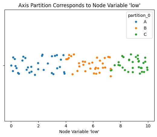
Thus, if we color the nodes according to the node variable low, we will see this pattern reflected in the colors of nodes on Axis A vs B vs C.
[4]:
from hiveplotlib.datasets import example_hive_plot
import matplotlib as mpl

hp = example_hive_plot(repeat_axes=True)

# point node color to node data column name
node_kwargs = {
    "c": "low",  # setting the color as the node dataframe column name
    "cmap": "magma",
    "vmin": 0,  # keep the min color the same for all nodes
    "vmax": 10,  # keep the max color the same for all nodes
    "s": 50,  # larger nodes so we can see the color better
    "edgecolor": "black",
}
hp.nodes.update_node_viz_kwargs(
    **node_kwargs
)

fig, ax = hp.plot()

# add custom colorbar to plot
fig.colorbar(
    mpl.cm.ScalarMappable(
        norm=mpl.colors.Normalize(
            node_kwargs["vmin"],
            node_kwargs["vmax"],
        ),
        cmap=node_kwargs["cmap"],
    ),
    ax=ax,
    shrink=0.7,
    label="Node Variable 'low'")

ax.set_title("Coloring Nodes Based on Each Node's 'low' Variable");
We see the expected color differences between axes! Note, however, we also see the colors increasing within each axis because this toy example is sorting nodes on each axis by the value low, which we can see by examining the sorting_variables attribute:
[5]:
hp.sorting_variables
[5]:
{'A': 'low',
 'B': 'low',
 'C': 'low',
 'A_repeat': 'low',
 'B_repeat': 'low',
 'C_repeat': 'low'}
For more discussion on node visualization possibilities, see the Visualizing Node Metadata gallery example.
Customize Edge Viz With Edge Data#
For custom edges, let’s start by looking at the underlying edge data for our toy example:
[6]:
hp.edges.data
[6]:
| from | to | low | med | high | |
|---|---|---|---|---|---|
| 0 | 85 | 63 | 6.567506 | 15.711859 | 24.629851 |
| 1 | 51 | 26 | 6.176714 | 16.259557 | 24.106476 |
| 2 | 30 | 4 | 7.501076 | 14.257005 | 26.436396 |
| 3 | 7 | 1 | 4.991420 | 15.811134 | 21.297566 |
| 4 | 17 | 81 | 5.189225 | 11.564580 | 26.122606 |
| ... | ... | ... | ... | ... | ... |
| 95 | 82 | 95 | 7.425179 | 13.559648 | 27.493189 |
| 96 | 36 | 14 | 6.071377 | 17.872480 | 21.423589 |
| 97 | 51 | 97 | 6.053931 | 15.682788 | 26.290276 |
| 98 | 36 | 88 | 3.000836 | 16.890711 | 23.835759 |
| 99 | 38 | 82 | 7.309462 | 15.496119 | 27.006405 |
100 rows × 5 columns
These edge variables low, med, and high, were computed as an average of the low / med / high values for each pair of from and to nodes.
If we color the edges by their low values, this should reveal two relationships:
We should see lower-level colors for A edges relative to B edges and lower values for B edges relative to C edges. For example, the average of an A to A edge will almost always be lower than a C to C edge.
Since we’re still sorting nodes by the node variable
low, edges with lower-level colors should be closer to the center of the hive plot relative to edges with higher-level colors.
[7]:
from hiveplotlib.datasets import example_hive_plot
import matplotlib as mpl

hp = example_hive_plot(repeat_axes=True)

# point edge color of edges to edge data column name
edge_kwargs = {
    "array": "low",  # 'array' is name of color param for underlying matplotlib `LineCollection`
    "cmap": "cividis",
    "clim": (0, 10),  # keep the min and max color the same for all edges
}

hp.update_edge_plotting_keyword_arguments(**edge_kwargs)

fig, ax = hp.plot()

# add custom colorbar to plot
fig.colorbar(
    mpl.cm.ScalarMappable(
        norm=mpl.colors.Normalize(*edge_kwargs["clim"]),
        cmap=edge_kwargs["cmap"],
    ),
    ax=ax,
    shrink=0.7,
    label="Edge Variable 'low'")

ax.set_title("Coloring Edges Based on Each Edge's 'low' Variable");

For more discussion on edge visualzation possibilities, see the Visualizing Edge Metadata gallery example.
Hover Capabilities#
Hovering is now included by default with the supported interactive visualization backends (bokeh, plotly, and holoviews-bokeh).
For each of these backends, users will now see node-specific, edge-specific, and axis-specific hover information.
To demonstrate this, let’s take the above edge coloring example, but set the visualization backend to bokeh, which only requires that we explicitly set backend="bokeh" and change the viz keyword arguments to be for bokeh rather than the default matplotlib:
[8]:
from bokeh.models import ColorBar
from bokeh.plotting import output_notebook, show
from bokeh.transform import linear_cmap
from hiveplotlib.datasets import example_hive_plot

output_notebook()

hp = example_hive_plot(
    repeat_axes=True,
    backend="bokeh",
)

# create a color mapper pointing color of edges to edge data column name
mapper = linear_cmap(
    field_name="low",
    palette="Cividis256",
    low=0,
    high=10,
)

edge_kwargs = {
    "line_color": mapper,  # edge color based on data, but must be created above
}

hp.update_edge_plotting_keyword_arguments(
    **edge_kwargs,
)

# when including color bar, make wider to maintain 1:1 aspect
fig = hp.plot(
    fig_kwargs={"width": 550, "height": 450},
)

# add a color bar
color_bar = ColorBar(color_mapper=mapper['transform'], width=8, title="Edge Variable 'low'")
fig.add_layout(color_bar, 'right')

show(fig)
Note, hover info can be included for all, none, or any subset of the nodes, edges, and axes by changing the hover parameter in the plot() call. For more on the flexibility when including hover information, see the Hover Information gallery example.
New Docs#
We’ve revamped the docs layout to support more examples, blog posts, and a roadmap for future development plans.
We’ve also included a blog post on migration to the new HivePlot class.
Breaking Changes#
For those who want to preserve their code using the original HivePlot class before the 0.26 release, that class from previous releases lives on, but has been renamed to BaseHivePlot, as its functionality is now the basis for the higher-level functionality of the new HivePlot class. Aside from the name change, this class can still be used similarly to past releases. For more information on the differences in behavior in the BaseHivePlot class, see this
discussion.
For a complete discussion of all other breaking changes, see the changelog.
Deprecations#
hiveplotlib.hive_plot_n_axes is set to be removed in version 0.28.0. Its functionality has been fully incorporated into the revised HivePlot class.