

Visualizing Edge Metadata#
This notebook demonstrates how to include additional columns of edge metadata in a single hive plot visualization.
[1]:
import matplotlib.pyplot as plt
from hiveplotlib.datasets import example_hive_plot
from matplotlib.cm import ScalarMappable
from matplotlib.colors import Normalize
The edges attribute of a hiveplotlib.HivePlot instance holds a DataFrame of edge data. This DataFrame will be used as a basis for generating a hive plot, connecting nodes specified by the DataFrame column Edges.from_column_name (from in the example below) to the nodes specified by the DataFrame column Edges.to_column_name (to in the example below).
Once we’ve settled the edges to draw though, what if we have additional columns of data in our edge DataFrame? How can we see how these additional variables relate to the interactions in our current hive plot?
Hive plots only dictate the edges to be drawn, not how we draw them. This gives us the flexibility to represent additional edge data in the same hive plot by plotting each edge while varying dimensions like color and line width.
We will use the following example to demonstrate flexibility in plotting edges:
[2]:
hp = example_hive_plot(repeat_axes=True)
[3]:
hp.edges.data
[3]:
| from | to | low | med | high | |
|---|---|---|---|---|---|
| 0 | 85 | 63 | 6.567506 | 15.711859 | 24.629851 |
| 1 | 51 | 26 | 6.176714 | 16.259557 | 24.106476 |
| 2 | 30 | 4 | 7.501076 | 14.257005 | 26.436396 |
| 3 | 7 | 1 | 4.991420 | 15.811134 | 21.297566 |
| 4 | 17 | 81 | 5.189225 | 11.564580 | 26.122606 |
| ... | ... | ... | ... | ... | ... |
| 95 | 82 | 95 | 7.425179 | 13.559648 | 27.493189 |
| 96 | 36 | 14 | 6.071377 | 17.872480 | 21.423589 |
| 97 | 51 | 97 | 6.053931 | 15.682788 | 26.290276 |
| 98 | 36 | 88 | 3.000836 | 16.890711 | 23.835759 |
| 99 | 38 | 82 | 7.309462 | 15.496119 | 27.006405 |
100 rows × 5 columns
Note that here we have three edge variables to work with: low, med, and high.
These edge variables were computed as an average of the correspondingly-named low, med, and high node metadata values for each pair of from and to nodes.
(For more on the node metadata values in this example, see the Visualizing Node Metadata notebook.)
By default, example_hive_plot() is partitioning and sorting nodes based on the low node metadata values, but is not plotting any of these edge metadata variables.
How to Plot Edge Metadata#
To plot a column of edge metadata in a hive plot, we need only assign that edge column name to the plotting keyword argument.
When plotting edges, the Hiveplotlib edge visualization function (for all visualization back ends) first checks the assigned kwarg values against the edge columns. If there’s a match, then the edge data is used for that kwarg.
Edge Color#
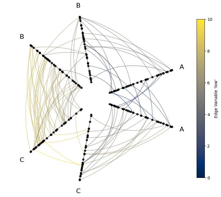
If we color the edges by their low values, this should reveal two relationships:
We should see lower-level colors for A edges relative to B edges and lower values for B edges relative to C edges. For example, the average of an A to A edge will almost always be lower than a C to C edge. This comes from the partition using the
lownode metadata values.Since we’re still sorting nodes by the node variable
low, edges with lower-level colors should be closer to the center of the hive plot relative to edges with higher-level colors.
[4]:
# point edge color of edges to edge data column name
edge_kwargs = {
    "array": "low",  # 'array' is name of color param for underlying matplotlib `LineCollection`
    "cmap": "cividis",
    "clim": (0, 10),  # keep the min and max color the same for all edges
}

fig, ax = hp.plot(**edge_kwargs)

# add custom colorbar to plot
fig.colorbar(
    ScalarMappable(
        norm=Normalize(*edge_kwargs["clim"]),
        cmap=edge_kwargs["cmap"],
    ),
    ax=ax,
    shrink=0.7,
    label="Edge Variable 'low'",
)

plt.show()
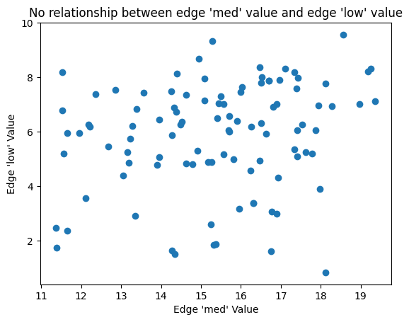
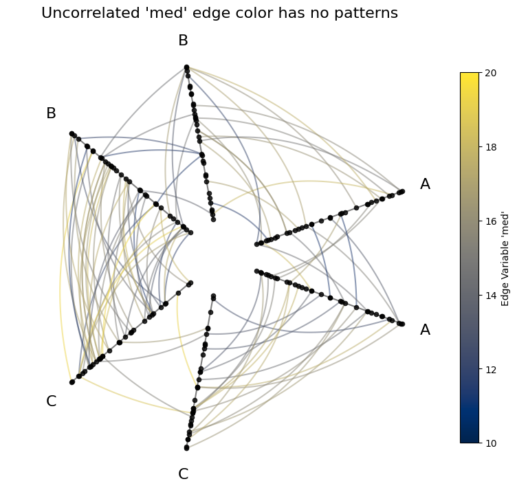
But if we instead choose an uncorrelated variable for the color (e.g. med), then these patterns will disappear.
[5]:
fig, ax = plt.subplots()
ax.scatter(hp.edges.data.med, hp.edges.data.low)
ax.set_xlabel("Edge 'med' Value")
ax.set_ylabel("Edge 'low' Value")
ax.set_title(
    "No relationship between edge 'med' value and edge 'low' value",
)
plt.show()
[6]:
# swith to using "med"
# make color range higher because med values are higher
edge_kwargs = {
    "array": "med",
    "cmap": "cividis",
    "clim": (10, 20),  # keep the min and max color the same for all edges
}

fig, ax = hp.plot(**edge_kwargs)

# add custom colorbar to plot
fig.colorbar(
    ScalarMappable(
        norm=Normalize(*edge_kwargs["clim"]),
        cmap=edge_kwargs["cmap"],
    ),
    ax=ax,
    shrink=0.7,
    label="Edge Variable 'med'",
)

ax.set_title(
    "Uncorrelated 'med' edge color has no patterns",
    size=16,
    y=1.05,
)

plt.show()
Edge Line Width#
We can also use edge line width to represent edge metadata.
[7]:
edge_kwargs = {
    "linewidth": "low",  # assign linewidth kwarg to edge column name
}

fig, ax = hp.plot(**edge_kwargs)

plt.show()
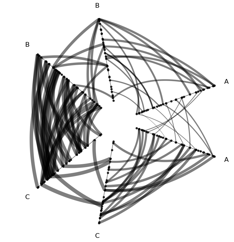
These line widths get a bit too large, which raises the question, how can we manipulate our metadata values to improve our metadata visualization?
Scaling Edge Metadata#
Users can create scaled data as needed for plotting through standard DataFrame manipulation (i.e. adding a new column to HivePlot.edges.data.
Users can scale the new data column however they seet fit, linearly or nonlinearly (e.g. log), to create new column(s) of scaled metadata to reference in their plotting.
[8]:
# edges got too big, let's scale down 1/3
hp.edges.data["linewidth_third"] = hp.edges.data["low"] / 3

hp.edges.data
[8]:
| from | to | low | med | high | linewidth_third | |
|---|---|---|---|---|---|---|
| 0 | 85 | 63 | 6.567506 | 15.711859 | 24.629851 | 2.189169 |
| 1 | 51 | 26 | 6.176714 | 16.259557 | 24.106476 | 2.058905 |
| 2 | 30 | 4 | 7.501076 | 14.257005 | 26.436396 | 2.500359 |
| 3 | 7 | 1 | 4.991420 | 15.811134 | 21.297566 | 1.663807 |
| 4 | 17 | 81 | 5.189225 | 11.564580 | 26.122606 | 1.729742 |
| ... | ... | ... | ... | ... | ... | ... |
| 95 | 82 | 95 | 7.425179 | 13.559648 | 27.493189 | 2.475060 |
| 96 | 36 | 14 | 6.071377 | 17.872480 | 21.423589 | 2.023792 |
| 97 | 51 | 97 | 6.053931 | 15.682788 | 26.290276 | 2.017977 |
| 98 | 36 | 88 | 3.000836 | 16.890711 | 23.835759 | 1.000279 |
| 99 | 38 | 82 | 7.309462 | 15.496119 | 27.006405 | 2.436487 |
100 rows × 6 columns
[9]:
edge_kwargs = {
    "linewidth": "linewidth_third",  # use 1/3 edge metadata for size
}

fig, ax = hp.plot(**edge_kwargs)

plt.show()
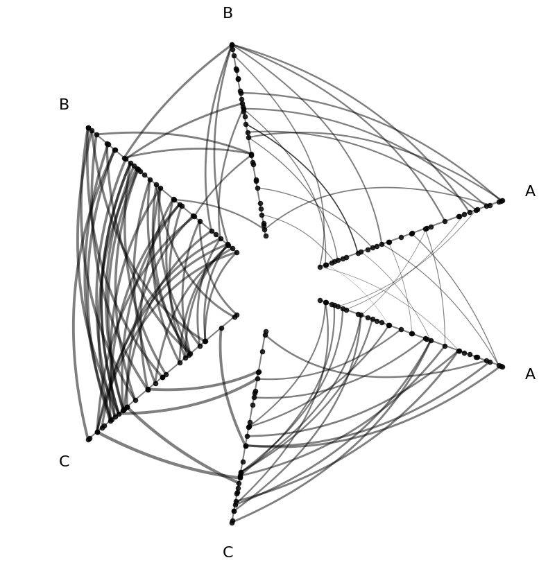
Multiple Edge Features#
Of course, nothing is stopping us from assigning edge metadata to multiple keyword arguments. Below, we use color and line width as used in the above examples, but in a single hive plot.
[10]:
edge_kwargs = {
    "array": "low",  # edge metadata for color
    "linewidth": "linewidth_third",  # AND edge metadata for size
    "cmap": "cividis",
    "clim": (0, 10),
}

fig, ax = hp.plot(**edge_kwargs)

plt.show()
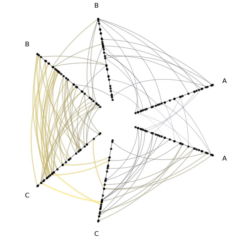
Persisting Edge Kwargs for Future Plots#
If you settle on a nice use of edge metadata that you want to persist without including in every plot() call, you can instead call HivePlot.update_edge_plotting_keyword_arguments(), passing along the same edge plotting kwargs.
[11]:
hp_persist_kwargs = hp.copy()

edge_kwargs = {
    "array": "low",
    "linewidth": "linewidth_third",
    "cmap": "cividis",
    "clim": (0, 10),
}

# this will persist for future plots
hp_persist_kwargs.update_edge_plotting_keyword_arguments(**edge_kwargs)

fig, ax = hp_persist_kwargs.plot()  # no edge kwargs needed here

plt.show()

Now we can instead focus on other plotting flexibility like node kwargs.
[12]:
fig, ax = hp_persist_kwargs.plot(node_kwargs={"color": "royalblue"})

ax.set_title("Edge Kwargs Persisted", y=1.05, size=16)
plt.show()
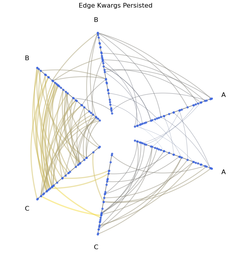
There is similar functionality available when plotting node metadata. For more information, see the Visualizing Node Metadata page.
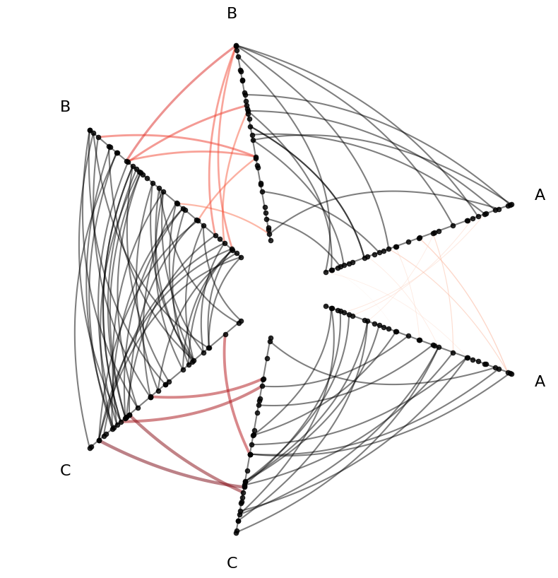
Persisting Edge Metadata to a Different Edge Hierarchy Variable#
Hiveplotlib maintains a hierarchy of options for changing edge kwargs. For more on this broader flexibility when modifying edges, see the Changing Edge Keyword Arguments page.
When we called HivePlot.update_edge_plotting_keyword_arguments() above, by default this changes the all_edge_kwargs parameter, but we can also change a different parameter, for example, the repeat_edge_kwargs parameter:
[13]:
hp_persist_kwargs = hp.copy()

edge_kwargs = {
    "array": "low",
    "linewidth": "linewidth_third",
    "cmap": "Reds",
    "clim": (0, 10),
}

# change just repeat edge kwargs
hp_persist_kwargs.update_edge_plotting_keyword_arguments(
    edge_kwarg_setting="repeat_edge_kwargs",
    **edge_kwargs,
)

fig, ax = hp_persist_kwargs.plot()  # no edge kwargs needed here

plt.show()
Visualizing Edge Graph Metrics#
Graph-level metrics are also valid sources of values for edge kwargs. For more on attaching graph metrics to the underlying Edges, see the Computing Graph Metrics page.