

Collapsing Axes#
This notebook discusses how to collapse multiple partition values onto a single HivePlot axis.
[1]:
import matplotlib.pyplot as plt
import seaborn as sns
from flexitext import flexitext
from hiveplotlib.datasets import example_hive_plot
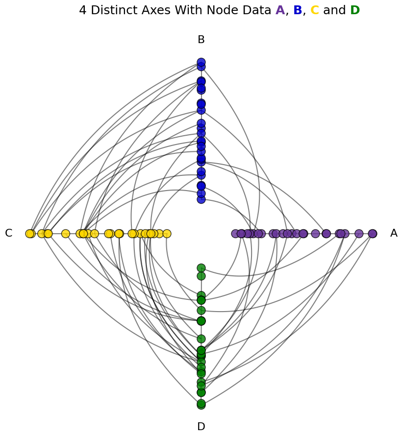
We will base this discussion on the following toy hive plot:
[2]:
# use node partition colors consistent throughout notebook
NODE_PARTITION_COLORS = {
    "A": "rebeccapurple",
    "B": "mediumblue",
    "C": "gold",
    "D": "green",
}

hp = example_hive_plot(
    cutoffs=4,
    labels=["A", "B", "C", "D"],
)

# add color information to node data
hp.nodes.data["node_color"] = [
    NODE_PARTITION_COLORS[i] for i in hp.nodes.data[hp.partition_variable]
]

# propagate extra node data changes through to data on axes
hp.update_partition_data()

hp.update_node_viz_kwargs(
    color="node_color",
    s=150,  # make nodes bigger to see color
    edgecolor="black",
)

fig, ax = hp.plot()

flexitext(
    x=0.55,
    y=0.95,
    s="<size:18>4 Distinct Axes With Node Data "
    f"<color:{NODE_PARTITION_COLORS['A']}, weight:bold>A</>, "
    f"<color:{NODE_PARTITION_COLORS['B']}, weight:bold>B</>, "
    f"<color:{NODE_PARTITION_COLORS['C']}, weight:bold>C</> and "
    f"<color:{NODE_PARTITION_COLORS['D']}, weight:bold>D</>"
    "</>",
    xycoords="figure fraction",
    ha="center",
    ax=ax,
)

plt.show()
For more on propagating node metadata to node visualization, see the Visualizing Node Metadata page.
Why Collapse Partition Values Onto a Single Axis?#
The simplest reason to collapse groups together would be that you want to. Perhaps a pair of groups need not be distinguished, especially at the expense of a more complex visualization.
More generally, keeping the number of axes to exactly 3 ensures that we are looking at all the nodes and edges in a single, compact hive plot.
For more on this, see the Hive Plots with More Than 3 Groups page.
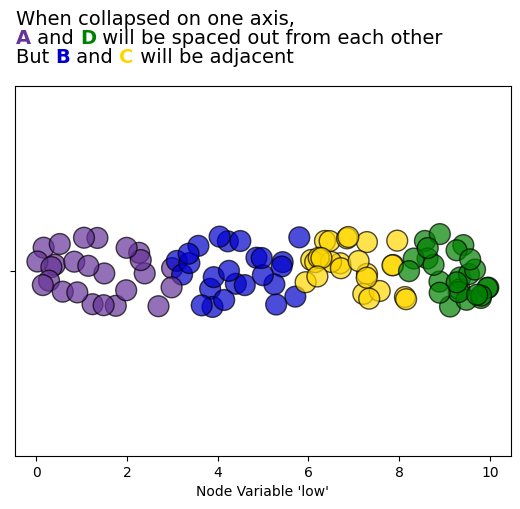
Predicting the Appearance of a Collapsed Axis#
Before we collapse any axes, let’s first predict what our collapsed axis will look like for our toy example.
Below we plot the node low values, which correspond to our hive plot’s partition. Our hive plot’s axes are also sorted by node low values.
Based on this picture, we should expect when collapsing Axes A and D onto a single axis that there will be a gap in between the purple nodes and the green nodes, since the collapsed axis will still be sorted on node low values.
If we collapse Axes B and C to a single axis, however, the blue and yellow nodes should be adjacent.
[3]:
fig, ax = plt.subplots()
sns.stripplot(
    data=hp.nodes.data,
    x="low",
    c=hp.nodes.data.node_color,
    ax=ax,
    s=15,
    edgecolor="black",
    linewidth=1,
    alpha=0.7,
    hue_order=["A", "B", "C", "D"],
)
ax.set_xlabel("Node Variable 'low'")

flexitext(
    x=0.46,
    y=0.98,
    s="<size:14>"
    "When collapsed on one axis,\n"
    f"<color:{NODE_PARTITION_COLORS['A']}, weight:bold>A</> and "
    f"<color:{NODE_PARTITION_COLORS['D']}, weight:bold>D</> "
    "will be spaced out from each other\n"
    "But "
    f"<color:{NODE_PARTITION_COLORS['B']}, weight:bold>B</> and "
    f"<color:{NODE_PARTITION_COLORS['C']}, weight:bold>C</> "
    "will be adjacent</>",
    xycoords="figure fraction",
    ha="center",
    ax=ax,
)

plt.show()
Collapsing Partition Values on Hive Plot Initialization#
We can collapse two or more hive plot axes on instantiation of a HivePlot via the axes_order parameter.
By explicitly specifying the axes we want to include, then including an additional None value, all unspecified axes will be collapsed onto the None axis.
This None axis will then be named by the provided collapsed_group_axis_name parameter.
In this below example, note that example_hive_plot() is setting every sorting variable to low, and does the same for the resulting collapsed axis. We could instead specify a different sorting variable by including the collapsed_group_axis_name as a key in the provided sorting_variables input with a different sorting variable as its value.
[4]:
collapsed_group_axis_name = "A & D"
hp = example_hive_plot(
    cutoffs=4,
    labels=["A", "B", "C", "D"],
    axes_order=["B", "C", None],
    collapsed_group_axis_name=collapsed_group_axis_name,
)

# add color information to node data
hp.nodes.data["node_color"] = [
    NODE_PARTITION_COLORS[i] for i in hp.nodes.data["partition_0"]
]

# propagate extra node data changes through to data on axes
hp.update_partition_data()

hp.update_node_viz_kwargs(
    color="node_color",
    s=150,  # make nodes bigger to see color
    edgecolor="black",
)

fig, ax = hp.plot()

flexitext(
    x=0.55,
    y=0.95,
    s="<size:18>2 Distinct Axes With Node Data "
    f"<color:{NODE_PARTITION_COLORS['B']}, weight:bold>B</> and "
    f"<color:{NODE_PARTITION_COLORS['C']}, weight:bold>C</>\n"
    "With a Single Collapsed Axis of "
    f"<color:{NODE_PARTITION_COLORS['A']}, weight:bold>A</> and "
    f"<color:{NODE_PARTITION_COLORS['D']}, weight:bold>D</>"
    "</>",
    xycoords="figure fraction",
    ha="center",
    ax=ax,
)

plt.show()
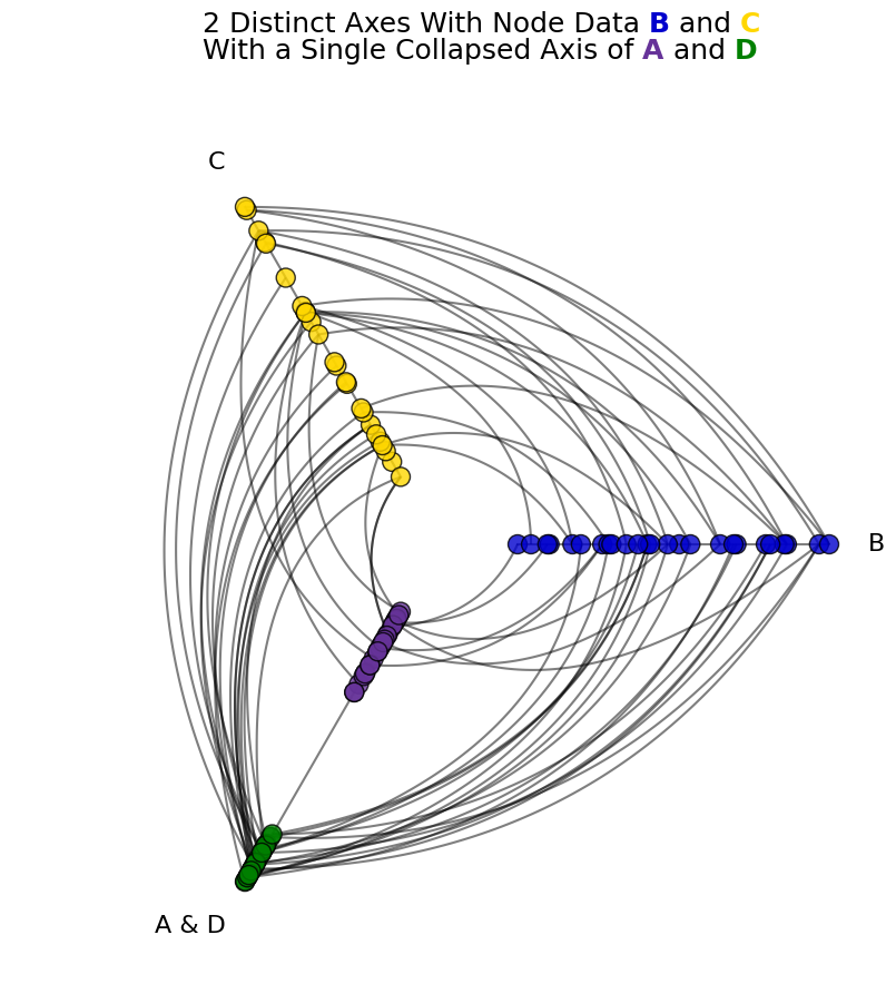
As predicted from the earlier figure, the green and purple nodes are spaced out from each other.
Collapsing Partition Values on an Existing Hive Plot#
For an existing hive plot, we can instead call the HivePlot.set_axes_order() method. Just as we did in the example above, we specify the specific axes to keep and a None axis, and this collapsed axis will be named by the provided collapsed_group_axis_name.
Here though, we need to explictly provide the collapsed_group_sorting_variable, as Hiveplotlib doesn’t assume anything about this new axis on an existing hive plot.
[5]:
collapsed_group_axis_name = "B & C"

hp = example_hive_plot(
    cutoffs=4,
    labels=["A", "B", "C", "D"],
)

# add color information to node data
hp.nodes.data["node_color"] = [
    NODE_PARTITION_COLORS[i] for i in hp.nodes.data[hp.partition_variable]
]

# this call will also propagate our new node data to each axis
hp.set_axes_order(
    axes=["A", "D", None],
    collapsed_group_axis_name=collapsed_group_axis_name,
    collapsed_group_sorting_variable="low",
)

hp.update_node_viz_kwargs(
    color="node_color",
    s=150,  # make nodes bigger to see color
    edgecolor="black",
)

fig, ax = hp.plot()

flexitext(
    x=0.55,
    y=0.95,
    s="<size:18>2 Distinct Axes With Node Data "
    f"<color:{NODE_PARTITION_COLORS['A']}, weight:bold>A</> and "
    f"<color:{NODE_PARTITION_COLORS['D']}, weight:bold>D</>\n"
    "With a Single Collapsed Axis of "
    f"<color:{NODE_PARTITION_COLORS['B']}, weight:bold>B</> and "
    f"<color:{NODE_PARTITION_COLORS['C']}, weight:bold>C</>"
    "</>",
    xycoords="figure fraction",
    ha="center",
    ax=ax,
)

plt.show()
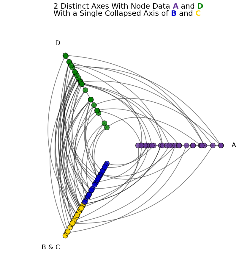
As predicted from the earlier figure, the blue and yellow nodes are adjacent to each other.