

Hive Plot Matrix: Generic Constructor#
This notebook covers the features and options for the generic HivePlotMatrix class, which builds a matrix from independently constructed HivePlot instances when per-cell flexibility is required.
For additional discussion motivating Hive Plot Matrices (HPMs) and the different HPM options, see the Hive Plot Matrices tutorial.
Note: this notebook requires that Hiveplotlib be installed with extra packages, which can be done by running:
pip install hiveplotlib[bokeh,datashader,networkx]
[1]:
import matplotlib.pyplot as plt
from hiveplotlib import HivePlot, HivePlotMatrix
from hiveplotlib.datasets import example_hpm_nodes_and_edges
from matplotlib.cm import ScalarMappable
from matplotlib.colors import Normalize
We will base this discussion on the following toy dataset:
[2]:
nodes, edges = example_hpm_nodes_and_edges(
    edge_tag_counts={"official": 90}, drop_duplicate_edges=True
)
[3]:
nodes.data.head()
[3]:
| unique_id | group | value1 | value2 | value3 | |
|---|---|---|---|---|---|
| 0 | 0 | A | 2.579853 | 7.447622 | 8.894677 |
| 1 | 1 | A | 1.462928 | 9.675097 | 8.236987 |
| 2 | 2 | A | 2.861993 | 3.258254 | 8.550787 |
| 3 | 3 | A | 2.324560 | 3.704597 | 9.216663 |
| 4 | 4 | A | 0.313924 | 4.695558 | 8.782394 |
[4]:
edges
[4]:
hiveplotlib.Edges of 86 edges.
[5]:
edges.data.head()
[5]:
| from | to | |
|---|---|---|
| 0 | 2 | 23 |
| 1 | 19 | 13 |
| 2 | 12 | 25 |
| 3 | 2 | 20 |
| 4 | 6 | 2 |
Building Individual HivePlots#
Each cell’s HivePlot is constructed independently. Let’s create four that each emphasize a different group:
[6]:
# group A on the first axis
#  sorted by value1
hp_a = HivePlot(
    nodes=nodes,
    edges=edges,
    partition_variable="group",
    sorting_variables="value1",
    axes_order=["A", "B", "C"],
    all_edge_kwargs={"color": "steelblue", "alpha": 0.4},
)

# group B on the first axis instead
#  change edge color
hp_b = HivePlot(
    nodes=nodes,
    edges=edges,
    partition_variable="group",
    sorting_variables="value1",
    axes_order=["B", "C", "A"],
    all_edge_kwargs={"color": "darkorange", "alpha": 0.4},
)

# group C on the first axis instead
#  change edge color
hp_c = HivePlot(
    nodes=nodes,
    edges=edges,
    partition_variable="group",
    sorting_variables="value1",
    axes_order=["C", "A", "B"],
    all_edge_kwargs={"color": "royalblue", "alpha": 0.4},
)

# group A on the first axis
#  sorted by value3 instead
#  change edge color
hp_d = HivePlot(
    nodes=nodes,
    edges=edges,
    partition_variable="group",
    sorting_variables="value3",
    axes_order=["A", "B", "C"],
    all_edge_kwargs={"color": "darkgray", "alpha": 0.4},
)
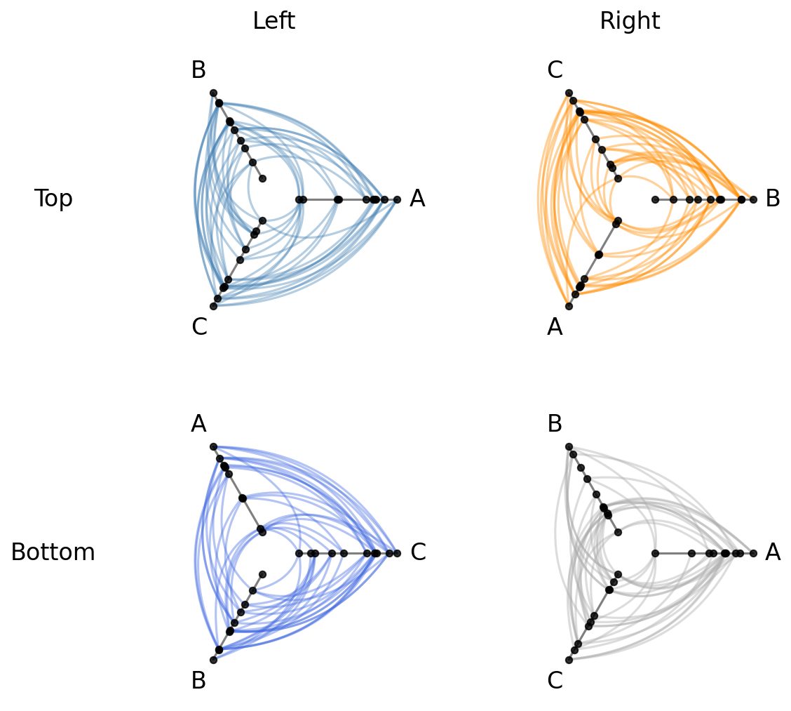
List-of-Lists Input Format#
The simplest input format is a list of lists of HivePlot instances, where each inner list is a row in the resulting matrix.
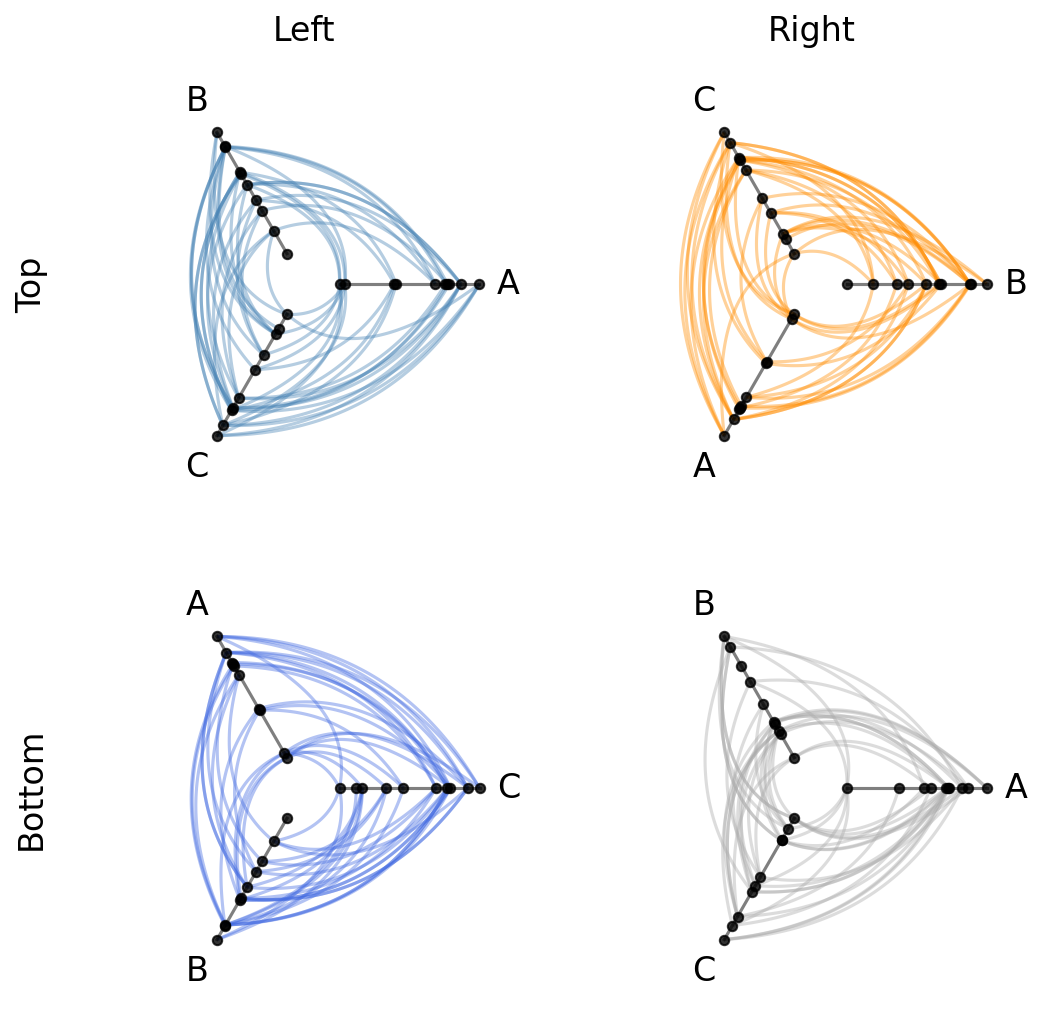
Let’s arrange our four hive plots into a 2 x 2 grid:
[7]:
hpm = HivePlotMatrix(
    hive_plots=[[hp_a, hp_b], [hp_c, hp_d]],
    row_labels=["Top", "Bottom"],
    col_labels=["Left", "Right"],
)
fig, axes = hpm.plot()
plt.show()
We can track some matrix properties for each HivePlotMatrix class:
[8]:
print("matrix_type:", hpm.matrix_type)
print("shape:", hpm.shape)
print("back end:", hpm.backend)
matrix_type: generic
shape: (2, 2)
back end: matplotlib
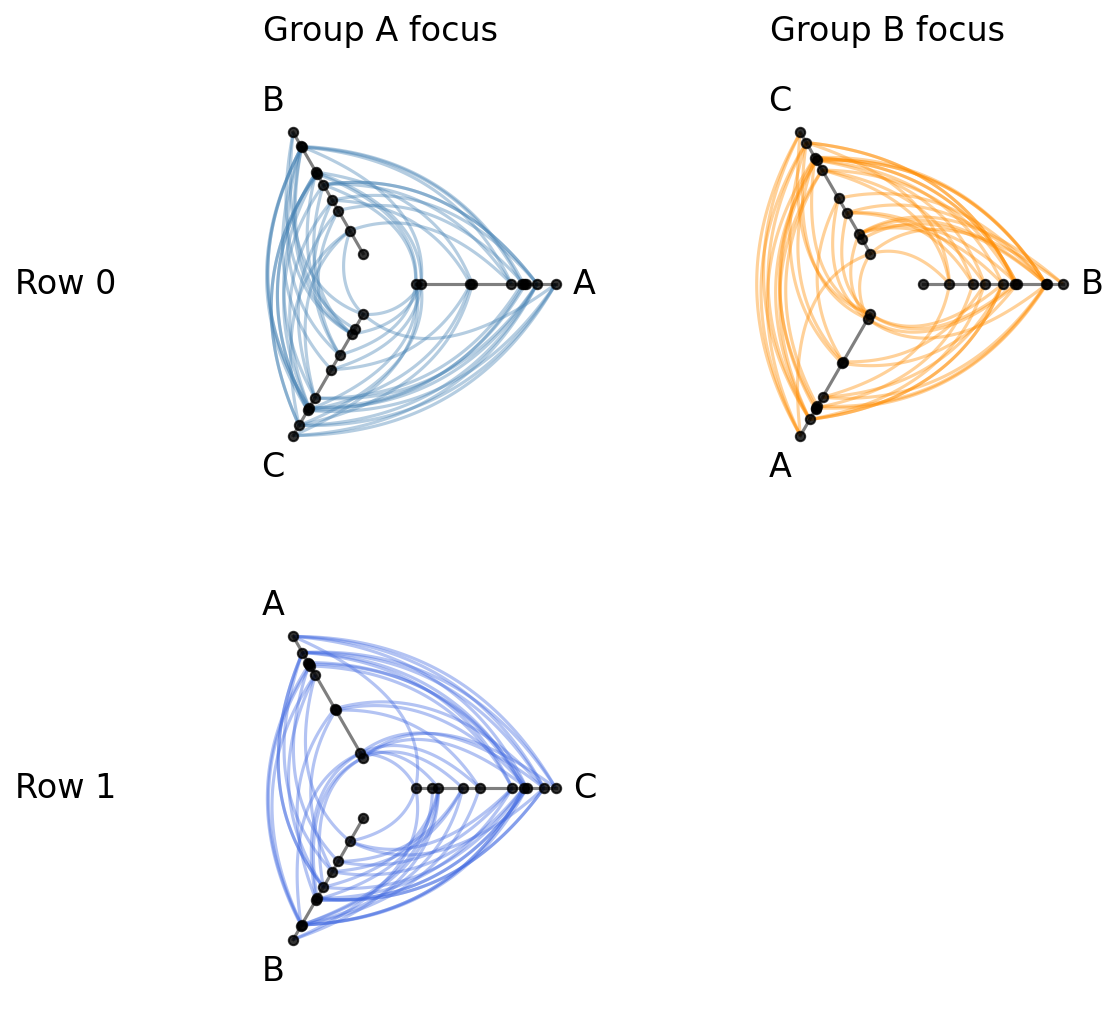
Sparse Layouts with None Cells#
What if we don’t want or need every position filled? We can pass None for any cell to leave it empty.
The grid size is determined by the full list-of-lists shape, where None positions will render as blank axes when plotting:
[9]:
hpm_sparse = HivePlotMatrix(
    hive_plots=[[hp_a, hp_b], [hp_c, None]],
    col_labels=["Group A focus", "Group B focus"],
    row_labels=["Row 0", "Row 1"],
)
fig, axes = hpm_sparse.plot()
plt.show()
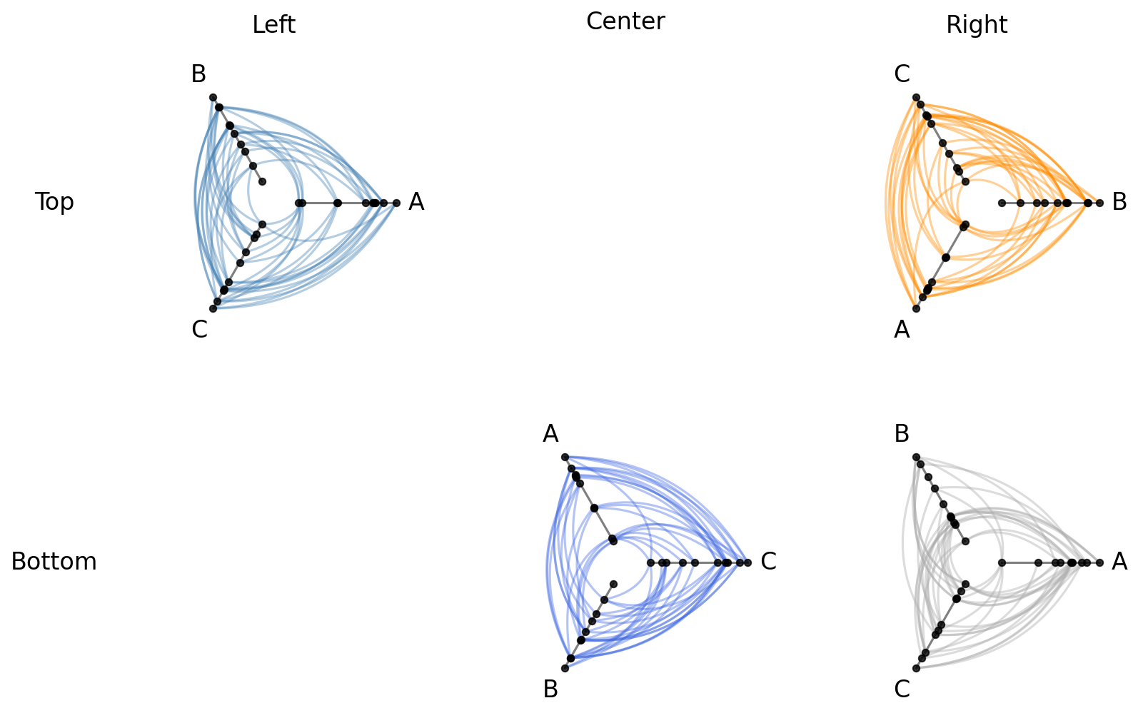
Dictionary Input Format#
For programmatically determined layouts, we can instead pass a dictionary mapping (row, col) integer tuples to HivePlot instances. Unspecified positions are automatically None, and the grid size is inferred from the maximum row and column indices:
[10]:
hpm_dict = HivePlotMatrix(
    hive_plots={
        (0, 0): hp_a,
        (0, 2): hp_b,
        (1, 1): hp_c,
        (1, 2): hp_d,
    },
    col_labels=["Left", "Center", "Right"],
    row_labels=["Top", "Bottom"],
)
fig, axes = hpm_dict.plot()
plt.show()
Cell Access#
Individual cells can be retrieved by index, and the iter_populated_cells() method provides a convenient iterator over all non-None cells. Let’s inspect the matrix we built above from a dictionary that includes None cells:
[11]:
# retrieve a single cell
print("Single Cell:")
cell = hpm_dict[0, 0]
print("hpm[0, 0]:", cell, "\n")

# inspect matrix properties
print("Matrix properties:")
print("shape:", hpm_dict.shape)
print("matrix_type:", hpm_dict.matrix_type)
print()

# Iterate over populated cells
print("Populated cells:")
for r, c, hp in hpm_dict.iter_populated_cells():
    print(f"  ({r}, {c}): axes = {list(hp.axes.keys())}")
Single Cell:
hpm[0, 0]: hiveplotlib.HivePlot: 30 nodes, axes=['A', 'B', 'C'], 86 edges, partition='group', sort='value1', backend='matplotlib'

Matrix properties:
shape: (2, 3)
matrix_type: generic

Populated cells:
  (0, 0): axes = ['A', 'B', 'C']
  (0, 2): axes = ['B', 'C', 'A']
  (1, 1): axes = ['C', 'A', 'B']
  (1, 2): axes = ['A', 'B', 'C']
Drilling Down on a Single Hive Plot in an HPM#
We can take a copy of a hive plot cell and explore further changes without disrupting the existing HPM. For example, we can switch to an interactive Hiveplotlib-supported back end like bokeh.
[12]:
from bokeh.io import output_notebook
from bokeh.plotting import show
from bokeh.resources import INLINE

output_notebook(resources=INLINE)

cell_hp = hpm[0, 0].copy()
cell_hp.set_viz_backend("bokeh")
show(cell_hp.plot())
Once we spot anomalous nodes or edges, we can use the hover tool support with the bokeh back end to find the relevant node or edge IDs.
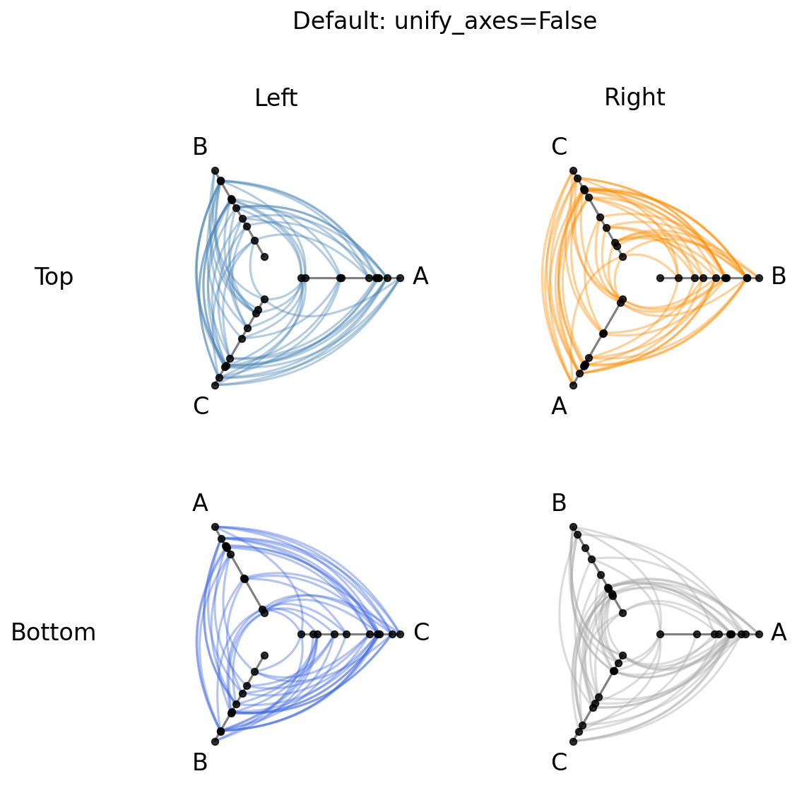
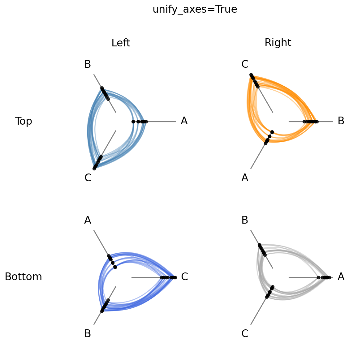
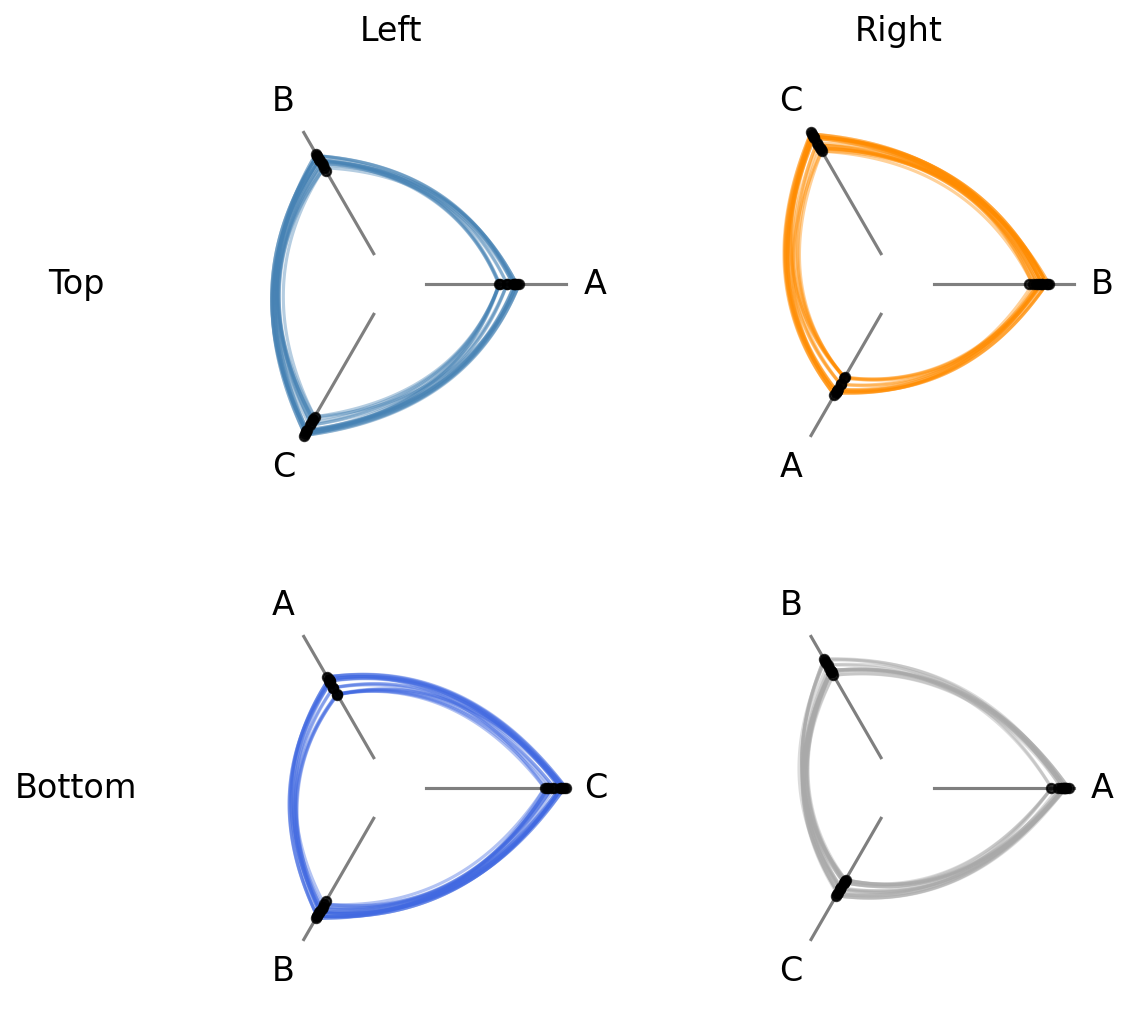
Unified Axis Scale with unify_axes#
By default, the generic HivePlotMatrix preserves whatever axis scaling each HivePlot was built with. If vmin / vmax were never explicitly set, each axis auto-scales to its own data range, so axis ranges will almost certainly differ across cells.
To compare node positions across cells on the same scale, pass unify_axes=True at construction time to compute a single global vmin / vmax and apply it to every axis.
[13]:
# default: each cell was built with independent per-cell axis scaling
fig, axes = hpm.plot()
fig.suptitle("Default: unify_axes=False", y=1.02, size=16)
plt.show()
[14]:
# unified: unify_axes=True auto-computes a shared range across all four cells
hpm_unified = HivePlotMatrix(
    hive_plots=[[hp_a.copy(), hp_b.copy()], [hp_c.copy(), hp_d.copy()]],
    row_labels=["Top", "Bottom"],
    col_labels=["Left", "Right"],
    unify_axes=True,
)
fig, axes = hpm_unified.plot()
fig.suptitle("unify_axes=True", y=1.02, size=16)
plt.show()
Set a Specific Range for Unified Axes#
To force a specific range instead of auto-computing, we can pass a dictionary with vmin and / or vmax. Missing keys are auto-computed to the global min / max of the data.
This can be helpful if there are outliers or if there are important threshold values for a given sorting variable.
[15]:
# pin vmin to -10, auto-compute vmax from the data
hpm_pinned = HivePlotMatrix(
    hive_plots=[[hp_a.copy(), hp_b.copy()], [hp_c.copy(), hp_d.copy()]],
    row_labels=["Top", "Bottom"],
    col_labels=["Left", "Right"],
    unify_axes={"vmin": -10},
)
fig, axes = hpm_pinned.plot()
plt.show()
Note, setting any unify_axes value other than False will update each HivePlot instance’s axes ranges. If you want to leave the original hive plots untouched, make sure to take a copy of each instance in the HPM instantiation as we did above with the HivePlot.copy() method.
Computing Graph Metrics During Construction#
Common node and edge properties can be requested directly at HPM construction via the node_graph_metrics and edge_graph_metrics parameters.
Below, we request both node degree and betweenness centrality as node metrics, plus edge betweenness centrality as an edge metric when initializing our HPM. Then, we use the edge metric to color the edges of each hive plot:
[16]:
hpm_with_metrics = HivePlotMatrix(
    # copy each hive plot to keep originals untouched
    hive_plots=[[hp_a.copy(), hp_b.copy()], [hp_c.copy(), hp_d.copy()]],
    row_labels=["Top", "Bottom"],
    col_labels=["Left", "Right"],
    node_graph_metrics=["degree", "betweenness_centrality"],
    edge_graph_metrics="edge_betweenness_centrality",
)

edge_coloring_kwargs = {
    "cmap": "cividis",
    "clim": (0, 0.06),
    "alpha": 1,
}

# data-driven edge styling must be done per hive plot
for _, _, hp in hpm_with_metrics.iter_populated_cells():
    hp.update_edge_plotting_keyword_arguments(
        array="edge_betweenness_centrality",
        **edge_coloring_kwargs,
    )

fig, axes = hpm_with_metrics.plot()

# add custom colorbar to plot
fig.colorbar(
    ScalarMappable(
        norm=Normalize(*edge_coloring_kwargs["clim"]),
        cmap=edge_coloring_kwargs["cmap"],
    ),
    ax=axes,
    shrink=0.7,
    orientation="horizontal",
    label="Edge Betweenness Centrality",
    extend="max",
)

plt.show()
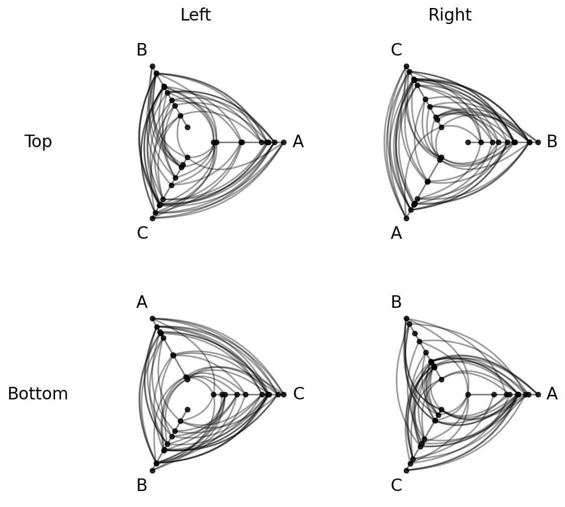
Note that data-driven edge styling must be set on each individual hive plot, as opposed to directional edge styling, which can be set at the HPM level. We discuss directional edge styling in the next section.
Each requested node metric is now a column on every populated cell’s underlying nodes:
[17]:
hpm_with_metrics[0, 0].nodes.data.head()
[17]:
| unique_id | group | value1 | value2 | value3 | degree | betweenness_centrality | |
|---|---|---|---|---|---|---|---|
| 0 | 0 | A | 2.579853 | 7.447622 | 8.894677 | 3 | 0.000000 |
| 1 | 1 | A | 1.462928 | 9.675097 | 8.236987 | 5 | 0.064226 |
| 2 | 2 | A | 2.861993 | 3.258254 | 8.550787 | 9 | 0.109805 |
| 3 | 3 | A | 2.324560 | 3.704597 | 9.216663 | 5 | 0.059176 |
| 4 | 4 | A | 0.313924 | 4.695558 | 8.782394 | 6 | 0.048867 |
Similarly, the requested edge_betweenness_centrality metric is now a column on every populated cell’s underlying edges:
[18]:
hpm_with_metrics[0, 0].edges.data.head()
[18]:
| from | to | edge_betweenness_centrality | |
|---|---|---|---|
| 0 | 2 | 23 | 0.023563 |
| 1 | 19 | 13 | 0.045920 |
| 2 | 12 | 25 | 0.030632 |
| 3 | 2 | 20 | 0.009483 |
| 4 | 6 | 2 | 0.076966 |
For more on Hiveplotlib-supported graph metrics, see the Computing Graph Metrics page.
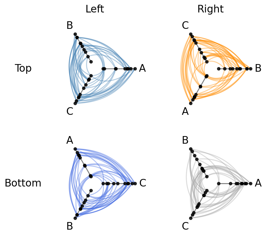
Apply Edge Styling to All HPM Hive Plots#
The HivePlotMatrix.update_all_edge_plotting_keyword_arguments() method applies a style change across every populated cell in a single call.
This lets us alter all hive plot edges in the HPM at once. For example, we can unify the colors of each hive plot’s edges to a single color:
[19]:
hpm_restyled = hpm.copy()

# unify all edge colors to black
hpm_restyled.update_all_edge_plotting_keyword_arguments(
    edge_kwarg_setting="all_edge_kwargs",
    color="black",
)
fig, axes = hpm_restyled.plot()
plt.show()
The edge_kwarg_setting parameter accepts any level from the edge kwarg hierarchy, including "clockwise_edge_kwargs" and "counterclockwise_edge_kwargs":
[20]:
hpm_directed = hpm.copy()

# remove the old color edge kwargs to avoid clashing edge kwargs
hpm_directed.update_all_edge_plotting_keyword_arguments(
    edge_kwarg_setting="all_edge_kwargs",
    reset_edge_kwarg_setting=True,
)

hpm_directed.update_all_edge_plotting_keyword_arguments(
    edge_kwarg_setting="clockwise_edge_kwargs",
    color="orange",
    linewidth=0.8,
    alpha=0.4,
)

hpm_directed.update_all_edge_plotting_keyword_arguments(
    edge_kwarg_setting="counterclockwise_edge_kwargs",
    color="green",
    linewidth=0.8,
    alpha=0.4,
)

fig, axes = hpm_directed.plot()
plt.show()
For more on the full hierarchy of edge kwarg options and how they take precedence, see the Changing Edge Keyword Arguments page.
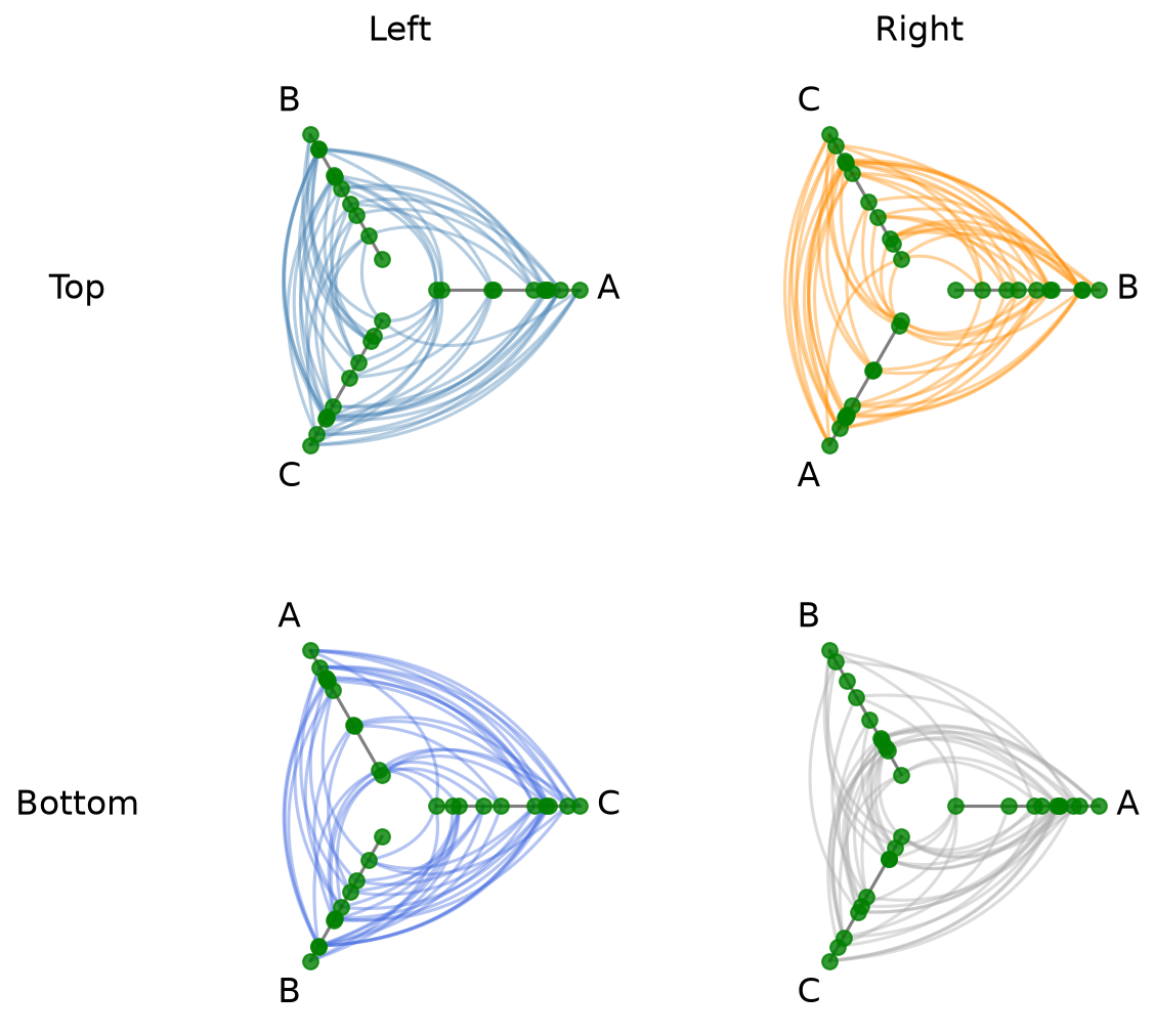
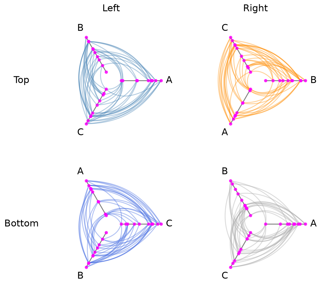
Uniform Node Rendering#
The node_kwargs parameter applies node rendering options uniformly across every cell when building the HivePlotMatrix. Node kwargs can also be passed to .plot(), which will take precedence.
[21]:
hpm_uniform = HivePlotMatrix(
    hive_plots=[[hp_a, hp_b], [hp_c, hp_d]],
    row_labels=["Top", "Bottom"],
    col_labels=["Left", "Right"],
    node_kwargs={"s": 50, "color": "green"},
)
fig, axes = hpm_uniform.plot()
plt.show()
[22]:
fig, axes = hpm_uniform.plot(node_kwargs={"color": "magenta"})
plt.show()
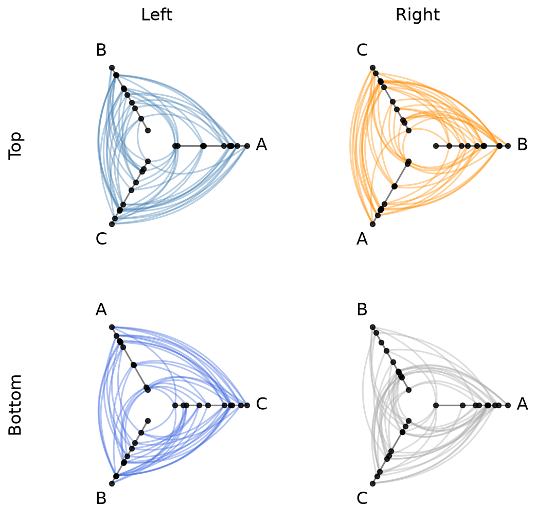
Plot Options#
The plot() method accepts several keyword arguments to control figure appearance. For example, we could change the figure size:
[23]:
# figsize: override the default auto-computed size
fig, axes = hpm.plot(figsize=(6, 6))
plt.show()

Or if our row labels are too long and hitting the hive plots, we can rotate them with the row_label_rotation parameter.
[24]:
# row_label_rotation: rotate row labels (useful when labels are long)
fig, axes = hpm.plot(row_label_rotation=90)
plt.show()
Visualization Back Ends#
Two visualization back ends are supported with HPMs: matplotlib and datashader. The back end is set at construction time via the backend parameter.
By default for generic HPMs, the back end will be inferred from the first populated cell.
[25]:
print("Current back end:", hpm.backend)
Current back end: matplotlib
Datashader Back End#
Datashader renders rasterized density images with shared colorbars across all cells.
For more on constructing hive plots with datashader, see the Hive Plots for Large Networks and Datashader pages.
Note that while the matplotlib back end only returns the figure and axes, here the plot() call also returns the node / edge rasterizations.
Below, we discuss three ways to use datashader with generic HPMs.
Method 1: Build HivePlot Instances With backend="datashader" Upfront#
With the example below, the HPM instantiation infers the back end as datashader from the first hive plot hp_a_ds.
Note that any other hive plots added to this HPM that use the matplotlib back end (i.e. hp_b_mpl) will be rendered in the final HPM with datashader.
[26]:
hp_a_ds = HivePlot(
    nodes=nodes,
    edges=edges,
    partition_variable="group",
    sorting_variables="value1",
    axes_order=["A", "B", "C"],
    all_edge_kwargs={"color": "#006BA4"},
    backend="datashader",
)
hp_b_mpl = HivePlot(
    nodes=nodes,
    edges=edges,
    partition_variable="group",
    sorting_variables="value1",
    axes_order=["B", "C", "A"],
    all_edge_kwargs={"color": "#FF800E"},
    backend="matplotlib",  # only first populated cell dictates HPM back end!
)
hpm_ds = HivePlotMatrix(
    hive_plots=[[hp_a_ds, hp_b_mpl]],
    row_labels=["Row 0"],
    col_labels=["Left", "Right"],
)
# datashader plot also returns node / edge rasterizations
fig, axes, im_nodes, im_edges = hpm_ds.plot()
plt.show()
Method 2: Specify backend="datashader" When Instantiating the HivePlotMatrix#
Here, the instantiation explicity converts each hive plot’s back end to datashader:
[27]:
hp_a_mpl = HivePlot(
    nodes=nodes,
    edges=edges,
    partition_variable="group",
    sorting_variables="value1",
    axes_order=["A", "B", "C"],
    all_edge_kwargs={"color": "#006BA4", "alpha": 0.4},
)
hp_b_mpl = HivePlot(
    nodes=nodes,
    edges=edges,
    partition_variable="group",
    sorting_variables="value1",
    axes_order=["B", "C", "A"],
    all_edge_kwargs={"color": "#FF800E", "alpha": 0.4},
)
hpm_ds2 = HivePlotMatrix(
    hive_plots=[[hp_a_mpl, hp_b_mpl]],
    row_labels=["Row 0"],
    col_labels=["Left", "Right"],
    backend="datashader",
)
fig, axes, im_nodes, im_edges = hpm_ds2.plot()
plt.show()
Method 3: Call set_viz_backend() After Construction#
We can always change the visualization back end on an existing HPM with the set_viz_backend() method:
[28]:
hp_a_mpl = HivePlot(
    nodes=nodes,
    edges=edges,
    partition_variable="group",
    sorting_variables="value1",
    axes_order=["A", "B", "C"],
    all_edge_kwargs={"color": "#006BA4", "alpha": 0.4},
)
hp_b_mpl = HivePlot(
    nodes=nodes,
    edges=edges,
    partition_variable="group",
    sorting_variables="value1",
    axes_order=["B", "C", "A"],
    all_edge_kwargs={"color": "#FF800E", "alpha": 0.4},
)
hpm_to_convert = HivePlotMatrix(
    hive_plots=[[hp_a_mpl, hp_b_mpl]],
    row_labels=["Row 0"],
    col_labels=["Left", "Right"],
)
hpm_to_convert.set_viz_backend("datashader")
fig, axes, im_nodes, im_edges = hpm_to_convert.plot()
plt.show()

Setting Explicit Density Cutoffs with Datashader#
The node and edge density colormaps and color range will be the same for all hive plots in the HPM.
By default, the max color range for each will top out at the maximum density value over all of the hive plots.
If preferred, users can set vmax_nodes and vmax_edges to fix the shared density max across all cells to a specific level. This can be useful when one cell is much denser than the others or if users have preferred, more-interpretable cutoffs.
[29]:
fig, axes, im_nodes, im_edges = hpm_ds.plot(vmax_nodes=15, vmax_edges=30)
plt.show()
Turn Off Density Colorbars with Datashader#
Users can turn off one or both node / edge colorbars that show up by default by setting show_node_colorbar / show_edge_colorbar to False (both default to True).
[30]:
fig, axes, im_nodes, im_edges = hpm_ds.plot(
    show_node_colorbar=False,
    show_edge_colorbar=False,
)
plt.show()
For a deeper dive into other Hive Plot Matrix convenience methods, see the HivePlotMatrix Gallery Examples.