

Exporting Hive Plots to JSON#
The HivePlot.to_json() method serializes a hive plot’s axes, nodes, edges, and node visualization keyword arguments into a portable JSON string.
This notebook demonstrates the export, walks through the resulting JSON structure, and shows two ways to use the output: a JavaScript visualization via the <hive-plot> Web Component, and a from-scratch matplotlib re-render driven entirely off the JSON data.
[1]:
import matplotlib.pyplot as plt
from hiveplotlib.datasets import example_hive_plot
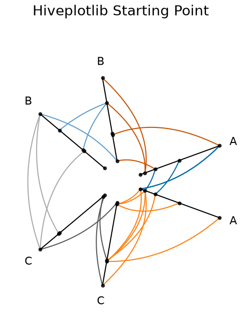
Example Hive Plot#
We will use the following toy hive plot with custom edge colors:
[2]:
hp = example_hive_plot(
    num_nodes=15,
    num_edges=25,
    repeat_axes=True,
    seed=3,
)

color_dict = {
    "A": {"A": "#006BA4", "C": "#FF800E"},
    "C": {"B": "#ABABAB", "C": "#595959"},
    "B": {"B": "#5F9ED1", "A": "#C85200"},
}

for p1 in color_dict:
    for p2 in color_dict[p1]:
        hp.update_edges(
            partition_id_1=p1,
            partition_id_2=p2,
            color=color_dict[p1][p2],
        )

fig, ax = hp.plot(
    figsize=(6, 6),
    axes_kwargs={"color": "black", "alpha": 1.0},
    alpha=1,
)
ax.set_title("Hiveplotlib Starting Point", y=1.2, fontsize=20)
plt.show()
Calling HivePlot.to_json()#
To export the relevant information of the HivePlot instance into JSON, we call HivePlot.to_json():
[3]:
hp_json = hp.to_json()
What’s in the Output JSON#
HivePlot.to_json() produces the following structure:
{
  "axes": {
    "<axis_id_0>": {
      "start": [axis_id_0_start_x (float), axis_id_0_start_y (float)],
      "end": [axis_id_0_end_x (float), axis_id_0_end_y (float)],
      "angle": axis_id_0_angle_degrees (float),
      "long_name": "axis_id_0_long_name (string)",
      "nodes": {
        "unique_id": [list, of, unique, node, ids],
        "x": [list, of, corresponding, node, x, values],
        "y": [list, of, corresponding, node, y, values]
      }
    },
       .
       .
       .
    "<axis_id_n>": {
      ...
    }
  },
  "edges": {
    "from_axis_id": {
      "to_axis_id": {
        "tag": {
          "ids": [
            [from_edge_0, to_edge_0], ... , [from_edge_k, to_edge_k]
          ],
          "curves": [
            [
              [edge_0_x_0, edge_0_y_0], ... , [edge_0_x_j, edge_0_y_j]
            ],
            [
              [edge_1_x_0, edge_1_y_0], ... , [edge_1_x_j, edge_1_y_j]
            ],
            .
            .
            .
            [
              [edge_k_x_0, edge_k_y_0], ... , [edge_k_x_j, edge_k_y_j]
            ]
          ],
          "edge_kwargs": {<edge kwargs>}
        }
      }
    }
  },
  "node_viz_kwargs": {
    "<axis_id_0>": {
      "<kwarg_name>": <scalar value or [per-node list]>,
      ...
    },
    ...
  }
}
The top-level keys are "axes", "edges", and "node_viz_kwargs".
Axis and Node Information#
"axes" contains the start and end points of each axis in Cartesian space, as well as the IDs and corresponding Cartesian coordinates of each node on a given axis.
Each axis entry also includes:
"angle": the angle of the axis in degrees, useful for positioning axis labels."long_name": the human-readable name of the axis, useful as a label.
For example, the information about axis "A" is under ["axes"]["A"], and the information for nodes on axis "A" is under ["axes"]["A"]["nodes"].
Edge Information#
"edges" contains the discretized curve information for plotting edges. Organized by nested dictionaries, the edges that go from axis "A" to axis "B" are stored under ["edges"]["A"]["B"].
The underlying curve information is nested one layer deeper under the tag of data being referenced. For more on tags, see the Comparing Network Subgroups tutorial. If you have not concerned yourself with tags up to this point, your tag will likely be "0".
All discretized curves that go from axis "A" to axis "B" are stored under ["edges"]["A"]["B"][<tag>]["curves"], where the \(n^{th}\) curve’s data is contained under ["edges"]["A"]["B"][<tag>]["curves"][n].
The corresponding node IDs from and to which each edge is being drawn are at ["edges"]["A"]["B"][<tag>]["ids"], where similarly the \(n^{th}\) pair of node IDs corresponding to the \(n^{th}\) curve is at ["edges"]["A"]["B"][<tag>]["ids"][n].
Any corresponding edge kwargs generated along the way are preserved under ["edges"]["A"]["B"][<tag>]["edge_kwargs"].
Node Visualization Kwargs#
"node_viz_kwargs" contains per-axis node styling information. If node visualization kwargs were set on the HivePlot instance (e.g. via HivePlot.update_node_viz_kwargs()), they appear here keyed by axis name.
For kwargs whose values reference a column in the node data (e.g. c="my_column"), the values are resolved to per-node lists matching the ordering of nodes in the corresponding axis entry. Scalar kwargs (e.g. s=20) are preserved as-is.
Saving the JSON to Disk#
Once we have a standardized format like JSON, we are no longer restricted to Python. Saving the JSON string to disk allows the resulting .json file to be loaded in any programming language:
with open('my_hive_plot.json', 'w') as f:
    f.write(hp_json)
JavaScript Visualization from JSON#
Below, we use the [@hiveplotlib/d3](https://www.npmjs.com/package/@hiveplotlib/d3) npm package to visualize the JSON output in JavaScript via its <hive-plot> Web Component, thickening nodes and edges on hover.
The <hive-plot> Web Component renders SVG elements with semantic CSS classes (.node, .edge, .axis, .axis-label) and data-* attributes (e.g. data-axis, data-node-id, data-source-axis, data-target-axis, data-tag), making it easy to customize the visualization with plain CSS.
Note: below, we plot the saved JSON file from the hiveplotlib-javascript repository, which is equivalent to our example above. One could equivalently pass a local file path (e.g. src="my_hive_plot.json") when working locally.
[4]:
import IPython.display
[5]:
js_url = (
    "https://cdn.jsdelivr.net/npm/@hiveplotlib/d3/hive_plot_element.min.js"
)

hp_json_file_url = (
    "https://raw.githubusercontent.com/gjkoplik/"
    "hiveplotlib-javascript/main/example_hive_plot.json"
)

script = f"""
<div> <h1> Hive Plots in JavaScript </h1> </div>

<script type="module" src="{js_url}"></script>

<style>
    .edge:hover {{
        stroke-width: 5;
    }}
    .node:hover {{
        r: 5;
    }}
</style>

<hive-plot src="{hp_json_file_url}"></hive-plot>
"""

IPython.display.display(IPython.display.HTML(script))
Hive Plots in JavaScript
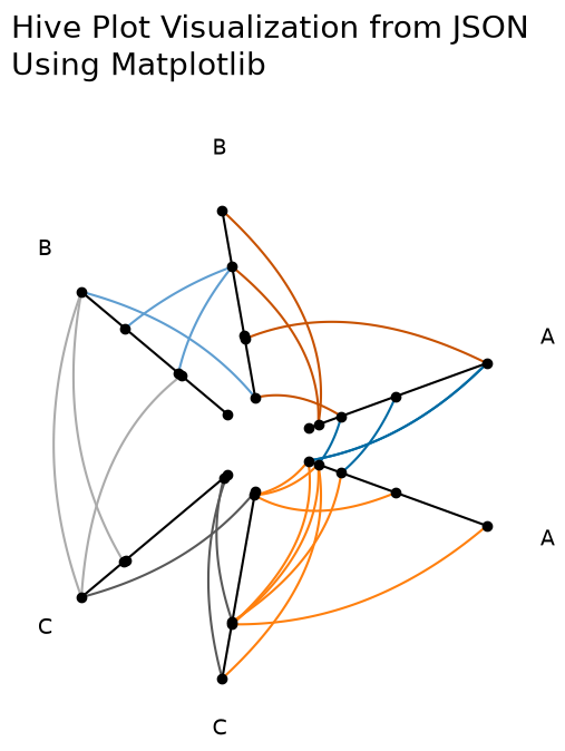
Replicating the Matplotlib Visualization from JSON#
Once we read the JSON back into Python as a dict, we can manually plot in matplotlib without touching any hiveplotlib-specific visualization code. Hiveplotlib supports matplotlib directly; this last example is meant for users who need to translate the JSON output to a Python visualization library that hiveplotlib does not support directly.
[6]:
import json

import matplotlib.pyplot as plt
import numpy as np
from hiveplotlib.utils import cartesian2polar, polar2cartesian
from matplotlib.collections import LineCollection
[7]:
# read in JSON output that we exported from `HivePlot` instance above
hp_dict = json.loads(hp_json)
[8]:
fig, ax = plt.subplots(figsize=(6, 6))

for axis in hp_dict["axes"]:
    axis_start = hp_dict["axes"][axis]["start"]
    axis_end = hp_dict["axes"][axis]["end"]
    axis_range = np.vstack([axis_start, axis_end])
    ax.plot(axis_range[:, 0], axis_range[:, 1], color="black")

    nodes = hp_dict["axes"][axis]["nodes"]
    ax.scatter(nodes["x"], nodes["y"], color="black", zorder=2)

    label = hp_dict["axes"][axis].get("long_name", axis)
    rho, phi = cartesian2polar(x=axis_end[0], y=axis_end[1])
    new_x, new_y = polar2cartesian(rho=rho + 1.2, phi=phi)
    ax.text(s=label, x=new_x, y=new_y, size=14)

for edge_from in hp_dict["edges"]:
    for edge_to in hp_dict["edges"][edge_from]:
        for tag in hp_dict["edges"][edge_from][edge_to]:
            tag_data = hp_dict["edges"][edge_from][edge_to][tag]
            if "curves" not in tag_data:
                continue
            curves_to_plot = [
                np.array(c).astype(float) for c in tag_data["curves"]
            ]
            color = tag_data["edge_kwargs"]["color"]
            if curves_to_plot:
                collection = LineCollection(
                    curves_to_plot, zorder=1, color=color
                )
                ax.add_collection(collection)

ax.set_title(
    "Hive Plot Visualization from JSON\nUsing Matplotlib",
    x=0,
    y=1.2,
    size=20,
    ha="left",
)
ax.axis("off")
ax.axis("equal")
plt.show()
For more on exporting to a networkx graph instead, see the Exporting Hive Plots to NetworkX page.
For more on using Hiveplotlib’s supported visualization back ends (matplotlib, bokeh, holoviews, plotly, datashader) directly without going through JSON, see the Hive Plots Using Other Visualization Libraries page.