

Hive Plot Matrix: from_variable_sweep#
This notebook covers the features and options of HivePlotMatrix.from_variable_sweep, which sweeps over sorting variables, partition variables, or both, and produces one cell per configuration for simultaneous comparison.
For additional discussion motivating Hive Plot Matrices (HPMs) and the different HPM options, see the Hive Plot Matrices tutorial.
Note: this notebook requires that Hiveplotlib be installed with extra packages, which can be done by running:
pip install hiveplotlib[bokeh,datashader,networkx]
[1]:
import matplotlib.pyplot as plt
from hiveplotlib import HivePlotMatrix
from hiveplotlib.datasets import example_hpm_nodes_and_edges
from matplotlib.cm import ScalarMappable
from matplotlib.colors import Normalize
We will base this discussion on the following toy dataset:
[2]:
nodes, edges = example_hpm_nodes_and_edges(
    edge_tag_counts={"official": 90}, drop_duplicate_edges=True
)
[3]:
nodes.data.head()
[3]:
| unique_id | group | value1 | value2 | value3 | |
|---|---|---|---|---|---|
| 0 | 0 | A | 2.579853 | 7.447622 | 8.894677 |
| 1 | 1 | A | 1.462928 | 9.675097 | 8.236987 |
| 2 | 2 | A | 2.861993 | 3.258254 | 8.550787 |
| 3 | 3 | A | 2.324560 | 3.704597 | 9.216663 |
| 4 | 4 | A | 0.313924 | 4.695558 | 8.782394 |
[4]:
edges
[4]:
hiveplotlib.Edges of 86 edges.
[5]:
edges.data.head()
[5]:
| from | to | |
|---|---|---|
| 0 | 2 | 23 |
| 1 | 19 | 13 |
| 2 | 12 | 25 |
| 3 | 2 | 20 |
| 4 | 6 | 2 |
The three numeric columns have different relationships to group membership:
value1is correlated with group: sorting by it places groups at distinct positions.value2is uncorrelated noise: sorting produces no visible group separation.value3is inversely correlated: the mirror image ofvalue1.
Sorting Variable Sweep#
Users can set the sorting_variables_list parameter to generate one hive plot per sorting variable. The partition stays fixed; only the placement of nodes along each axis changes:
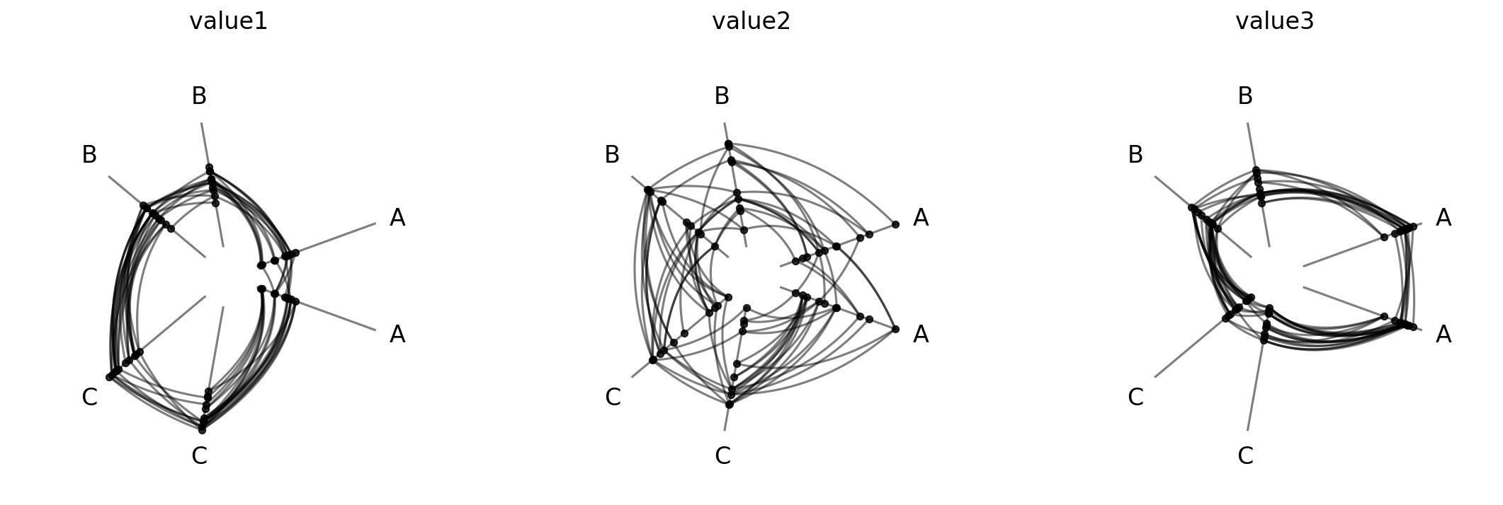
[6]:
hpm = HivePlotMatrix.from_variable_sweep(
    nodes=nodes,
    edges=edges,
    partition_variable="group",
    sorting_variables_list=["value1", "value2", "value3"],
    unify_axes=True,
)
hpm
[6]:
hiveplotlib.HivePlotMatrix (1 x 3), 3 populated cells, type='from_variable_sweep', backend='matplotlib'
[7]:
fig, axes = hpm.plot()
plt.show()
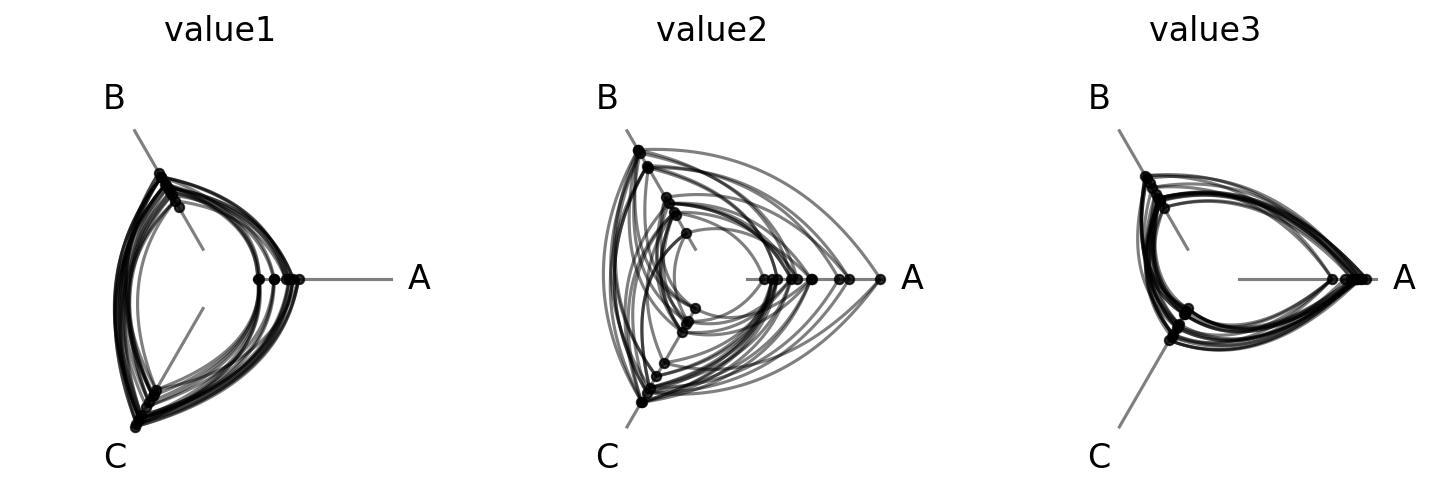
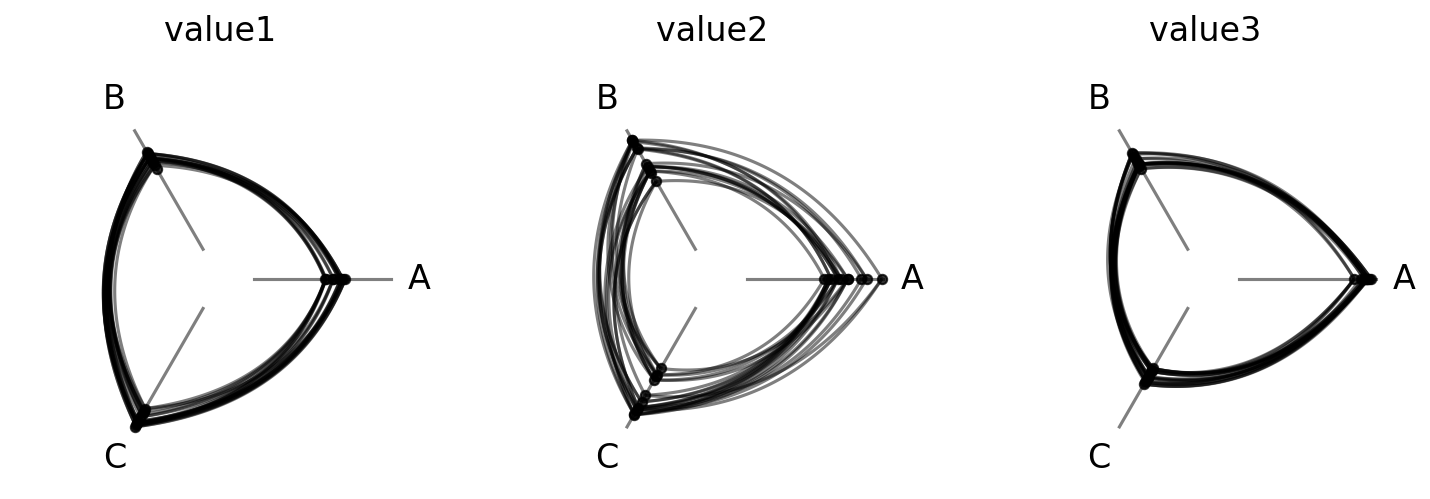
Since value1 and value3 relate to our group partition variable, these two hive plots produce clear group separation. The uncorrelated value2 produces a random spread.
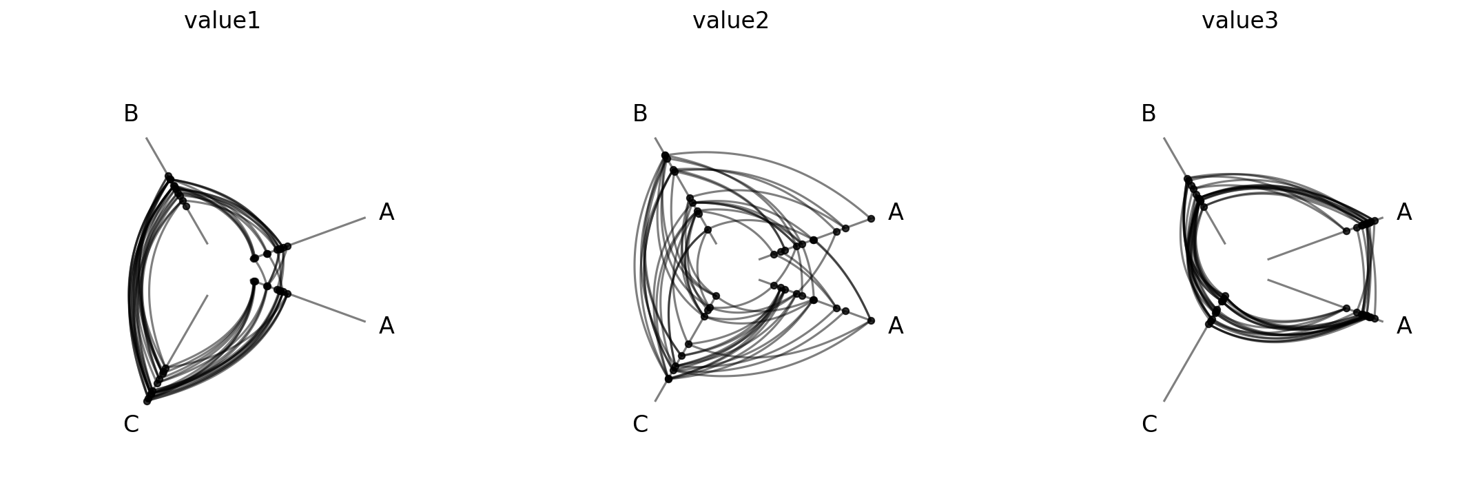
Wrapping with ncols#
For longer sweeps, ncols wraps the 1D row of cells into a 2D grid:
[8]:
hpm_wrapped = HivePlotMatrix.from_variable_sweep(
    nodes=nodes,
    edges=edges,
    partition_variable="group",
    sorting_variables_list=["value1", "value2", "value3"],
    unify_axes=True,
    ncols=2,
    progress=False,
)
fig, axes = hpm_wrapped.plot()
plt.show()
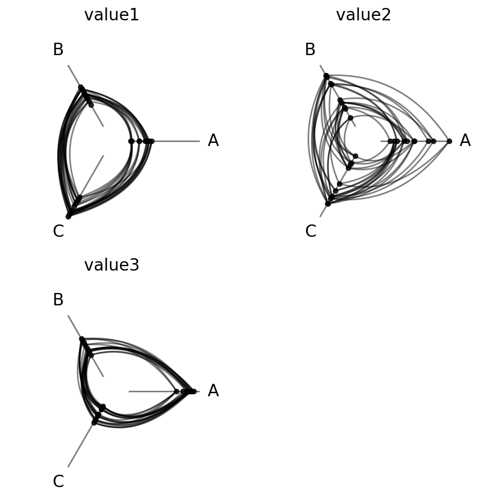
With three cells wrapping into two columns, the last position is None (empty).
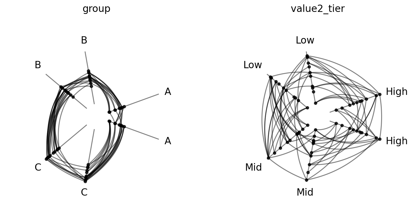
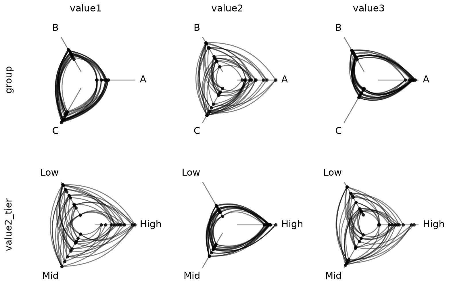
Partition Variable Sweep#
Users can set the partition_variables_list parameter to generate one hive plot per partition variable. The sorting variable stays fixed; only the assignment of nodes to axes changes:
[9]:
# create a second partition of nodes based on value2
nodes.create_partition_variable(
    data_column="value2",
    cutoffs=3,
    labels=["Low", "Mid", "High"],
    partition_variable_name="value2_tier",
)
nodes.data.head()
[9]:
| unique_id | group | value1 | value2 | value3 | value2_tier | |
|---|---|---|---|---|---|---|
| 0 | 0 | A | 2.579853 | 7.447622 | 8.894677 | High |
| 1 | 1 | A | 1.462928 | 9.675097 | 8.236987 | High |
| 2 | 2 | A | 2.861993 | 3.258254 | 8.550787 | Mid |
| 3 | 3 | A | 2.324560 | 3.704597 | 9.216663 | Mid |
| 4 | 4 | A | 0.313924 | 4.695558 | 8.782394 | Mid |
[10]:
hpm_partition = HivePlotMatrix.from_variable_sweep(
    nodes=nodes,
    edges=edges,
    sorting_variables="value1",
    partition_variables_list=["group", "value2_tier"],
    unify_axes=True,
    progress=False,
)
fig, axes = hpm_partition.plot()
plt.show()
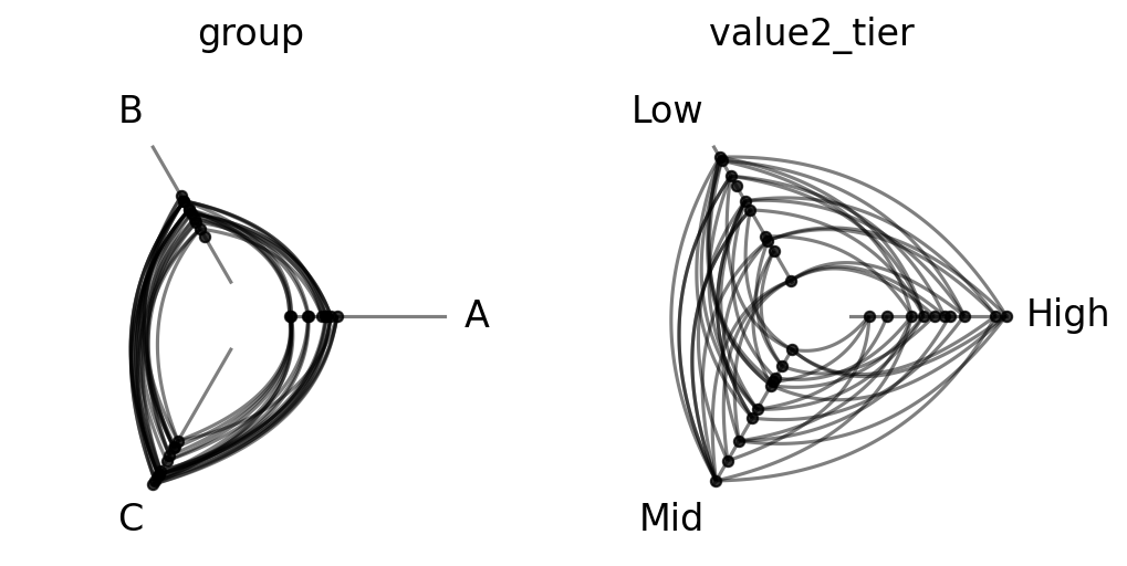
Since we’re sorting on value1 and only the group partition relates to value1, only the left hive plot has any patterns.
Partition Variable x Sorting Variable Grid Sweep#
To vary both sorting variables and partition variables at once, we simply set both the sorting_variables_list and partition_variables_list parameters at the same time.
This generates a 2D grid visualization, where each row fixes one partition variable, and each column fixes one sorting variable:
[11]:
hpm_2d = HivePlotMatrix.from_variable_sweep(
    nodes=nodes,
    edges=edges,
    sorting_variables_list=["value1", "value2", "value3"],
    partition_variables_list=["group", "value2_tier"],
    unify_axes=True,
    progress=False,
)
fig, axes = hpm_2d.plot()
plt.show()
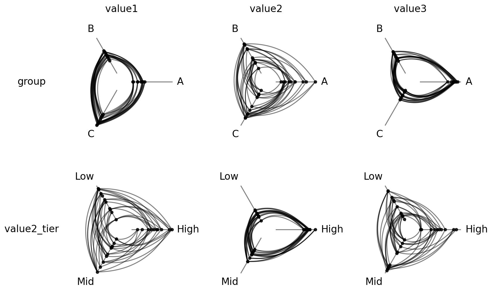
Now we can see exactly which sorting variables associate with which partition variables in our toy example.
Repeat Axes#
Repeat axes allow us to see intragroup edges (edges between nodes in the same group) in addition to intergroup edges.
Support in from_variable_sweep for repeat axes depends on whether or not we are sweeping over multiple partition variables.
Repeat Axes When Varying Only Sorting Variables#
When we’re only changing the sorting variable (i.e. partition_variables_list=None), we can set repeat axes in 2 ways:
repeat_axes=Trueadds a repeat axis for every group in every cell.We can also specify
repeat_axesas a specific axis name or a list of axis names. See the Adding Repeat Axes page for more information.
[12]:
hpm_repeat = HivePlotMatrix.from_variable_sweep(
    nodes=nodes,
    edges=edges,
    partition_variable="group",
    sorting_variables_list=["value1", "value2", "value3"],
    repeat_axes=True,  # turn on all repeat axes
    unify_axes=True,
    progress=False,
)
fig, axes = hpm_repeat.plot()
plt.show()
[13]:
hpm_repeat_single_axis = HivePlotMatrix.from_variable_sweep(
    nodes=nodes,
    edges=edges,
    partition_variable="group",
    sorting_variables_list=["value1", "value2", "value3"],
    repeat_axes="A",  # repeat axes only for axis A
    unify_axes=True,
    progress=False,
)
fig, axes = hpm_repeat_single_axis.plot()
plt.show()
Repeat Axes When Varying Partition Variables#
If we set a non-None value for partition_variables_list, we can only set repeat_axes as True or False.
[14]:
hpm_repeat_partition = HivePlotMatrix.from_variable_sweep(
    nodes=nodes,
    edges=edges,
    sorting_variables="value1",
    partition_variables_list=["group", "value2_tier"],
    unify_axes=True,
    repeat_axes=True,
    progress=False,
)
fig, axes = hpm_repeat_partition.plot()
plt.show()
We cannot set individual axes here, as the axes are different between our resulting hive plots. Non-boolean values in this case will raise a ValueError:
[15]:
import traceback

try:
    HivePlotMatrix.from_variable_sweep(
        nodes=nodes,
        edges=edges,
        sorting_variables="value1",
        partition_variables_list=["group", "value2_tier"],
        unify_axes=True,
        repeat_axes="A",
        progress=False,
    )
except ValueError:
    traceback.print_exc()
Traceback (most recent call last):
  File "/tmp/ipykernel_2709915/3428959830.py", line 4, in <module>
    HivePlotMatrix.from_variable_sweep(
  File "/home/garyk/repos/hiveplotlib/src/hiveplotlib/hiveplot_matrix.py", line 1738, in from_variable_sweep
    raise ValueError(msg)
ValueError: `repeat_axes` must be a bool (`True` or `False`) when `partition_variables_list` is provided, because each partition variable produces different axis names.
Drilling Down on a Single Hive Plot in an HPM#
We can take a copy of a hive plot cell and explore further changes without disrupting the existing HPM. For example, we can switch to an interactive Hiveplotlib-supported back end like bokeh.
[16]:
from bokeh.io import output_notebook
from bokeh.plotting import show
from bokeh.resources import INLINE

output_notebook(resources=INLINE)

sweep_hp = hpm[0, 0].copy()
sweep_hp.set_viz_backend("bokeh")
show(sweep_hp.plot())
Once we spot anomalous nodes or edges, for example, we can use the hover tool support with the bokeh back end to find the relevant node or edge IDs.
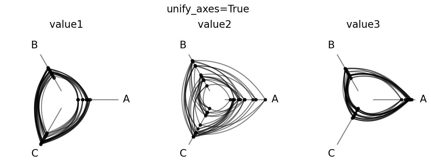
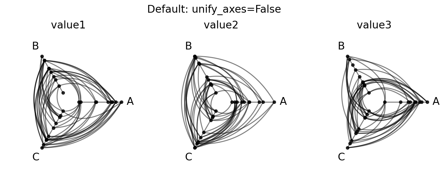
Unified Axis Scaling with unify_axes#
By default, each hive plot axis auto-scales to the data range of the nodes assigned to it by setting unify_axes=False. We do this for two reasons.
First, when sweeping over different sorting variables, these variables are likely to have different natural scales. Fixing all axes to the same range risks washing out meaningful variance of a sorting variable operating on a different order of magnitude, for example node degree and pagerank.
Second, when sweeping over different partition variables, we might be interested in relative positions of nodes across axes, not necessarily absolute positions.
When the goal is to compare node positions across sorting and / or partition variables on the exact same scale, however, unify_axes=True ensures a consistent range.
For the network relationships we’ve contrived in this toy dataset, where all variables extend the same range, this works well with unify_axes=True, hence us setting it accordingly in the above examples.
[17]:
# unified: all axes share the same global range
hpm_unified = HivePlotMatrix.from_variable_sweep(
    nodes=nodes,
    edges=edges,
    partition_variable="group",
    sorting_variables_list=["value1", "value2", "value3"],
    unify_axes=True,
    progress=False,
)
fig, axes = hpm_unified.plot()
fig.suptitle("unify_axes=True", y=1.02, size=16)
plt.show()
If we instead set unify_axes to its default False, then the node placements on each axis will span the full axis. Since our data generation only has structure as a function of the range of values but is otherwise random, we end up with hive plots that look entirely random:
[18]:
# default: each cell auto-scales to its own data range
hpm_unscaled = HivePlotMatrix.from_variable_sweep(
    nodes=nodes,
    edges=edges,
    partition_variable="group",
    sorting_variables_list=["value1", "value2", "value3"],
    progress=False,
)
fig, axes = hpm_unscaled.plot()
fig.suptitle("Default: unify_axes=False", y=1.02, size=16)
plt.show()
Set a Specific Range for Unified Axes#
To force a specific range instead of auto-computing, we can pass a dictionary with vmin and / or vmax. Missing keys are auto-computed to the global min / max of the data.
This can be helpful if there are outliers or if there are important threshold values for a given sorting variable.
[19]:
# pin vmin to -10, auto-compute vmax from the data
hpm_pinned = HivePlotMatrix.from_variable_sweep(
    nodes=nodes,
    edges=edges,
    partition_variable="group",
    sorting_variables_list=["value1", "value2", "value3"],
    unify_axes={"vmin": -10},
    progress=False,
)
fig, axes = hpm_pinned.plot()
plt.show()
Building from a NetworkX Graph#
HivePlotMatrix.from_variable_sweep accepts a NetworkX graph directly via the graph parameter as an alternative to passing the nodes and edges parameters. Note that users cannot provide both sets of parameters.
Working off the same toy dataset, we’ll use the low-level Hiveplotlib converter nodes_edges_to_networkx() to build the equivalent NetworkX graph, then pass that graph directly to HivePlotMatrix.from_variable_sweep() to reproduce the original sorting sweep.
[20]:
# build a NetworkX graph from the same toy nodes / edges
from hiveplotlib.converters import nodes_edges_to_networkx

G = nodes_edges_to_networkx(nodes=nodes, edges=edges)

hpm_from_graph = HivePlotMatrix.from_variable_sweep(
    graph=G,
    partition_variable="group",
    sorting_variables_list=["value1", "value2", "value3"],
    unify_axes=True,
    progress=False,
)
fig, axes = hpm_from_graph.plot()
plt.show()
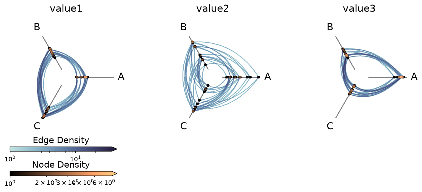
Computing Graph Metrics During Construction#
Node metrics like node degree are often useful as sorting_variables_list entries (or, after discretizing them with `NodeCollection.create_partition_variable() <create_partition_variable.ipynb>`__, as a partition_variable). Edge metrics like edge betweenness centrality can drive data-driven edge styling.
Rather than computing these metrics by hand and merging them onto our node and edge data structures, we can instead request Hiveplotlib-supported metrics directly via the node_graph_metrics and edge_graph_metrics parameters at construction time.
One natural use case in a variable sweep is to pass a list of node metrics as both node_graph_metrics and sorting_variables_list to compare hive plots laid out by graph-derived sorting variables like node degree, betweenness centrality, and PageRank side by side.
Below, we request all three node metrics for sorting and edge betweenness centrality for edge coloring in a single construction call:
[21]:
node_metric_names = ["degree", "betweenness_centrality", "pagerank"]

hpm_metrics = HivePlotMatrix.from_variable_sweep(
    nodes=nodes,
    edges=edges,
    partition_variable="group",
    sorting_variables_list=node_metric_names,  # sort by each computed metric
    node_graph_metrics=node_metric_names,  # request all three on initialization
    edge_graph_metrics="edge_betweenness_centrality",  # request an edge metric too
    unify_axes=False,  # metrics have different scales
    progress=False,
)

edge_coloring_kwargs = {
    "cmap": "cividis",
    "clim": (0, 0.06),
    "alpha": 1,
}

# data-driven edge styling must be done per hive plot
for _, _, hp in hpm_metrics.iter_populated_cells():
    hp.update_edge_plotting_keyword_arguments(
        array="edge_betweenness_centrality",
        **edge_coloring_kwargs,
    )

fig, axes = hpm_metrics.plot()

# add custom colorbar spanning the row
fig.colorbar(
    ScalarMappable(
        norm=Normalize(*edge_coloring_kwargs["clim"]),
        cmap=edge_coloring_kwargs["cmap"],
    ),
    orientation="horizontal",
    ax=axes,
    label="Edge Betweenness Centrality",
    extend="max",
    shrink=0.7,
)

plt.show()
Note that data-driven edge styling must be set on each individual hive plot, as opposed to directional edge styling, which can be set at the HPM level. We discuss directional edge styling in the next section.
Each requested metric is now a column on every populated cell’s underlying nodes:
[22]:
hpm_metrics[0, 0].nodes.data.head()
[22]:
| unique_id | group | value1 | value2 | value3 | value2_tier | degree | betweenness_centrality | pagerank | |
|---|---|---|---|---|---|---|---|---|---|
| 0 | 0 | A | 2.579853 | 7.447622 | 8.894677 | High | 3 | 0.000000 | 0.030713 |
| 1 | 1 | A | 1.462928 | 9.675097 | 8.236987 | High | 5 | 0.064226 | 0.044355 |
| 2 | 2 | A | 2.861993 | 3.258254 | 8.550787 | Mid | 9 | 0.109805 | 0.043100 |
| 3 | 3 | A | 2.324560 | 3.704597 | 9.216663 | Mid | 5 | 0.059176 | 0.027716 |
| 4 | 4 | A | 0.313924 | 4.695558 | 8.782394 | Mid | 6 | 0.048867 | 0.053304 |
Note that since these node metrics produce values on different scales, we left unify_axes=False before plotting the figure above so each cell auto-scales to its own range.
Similarly, the requested edge_betweenness_centrality metric is now a column on every populated cell’s underlying edges:
[23]:
hpm_metrics[0, 0].edges.data.head()
[23]:
| from | to | edge_betweenness_centrality | |
|---|---|---|---|
| 0 | 2 | 23 | 0.023563 |
| 1 | 19 | 13 | 0.045920 |
| 2 | 12 | 25 | 0.030632 |
| 3 | 2 | 20 | 0.009483 |
| 4 | 6 | 2 | 0.076966 |
For more information about requesting and using graph metrics, which graph metrics are available, or discretizing node graph metrics to use as partition variables, see the Computing Graph Metrics page.
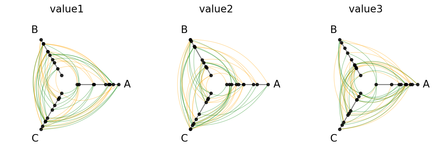
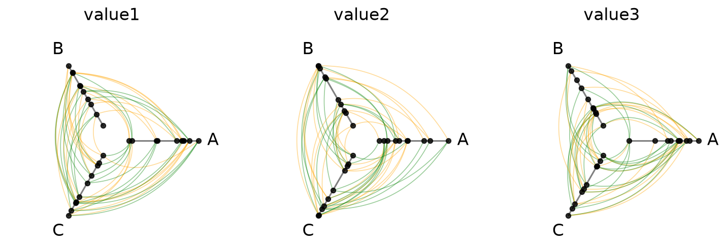
Styling Directed Edges#
If we are working with a directed network (e.g. an edge from \(i\) to \(j\) is not the same as an edge from \(j\) to \(i\)), then clockwise_edge_kwargs / counterclockwise_edge_kwargs allow us to see edges by direction:
[24]:
hpm_directed = HivePlotMatrix.from_variable_sweep(
    nodes=nodes,
    edges=edges,
    partition_variable="group",
    sorting_variables_list=["value1", "value2", "value3"],
    all_edge_kwargs={"alpha": 0.4},
    clockwise_edge_kwargs={"color": "orange", "linewidth": 0.8},
    counterclockwise_edge_kwargs={"color": "green", "linewidth": 0.8},
    progress=False,
)
fig, axes = hpm_directed.plot()
plt.show()
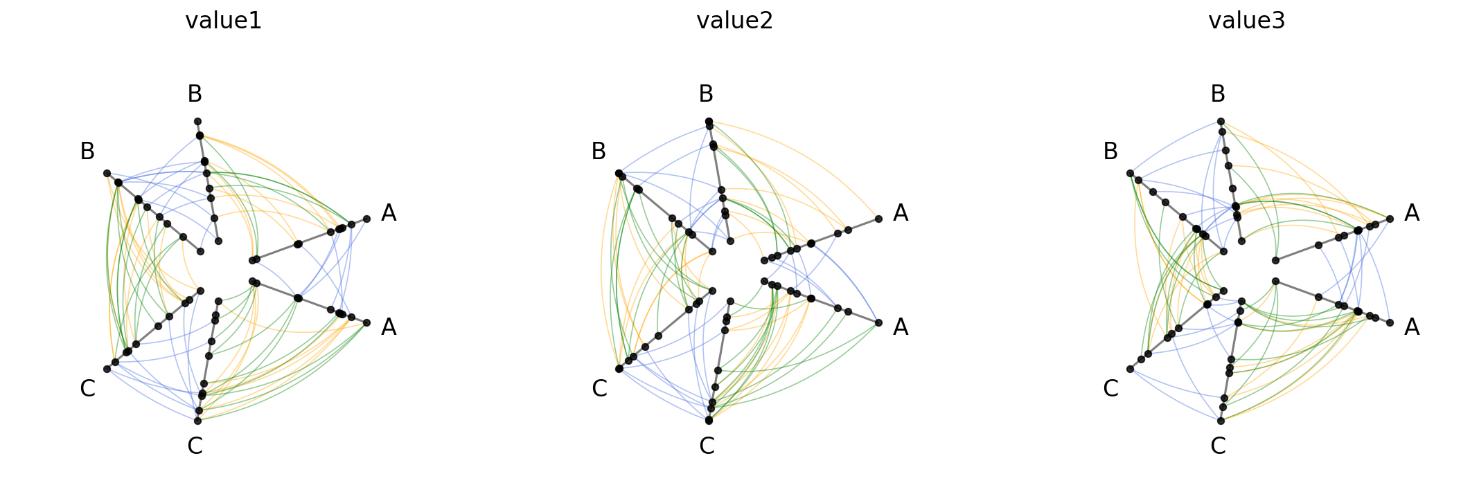
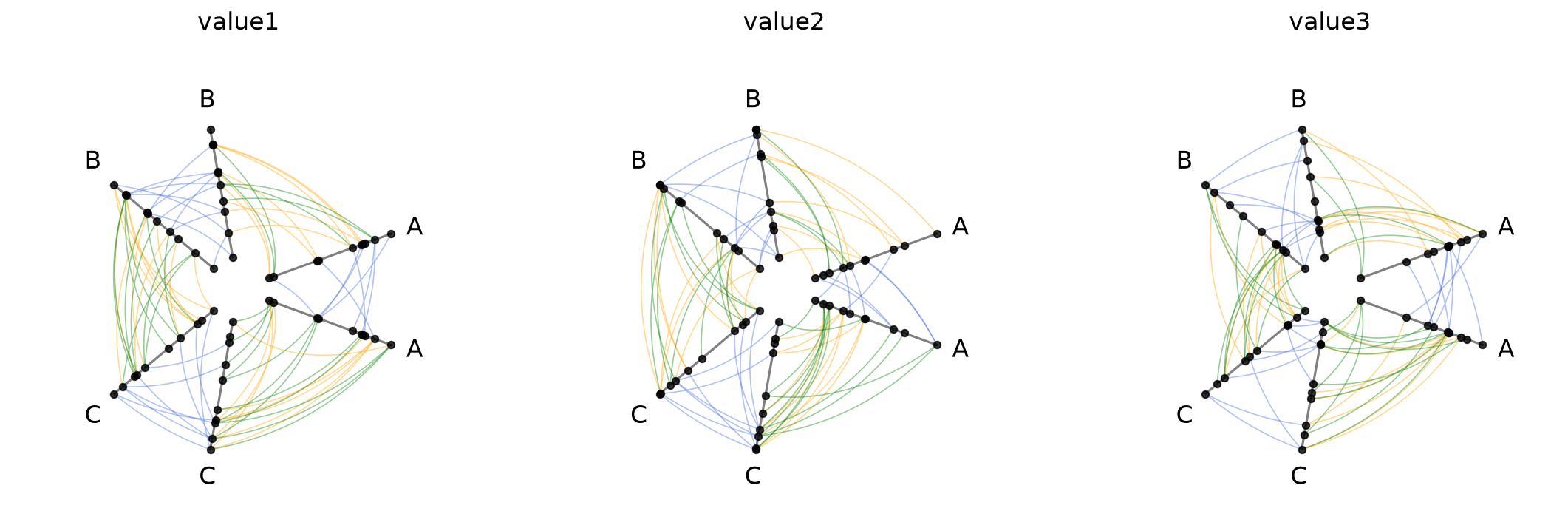
Repeat Edge Styling#
repeat_edge_kwargs targets intragroup edges, which have no meaningful directionality since both endpoints belong to the same group:
[25]:
hpm_directed_repeat = HivePlotMatrix.from_variable_sweep(
    nodes=nodes,
    edges=edges,
    partition_variable="group",
    sorting_variables_list=["value1", "value2", "value3"],
    repeat_axes=True,
    all_edge_kwargs={"alpha": 0.4},
    clockwise_edge_kwargs={"color": "orange", "linewidth": 0.8},
    counterclockwise_edge_kwargs={"color": "green", "linewidth": 0.8},
    repeat_edge_kwargs={"color": "royalblue", "linewidth": 0.8},
    progress=False,
)
fig, axes = hpm_directed_repeat.plot()
plt.show()
For more on the full hierarchy of edge kwarg options and how they take precedence, see the Changing Edge Keyword Arguments page.
Uniform Node and Edge Rendering#
node_kwargs and all_edge_kwargs apply rendering options uniformly across every cell at construction time. Node and edge kwargs can also be passed to .plot() to override them at render time.
[26]:
hpm_uniform = HivePlotMatrix.from_variable_sweep(
    nodes=nodes,
    edges=edges,
    partition_variable="group",
    sorting_variables_list=["value1", "value2", "value3"],
    node_kwargs={"s": 40, "color": "steelblue"},
    all_edge_kwargs={"color": "salmon", "alpha": 0.5},
    progress=False,
)
fig, axes = hpm_uniform.plot()
plt.show()
For more on how all_edge_kwargs interacts with more targeted overrides like clockwise_edge_kwargs and repeat_edge_kwargs, see the Changing Edge Keyword Arguments page.
Plot Options#
The plot() method accepts several keyword arguments to control figure appearance. For example, we could change the figure size:
[27]:
# figsize: override the default auto-computed size
fig, axes = hpm.plot(figsize=(6, 3))
plt.show()
Or if our row labels are too long and hitting the hive plots, we can rotate them with the row_label_rotation parameter.
[28]:
# row_label_rotation: rotate row labels
fig, axes = hpm_2d.plot(row_label_rotation=90)
plt.show()
Visualization Back Ends#
Two visualization back ends are supported with HPMs: matplotlib (default) and datashader. The back end is set at construction time via the backend parameter.
[29]:
print("Current back end:", hpm.backend)
Current back end: matplotlib
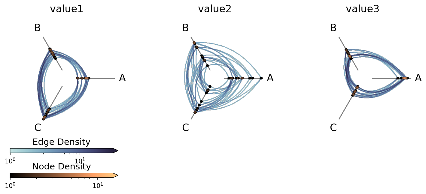
Datashader Back End#
Datashader renders rasterized density images with shared colorbars across all cells.
For more on constructing hive plots with datashader, see the Hive Plots for Large Networks and Datashader pages.
Note that while the matplotlib back end only returns the figure and axes, here the plot() call also returns the node / edge rasterizations.
[30]:
hpm_ds = HivePlotMatrix.from_variable_sweep(
    nodes=nodes,
    edges=edges,
    partition_variable="group",
    sorting_variables_list=["value1", "value2", "value3"],
    unify_axes=True,
    backend="datashader",
    progress=False,
)
# datashader plot also returns node / edge rasterizations
fig, axes, im_nodes, im_edges = hpm_ds.plot()
plt.show()
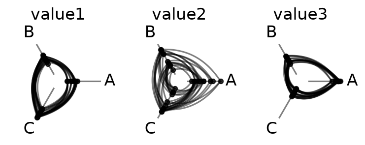
Setting Explicit Density Cutoffs with Datashader#
The node and edge density colormaps and color range will be the same for all hive plots in the HPM.
By default, the max color range for each will top out at the maximum density value over all of the hive plots.
If preferred, users can set vmax_nodes and vmax_edges to fix the shared density max across all cells to a specific level. This can be useful when one cell is much denser than the others or if users have preferred, more-interpretable cutoffs.
[31]:
fig, axes, im_nodes, im_edges = hpm_ds.plot(vmax_nodes=15, vmax_edges=30)
plt.show()

Turn Off Density Colorbars with Datashader#
Users can turn off one or both node / edge colorbars that show up by default by setting show_node_colorbar / show_edge_colorbar to False (both default to True).
[32]:
fig, axes, im_nodes, im_edges = hpm_ds.plot(
    show_node_colorbar=False,
    show_edge_colorbar=False,
)
plt.show()
For a deeper dive into other Hive Plot Matrix convenience methods, see the HivePlotMatrix Gallery Examples.