Customizing Edge Curves#
This notebook demonstrates several ways to change how one draws hive plot edges through the HivePlot.update_edges() method call.
This notebook specifically focuses on changing edges with respect to shape / orientation. For more on changing edge appearance in terms of color, width, etc., see the Changing Edge Keyword Arguments and Visualizing Edge Metadata pages.
[1]:
import matplotlib.pyplot as plt
import numpy as np
from flexitext import flexitext
from hiveplotlib.datasets import example_hive_plot
from hiveplotlib.viz import edge_viz
Short vs Long Arc#
By default, hiveplotlib draws edges between two axes using the short angle between two axes. There are, however, two ways to draw these edges, since one could draw the edges along the short angle \(\theta\) or along the long angle \(360 - \theta\).
Below, we demonstrate calling HivePlot.update_edges() modifying the default short_arc=True behavior to instead use the short_arc=False option.
[2]:
axis_kwargs = {
    "A": {
        "angle": 30,
    },
    "B": {
        "angle": 150,
    },
}

# generate example 2 axis hive plot
hp = example_hive_plot(
    labels=["A", "B"],
    cutoffs=2,
    axis_kwargs=axis_kwargs,
)

# plot both short arc and long arc
fig, axes = plt.subplots(1, 2, figsize=(10, 5))

hp.plot(
    show_axes_labels=False,
    fig=fig,
    ax=axes[0],
    color="C2",
)

axes[0].set_title("Short Arc: True", size=16)

hp.update_edges(
    partition_id_1="A",
    partition_id_2="B",
    short_arc=False,
)

hp.plot(
    show_axes_labels=False,
    fig=fig,
    ax=axes[1],
    color="C2",
)

axes[1].set_title("Short Arc: False", size=16)
plt.show()

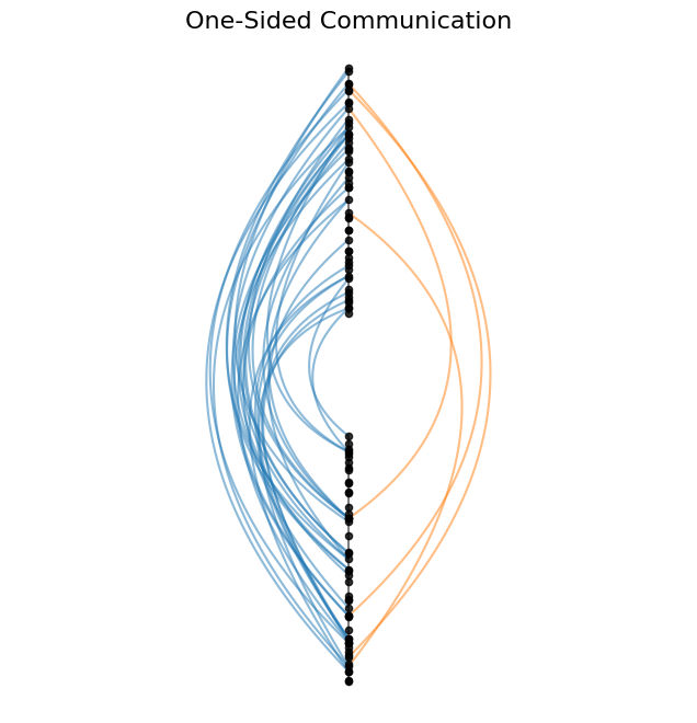
When Would One Use This?#
A simple situation when one might use short_arc=False is when the short arc and long arc are equal i.e. we have two axes 180 degrees apart.
Below, we contrive such a 2-axis example of communication between two groups. Specifically, communication is greater between the two groups in one direction relative to the other.
In our hive plot below, we use the full 360 degrees of hive plot real estate by plotting edges going from the first axis to the second axis on one side of the hive plot (short_arc=True). Edges going in the opposite direction are restricted to the other side of the hive plot (short_arc=False).
The resulting hive plot quickly and simply demonstrates the imbalance in who more frequently initiates communication between the two groups.
[3]:
# generate example hive plot with only 2 axes
hp = example_hive_plot(
    labels=["A", "B"],
    cutoffs=2,
    rotation=90,
)

# purposely subset one direction of edges to show
#  how this figure can nicely show a difference in quantity of edges by direction

# which node IDs are axis A
a_node_ids = hp.nodes.data.loc[
    hp.nodes.data.partition_0 == "A"
].unique_id.to_numpy()

# which edges start at axis A
from_a_edges = np.where(np.isin(hp.edges.data["from"], a_node_ids))[0]

# delete almost all of the edges starting at axis A
hp.edges._data[0] = hp.edges.data.drop(from_a_edges[:-5])

# rebuild hive plot with asymmetric edges
hp.build_hive_plot()
[4]:
# different arc for different direction edges
hp.update_edges(
    partition_id_1="A",
    partition_id_2="B",
    p2_to_p1=False,
    color="C1",
    short_arc=False,
)

hp.update_edges(
    partition_id_1="A",
    partition_id_2="B",
    p1_to_p2=False,
    color="C0",
    short_arc=True,
)

fig, ax = hp.plot(show_axes_labels=False, figsize=(8, 8))
ax.set_title("One-Sided Communication", size=16)

plt.show()
Move Bézier Control Point Closer to or Further from Origin#
By default, an edge in hiveplotlib is drawn between its associated start and end nodes with a Bézier curve with a single control point at the median polar coordinate of the start and end nodes. One may want to alter this curvature by shifting the control pointcloser to or further fromthe origin.
This capability can be changed via the control_rho_scale parameter in hiveplotlib.HivePlot.update_edges(). This parameter scales out (or in) the single control point for each curve relative to the origin.
A value greater than 1 will move the edges away from the origin, making them more curvy than the default edges, while a value between 0 and 1 will move the edges closer to the origin, making them less curvy than the default, and eventually concave rather than convex with a low enough value.
Below, we demonstrate calling hiveplotlib.HivePlot.update_edges() using multiple values for control_rho_scale between 0 and 2. We also include the default edges on each hive plot as a point of comparison.
[5]:
axis_kwargs = {
    "A": {
        "angle": 30,
    },
    "B": {
        "angle": 150,
    },
}

# generate example 2 axis hive plot
hp = example_hive_plot(
    labels=["A", "B"],
    cutoffs=2,
    axis_kwargs=axis_kwargs,
)


fig, axes = plt.subplots(2, 4, figsize=(12, 6))

# make default hp curves first
default_hp = hp.copy()

control_rho_scales = [0, 0.25, 0.5, 0.75, 1.25, 1.5, 1.75, 2]

for i, control_rho_scale in enumerate(control_rho_scales):
    # make a copy of hive plot to plot two sets of edges
    temp_hp = hp.copy()

    # update edge rho between our 2 axes
    temp_hp.update_edges(
        partition_id_1="A",
        partition_id_2="B",
        color="C2",  # rho-scaled edges in green
        control_rho_scale=control_rho_scale,
    )
    # plot default edges only in gray
    edge_viz(
        default_hp,
        fig=fig,
        ax=axes.flatten()[i],
        color="lightgray",  # default edges in gray
        alpha=0.5,
    )
    # plot full rho-scaled edge hive plot on top of gray edges
    temp_hp.plot(
        show_axes_labels=False,
        fig=fig,
        ax=axes.flatten()[i],
        lw=0.5,
        buffer=0.3,
        node_kwargs={"s": 3},
    )
    axes.flatten()[i].set_title(f"{control_rho_scale}", size=12)

# embed legend in the title
flexitext(
    x=0.5,
    y=1,
    s="<size:18>Changing <color:green, weight: bold>Control Rho Scale</> "
    "Relative to <color:lightgray, weight:bold>Default Scale (1)</></>",
    xycoords="figure fraction",
    ha="center",
)

fig.subplots_adjust(hspace=-0.2, wspace=-0.1)

plt.show()

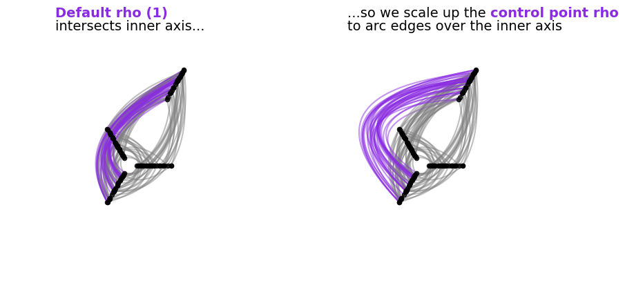
When Would One Use This?#
A situation when this capability becomes not only relevant, but necessary would be when we move to multiple layers of hive plot axes, which can cause overlapping (and therefore indistinguishable) edges when drawn with default rho values.
Below, we contrive an example of this with a standard 3-axis hive plot plus an outer axis misaligned to the angles of any of the inner axes.
We highlight in purple the edge curves that overlap other edges with the default rho value.
We then demonstrate scaling up the rho value for the purple edges. This results in the purples edges no longer traversing over an inner axis, thus allowing us to look at six pairs of edge relationships in one figure with minimal overlap.
[6]:
# generate example hive plot with four axes
#  but force one of them to the outer axis
axis_kwargs = {
    "A": {
        "angle": 0,
    },
    "B": {
        "angle": 120,
    },
    "C": {
        "angle": 240,
    },
    "D": {
        "angle": 60,  # in between A and B
        "start": 9,  # outside inner ring of axes
        "end": 13,
    },
}

hp = example_hive_plot(
    num_edges=200,
    labels=["A", "B", "C", "D"],
    cutoffs=4,
    axis_kwargs=axis_kwargs,
    all_edge_kwargs={"color": "gray"},
)

# manually fill in some connections
#  (HivePlot connects adjacent axes only)
hp.connect_axes(
    edges=hp.edges,
    axis_id_1="A",
    axis_id_2="B",
    color="gray",
)
hp.connect_axes(
    edges=hp.edges,
    axis_id_1="C",
    axis_id_2="D",
    color="blueviolet",  # highlight edges of interest
)

fig, axes = plt.subplots(1, 2, figsize=(10, 5))

hp.plot(
    fig=fig,
    ax=axes[0],
    show_axes_labels=False,
)

# update relevant edge rho
hp.update_edges(
    partition_id_1="C",
    partition_id_2="D",
    control_rho_scale=2,  # larger rho pulls edges away from center
)

hp.plot(
    fig=fig,
    ax=axes[1],
    show_axes_labels=False,
)

flexitext(
    x=0.2,
    y=1.1,
    s="<size:14><color:blueviolet, weight: bold>Default rho (1)</>"
    "\nintersects inner axis...</>",
    ax=axes[0],
)
flexitext(
    x=0.2,
    y=1.1,
    s="<size:14>...so we scale up the "
    "<color:blueviolet, weight: bold>control point rho</>"
    "\nto arc edges over the inner axis</>",
    ax=axes[1],
)

plt.show()
Shift Bézier Control Point Around Origin#
By default, an edge in hiveplotlib is drawn between its associated start and end nodes with a Bézier curve with a single control point at the median polar coordinate of the start and end nodes. One may want to alter this curvature by shifting the control pointaroundthe origin.
This capability can be changed via the control_angle_shift parameter in hiveplotlib.HivePlot.update_edges(). This parameter shifts counterclockwise the single control point for each curve.
Values greater than 0 will shift the peaks of edges counterclockwise, while values less than 0 will shift the peaks of edges clockwise.
Below, we demonstrate calling hiveplotlib.HivePlot.update_edges() using multiple values for control_angle_shift between \(-45^\circ\) and \(45^\circ\). We also include the default edges on each hive plot as a point of comparison.
[7]:
axis_kwargs = {
    "A": {
        "angle": 30,
    },
    "B": {
        "angle": 150,
    },
}

# generate example 2 axis hive plot
hp = example_hive_plot(
    labels=["A", "B"],
    cutoffs=2,
    axis_kwargs=axis_kwargs,
)


fig, axes = plt.subplots(2, 3, figsize=(12, 8))

# make default hp curves first
default_hp = hp.copy()

control_angle_shifts = [-15, -30, -45, 15, 30, 45]

for i, control_angle_shift in enumerate(control_angle_shifts):
    # make a copy of hive plot to plot two sets of edges
    temp_hp = hp.copy()

    # update edge angle between our 2 axes
    temp_hp.update_edges(
        partition_id_1="A",
        partition_id_2="B",
        color="C2",  # angle-changed edges in green
        control_angle_shift=control_angle_shift,
    )
    # plot default edges only in gray
    edge_viz(
        default_hp,
        fig=fig,
        ax=axes.flatten()[i],
        color="lightgray",  # default edges in gray
        alpha=0.5,
    )
    # plot full angle-scaled edge hive plot on top of gray edges
    temp_hp.plot(
        show_axes_labels=False,
        fig=fig,
        ax=axes.flatten()[i],
        lw=0.8,
        node_kwargs={"s": 3},
    )
    axes.flatten()[i].set_title(
        rf"${control_angle_shift}^\circ$", size=12, y=0.8
    )

# embed legend in the title
flexitext(
    x=0.5,
    y=0.85,
    s="<size:18>Changing <color:green, weight: bold>Control Angle Shift</> "
    "Relative to <color:lightgray, weight:bold>Default Angle Shift (0)</></>",
    xycoords="figure fraction",
    ha="center",
)

fig.subplots_adjust(hspace=-0.6, wspace=-0.1)

plt.show()

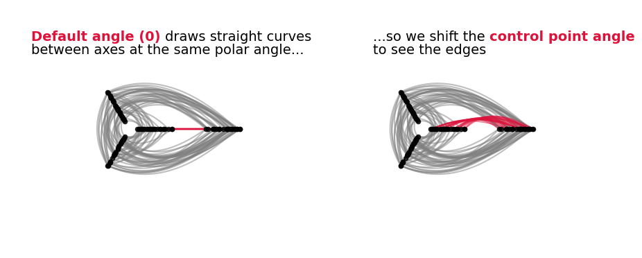
When Would One Use This?#
A situation when this capability becomes not only relevant, but necessary would be when we move to multiple layers of hive plot axes, specifically when we have two hive plot axes placed at the same angle.
Since, by default, the control point of an edge uses the mean angle of the two axes corresponding to its start and end nodes, this leads to a control point that is in line with the nodes, resulting in straight edges on top of each other that are impossible to visually disentangle.
Below, we contrive an example of this with a standard 3-axis hive plot plus an outer axis aligned with one of the inner axes.
We highlight in red the edge curves that end up being straight lines with the default control point angle value.
We then demonstrate shifting the control point angle for the red edges, allowing us to see those edges in the final visualization.
[8]:
# generate example hive plot with four axes
#  but force one of them to the outer axis
axis_kwargs = {
    "A": {
        "angle": 0,
    },
    "B": {
        "angle": 120,
    },
    "C": {
        "angle": 240,
    },
    "D": {
        "angle": 0,  # same angle as A
        "start": 9,  # outside inner ring of axes
        "end": 13,
    },
}

hp = example_hive_plot(
    num_edges=200,
    labels=["A", "B", "C", "D"],
    cutoffs=4,
    axis_kwargs=axis_kwargs,
    all_edge_kwargs={"color": "gray"},
)

# manually fill in some connections
#  (HivePlot connects adjacent axes only)
hp.connect_axes(
    edges=hp.edges,
    axis_id_1="A",
    axis_id_2="B",
    color="gray",
)
hp.connect_axes(
    edges=hp.edges,
    axis_id_1="C",
    axis_id_2="D",
    color="gray",
)

# highlight edges of interest
hp.update_edges(
    partition_id_1="A",
    partition_id_2="D",
    color="crimson",
)

fig, axes = plt.subplots(1, 2, figsize=(10, 5))

hp.plot(
    fig=fig,
    ax=axes[0],
    show_axes_labels=False,
)

# update relevant edge angle
hp.update_edges(
    partition_id_1="A",
    partition_id_2="D",
    control_angle_shift=20,  # angle pulls edges ccw
    zorder=3,  # make sure these edges are on top
)

hp.plot(
    fig=fig,
    ax=axes[1],
    show_axes_labels=False,
)

flexitext(
    x=0.1,
    y=0.85,
    s="<size:14><color:crimson, weight: bold>Default angle (0) </>"
    "draws straight curves\nbetween axes at the same polar angle...</>",
    ax=axes[0],
)
flexitext(
    x=0.3,
    y=0.85,
    s="<size:14>...so we shift the "
    "<color:crimson, weight: bold>control point angle</>"
    "\nto see the edges</>",
    ax=axes[1],
)

plt.show()