

Datashader#
This notebook discusses how to use the HivePlot class with the datashader visualization back end.
This back end is noticeably different than the other Hiveplotlib visualization back ends, specifically designed for supporting the visualization of larger networks. This is done via a rasterization of the nodes / edges into a single 2d array before plotting.
We encourage users to review the Hive Plots for Large Networks tutorial before working with the datashader back end. For further reading, we recommend the excellent documentation for the Datashader package.
Note: the datashader viz back end requires that Hiveplotlib be installed with extra packages, which can be done by running:
pip install hiveplotlib[datashader]
[1]:
import matplotlib.pyplot as plt
from hiveplotlib import Edges, HivePlot, NodeCollection
from hiveplotlib.datasets import (
    example_edges,
    example_hive_plot,
    example_node_collection,
)
Change Plotting Kwargs For Nodes, Edges, and Axes#
By default, Hiveplotlib viz standardizes sizes that should cover most users’ needs. With the datashader back end, axes are default black, but nodes and edges are each plotted according to their own colormaps.
Nodes are by default plotted with an orange colormap (the matplotlib colormap copper). Edges are by default plotted with a blue colormap (a seaborn colormap similar to the matplotlib "Blues" colormap). These colormaps are by default plotted with a log scale.
[2]:
# using larger number of nodes + edges than other viz back end demos
hp = example_hive_plot(
    num_nodes=1000,
    num_edges=5000,
    backend="datashader",
)

fig, ax, im_nodes, im_edges = hp.plot()

ax.set_title("Base Datashader Hive Plot Viz", size=16)

cax_edges = ax.inset_axes([0.85, 0.25, 0.2, 0.01], transform=ax.transAxes)
cb_edges = fig.colorbar(
    im_edges, ax=ax, cax=cax_edges, orientation="horizontal"
)
cb_edges.ax.set_title("Edge Density")

cax_nodes = ax.inset_axes([0.85, 0.15, 0.2, 0.01], transform=ax.transAxes)
cb_nodes = fig.colorbar(
    im_nodes, ax=ax, cax=cax_nodes, orientation="horizontal"
)
cb_nodes.ax.set_title("Node Density")

plt.show()

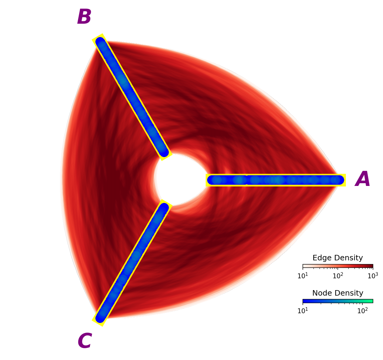
All of these defaults, however, can be modified. Below, we modify every color and size to serve as a reference for how to change these defaults with the datashader back end:
[3]:
fig, ax, im_nodes, im_edges = hp.plot(
    # node kwarg changes
    cmap_nodes="winter",  # different node colormap
    vmin_nodes=10,  # node cmap min val
    vmax_nodes=150,  # node cmap max val
    pixel_spread_nodes=15,  # larger values => larger nodes
    # axes label kwarg changes
    axes_labels_fontsize=32,
    text_kwargs={
        "color": "purple",
        "weight": "bold",
        "style": "italic",
    },
    # axes kwarg changes
    axes_kwargs={
        "linewidth": 20,
        "color": "yellow",
        "alpha": 0.9,
    },
    # edge kwarg changes
    cmap_edges="Reds",  # different edge colormap
    vmin_edges=10,  # edge cmap min val
    vmax_edges=1000,  # edge cmap max val
    pixel_spread_edges=7,  # larger values => wider edges
)

cax_edges = ax.inset_axes([0.85, 0.25, 0.2, 0.01], transform=ax.transAxes)
cb_edges = fig.colorbar(
    im_edges, ax=ax, cax=cax_edges, orientation="horizontal"
)
cb_edges.ax.set_title("Edge Density")

cax_nodes = ax.inset_axes([0.85, 0.15, 0.2, 0.01], transform=ax.transAxes)
cb_nodes = fig.colorbar(
    im_nodes, ax=ax, cax=cax_nodes, orientation="horizontal"
)
cb_nodes.ax.set_title("Node Density")

plt.show()
Different Node and Edge Kwargs#
The datashader back end does not support passing the same node_kwargs as before:
[4]:
import traceback

try:
    hp.plot(
        # how we change node color with other back ends
        node_kwargs={"color": "blue"},
    )
except AttributeError:
    traceback.print_exc()
    # close empty figure
    plt.close()
Traceback (most recent call last):
  File "/tmp/ipykernel_1890995/1074246582.py", line 4, in <module>
    hp.plot(
  File "/home/garyk/repos/hiveplotlib/src/hiveplotlib/hiveplot.py", line 4559, in plot
    return hive_plot_viz(self, **kwargs)
           ^^^^^^^^^^^^^^^^^^^^^^^^^^^^^
  File "/home/garyk/repos/hiveplotlib/src/hiveplotlib/viz/datashader.py", line 615, in datashade_hive_plot_mpl
    fig, ax, im_nodes = datashade_nodes_mpl(
                        ^^^^^^^^^^^^^^^^^^^^
  File "/home/garyk/repos/hiveplotlib/src/hiveplotlib/viz/datashader.py", line 434, in datashade_nodes_mpl
    im = ax.imshow(
         ^^^^^^^^^^
  File "/home/garyk/repos/hiveplotlib/.venv/lib/python3.12/site-packages/matplotlib/__init__.py", line 1528, in inner
    return func(
           ^^^^^
  File "/home/garyk/repos/hiveplotlib/.venv/lib/python3.12/site-packages/matplotlib/axes/_axes.py", line 6363, in imshow
    im = mimage.AxesImage(self, cmap=cmap, norm=norm, colorizer=colorizer,
         ^^^^^^^^^^^^^^^^^^^^^^^^^^^^^^^^^^^^^^^^^^^^^^^^^^^^^^^^^^^^^^^^^
  File "/home/garyk/repos/hiveplotlib/.venv/lib/python3.12/site-packages/matplotlib/image.py", line 908, in __init__
    super().__init__(
  File "/home/garyk/repos/hiveplotlib/.venv/lib/python3.12/site-packages/matplotlib/image.py", line 290, in __init__
    self._internal_update(kwargs)
  File "/home/garyk/repos/hiveplotlib/.venv/lib/python3.12/site-packages/matplotlib/artist.py", line 1313, in _internal_update
    return self._update_props(
           ^^^^^^^^^^^^^^^^^^^
  File "/home/garyk/repos/hiveplotlib/.venv/lib/python3.12/site-packages/matplotlib/artist.py", line 1271, in _update_props
    raise AttributeError(
AttributeError: AxesImage.set() got an unexpected keyword argument 'color'
Furthermore, we cannot pass the same edge kwargs as we did with other back ends:
[5]:
try:
    hp.plot(
        color="red"  # how we change edge color with other back ends
    )
except AttributeError:
    traceback.print_exc()
    # close empty figure
    plt.close()
Traceback (most recent call last):
  File "/tmp/ipykernel_1890995/4048787081.py", line 2, in <module>
    hp.plot(
  File "/home/garyk/repos/hiveplotlib/src/hiveplotlib/hiveplot.py", line 4559, in plot
    return hive_plot_viz(self, **kwargs)
           ^^^^^^^^^^^^^^^^^^^^^^^^^^^^^
  File "/home/garyk/repos/hiveplotlib/src/hiveplotlib/viz/datashader.py", line 583, in datashade_hive_plot_mpl
    fig, ax, im_edges = datashade_edges_mpl(
                        ^^^^^^^^^^^^^^^^^^^^
  File "/home/garyk/repos/hiveplotlib/src/hiveplotlib/viz/datashader.py", line 261, in datashade_edges_mpl
    im = ax.imshow(
         ^^^^^^^^^^
  File "/home/garyk/repos/hiveplotlib/.venv/lib/python3.12/site-packages/matplotlib/__init__.py", line 1528, in inner
    return func(
           ^^^^^
  File "/home/garyk/repos/hiveplotlib/.venv/lib/python3.12/site-packages/matplotlib/axes/_axes.py", line 6363, in imshow
    im = mimage.AxesImage(self, cmap=cmap, norm=norm, colorizer=colorizer,
         ^^^^^^^^^^^^^^^^^^^^^^^^^^^^^^^^^^^^^^^^^^^^^^^^^^^^^^^^^^^^^^^^^
  File "/home/garyk/repos/hiveplotlib/.venv/lib/python3.12/site-packages/matplotlib/image.py", line 908, in __init__
    super().__init__(
  File "/home/garyk/repos/hiveplotlib/.venv/lib/python3.12/site-packages/matplotlib/image.py", line 290, in __init__
    self._internal_update(kwargs)
  File "/home/garyk/repos/hiveplotlib/.venv/lib/python3.12/site-packages/matplotlib/artist.py", line 1313, in _internal_update
    return self._update_props(
           ^^^^^^^^^^^^^^^^^^^
  File "/home/garyk/repos/hiveplotlib/.venv/lib/python3.12/site-packages/matplotlib/artist.py", line 1271, in _update_props
    raise AttributeError(
AttributeError: AxesImage.set() got an unexpected keyword argument 'color'
This is because we are rasterizing our nodes and edges into images, plotted with an underlying plt.imshow() call.
We can still provide kwargs for an imshow call though.
Mirroring the experience with other back ends, users can still provide a node_kwargs dictionary input to the plot() call to modify solely the node image:
[6]:
hp.plot(node_kwargs={"alpha": 0.2});
and for edge kwargs, these can be provided directly to the plot() call:
[7]:
hp.plot(alpha=0.2);
Remember not to add kwargs that clash with related parameters exposed elsewhere, i.e. the cmap_nodes / cmap_edges, vmin_nodes / vmin_edges, and vmax_nodes / vmax_edges parameters in the underlying hiveplotlib.viz.datashader.datashade_hive_plot_mpl call:
[8]:
try:
    hp.plot(
        cmap="viridis",  # clashes with `cmap_edges`
    )
except TypeError:
    traceback.print_exc()
    # close empty figure
    plt.close()
Traceback (most recent call last):
  File "/tmp/ipykernel_1890995/3613260550.py", line 2, in <module>
    hp.plot(
  File "/home/garyk/repos/hiveplotlib/src/hiveplotlib/hiveplot.py", line 4559, in plot
    return hive_plot_viz(self, **kwargs)
           ^^^^^^^^^^^^^^^^^^^^^^^^^^^^^
  File "/home/garyk/repos/hiveplotlib/src/hiveplotlib/viz/datashader.py", line 583, in datashade_hive_plot_mpl
    fig, ax, im_edges = datashade_edges_mpl(
                        ^^^^^^^^^^^^^^^^^^^^
TypeError: hiveplotlib.viz.datashader.datashade_edges_mpl() got multiple values for keyword argument 'cmap'
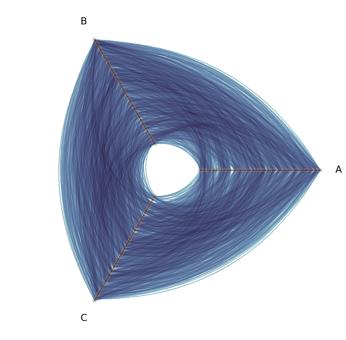
Multiple Tags of Edge Data#
For other visualization back ends, Hiveplotlib supports plotting Multiple Tags of Edge Data on a single hive plot by default:
[9]:
# generate all nodes for a standard 3 axis hive plot
nodes = example_node_collection(num_nodes=1000)
nodes.create_partition_variable(
    data_column="low",
    labels=["A", "B", "C"],
)

# build out multi tag edge data
edge_data = {}

# get subsets of edges each restricted to one pair of axes
for axis_to_skip in ["A", "B", "C"]:
    subset_df = nodes.data[nodes.data.partition_0 != axis_to_skip]

    subset_nodes = NodeCollection(
        data=subset_df,
        unique_id_column=nodes.unique_id_column,
    )

    subset_edges = example_edges(
        nodes=subset_nodes,
        num_edges=2500,
    )
    edge_data[f"Not {axis_to_skip}"] = subset_edges.data

edges = Edges(data=edge_data)

hp = HivePlot(
    nodes=nodes,
    edges=edges,
    partition_variable="partition_0",
    sorting_variables="low",
)

# color each tag of edges
edge_kwargs = {
    "Not A": {"color": "purple"},
    "Not B": {"color": "blue"},
    "Not C": {"color": "green"},
}

for k in edge_kwargs:
    # propagate specific kwargs to specific tags of edges
    hp.edges.update_edge_viz_kwargs(tag=k, **edge_kwargs[k])

# plot all tags of data in one `plot()` call
fig, ax = hp.plot()
ax.set_title(
    "All tags plot at once\nBut oversaturation issues without datashader",
    ha="left",
    x=0.2,
    size=16,
)
plt.show()
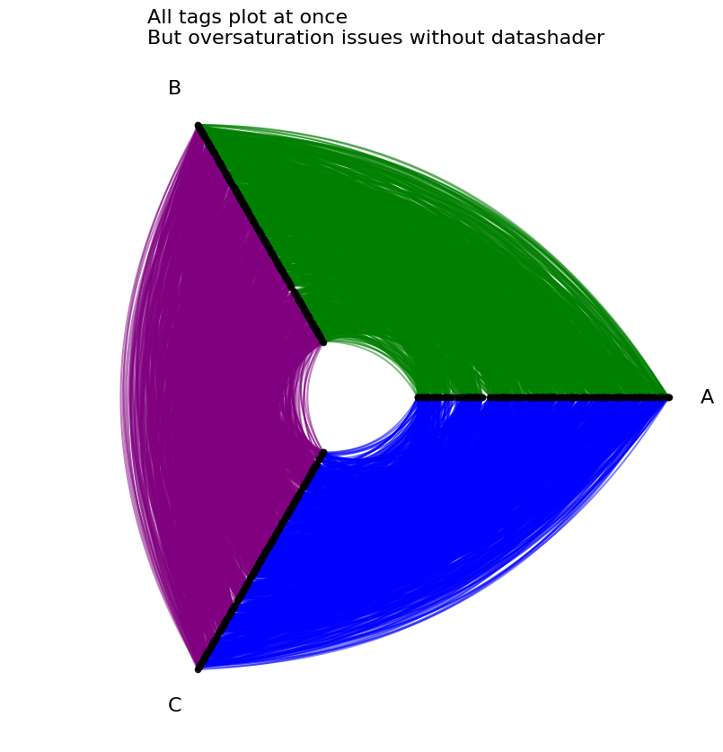
When scaling up to a large number of edges with the datashader back end, however, the rasterization of each tag of edge data all but guarantees that one tag of plotted edges occludes the other.
For a more detailed example and discussion of multi-tag edge occlusion in large networks, see the Comparing Network Subgroups tutorial.
To lower the risk of unintended edge occlusion, when plotting multi-tag edge data with the datashader back end, users must specify a single tag=<tag name> in their plot() call.
[10]:
hp = HivePlot(
    nodes=nodes,
    edges=edges,
    partition_variable="partition_0",
    sorting_variables="low",
    backend="datashader",
)

fig, axes = plt.subplots(
    1,
    3,
    figsize=(9, 3),
    dpi=300,  # higher dpi to see more nuance on smaller hive plots
)
for axis_to_skip, ax, cmap in zip(
    ["A", "B", "C"],
    axes.flatten(),
    ["Greens", "Blues", "Purples"],
    strict=True,
):
    hp.plot(
        tag=f"Not {axis_to_skip}",  # must specify tag to plot
        fig=fig,
        ax=ax,
        cmap_edges=cmap,
    )
    ax.set_title(f"Not {axis_to_skip}", size=16, y=1.1)
plt.show()

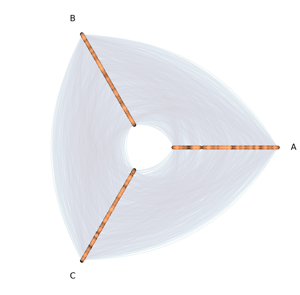
Otherwise, a single tag will be chosen and a warning will be raised:
[11]:
hp.plot();
/home/garyk/repos/hiveplotlib/src/hiveplotlib/viz/datashader.py:583: UserWarning: Multiple tags detected between edges. Only plotting tag Not A
  fig, ax, im_edges = datashade_edges_mpl(

If we have no occlusion issues (as we have contrived in the above example), however, then we can manually plot multiple tags of edge data on a single hive plot visualization:
[12]:
# plot first tag the usual way
fig, ax, _, _ = hp.plot(
    tag="Not A",
    cmap_edges="Greens",
)

# plot follow up tags on same fig, ax
hp.plot(
    tag="Not B",
    cmap_edges="Blues",
    fig=fig,
    ax=ax,
)

hp.plot(
    tag="Not C",
    cmap_edges="Purples",
    fig=fig,
    ax=ax,
)

plt.show()

We encourage users to always start with small multiples (one tag per hive plot) when visualizing multiple tags of edge data for large networks.
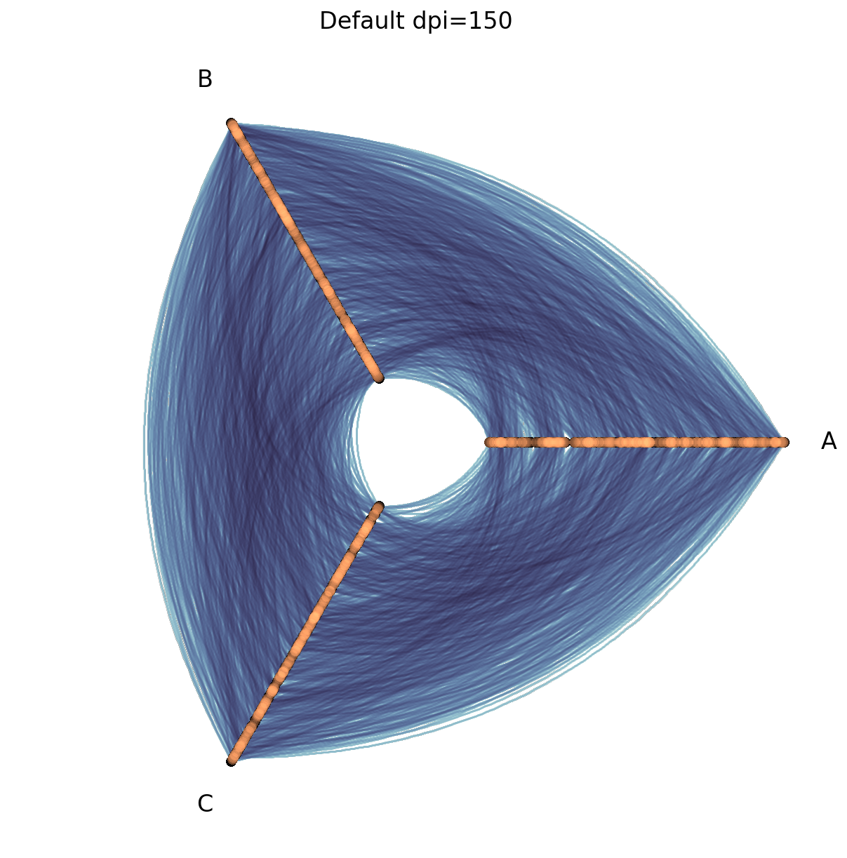
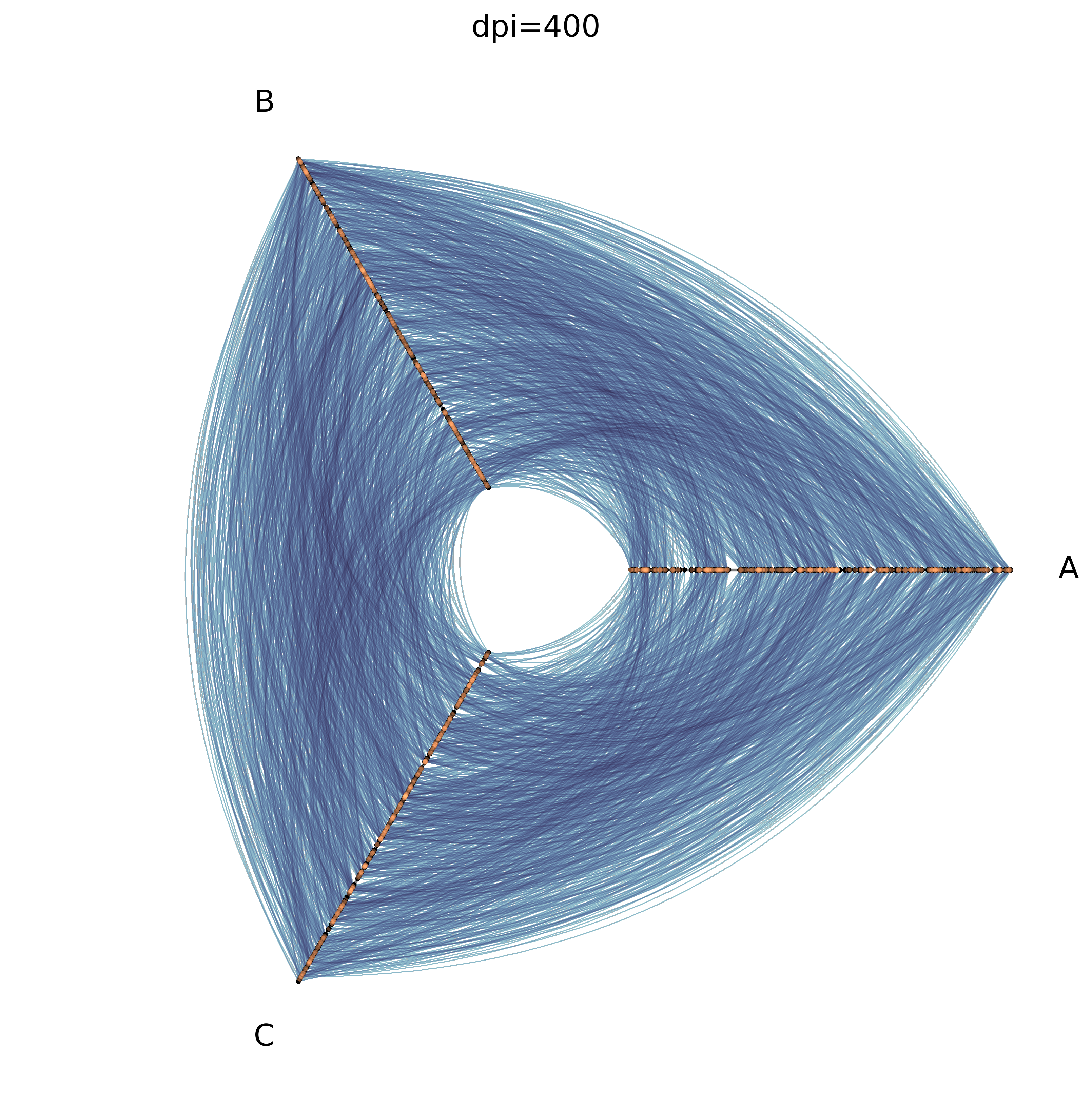
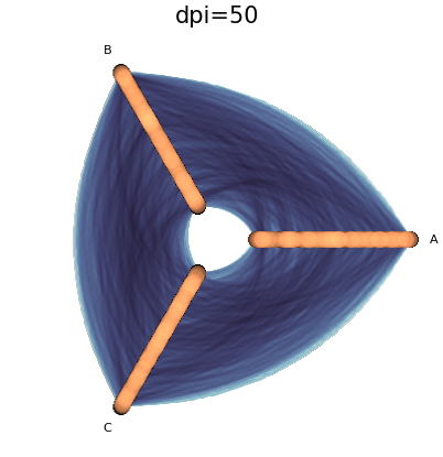
Changing DPI Parameter#
The DPI (dots per inch) parameter for matplotlib figures greatly affects the resulting hive plot visualization when using the datashader back end.
A higher dpi value creates a more granular rasterization (more bins), which can show more detail, whereas a lower dpi creates a less refined rasterization (less bins).
Higher dpi (more bins), however, takes longer to compute, while lower dpi runs faster.
By default, the datashader back end plots with dpi=150.
Lowering dpi is an excellent way to quickly explore multiple hive plot visualizations of large networks, but we recommend returning to a higher dpi value before making your final visualization.
[13]:
hp = example_hive_plot(
    num_nodes=1000,
    num_edges=5000,
    backend="datashader",
)
[14]:
%%time
fig, ax, _, _ = hp.plot()
ax.set_title("Default dpi=150", size=16)
plt.show()
CPU times: user 543 ms, sys: 153 ms, total: 696 ms
Wall time: 695 ms
[15]:
%%time
dpi = 400

fig, ax, _, _ = hp.plot(dpi=dpi)
ax.set_title(f"dpi={dpi}", size=16)
plt.show()
CPU times: user 3.64 s, sys: 1.44 s, total: 5.08 s
Wall time: 5.09 s
[16]:
%%time
dpi = 50

fig, ax, _, _ = hp.plot(dpi=dpi)
ax.set_title(f"dpi={dpi}", size=30)
plt.show()
CPU times: user 113 ms, sys: 792 μs, total: 114 ms
Wall time: 113 ms
Note that this lower dpi visualization resulted in fatter nodes and edges. This is because the pixel_spread_nodes and pixel_spread_edges parameters were left unchanged, and the resulting rasterizations (images) now have less pixels. More on this in the next section.
Experimenting with Pixel Spread Parameters#
For fixed dpi, we can increase the size of nodes / width of edges by increasing the value for the pixel_spread_nodes / pixel_spread_edges parameter.
Let’s first set up an example hive plot visualization with default pixel spread parameters as a reference:
[17]:
hp = example_hive_plot(
    num_nodes=1000,
    num_edges=5000,
    backend="datashader",
)
hp.plot();
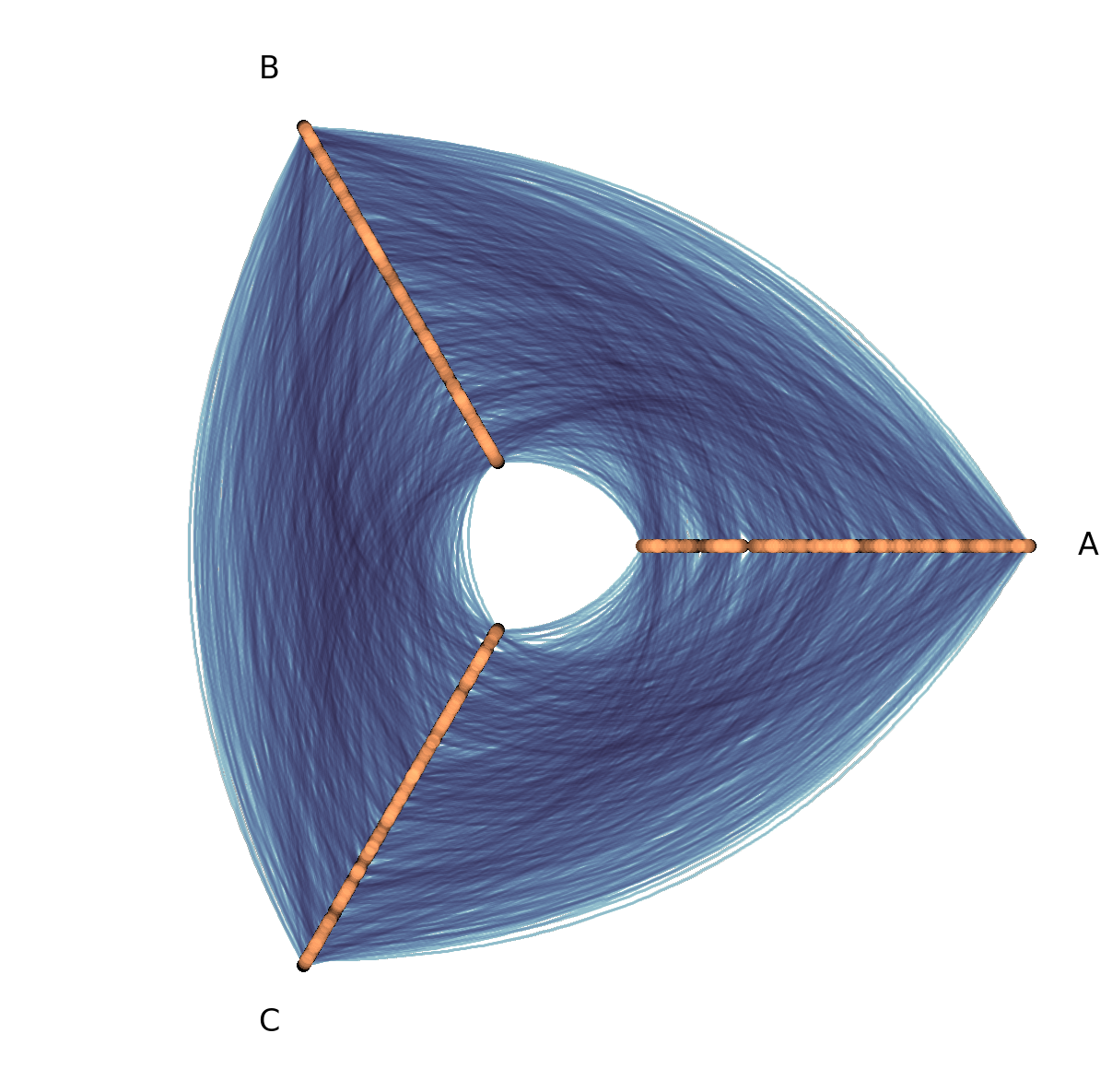
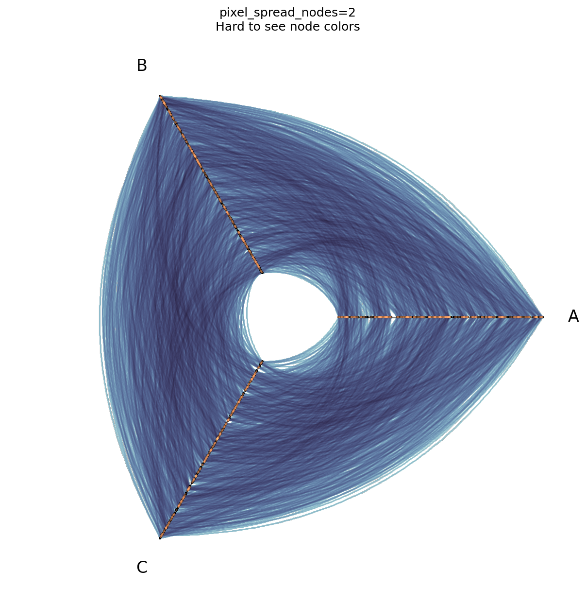
By default, pixel_spread_nodes is set to 7. This allows us to see the nodes as solid points and visually distinguish node color, which would be harder if we make the pixel spread too small.
[18]:
fig, ax, _, _ = hp.plot(
    pixel_spread_nodes=2,  # lower than default 7
)
ax.set_title("pixel_spread_nodes=2\nHard to see node colors")
plt.show()
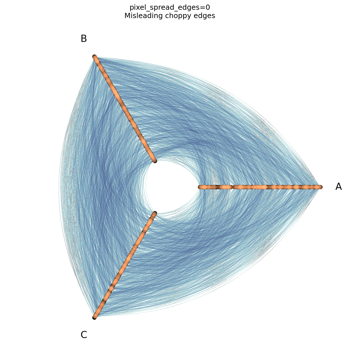
By default, pixel_spread_edges is set to 1. For more on why we set a non-zero pixel_spread_edges, see this discussion from the Hive Plots for Large Networks Tutorial (in short, the edges otherwise show up choppy).
[19]:
fig, ax, _, _ = hp.plot(
    pixel_spread_edges=0,  # lower than default 1
)
ax.set_title("pixel_spread_edges=0\nMisleading choppy edges")
plt.show()
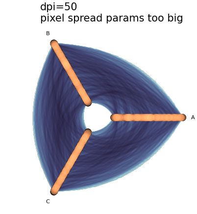
Balancing Pixel Spread and DPI#
As discussed briefly in the DPI section above, when we decrease the raster size (via lower dpi values), we are effectively increasing the pixel spread parameters, at least in how they will appear in the final visualization.
Thus, when we choose noticeably higher or lower dpi values relative to the default dpi=150, we will likely want to adjust one or both of our pixel spread parameters to keep the final visualization in balance.
Below, we borrow the dpi=50 example from the DPI section above, and balance out its pixel spread parameters as needed:
[20]:
dpi = 50

fig, ax, _, _ = hp.plot(dpi=dpi)
ax.set_title(
    f"dpi={dpi}\npixel spread params too big",
    size=30,
    ha="left",
    x=0.2,
)
plt.show()
[21]:
dpi = 50

fig, ax, _, _ = hp.plot(
    dpi=dpi,
    pixel_spread_nodes=5,  # lower than default
    pixel_spread_edges=0,  # lower than default
)
ax.set_title(
    f"dpi={dpi}, pixel_spread_edges=0\n"
    "Lowered pixel spread values\n"
    "Some edge choppiness",
    size=30,
    ha="left",
    x=0.2,
)
plt.show()
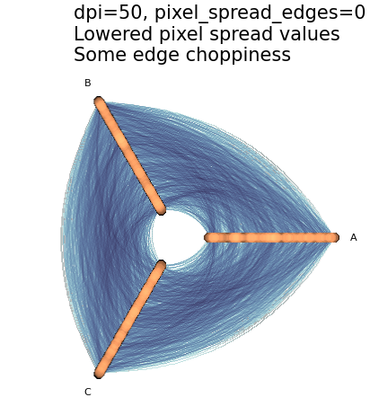
By lowering dpi and our pixel spread parameters, we fixed the blurriness while exploiting the faster rendering.
In this example, however, by going all the way down to pixel_spread_edges=0, we introduced some of the choppiness discussed above.
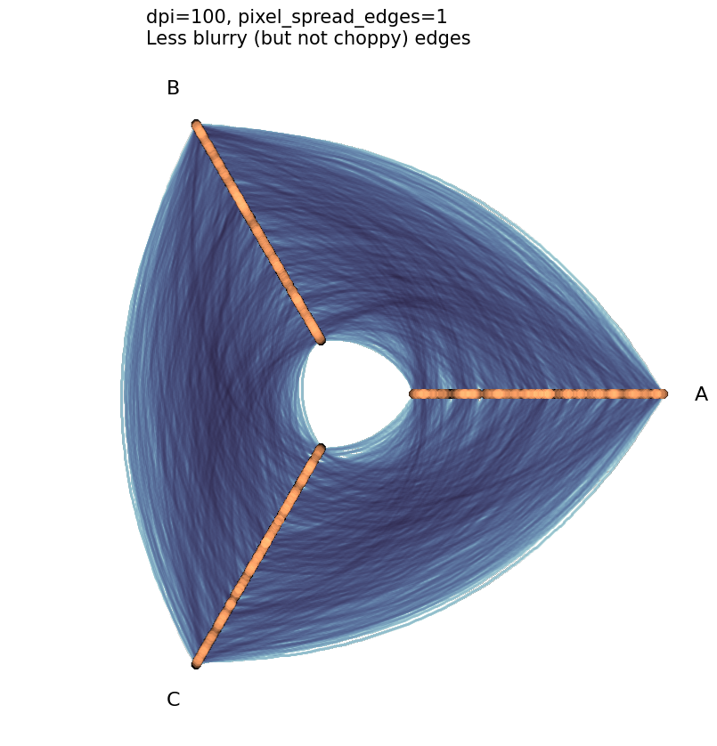
Since pixel_spread_edges can only be a non-negative integer (0, 1, 2, …), the only way we can split the difference here between choppiness and blurriness is to set pixel_spread_edges=1 (to eliminate choppiness) and set the dpi parameter to a value in between 50 and 150 (to mitigate the blurriness).
[22]:
dpi = 100  # bump up DPI since edges are blurry but can't lower spread without choppiness

fig, ax, _, _ = hp.plot(
    dpi=dpi,
    pixel_spread_nodes=5,  # lower than default
    pixel_spread_edges=1,  # as low as it can go without choppiness
)
ax.set_title(
    f"dpi={dpi}, pixel_spread_edges=1\nLess blurry (but not choppy) edges",
    size=15,
    ha="left",
    x=0.2,
)
plt.show()
The Importance of Fixing Parameters When Comparing Multiple Datashaded Plots#
When visualizing hive plots with the datashader back end and plotting node / edge density (the default behavior), we need to mind the fact that changing either of our pixel spread parameters and / or dpi will disrupt our density measures.
Note that by changing the pixel spread parameters below, for example, we slightly shifted the colormap ranges:
[23]:
# using larger number of nodes + edges than other viz back end demos
hp = example_hive_plot(
    num_nodes=1000,
    num_edges=5000,
    backend="datashader",
)

# plot with default values
fig, ax, im_nodes, im_edges = hp.plot()

ax.set_title("Base Datashader Hive Plot Viz", size=16)

cax_edges = ax.inset_axes([0.85, 0.25, 0.2, 0.01], transform=ax.transAxes)
cb_edges = fig.colorbar(
    im_edges, ax=ax, cax=cax_edges, orientation="horizontal"
)
cb_edges.ax.set_title("Edge Density")

cax_nodes = ax.inset_axes([0.85, 0.15, 0.2, 0.01], transform=ax.transAxes)
cb_nodes = fig.colorbar(
    im_nodes, ax=ax, cax=cax_nodes, orientation="horizontal"
)
cb_nodes.ax.set_title("Node Density")

plt.show()
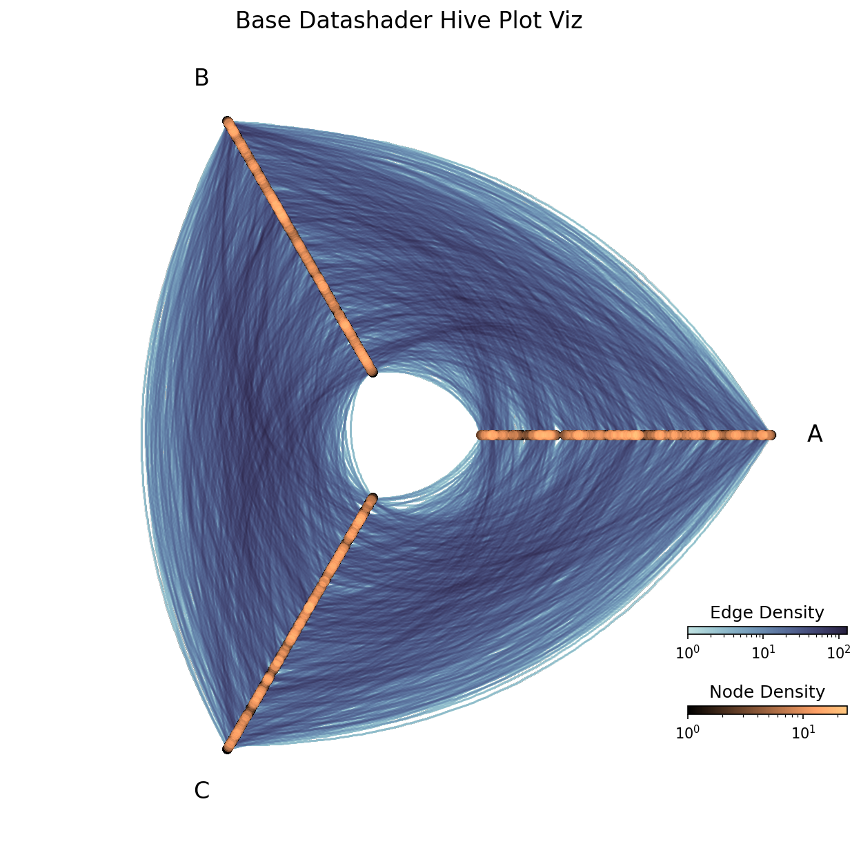
[24]:
print(f"Range of Node Rasterization Values: {im_nodes.get_clim()}")
print(f"Range of Edge Rasterization Values: {im_edges.get_clim()}")
Range of Node Rasterization Values: (1.0, 23.0)
Range of Edge Rasterization Values: (1.0, 145.0)
[25]:
fig, ax, im_nodes, im_edges = hp.plot(
    pixel_spread_nodes=10,  # higher than default
    pixel_spread_edges=2,  # higher than default
)

ax.set_title("Higher Pixel Spreads => Higher Counts", size=16)

cax_edges = ax.inset_axes([0.85, 0.25, 0.2, 0.01], transform=ax.transAxes)
cb_edges = fig.colorbar(
    im_edges, ax=ax, cax=cax_edges, orientation="horizontal"
)
cb_edges.ax.set_title("Edge Density")

cax_nodes = ax.inset_axes([0.85, 0.15, 0.2, 0.01], transform=ax.transAxes)
cb_nodes = fig.colorbar(
    im_nodes, ax=ax, cax=cax_nodes, orientation="horizontal"
)
cb_nodes.ax.set_title("Node Density")

plt.show()
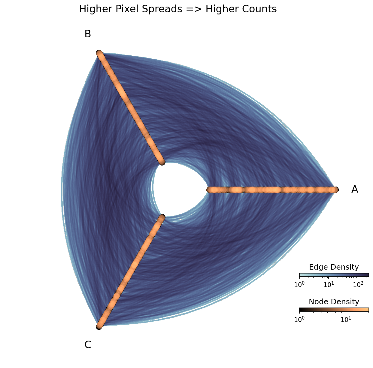
[26]:
print(f"Range of Node Rasterization Values: {im_nodes.get_clim()}")
print(f"Range of Edge Rasterization Values: {im_edges.get_clim()}")
Range of Node Rasterization Values: (1.0, 31)
Range of Edge Rasterization Values: (1.0, 258)
Although these visualizations are of the exact same network and even look the same at a glance, we’ve managed to “increase” the implied number of nodes and edges in the network!
This isn’t necessarily important within a single hive plot, as we can still accurately compare relative densities of nodes / edges in different parts of the hive plot.
Where we need to be careful, however, is when we want to compare counts between multiple hive plots.
To ensure consistency when comparing multiple hive plot visualizations with the datashader back end, we recommend:
Make sure to keep the
dpiand pixel spread parameters (pixel_spread_nodesandpixel_spread_edges) consistent between visualizations.Make sure to keep the node and edge vmin and vmax values consistent between the plots. By default,
vmax_nodesandvmax_edgesscale to the maximum value in each rasterization. When comparing multiple hive plots, we encourage choosing the same fixed value, for example, the maximum node density of the hive plots.
Changing Reductions#
By default, the datashader back end uses the datashader.count() reduction for both nodes (the reduction_nodes parameter) and edges (the reduction_edges parameter). The count() reduction represents the number of overlapping nodes / edges in a pixel of the raster, giving us accurate representations of node / edge density.
Hiveplotlib also supports providing different Datashader-supported reductions other than datashader.count() to generate a 2d rasterization for the reduction_nodes and reduction_edges parameters. These other reductions are of particular interest if we want to run our reduction on node / edge metadata variables.
For more on changing reductions to use node / edge metadata, see the Datashading Statistical Summaries of Node and Edge Metadata page.
Log Colormaps#
As the number of nodes / edges in the network increases (i.e. why you’re probably using the datashader back end in the first place), the distribution of values in the resulting rasterization is likely skewed, making a log colormap necessary to visualize any nuance in colors in the resulting hive plot. This is why log colormaps are the default for both nodes (the log_cmap_nodes parameter) and edges (the log_cmap_edges parameter).
(For more on the relevance of using a log color scale when visualizing large networks, see the Hive Plots for Large Networks tutorial.)
If we have no skewed distribution in the final rasterization, however, we will want to turn off our logarithmic color scale. This can be done by setting log_cmap_nodes / log_cmap_edges to False.