

Datashading Statistical Summaries of Node and Edge Metadata#
This notebook discusses using different Datashader reductions on node and edge metadata to summarize metadata patterns for large networks.
We encourage users to review the Hive Plots for Large Networks tutorial and the Datashader page before working with the datashader back end. For further reading, we recommend the excellent documentation for the Datashader package.
Note: the datashader viz back end requires that Hiveplotlib be installed with extra packages, which can be done by running:
pip install hiveplotlib[datashader]
[1]:
import datashader as ds
import matplotlib.pyplot as plt
import numpy as np
from hiveplotlib.datasets import example_hive_plot
By default, the datashader back end uses the datashader.count() reduction for both nodes (the reduction_nodes parameter) and edges (the reduction_edges parameter) when generating a 2d rasterization.
Although count() is the only reduction that will represent the density of nodes / edges correctly, there are other available reductions in Datashader that offer the means to statistically summarize a different column of node or edge data.
This presents an opportunity for us to summarize patterns in our node or edge metadata even in large networks. (Remember, we cannot use node and edge keyword arguments for metadata viz, as discussed on the Datashader page.)
Below, we show examples of different reductions for node and edge metadata, showing an example for each using both datashader.mean() (average metadata values) and datashader.var() (variance of metadata values).
Visualizing Statistical Summaries of Node Metadata in Datashader#
Below, we set up an example comparable to the one on the Visualizing Node Metadata page, only with more nodes and edges.
[2]:
hp = example_hive_plot(
    num_nodes=1000,
    num_edges=5000,
    repeat_axes=True,
    backend="datashader",
)
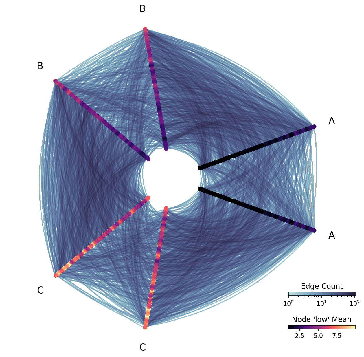
Mean of Node Metadata Values#
Since we’re rasterizing values, we cannot view individual node low values like we did in the example from the Visualizing Node Metadata page. But we can view statistical summaries of the low values.
Below, we rasterize based on the mean low values for nodes in each bin.
Note, since the distribution of values for node variable low is not skewed, we choose to set log_cmap_nodes=False.
[3]:
fig, ax = plt.subplots()

ax.hist(
    hp.nodes.data.low,
    edgecolor="black",
)
ax.set_title("Node 'low' vals not skewed")
plt.show()

[4]:
fig, ax, im_nodes, im_edges = hp.plot(
    reduction_nodes=ds.reductions.mean("low"),
    log_cmap_nodes=False,  # raster not skewed
    cmap_nodes="magma",
)

cax_edges = ax.inset_axes([0.85, 0.15, 0.2, 0.01], transform=ax.transAxes)
cb_edges = fig.colorbar(
    im_edges, ax=ax, cax=cax_edges, orientation="horizontal"
)
cb_edges.ax.set_title("Edge Count")

cax_nodes = ax.inset_axes([0.85, 0.05, 0.2, 0.01], transform=ax.transAxes)
cb_nodes = fig.colorbar(
    im_nodes, ax=ax, cax=cax_nodes, orientation="horizontal"
)
cb_nodes.ax.set_title("Node 'low' Mean")

plt.show()
Variance of Node Metadata Values#
As discussed on the Visualizing Node Metadata page, we are both partitioning and sorting our hive plot axes using the low variable, but perhaps we’re curious about the variance of another value relative to the low values.
Let’s contrive a node variable whose variance decreases as node low values increase:
[5]:
hp = example_hive_plot(
    num_nodes=1000,
    num_edges=5000,
    repeat_axes=True,
    backend="datashader",
)

# create new node metadata var whose variance decreases as 'low' increases
rng = np.random.default_rng()
hp.nodes.data["new_var"] = rng.uniform(
    low=-1, high=1, size=len(hp.nodes.data)
) * (10 - hp.nodes.data["low"])

# propagate extra node data changes through to data on axes
hp.update_partition_data()
[6]:
fig, ax = plt.subplots()
ax.scatter(
    hp.nodes.data.low,
    hp.nodes.data.new_var,
    s=5,
)
ax.axhline(y=0, c="black", ls="--")
ax.set_xlabel("Node 'low' Value")
ax.set_ylabel("Node 'new_var' Value")
ax.set_title(
    "Variance decreases for node variable 'new_var'\n"
    "as node variable 'low' increases",
    ha="left",
    x=0,
)
plt.show()
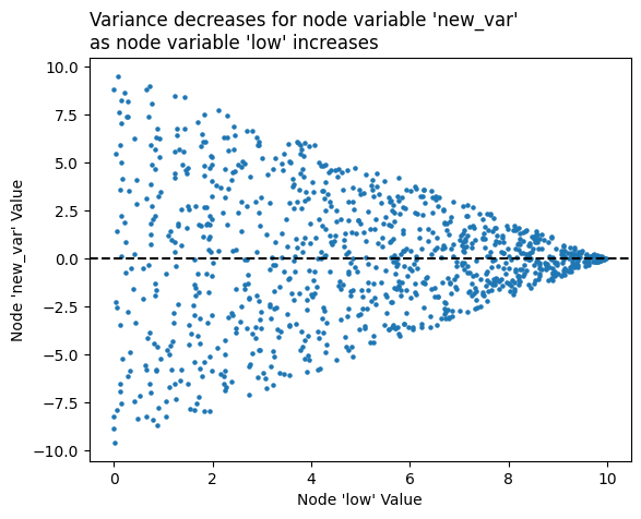
By making the variance decrease as node low values increase, our node colors light up as roughly the inverse of how they were colored up above, with the smallest A axis node values having the highest new_var variance:
[7]:
# variance values skewed, so we leave default `log_cmap_nodes=True`
fig, ax, im_nodes, im_edges = hp.plot(
    reduction_nodes=ds.var("new_var"),
    cmap_nodes="magma",
    vmax_nodes=10,
    vmin_nodes=0.1,  # keep above 0 or log scale will crash
)

cax_edges = ax.inset_axes([0.85, 0.15, 0.2, 0.01], transform=ax.transAxes)
cb_edges = fig.colorbar(
    im_edges, ax=ax, cax=cax_edges, orientation="horizontal"
)
cb_edges.ax.set_title("Edge Count")

cax_nodes = ax.inset_axes([0.85, 0.05, 0.2, 0.01], transform=ax.transAxes)
cb_nodes = fig.colorbar(
    im_nodes, ax=ax, cax=cax_nodes, orientation="horizontal"
)
cb_nodes.ax.set_title("Node 'new_var' Variance")

plt.show()
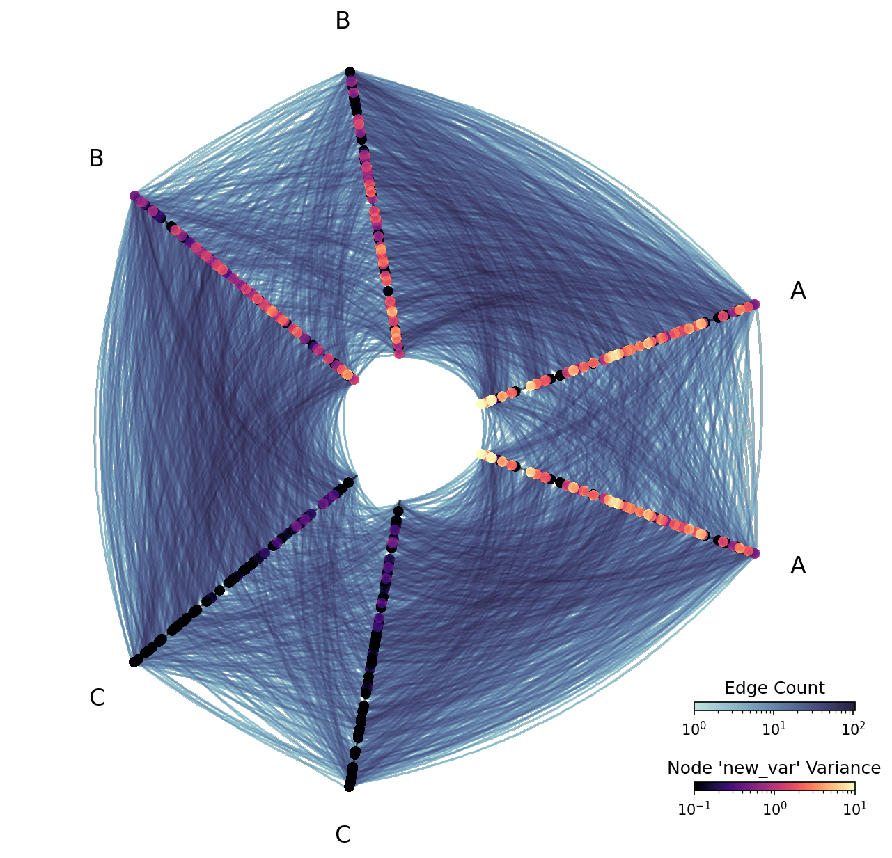
Note that this visualization is “missing” nodes relative to the previous visualization. This is not a mistake—sample variance is only defined when there are two or more points, and some bins of the node rasterization only had 1 node.
Visualizing Statistical Summaries of Edge Metadata in Datashader#
Below, we set up an example comparable to the one on the Visualizing Edge Metadata page, only with more nodes and edges.
[8]:
hp = example_hive_plot(
    num_nodes=1000,
    num_edges=5000,
    repeat_axes=True,
    backend="datashader",
)
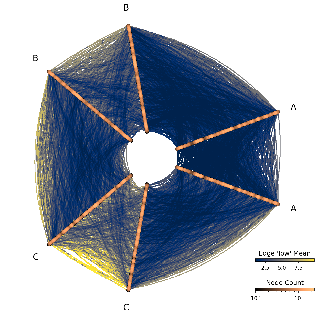
Mean of Edge Metadata Values#
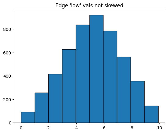
Since we’re rasterizing values, we cannot view individual edge low values like we did in the example from the Visualizing Edge Metadata page. But we can view statistical summaries of the low values.
Below, we rasterize based on the mean low values for edges in each bin.
Note, since the distribution of values for edge variable low is not skewed, we choose to set log_cmap_edges=False.
[9]:
fig, ax = plt.subplots()

ax.hist(
    hp.edges.data.low,
    edgecolor="black",
)
ax.set_title("Edge 'low' vals not skewed")
plt.show()
[10]:
fig, ax, im_nodes, im_edges = hp.plot(
    reduction_edges=ds.mean("low"),
    log_cmap_edges=False,
    cmap_edges="cividis",
)

cax_edges = ax.inset_axes([0.85, 0.15, 0.2, 0.01], transform=ax.transAxes)
cb_edges = fig.colorbar(
    im_edges, ax=ax, cax=cax_edges, orientation="horizontal"
)
cb_edges.ax.set_title("Edge 'low' Mean")

cax_nodes = ax.inset_axes([0.85, 0.05, 0.2, 0.01], transform=ax.transAxes)
cb_nodes = fig.colorbar(
    im_nodes, ax=ax, cax=cax_nodes, orientation="horizontal"
)
cb_nodes.ax.set_title("Node Count")

plt.show()
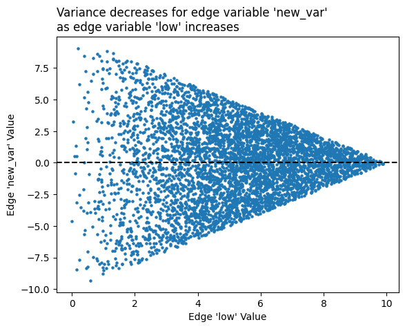
Variance of Edge Metadata Values#
As discussed on the Visualizing Edge Metadata page, our edge low variable values should increase as we move from A edges to B edges to C edges, but perhaps we’re curious about the variance of another value relative to the low values.
Let’s contrive an edge variable whose variance decreases as edge low values increase:
[11]:
hp = example_hive_plot(
    num_nodes=1000,
    num_edges=5000,
    repeat_axes=True,
    backend="datashader",
)

# create new edge metadata var whose variance decreases as 'low' increases
rng = np.random.default_rng()
hp.edges.data["new_var"] = rng.uniform(
    low=-1, high=1, size=len(hp.edges.data)
) * (10 - hp.edges.data["low"])
[12]:
fig, ax = plt.subplots()
ax.scatter(
    hp.edges.data.low,
    hp.edges.data.new_var,
    s=5,
)
ax.axhline(y=0, c="black", ls="--")
ax.set_xlabel("Edge 'low' Value")
ax.set_ylabel("Edge 'new_var' Value")
ax.set_title(
    "Variance decreases for edge variable 'new_var'\n"
    "as edge variable 'low' increases",
    ha="left",
    x=0,
)
plt.show()
By making the variance decrease as edge low values increase, our edge colors will light up as roughly the inverse of how they were colored up above, with the smallest A axis edge values having the highest new_var variance:
[13]:
# variance values skewed, so we leave default `log_cmap_edges=True`
fig, ax, im_nodes, im_edges = hp.plot(
    reduction_edges=ds.var("new_var"),
    cmap_edges="cividis",
    vmax_edges=10,
    vmin_edges=0.1,  # keep above 0 or log scale will crash
)

cax_edges = ax.inset_axes([0.85, 0.15, 0.2, 0.01], transform=ax.transAxes)
cb_edges = fig.colorbar(
    im_edges, ax=ax, cax=cax_edges, orientation="horizontal"
)
cb_edges.ax.set_title("Edge 'new_var' Variance")

cax_nodes = ax.inset_axes([0.85, 0.05, 0.2, 0.01], transform=ax.transAxes)
cb_nodes = fig.colorbar(
    im_nodes, ax=ax, cax=cax_nodes, orientation="horizontal"
)
cb_nodes.ax.set_title("Node Count")

plt.show()

Note that this visualization is “choppy,” with pieces of edges missing relative to the previous visualization. This is not a mistake—sample variance is only defined when there are two or more points, and some bins of the edge rasterization only had 1 edge.