

Hive Plot Matrix: from_partition#
This notebook covers the features and options of HivePlotMatrix.from_partition, which allows us to look at hive plots exploring a partition with more than three groups by arranging pairwise group comparisons into an upper-triangular Hive Plot Matrix (HPM).
For a longer-form discussion motivating the use of these HPMs specifically, see the Hive Plots for More Than Three Groups page.
For additional discussion motivating Hive Plot Matrices (HPMs) and the different HPM options, see the Hive Plot Matrices tutorial.
Note: this notebook requires that Hiveplotlib be installed with extra packages, which can be done by running:
pip install hiveplotlib[bokeh,datashader,networkx]
[1]:
import matplotlib.pyplot as plt
from hiveplotlib import HivePlotMatrix
from hiveplotlib.datasets import example_hpm_nodes_and_edges
from matplotlib.cm import ScalarMappable
from matplotlib.colors import Normalize
We will base this discussion on the following toy dataset:
[2]:
nodes, edges = example_hpm_nodes_and_edges(
    num_groups=4,
    edge_tag_counts={"official": 90},
    drop_duplicate_edges=True,
)
[3]:
nodes
[3]:
hiveplotlib.NodeCollection of 40 nodes and unique ID column 'unique_id'.
[4]:
nodes.data.head()
[4]:
| unique_id | group | value1 | value2 | value3 | |
|---|---|---|---|---|---|
| 0 | 0 | A | 1.934890 | 4.371519 | 9.160784 |
| 1 | 1 | A | 1.097196 | 8.326782 | 8.515967 |
| 2 | 2 | A | 2.146495 | 7.002651 | 9.535051 |
| 3 | 3 | A | 1.743420 | 3.123666 | 7.917432 |
| 4 | 4 | A | 0.235443 | 8.322598 | 7.556780 |
[5]:
edges
[5]:
hiveplotlib.Edges of 86 edges.
[6]:
edges.data.head()
[6]:
| from | to | |
|---|---|---|
| 0 | 3 | 30 |
| 1 | 26 | 17 |
| 2 | 17 | 34 |
| 3 | 3 | 27 |
| 4 | 8 | 3 |
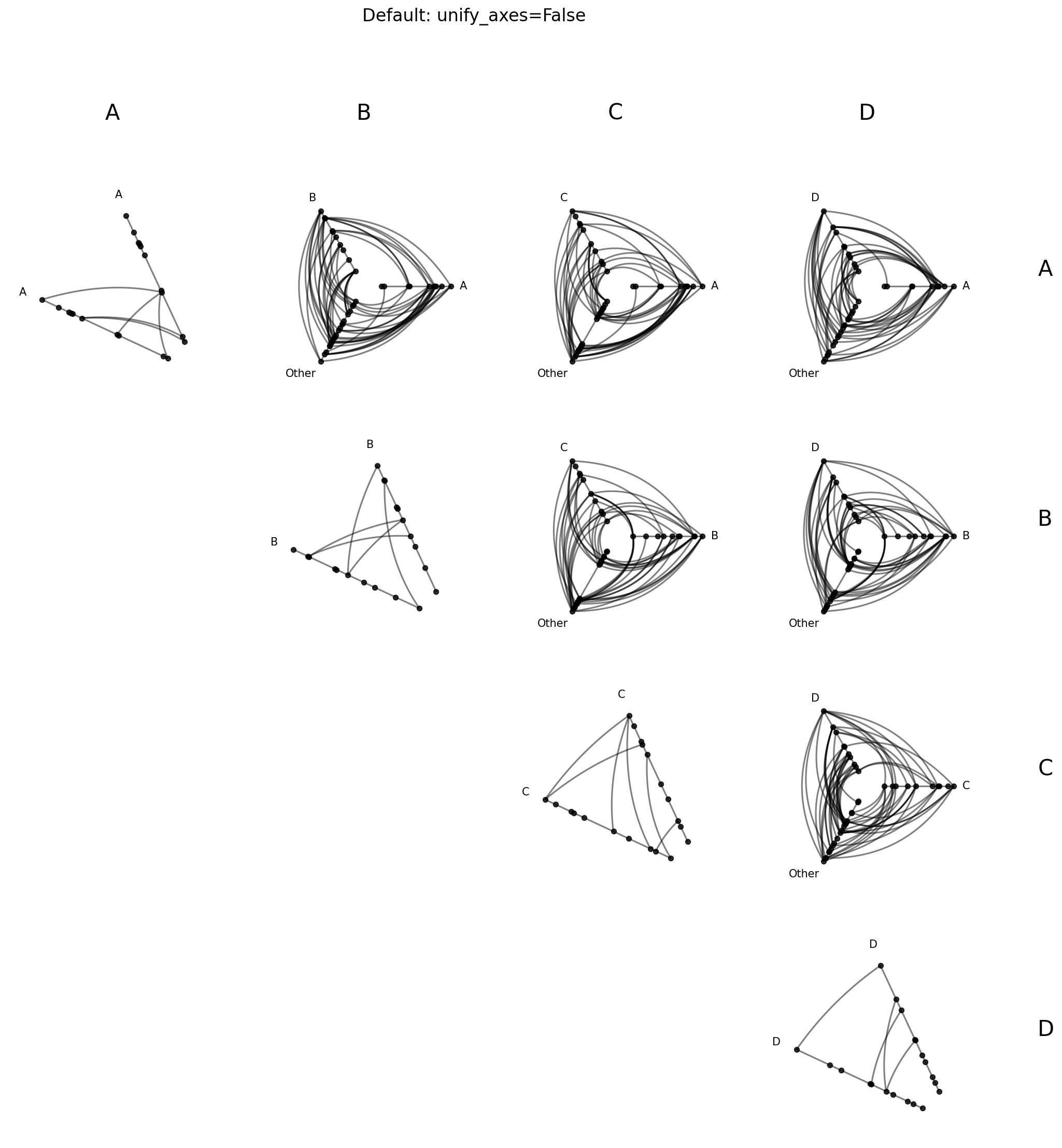
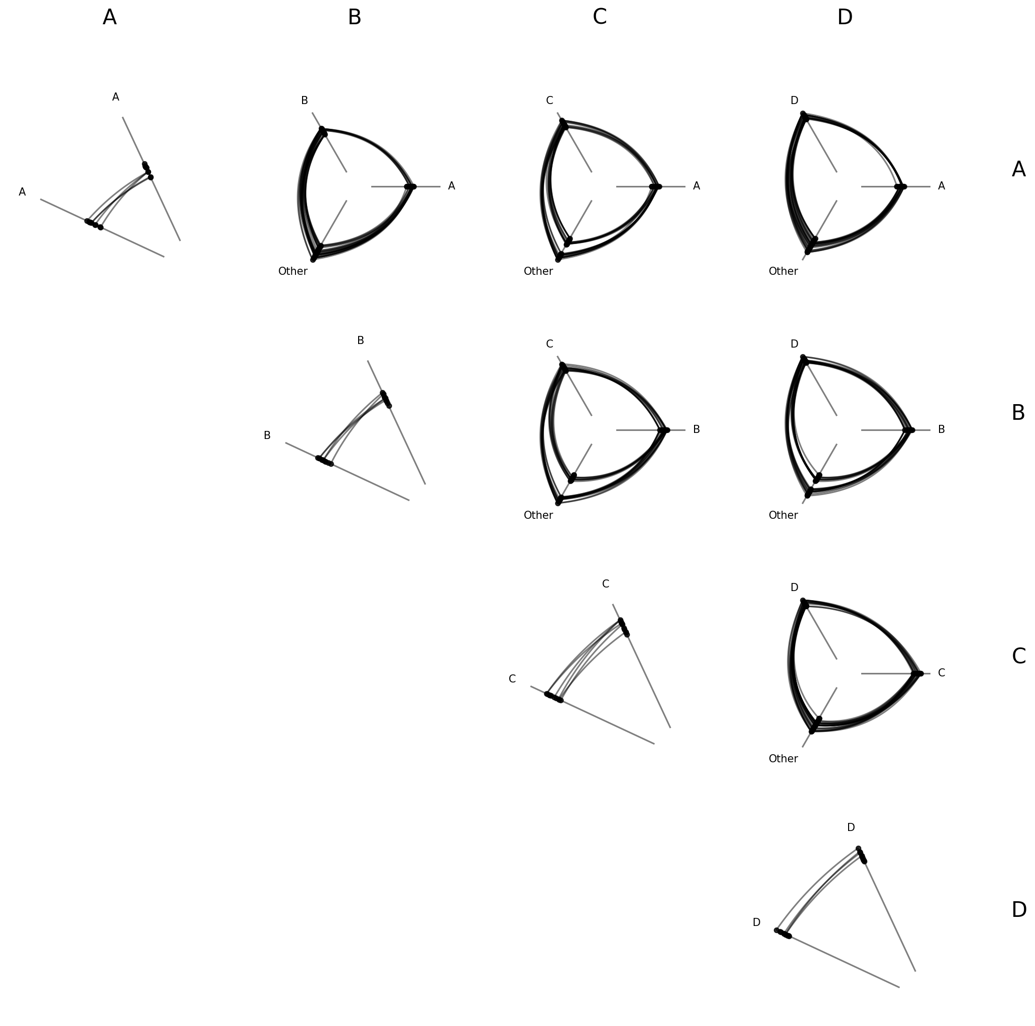
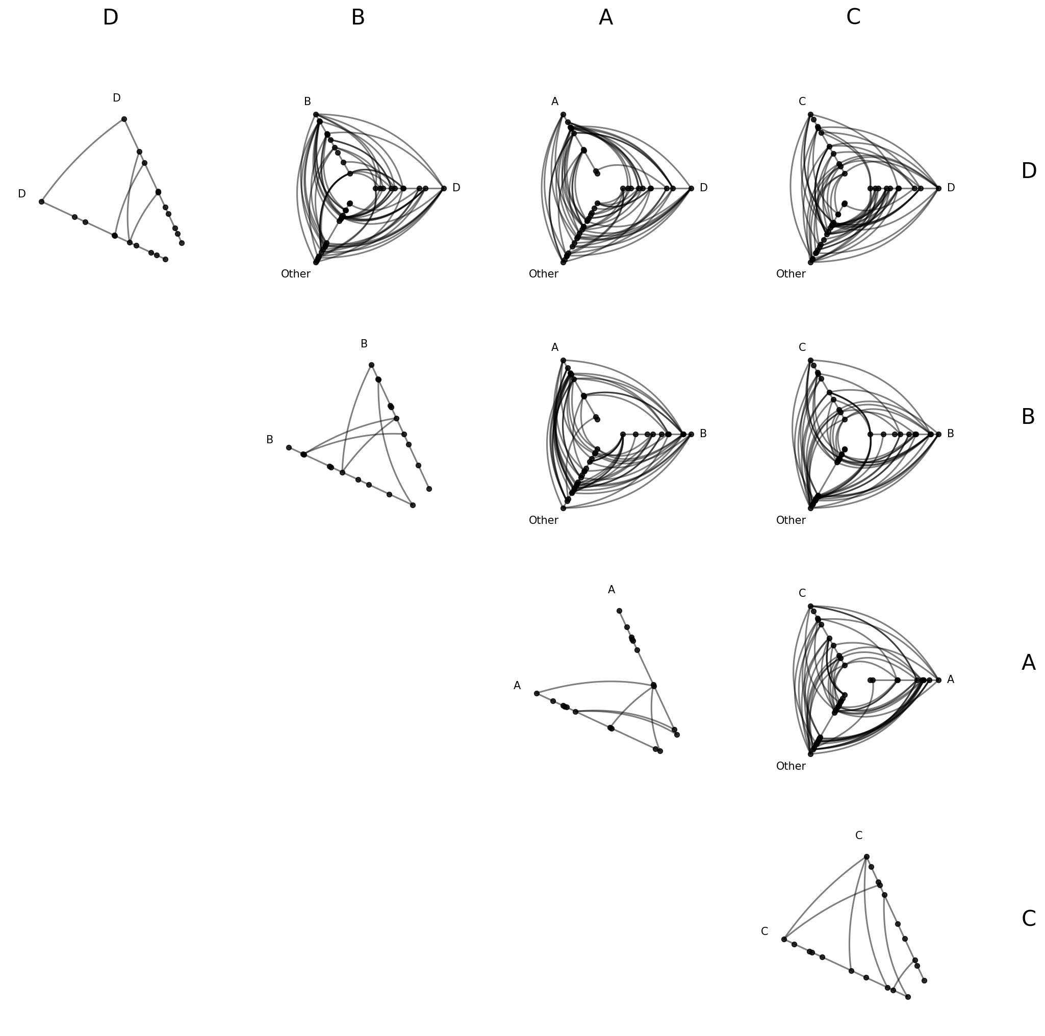
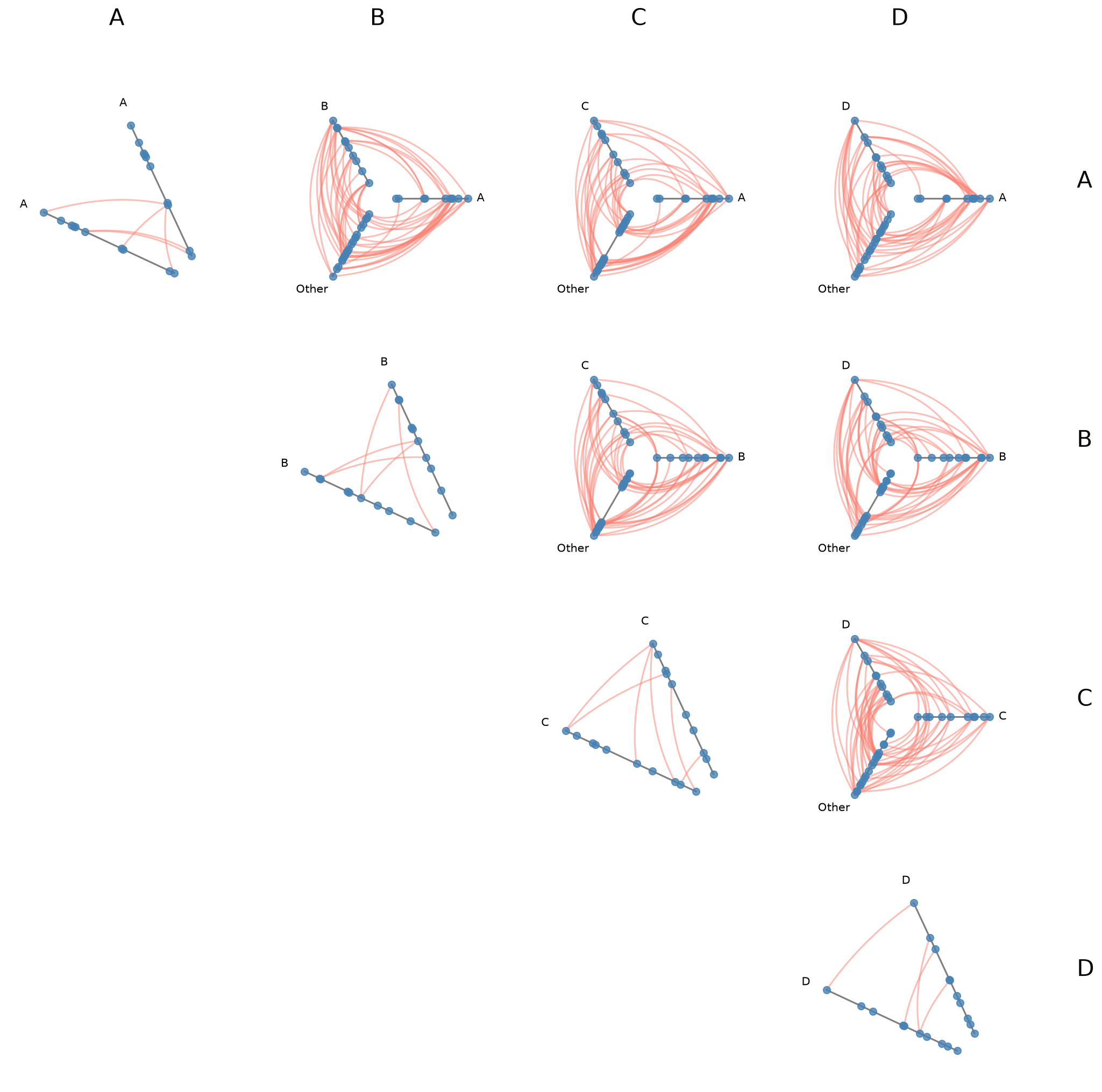
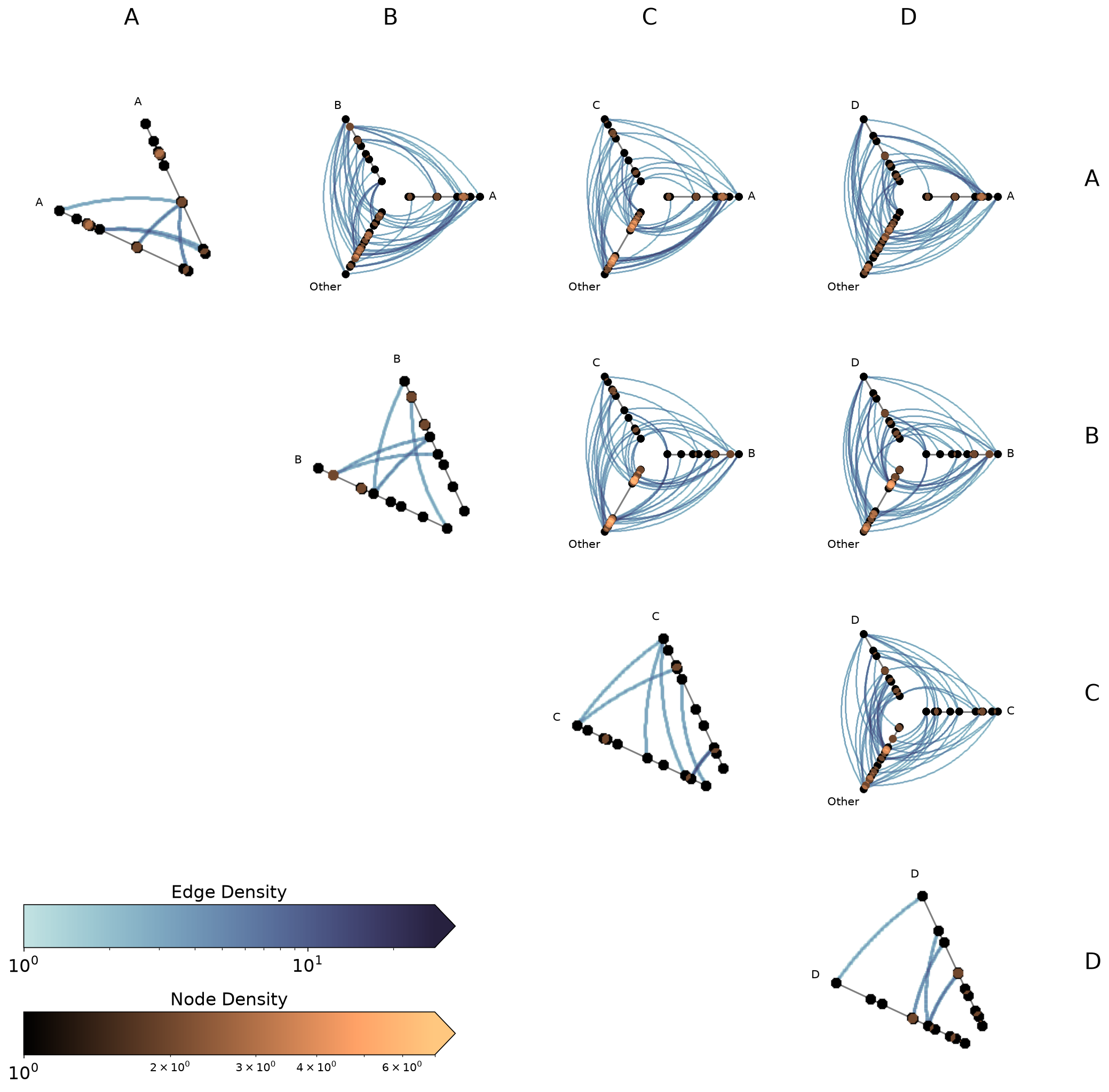
The Upper-Triangular Layout#
from_partition auto-detects the group values from the provided partition_variable value and builds one cell for every unique combination of 2 group values in the upper triangle. With four groups, that gives us a 4 x 4 grid with 10 populated cells (4 diagonal + 6 off-diagonal).
Let’s build our first matrix. Note with the default progress=True, we’ll see a tqdm bar tracking cell-by-cell construction:
[7]:
hpm = HivePlotMatrix.from_partition(
    nodes=nodes,
    edges=edges,
    partition_variable="group",
    sorting_variables="value1",
)
hpm
[7]:
hiveplotlib.HivePlotMatrix (4 x 4), 10 populated cells, type='from_partition', backend='matplotlib'
[8]:
fig, axes = hpm.plot()
plt.show()

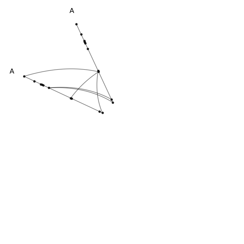
Diagonal Cells#
Diagonal cells show intragroup structure via repeat axes:
[9]:
# the (0,0) cell corresponds to group A vs itself
hpm[0, 0]
[9]:
hiveplotlib.HivePlot: 40 nodes, axes=['A'], 86 edges, partition='group', sort='value1', repeat_axes=[np.str_('A')], backend='matplotlib'
[10]:
hpm[0, 0].plot();
Off-Diagonal Cells#
An off-diagonal cell contains a hive plot with two specific groups and a collapsed “Other” axis:
[11]:
# the (0,1) cell compares group A (row 0) against group B (col 1)
hpm[0, 1]
[11]:
hiveplotlib.HivePlot: 40 nodes, axes=['A', 'B', 'Other'], 86 edges, partition='group', sort='value1', backend='matplotlib'
[12]:
hpm[0, 1].plot();
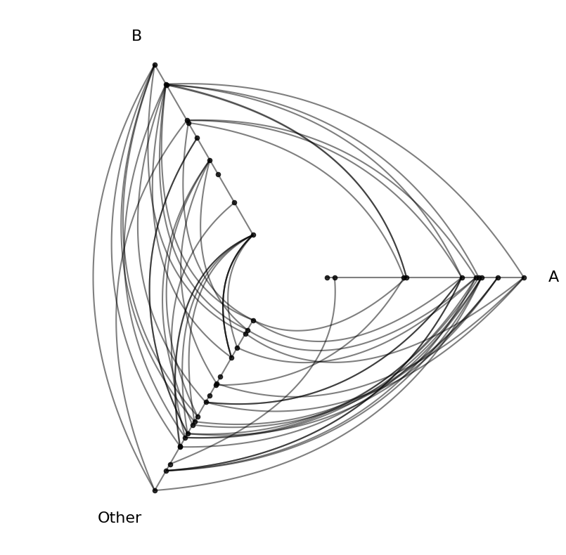
The “Other” axis holds all nodes not belonging to the two named groups. In the above plot, that means “Other” is nodes from groups C and D. This hive plot still shows the full network of nodes and edges! For more on collapsed axes, see the Collapsing Axes page.
Drilling Down on a Single Hive Plot in the HPM#
We can take a copy of a hive plot cell and explore further changes without disrupting the existing HPM. For example, we can switch to an interactive Hiveplotlib-supported back end like bokeh.
[13]:
from bokeh.io import output_notebook
from bokeh.plotting import show
from bokeh.resources import INLINE

output_notebook(resources=INLINE)

off_diagonal_hp = hpm[0, 1].copy()
off_diagonal_hp.set_viz_backend("bokeh")
show(off_diagonal_hp.plot())
Once we spot anomalous nodes or edges, for example, we can use the hover tool support with the bokeh back end to find the relevant node or edge IDs.
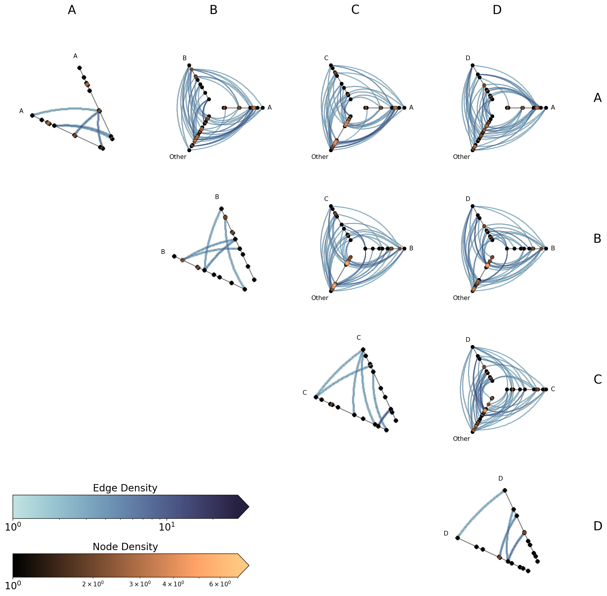
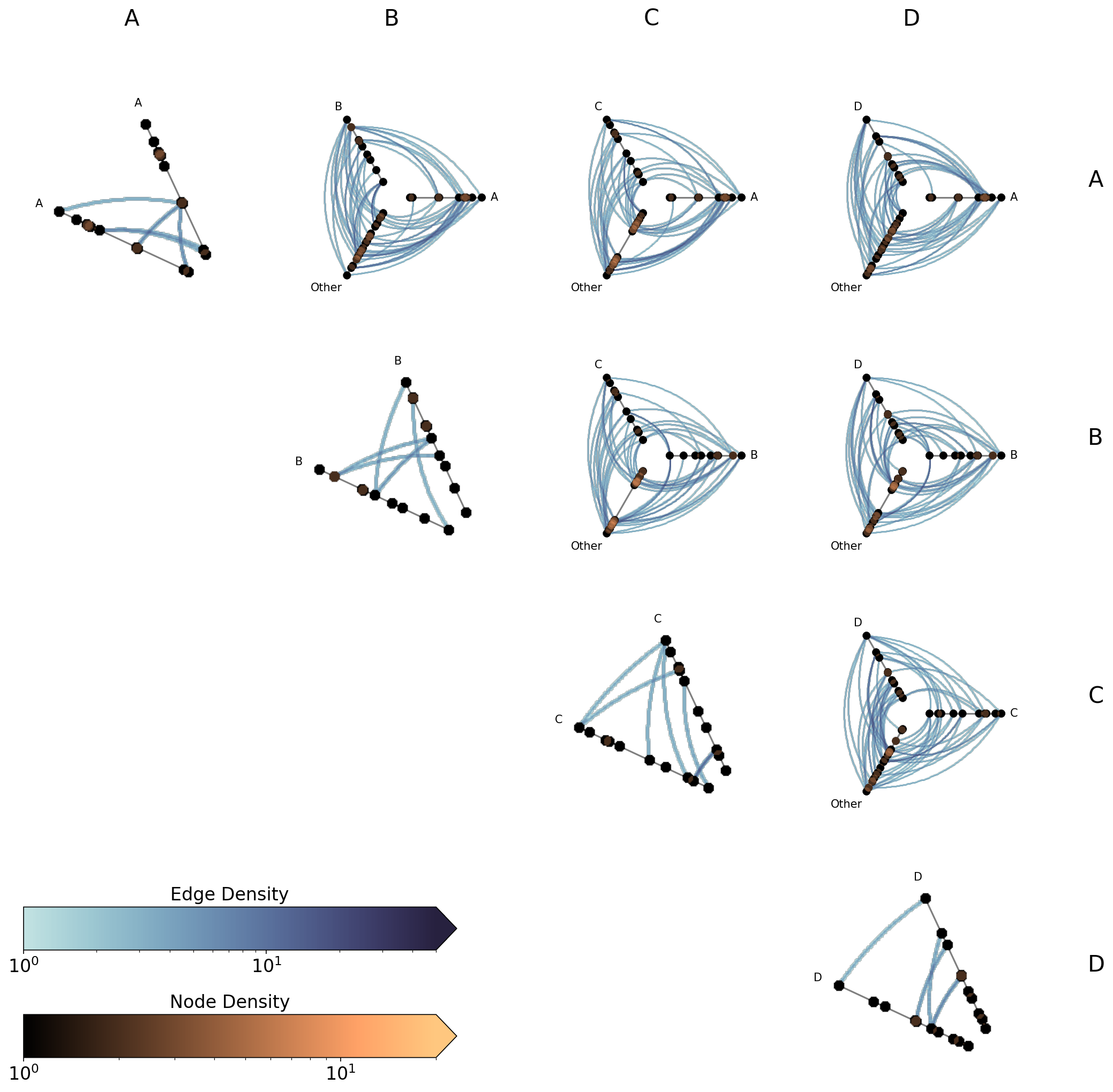
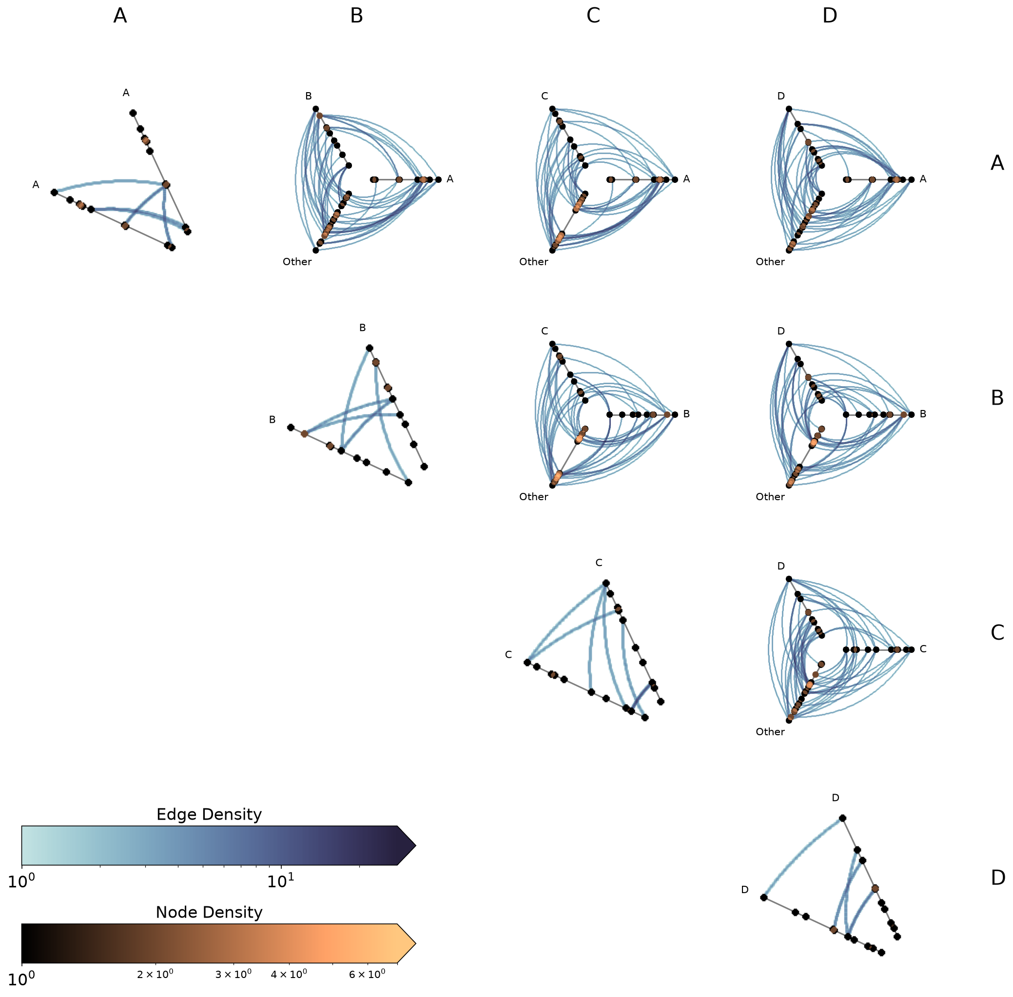
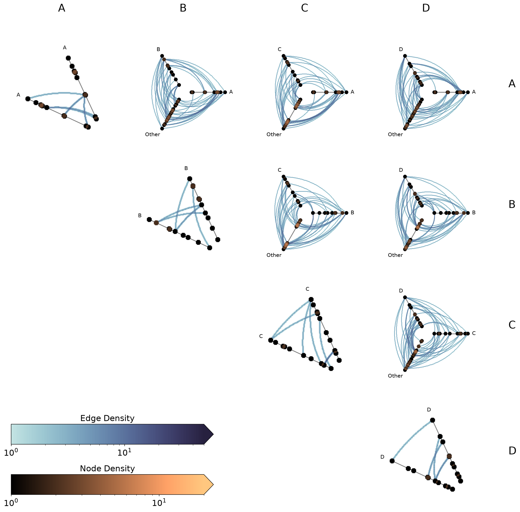
Unified Axis Scaling with unify_axes#
By default, each hive plot axis auto-scales to the data range of the nodes assigned to it by setting unify_axes=False. Since from_partition results in hive plots each partitioning nodes differently onto axes, this means axes will almost certainly have different ranges across cells.
Although this default behavior can be useful, especially if we want to use the full range of each axis to place nodes, it requires careful interpretation across hive plots. In the unify_axes=False case, if we see an edge from high A values to high D values, “high” is only within group.
If we want the relative position of nodes across axes to matter, we can pass unify_axes=True to auto-compute a single global vmin / vmax from all node data and apply it to each axis.
Let’s compare the two approaches below, with an eye towards the earlier-mentioned “high A to high D” edges (top right hive plot):
[14]:
# default: each cell auto-scales to its own data range
hpm_unscaled = HivePlotMatrix.from_partition(
    nodes=nodes,
    edges=edges,
    partition_variable="group",
    sorting_variables="value1",
    progress=False,
)
fig, axes = hpm_unscaled.plot()
fig.suptitle("Default: unify_axes=False", y=1.02, size=16)
plt.show()
[15]:
# unified: all axes share the same global range
hpm_unified = HivePlotMatrix.from_partition(
    nodes=nodes,
    edges=edges,
    partition_variable="group",
    sorting_variables="value1",
    unify_axes=True,
    progress=False,
)
fig, axes = hpm_unified.plot()
fig.suptitle("unify_axes=True", y=1.02, size=16)
plt.show()
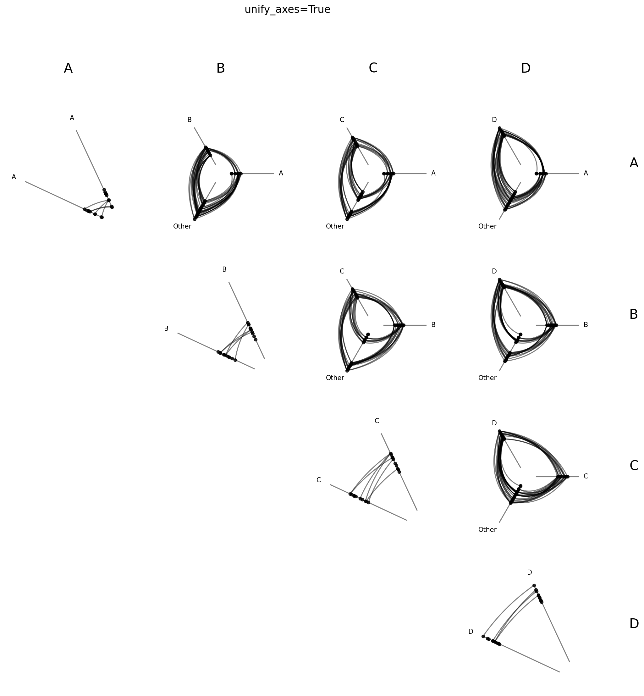
In absolute terms, the D values are much higher on the unified axes than any of the A values:
[16]:
fig, axes = plt.subplots(1, 2, figsize=(8, 4))

hpm_unscaled[0, 3].plot(fig=fig, ax=axes[0])
axes[0].set_title("Relative", size=18, y=1.05)

hpm_unified[0, 3].plot(fig=fig, ax=axes[1])
axes[1].set_title("Absolute", size=18, y=1.05)

fig.suptitle("High A to High D", size=24, y=1.1)

plt.show()
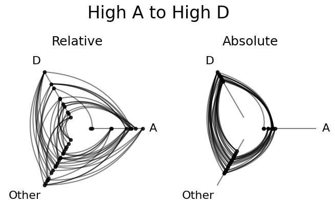
Both choices have their use cases. For example, if we chose Gross Domestic Product (GDP) as our sorting variable, perhaps we would want to compare all nodes on the same GDP scale with unify_axes=True.
Or, if we chose node degree, and some groups were drastically smaller than others, maybe we only want to see how the most connected members of one group talk with the most connected members of another group, in which case we might keep the default unify_axes=False to look for edges between the top of each pair of axes.
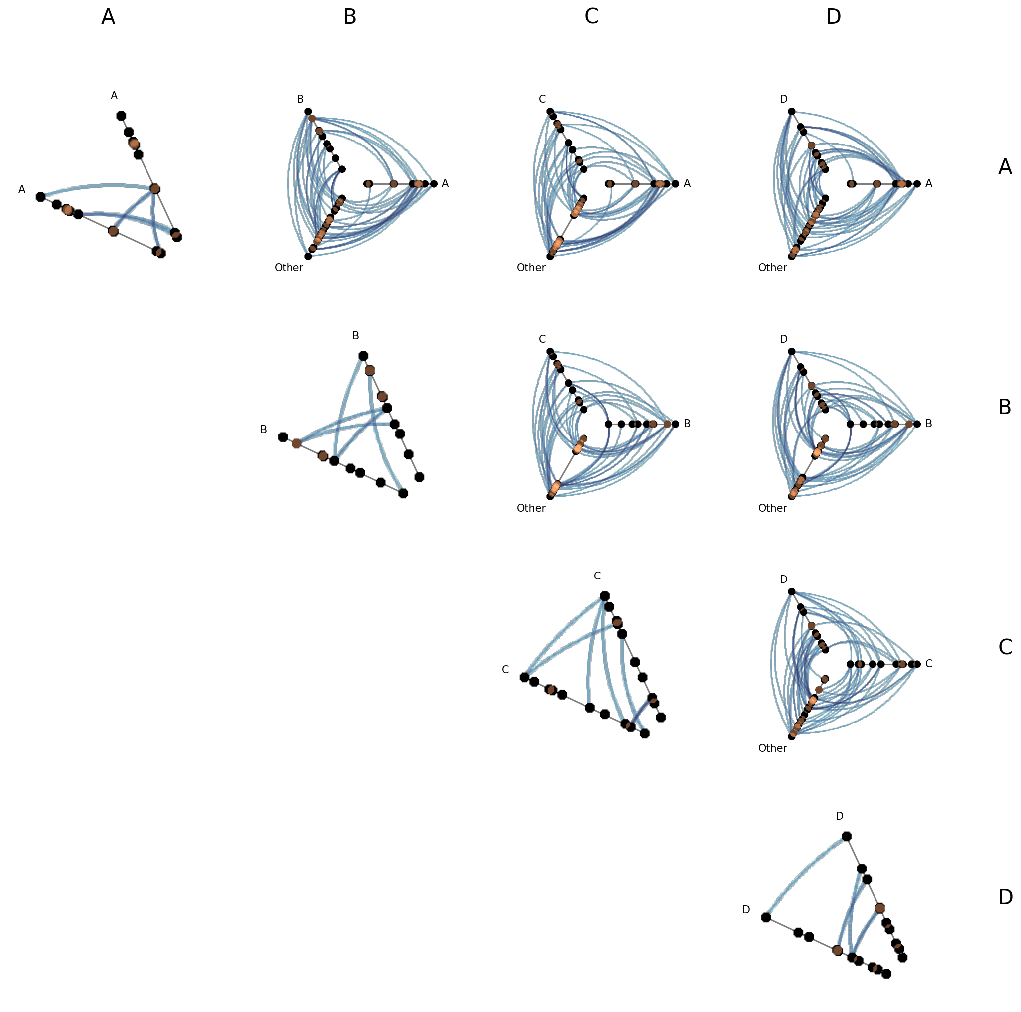
Set a Specific Range for Unified Axes#
To force a specific range instead of auto-computing, we can pass a dictionary with vmin and / or vmax. Missing keys are auto-computed to the global min / max of the data.
This can be helpful if there are outliers or if there are important threshold values for a given sorting variable.
[17]:
# pin vmin to -10, auto-compute vmax from the data
hpm_pinned = HivePlotMatrix.from_partition(
    nodes=nodes,
    edges=edges,
    partition_variable="group",
    sorting_variables="value1",
    unify_axes={"vmin": -10},
    progress=False,
)
fig, axes = hpm_pinned.plot()
plt.show()
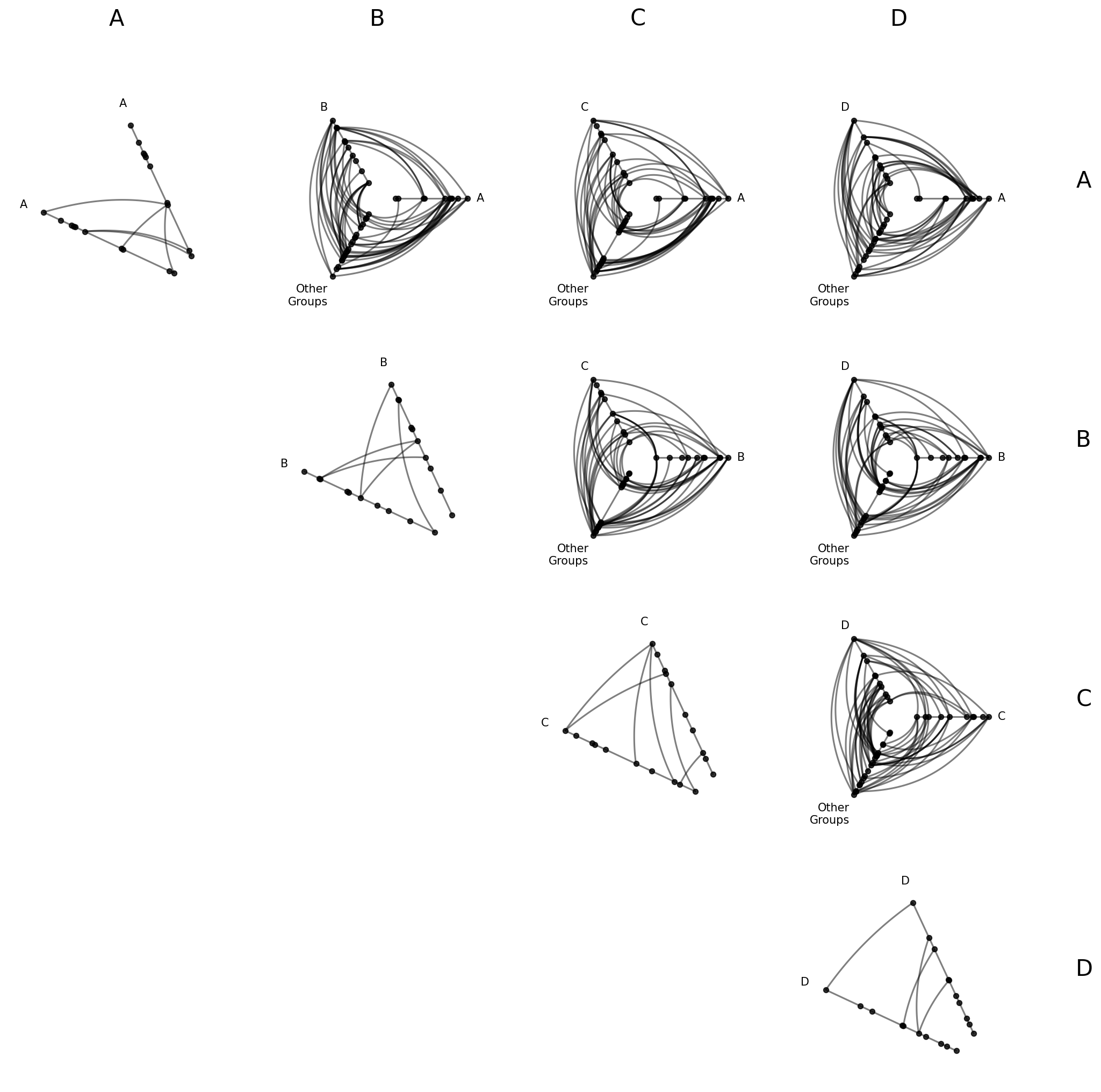
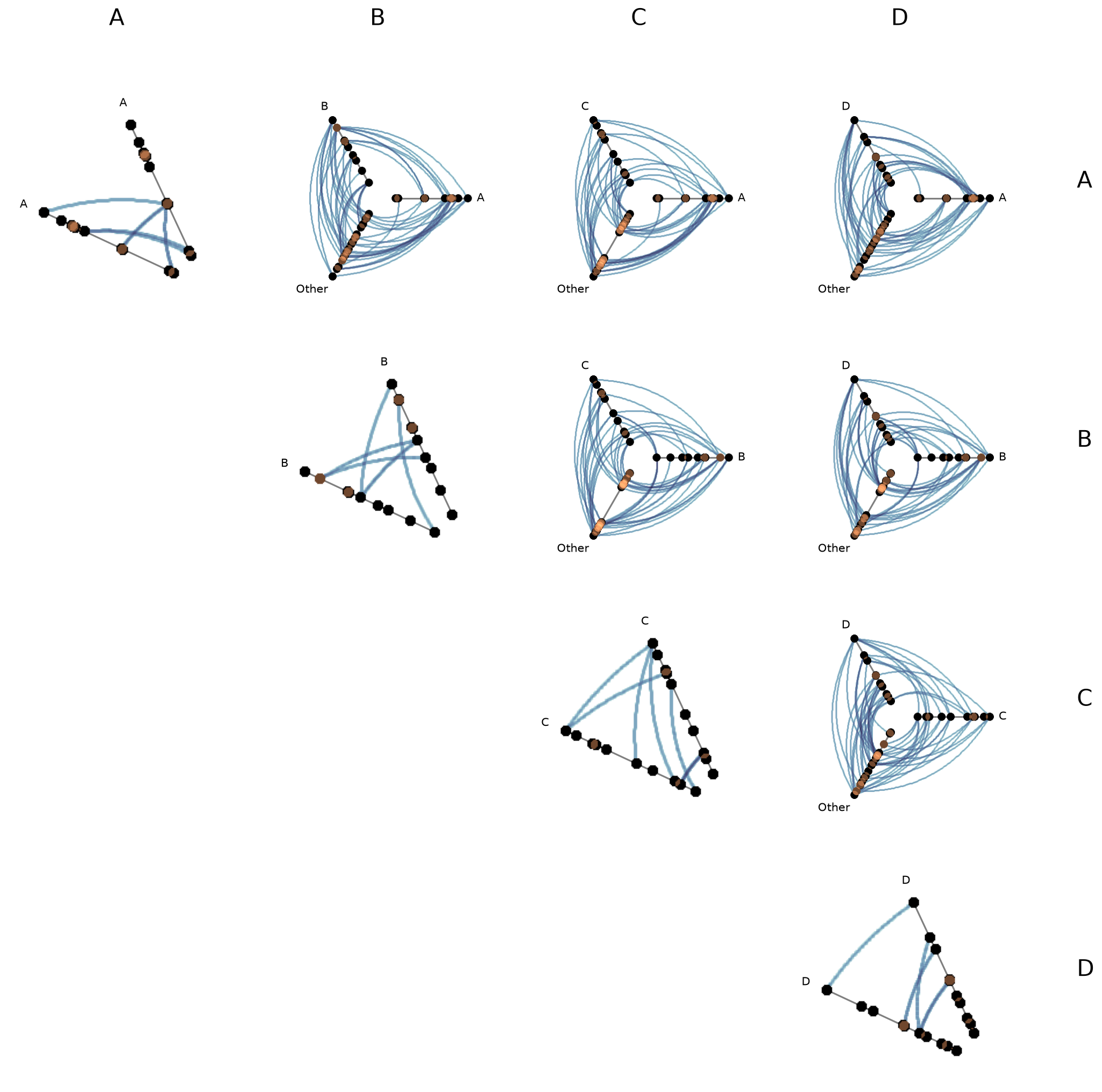
Renaming the Collapsed Axis#
The default label “Other” for the collapsed axis can be changed with collapsed_group_axis_name. This is useful when you want a more descriptive label:
[18]:
hpm_named = HivePlotMatrix.from_partition(
    nodes=nodes,
    edges=edges,
    partition_variable="group",
    sorting_variables="value1",
    collapsed_group_axis_name="Other\nGroups",
    progress=False,
)
fig, axes = hpm_named.plot()
plt.show()
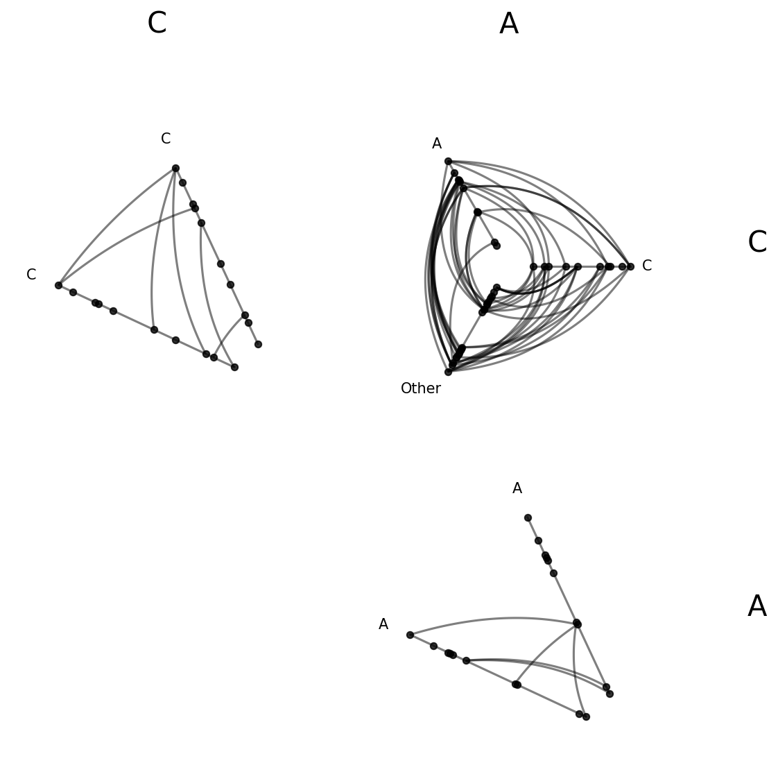
Filtering and Reordering with partition_values#
By default, from_partition sorts group labels alphabetically (A, B, C, D) and includes all of them. What if we only care about a subset of groups, or want a different display order? The partition_values parameter lets us override both.
[19]:
hpm_sub = HivePlotMatrix.from_partition(
    nodes=nodes,
    edges=edges,
    partition_variable="group",
    sorting_variables="value1",
    partition_values=["C", "A"],
    progress=False,
)
fig, axes = hpm_sub.plot()
plt.show()
[20]:
hpm_reordered = HivePlotMatrix.from_partition(
    nodes=nodes,
    edges=edges,
    partition_variable="group",
    sorting_variables="value1",
    partition_values=["D", "B", "A", "C"],
    progress=False,
)
fig, axes = hpm_reordered.plot()
plt.show()
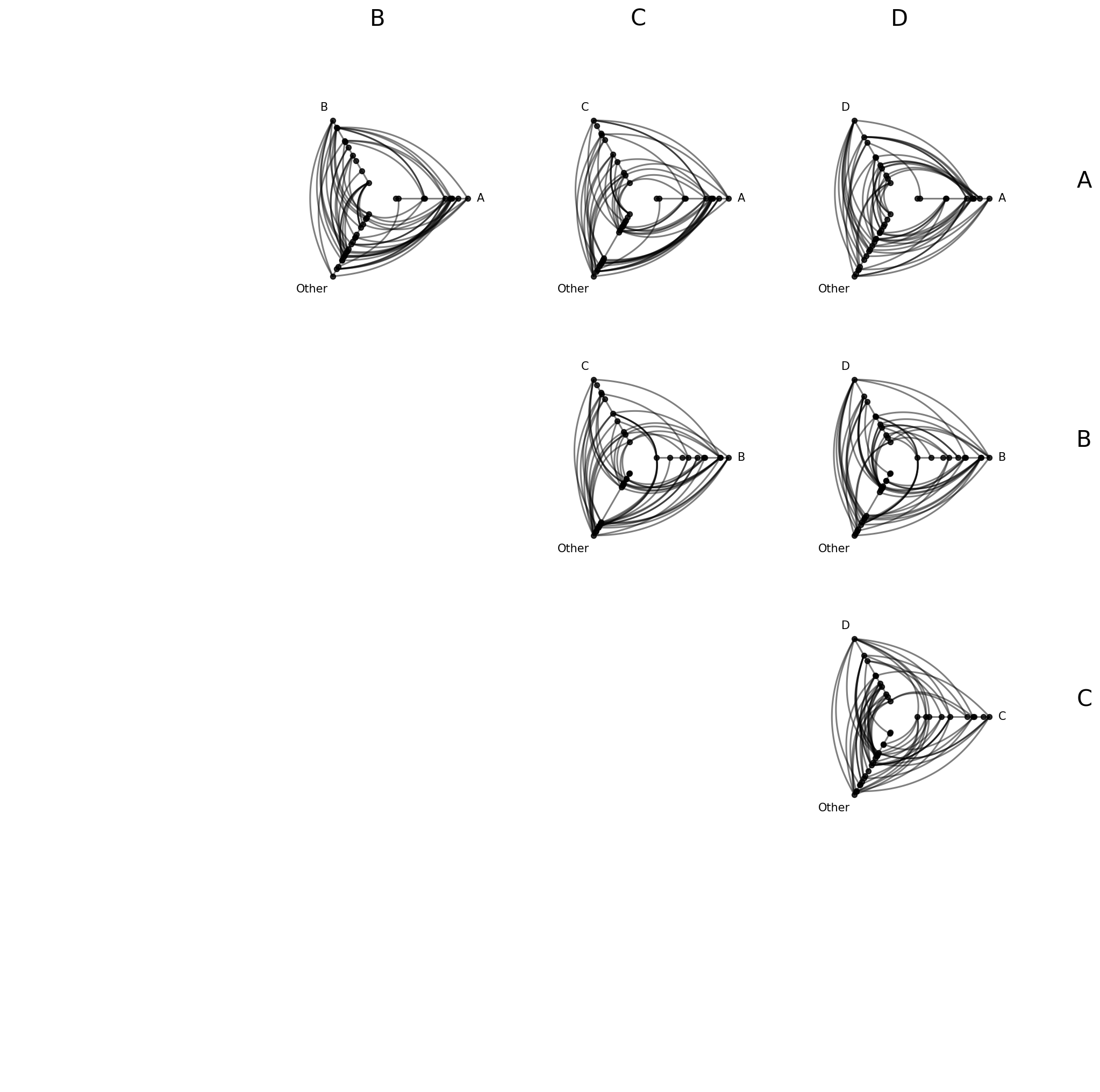
Excluding Diagonal Cells#
What if we’re only interested in intergroup connectivity and don’t need to see intragroup structure? Setting include_diagonal=False omits diagonal cells entirely, leaving only off-diagonal cells with two named group axes plus “Other”:
[21]:
hpm_no_diag = HivePlotMatrix.from_partition(
    nodes=nodes,
    edges=edges,
    partition_variable="group",
    sorting_variables="value1",
    include_diagonal=False,
    progress=False,
)
fig, axes = hpm_no_diag.plot()
plt.show()
Building from a NetworkX Graph#
HivePlotMatrix.from_partition accepts a NetworkX graph directly via the graph parameter as an alternative to passing the nodes and edges parameters. Note that users cannot provide both sets of parameters.
To stick with the same example we’ve been using throughout this discussion, we’ll use the low-level Hiveplotlib converter nodes_edges_to_networkx() to get the equivalent NetworkX graph, then pass that graph directly to HivePlotMatrix.from_partition() to get the same HPM from the top of the page.
[22]:
# build a NetworkX graph from the same toy nodes / edges
from hiveplotlib.converters import nodes_edges_to_networkx

G = nodes_edges_to_networkx(nodes=nodes, edges=edges)

hpm_from_graph = HivePlotMatrix.from_partition(
    graph=G,
    partition_variable="group",
    sorting_variables="value1",
    progress=False,
)
fig, axes = hpm_from_graph.plot()
plt.show()
Computing Graph Metrics During Construction#
Node metrics like node degree are often useful as sorting_variables (or, after discretizing them with `NodeCollection.create_partition_variable() <create_partition_variable.ipynb>`__, as a partition_variable). Edge metrics like edge betweenness centrality can drive data-driven edge styling.
Rather than computing these metrics by hand and merging them onto our node and edge data structures, we can instead request Hiveplotlib-supported metrics directly via the node_graph_metrics and edge_graph_metrics parameters at construction time:
[23]:
hpm_degree = HivePlotMatrix.from_partition(
    nodes=nodes,
    edges=edges,
    partition_variable="group",
    sorting_variables="degree",  # use the to-be-computed metric
    node_graph_metrics="degree",  # request degree on initialization
    edge_graph_metrics="edge_betweenness_centrality",  # request an edge metric too
    progress=False,
)

edge_coloring_kwargs = {
    "cmap": "cividis",
    "clim": (0, 0.06),
    "alpha": 1,
}

# data-driven edge styling must be done per hive plot
for _, _, hp in hpm_degree.iter_populated_cells():
    hp.update_edge_plotting_keyword_arguments(
        array="edge_betweenness_centrality",
        **edge_coloring_kwargs,
    )

fig, axes = hpm_degree.plot()

# add custom colorbar to plot
fig.colorbar(
    ScalarMappable(
        norm=Normalize(*edge_coloring_kwargs["clim"]),
        cmap=edge_coloring_kwargs["cmap"],
    ),
    orientation="horizontal",
    ax=axes[-1, 0:3],
    label="Edge Betweenness Centrality",
    extend="max",
)

plt.show()
Note that data-driven edge styling must be set on each individual hive plot, as opposed to directional edge styling, which can be set at the HPM level. We discuss directional edge styling in the next section.
The requested degree metric is now a column on every populated cell’s underlying nodes:
[24]:
hpm_degree[0, 0].nodes.data.head()
[24]:
| unique_id | group | value1 | value2 | value3 | group_collapsed_axis | degree | |
|---|---|---|---|---|---|---|---|
| 0 | 0 | A | 1.934890 | 4.371519 | 9.160784 | Other | 2 |
| 1 | 1 | A | 1.097196 | 8.326782 | 8.515967 | Other | 4 |
| 2 | 2 | A | 2.146495 | 7.002651 | 9.535051 | Other | 3 |
| 3 | 3 | A | 1.743420 | 3.123666 | 7.917432 | Other | 7 |
| 4 | 4 | A | 0.235443 | 8.322598 | 7.556780 | Other | 2 |
Similarly, the requested edge_betweenness_centrality metric is now a column on every populated cell’s underlying edges:
[25]:
hpm_degree[0, 0].edges.data.head()
[25]:
| from | to | edge_betweenness_centrality | |
|---|---|---|---|
| 0 | 3 | 30 | 0.022115 |
| 1 | 26 | 17 | 0.112831 |
| 2 | 17 | 34 | 0.065951 |
| 3 | 3 | 27 | 0.011538 |
| 4 | 8 | 3 | 0.027244 |
For more information about requesting and using graph metrics, which graph metrics are available, or discretizing node graph metrics to use as partition variables, see the Computing Graph Metrics page.
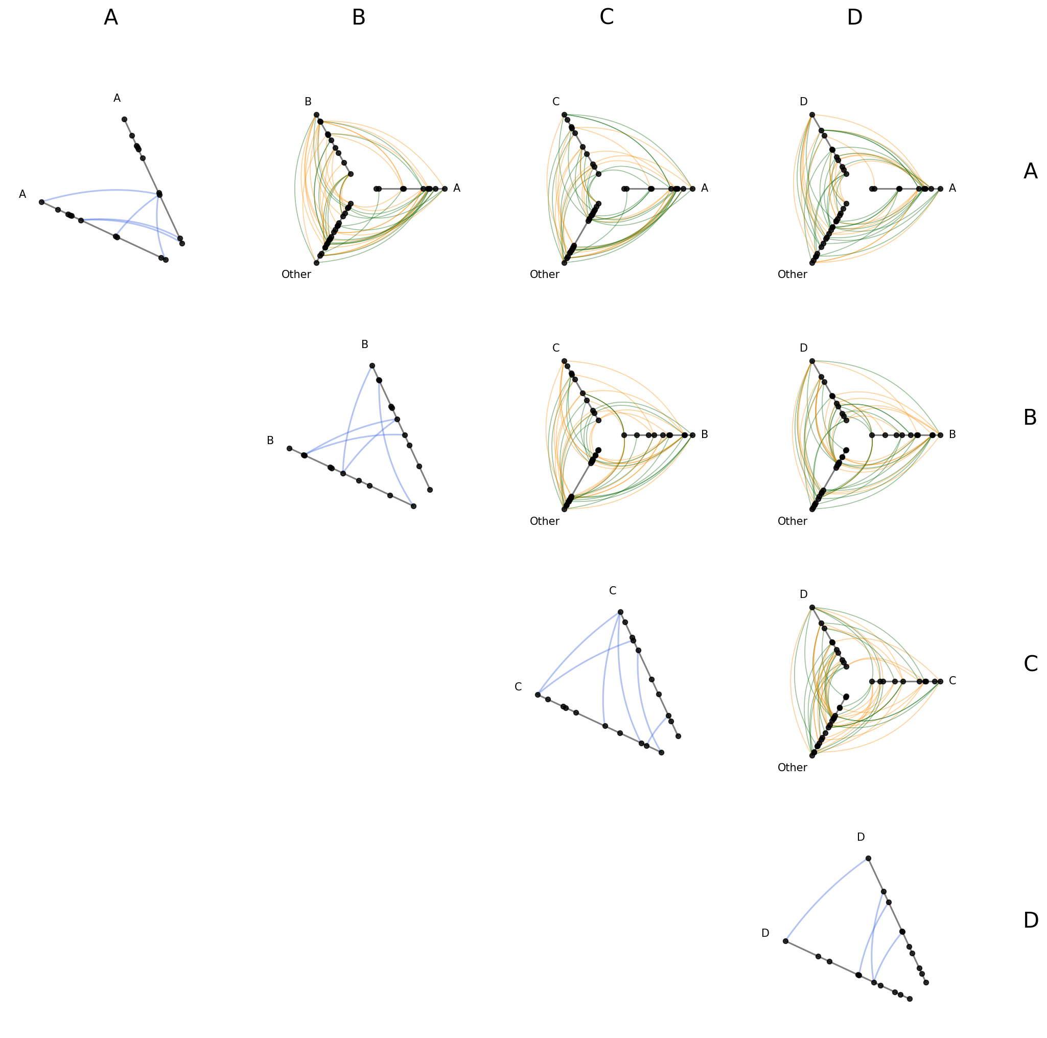
Styling Directed Edges#
If we are working with a directed network (e.g. an edge from node \(i\) to node \(j\) is not the same as an edge from \(j\) to \(i\)), then clockwise_edge_kwargs / counterclockwise_edge_kwargs allow us to see edges by direction.
In from_partition, these kwargs apply to off-diagonal cells only. repeat_edge_kwargs targets intragroup edges in diagonal cells, which have no meaningful directionality since both endpoints belong to the same group:
[26]:
hpm_styled = HivePlotMatrix.from_partition(
    nodes=nodes,
    edges=edges,
    partition_variable="group",
    sorting_variables="value1",
    all_edge_kwargs={"alpha": 0.4},
    repeat_edge_kwargs={
        "color": "royalblue",
        "linewidth": 1.5,
    },  # diagonal cells: intragroup edges
    clockwise_edge_kwargs={
        "color": "darkorange",
        "linewidth": 0.8,
    },  # off-diagonal cells: clockwise directed edges
    counterclockwise_edge_kwargs={
        "color": "darkgreen",
        "linewidth": 0.8,
    },  # off-diagonal cells: counterclockwise directed edges
    progress=False,
)
fig, axes = hpm_styled.plot()
plt.show()

For more on the full hierarchy of edge kwarg options and how they take precedence, see the Changing Edge Keyword Arguments page.
Uniform Node and Edge Rendering#
node_kwargs and all_edge_kwargs apply rendering options uniformly across every cell at construction time. Node and edge kwargs can also be passed to .plot() to override them at render time.
[27]:
hpm_uniform = HivePlotMatrix.from_partition(
    nodes=nodes,
    edges=edges,
    partition_variable="group",
    sorting_variables="value1",
    node_kwargs={"s": 40, "color": "steelblue"},
    all_edge_kwargs={"color": "salmon", "alpha": 0.5},
    progress=False,
)
fig, axes = hpm_uniform.plot()
plt.show()
For more on how all_edge_kwargs interacts with more targeted overrides like clockwise_edge_kwargs and repeat_edge_kwargs, see the Changing Edge Keyword Arguments page.
Plot Options#
The plot() method accepts several keyword arguments to control figure appearance. For example, we can change the figsize:
[28]:
# figsize: override the default auto-computed size
# default 4 per cell, so by default this example figsize is (16, 16)
# smaller makes lines thicker, nodes bigger, text larger
fig, axes = hpm.plot(figsize=(8, 8))
plt.show()
Or we could only change the row / column text label size:
[29]:
# label_fontsize: control the row/column header font size
fig, axes = hpm.plot(label_fontsize=12)
plt.show()
Turn Off Axes Labels#
Each off-diagonal cell’s three axes orient to match the grid layout:
Each axis pointing due East corresponds to the row group name.
Each axis pointing up corresponds to the column group name.
The “Other” axis containing all remaining nodes points toward the lower-left, away from both headers.
The per-cell axis labels make this explicit, but once the pattern is familiar, show_axes_labels=False gives a cleaner view:
[30]:
# show_axes_labels=False: hide per-cell axis labels for a cleaner large-matrix view
fig, axes = hpm.plot(show_axes_labels=False)
plt.show()
Visualization Back Ends#
Two visualization back ends are supported with HPMs: matplotlib (default) and datashader. The back end is set at construction time via the backend parameter.
[31]:
print("Current back end:", hpm.backend)
Current back end: matplotlib
Datashader Back End#
Datashader renders rasterized density images with shared colorbars across all cells.
For more on constructing hive plots with datashader, see the Hive Plots for Large Networks and Datashader pages.
Note that while the matplotlib back end only returns the figure and axes, here the plot() call also returns the node / edge rasterizations.
[32]:
hpm_ds = HivePlotMatrix.from_partition(
    nodes=nodes,
    edges=edges,
    partition_variable="group",
    sorting_variables="value1",
    backend="datashader",
    progress=False,
)
# datashader plot also returns node / edge rasterizations
fig, axes, im_nodes, im_edges = hpm_ds.plot()
plt.show()
Changing Parameters for Diagonal with Datashader#
from_partition exposes separate pixel-spread parameters for diagonal vs. off-diagonal cells. Since diagonal cells zoom in on a 2-axis layout, they need a smaller pixel spread to have comparably-sized nodes and edges:
[33]:
fig, axes, im_nodes, im_edges = hpm_ds.plot(
    diagonal_pixel_spread_nodes=3,
    off_diagonal_pixel_spread_nodes=6,
)
plt.show()
Setting Explicit Density Cutoffs with Datashader#
The node and edge density colormaps and color range will be the same for all hive plots in the HPM.
By default, the max color range for each will top out at the maximum density value over all of the hive plots.
If preferred, users can set vmax_nodes and vmax_edges to fix the shared density max across all cells to a specific level. This can be useful when one cell is much denser than the others or if users have preferred, more-interpretable cutoffs.
[34]:
fig, axes, im_nodes, im_edges = hpm_ds.plot(vmax_nodes=20, vmax_edges=50)
plt.show()
Turn Off Density Colorbars with Datashader#
Users can turn off one or both node / edge colorbars that show up by default by setting show_node_colorbar / show_edge_colorbar to False (both default to True).
[35]:
fig, axes, im_nodes, im_edges = hpm_ds.plot(
    show_node_colorbar=False,
    show_edge_colorbar=False,
)
plt.show()
For a deeper dive into other Hive Plot Matrix convenience methods, see the HivePlotMatrix Gallery Examples.