

Modifying Axes#
This notebook demonstrates the ways we can modify axes on a new or existing HivePlot instance.
[1]:
import matplotlib.pyplot as plt
from hiveplotlib.datasets import example_hive_plot
Change Axis Appearance#
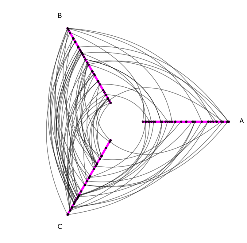
First, we may simply want to change the appearance of our axes, e.g. color, line width, etc. This can be done by passing along axes_kwargs to our HivePlot.plot() call:
[2]:
hp = example_hive_plot()
axes_kwargs = {"c": "magenta", "lw": 5, "alpha": 1}
hp.plot(axes_kwargs=axes_kwargs);
Change Axis Positioning / Node Placement / Naming#
The HivePlot class also supports making structural changes to each axis. We need only specify the name of the axis to modify and the new kwarg names and values.
Below, we briefly demonstrate how this can be done on HivePlot instantiation or to an existing HivePlot instance. We then discuss the specific options for structurally modifying axes.
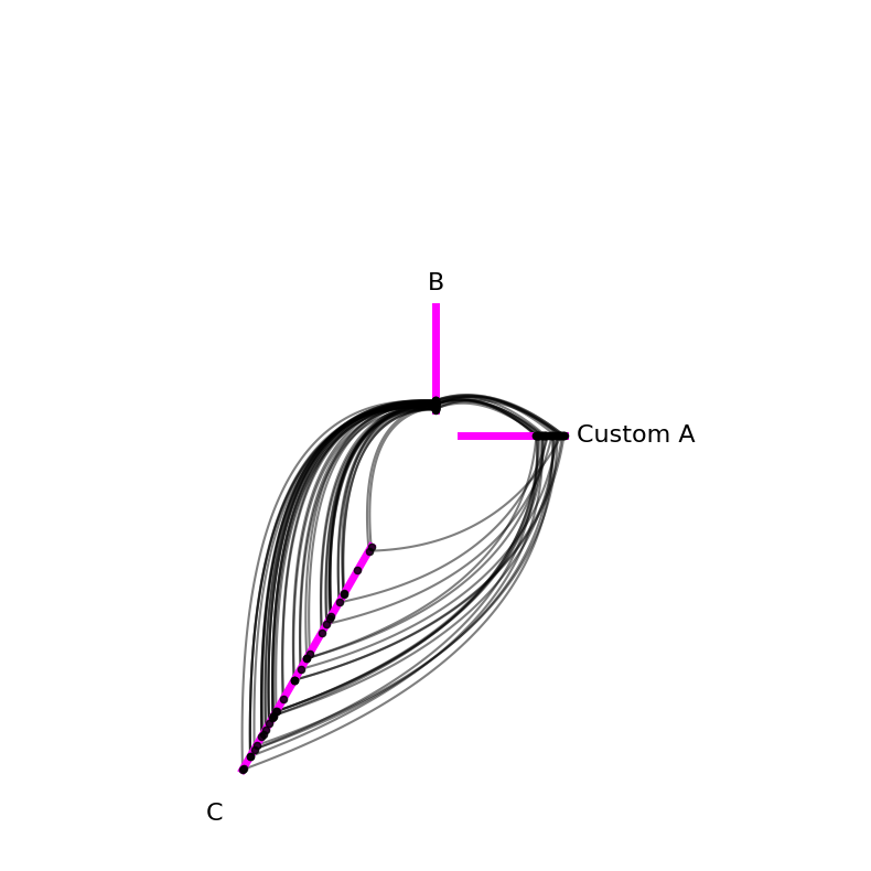
Change Axis on Hive Plot Initialization#
We can change axes on HivePlot instantiation by providing a dictionary input to the axis_kwargs parameter:
[3]:
custom_axis_kwargs = {
    "A": {"vmin": -10, "long_name": "Custom A"},
    "B": {"vmax": 40, "angle": 90},
    "C": {"start": 5, "end": 15},
}

# instantiate with custom axis kwargs
hp_on_init = example_hive_plot(
    axis_kwargs=custom_axis_kwargs,
)

# keep plotting with custom colored axes
hp_on_init.plot(axes_kwargs=axes_kwargs);

Change Axis on Existing Hive Plot#
Alternatively, we can change one existing axis at a time via the HivePlot.update_axis() method:
[4]:
custom_axis_kwargs = {
    "A": {"vmin": -10, "long_name": "Custom A"},
    "B": {"vmax": 40, "angle": 90},
    "C": {"start": 5, "end": 15},
}

# instantiate default axes
hp = example_hive_plot()

# add custom axis kwargs to each axis
for axis_id in custom_axis_kwargs:
    hp.update_axis(
        axis_id=axis_id,
        **custom_axis_kwargs[axis_id],
    )


# keep plotting with custom colored axes
hp.plot(axes_kwargs=axes_kwargs);
Below, we discuss each modifiable axis kwarg.
Vmin#
Every axis in a hive plot must have a sorting variable. This dictates an ordering of nodes to be placed on an axis, but we still get to choose the extent they can range over an axis.
vmin dictates the value corresponding to the interior end of each axis. By default, vmin and vmax will extend exactly the range of the node data according to the sorting variable. In other words, the node with the lowest sorting variable value will be on the interior end of the axis, and the node with the highest sorting variable value will be on the exterior end of the axis.
You can think of this default behavior like normalizing the range of the nodes to the extent of each axis.
Below, we demonstrate altering vmin in a few ways:
For axis
A, we set thevminbelow the minimum value for the current sorting variable node values. This results in no nodes being placed on an interior chunk of the axis, as no nodes have that range of values for the sorting variable.For axis
B, we set thevminto a value in between the minimum and maximum sorting variable node values. This results in all nodes with a value less than the currentvminbeing normalized to the interior end of the axis.For axis
C, we set thevmintoNone, which is actually the defaultvminvalue.vmin=Nonewill place the node with the minimum sorting variable value at the interior end of the axis.
[5]:
hp = example_hive_plot()

fig, axes = plt.subplots(1, 2, figsize=(8, 4))

hp.plot(
    fig=fig,
    ax=axes.flatten()[0],
    axes_kwargs=axes_kwargs,
)

axes.flatten()[0].set_title("Initial Hive Plot", y=1.05)

# custom axis kwargs
axis_kwargs = {
    "A": {"vmin": -10},  # nodes will be further from center
    "B": {"vmin": 7},  # nodes will be closer to center
    "C": {"vmin": None},  # same as default, infers min node value
}

# update axis with custom axis kwargs
for axis_id in axis_kwargs:
    hp.update_axis(
        axis_id=axis_id,
        **axis_kwargs[axis_id],
    )

# keep plotting with custom colored axes
hp.plot(
    fig=fig,
    ax=axes.flatten()[1],
    axes_kwargs=axes_kwargs,
)

axes.flatten()[1].set_title(
    "New 'vmin' for axes A and B\nBut C unchanged",
    y=1.05,
)

plt.show()
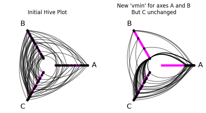
(By default, as the name suggests, setting vmin="unchanged" will leave the axis vmin value unchanged from its previous setting.)
Why might you care about setting the vmin value? Here are a couple of cases:
If you have an outlier sorting variable value for a single node on an axis, then the non-outlier nodes will be squished to a small range on that axis, making it hard to see any nuance when viewing the resulting hive plot. In this case, you will likely want to restrict your
[vmin, vmax]range to exclude the outlier values, which would then be normalized to the ends of the axis.If you were generating multiple hive plots to compare to each other, you might want to restrict the comparable axes to the same
[vmin, vmax]range to make it easier to tease apart meaningful differences between the two hive plots.
Vmax#
Every axis in a hive plot must have a sorting variable. This dictates an ordering of nodes to be placed on an axis, but we still get to choose the extent they can range over an axis.
vmax dictates the value corresponding to the exterior end of each axis. By default, vmin and vmax will extend exactly the range of the node data according to the sorting variable. In other words, the node with the lowest sorting variable value will be on the interior end of the axis, and the node with the highest sorting variable value will be on the exterior end of the axis.
You can think of this default behavior like normalizing the range of the nodes to the extent of each axis.
Below, we demonstrate altering vmax in a few ways:
For axis
A, we set thevmaxto a value in between the minimum and maximum sorting variable node values. This results in all nodes with a value greater than the currentvmaxbeing normalized to the exterior end of the axis.For axis
B, we set thevmaxabove the maximum value for the current sorting variable node values. This results in no nodes being placed on an exterior chunk of the axis, as no nodes have that range of values for the sorting variable.For axis
C, we set thevmaxtoNone, which is actually the defaultvmaxvalue.vmax=Nonewill place the node with the maximum sorting variable value at the exterior end of the axis.
[6]:
hp = example_hive_plot()

fig, axes = plt.subplots(1, 2, figsize=(8, 4))

hp.plot(
    fig=fig,
    ax=axes.flatten()[0],
    axes_kwargs=axes_kwargs,
)

axes.flatten()[0].set_title("Initial Hive Plot", y=1.05)

# custom axis kwargs
axis_kwargs = {
    "A": {"vmax": 0.5},  # nodes will be further from center
    "B": {"vmax": 15},  # nodes will be closer to center
    "C": {"vmax": None},  # same as default, infers node max node value
}

# update axis with custom axis kwargs
for axis_id in axis_kwargs:
    hp.update_axis(
        axis_id=axis_id,
        **axis_kwargs[axis_id],
    )

# keep plotting with custom colored axes
hp.plot(
    fig=fig,
    ax=axes.flatten()[1],
    axes_kwargs=axes_kwargs,
)

axes.flatten()[1].set_title(
    "New 'vmax' for axes A and B\nBut C unchanged",
    y=1.05,
)

plt.show()
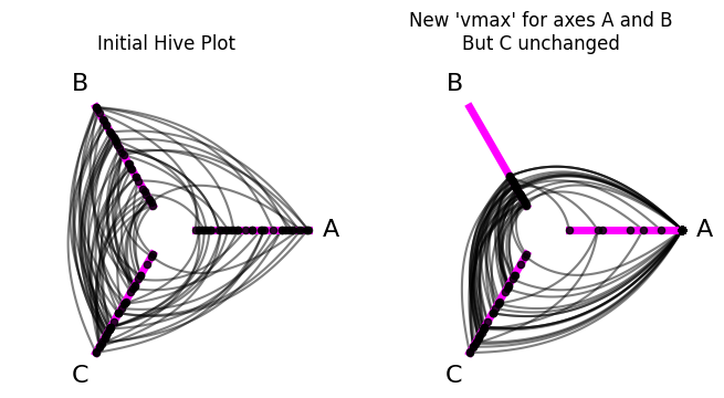
(By default, as the name suggests, setting vmax="unchanged" will leave the axis vmax value unchanged from its previous setting.)
Why might you care about setting the vmax value? Here are a couple of cases:
If you have an outlier sorting variable value for a single node on an axis, then the non-outlier nodes will be squished to a small range on that axis, making it hard to see any nuance when viewing the resulting hive plot. In this case, you will likely want to restrict your
[vmin, vmax]range to exclude the outlier values, which would then be normalized to the ends of the axis.If you were generating multiple hive plots to compare to each other, you might want to restrict the comparable axes to the same
[vmin, vmax]range to make it easier to tease apart meaningful differences between the two hive plots.
Start#
For each HivePlot axis, we can choose a start and an end position. These values are represented as distances from the origin (0, 0), the default center of the hive plot.
(The angle of the axis is dictated by the angle parameter, discussed further below.)
start and end thus let us settle both the position of an axis relative to the origin as well as its length.
By default, an axis’ start and end values are 1 and 5, respectively. This results in default axes of the same length, while maintaining some space between each axis at the interior ends (which allows us to still see edges at the interior end of the axes).
Below, we demonstrate altering start in a few ways:
For axis
A, we set thestartto a value less than the default1. Withendunchanged, this results in a longer axis.For axis
B, we set thestartto a value greater than the default1. Withendunchanged, this results in a shorter axis, further away from the origin.For axis
C, we set thestartto a value greater than the default1and even larger than the value we chose for axisB. Withendunchanged, this results in an even shorter axis, even further away from the origin.
[7]:
hp = example_hive_plot()

fig, axes = plt.subplots(1, 2, figsize=(8, 4))

hp.plot(
    fig=fig,
    ax=axes.flatten()[0],
    axes_kwargs=axes_kwargs,
)

axes.flatten()[0].set_title("Initial Hive Plot", y=1.05)

# custom axis kwargs
axis_kwargs = {
    "A": {"start": -1},  # axis will be larger
    "B": {"start": 3},  # axis will be smaller
    "C": {"start": 4},  # axis will be even smaller
}

# update axis with custom axis kwargs
for axis_id in axis_kwargs:
    hp.update_axis(
        axis_id=axis_id,
        **axis_kwargs[axis_id],
    )

# keep plotting with custom colored axes
hp.plot(
    fig=fig,
    ax=axes.flatten()[1],
    axes_kwargs=axes_kwargs,
)

axes.flatten()[1].set_title(
    "New 'start' for all axes",
    y=1.05,
)

plt.show()
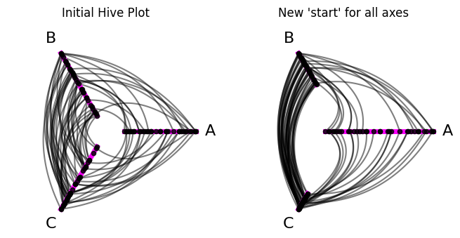
Why might you care about setting the start value? Here are a couple of cases:
If you are using the same sorting variables for each axis and one axis has a much larger range of values than the others, you may want to represent that with a larger axis, extending the
[start, end]range.You may want to make a completely custom axis, with unique values for
start,end, and maybe alsoangle.
End#
For each HivePlot axis, we can choose a start and an end position. These values are represented as distances from the origin (0, 0), the default center of the hive plot.
(The angle of the axis is dictated by the angle parameter, discussed further below.)
start and end thus let us settle both the position of an axis relative to the origin as well as its length.
By default, an axis’ start and end values are 1 and 5, respectively. This results in default axes of the same length, while maintaining some space between each axis at the interior ends (which allows us to still see edges at the interior end of the axes).
Below, we demonstrate altering end in a few ways:
For axis
A, we set theendto a value less than the default5. Withstartunchanged, this results in a shorter axis.For axis
B, we set theendto a value greater than the default5. Withstartunchanged, this results in a longer axis.For axis
C, we set theendto a value greater than the default5and even larger than the value we chose for axisB. Withstartunchanged, this results in an even longer axis.
[8]:
hp = example_hive_plot()

fig, axes = plt.subplots(1, 2, figsize=(8, 4))

hp.plot(
    fig=fig,
    ax=axes.flatten()[0],
    axes_kwargs=axes_kwargs,
)

axes.flatten()[0].set_title("Initial Hive Plot", y=1.05)

# custom axis kwargs
axis_kwargs = {
    "A": {"end": 3},  # axis will be smaller
    "B": {"end": 7},  # axis will be larger
    "C": {"end": 10},  # axis will be even larger
}

# update axis with custom axis kwargs
for axis_id in axis_kwargs:
    hp.update_axis(
        axis_id=axis_id,
        **axis_kwargs[axis_id],
    )

# keep plotting with custom colored axes
hp.plot(
    fig=fig,
    ax=axes.flatten()[1],
    axes_kwargs=axes_kwargs,
)

axes.flatten()[1].set_title(
    "New 'end' for all axes",
    y=1.05,
)

plt.show()
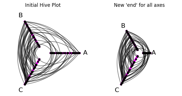
Why might you care about setting the end value? Here are a couple of cases:
If you are using the same sorting variables for each axis and one axis has a much larger range of values than the others, you may want to represent that with a larger axis, extending the
[start, end]range.You may want to make a completely custom axis, with unique values for
start,end, and maybe alsoangle.
Angle#
For each HivePlot axis, we can choose a start, an end, and an angle. The start and end values are represented as distances from the origin (0, 0), the default center of the hive plot.
The angle of the axis is dictated by the angle value. This value sets the angle of the axis, measured in degrees counterclockwise from the positive X axis.
By default, the axes will be evenly-spaced around the full 360 degree range, with the first axis always starting at 0 degrees.
Below, we demonstrate altering the angle of each axis:
[9]:
hp = example_hive_plot()

fig, axes = plt.subplots(1, 2, figsize=(10, 4))

hp.plot(
    fig=fig,
    ax=axes.flatten()[0],
    axes_kwargs=axes_kwargs,
)

axes.flatten()[0].set_title("Initial Hive Plot", y=1.1)

# custom axis kwargs
axis_kwargs = {
    "A": {"angle": 90},
    "B": {"angle": 180},
    "C": {"angle": 300},
}

# update axis with custom axis kwargs
for axis_id in axis_kwargs:
    hp.update_axis(
        axis_id=axis_id,
        **axis_kwargs[axis_id],
    )

# keep plotting with custom colored axes
hp.plot(
    fig=fig,
    ax=axes.flatten()[1],
    axes_kwargs=axes_kwargs,
)

axes.flatten()[1].set_title(
    "New 'angle' for all axes",
    y=1.1,
)

plt.show()
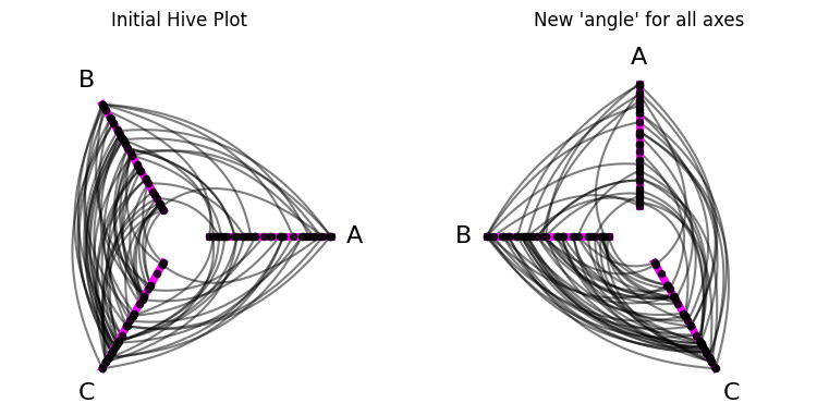
Why might you care about setting the angle value? Perhaps some inter-axis interactions are more interesting to you than others, and you want to give those pairs of axes greater / different “radial real-estate” to draw more attention to them. In general though, we suspect users will rarely need to change the angle value on axes.
Long Name#
For each HivePlot axis, we can set a long_name value that will appear as the axis label when we visualize the hive plot.
By default, these axes labels are the same as the axis name, but sometimes we might want to customize them. long_name allows for this flexibility in the final visualization without needing to delete and recreate axes with new names in the HivePlot instance.
Below, we demonstrate changing the displayed names of each axis:
[10]:
hp = example_hive_plot()

fig, axes = plt.subplots(1, 2, figsize=(8, 4))

hp.plot(
    fig=fig,
    ax=axes.flatten()[0],
    axes_kwargs=axes_kwargs,
)

axes.flatten()[0].set_title("Initial Hive Plot", y=1.1)

# custom axis kwargs
axis_kwargs = {
    "A": {"long_name": r"$\hat{A}$"},  # matplotlib backend recognizes mathjax
    "B": {"long_name": r"$B_{new}$"},
    "C": {"long_name": "New C"},
}

# update axis with custom axis kwargs
for axis_id in axis_kwargs:
    hp.update_axis(
        axis_id=axis_id,
        **axis_kwargs[axis_id],
    )

# keep plotting with custom colored axes
hp.plot(
    fig=fig,
    ax=axes.flatten()[1],
    axes_kwargs=axes_kwargs,
)

axes.flatten()[1].set_title(
    "New 'long_name' for all axes",
    y=1.1,
)

plt.show()
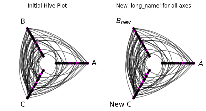
Note this does not change the official name of each axis. These will still be A, B, and C for this example:
[11]:
hp.axes
[11]:
{'A': hiveplotlib.Axis(axis_id='A', start=1, end=5, angle=0.0, long_name='$\hat{A}$'),
 'B': hiveplotlib.Axis(axis_id='B', start=1, end=5, angle=120.0, long_name='$B_{new}$'),
 'C': hiveplotlib.Axis(axis_id='C', start=1, end=5, angle=240.0, long_name='New C')}
When might you care about setting the long_name value? Here are a couple of cases:
Your partition values (that become your axis names) aren’t intuitive / reader-friendly, so you rename them here rather than rebuild / rename the partition values in the underlying node DataFrame (
HivePlot.nodes.data).You have more complex notation with your partition names that you want to explicitly pass in, like we do in our example above.
Sorting Variable#
Note, we recommend changing the axis sorting variables via the HivePlot.update_sorting_variables() method. For more on this, see the Setting Axis Sorting Variables page.
The sorting_variable kwarg changes the node sorting variable for an axis. Below, we change the sorting variable only for axis A:
[12]:
hp = example_hive_plot()

fig, axes = plt.subplots(1, 2, figsize=(8, 4))

hp.plot(
    fig=fig,
    ax=axes.flatten()[0],
    axes_kwargs=axes_kwargs,
)

axes.flatten()[0].set_title("Initial Hive Plot")

# custom axis kwargs
axis_id = "A"
axis_kwargs = {"sorting_variable": "high"}

# update axis with custom axis kwargs
hp.update_axis(axis_id=axis_id, **axis_kwargs)

# keep plotting with custom colored axes
hp.plot(
    fig=fig,
    ax=axes.flatten()[1],
    axes_kwargs=axes_kwargs,
)

axes.flatten()[1].set_title("New sorting variable for axis A")

plt.show()
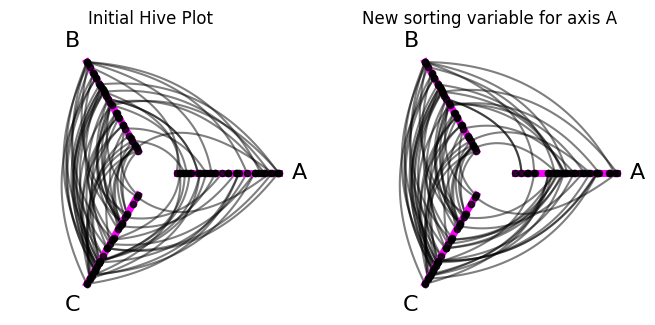
We can also confirm that we updated A’s sorting variable by looking at the HivePlot.sorting_variables attribute:
[13]:
# all other variables were 'low' by default
#  but now 'A' is 'high'
hp.sorting_variables
[13]:
{'A': 'high',
 'B': 'low',
 'C': 'low',
 'A_repeat': 'low',
 'B_repeat': 'low',
 'C_repeat': 'low'}
Note we have to provide a valid sorting variable here, i.e. a column name from the HivePlot.nodes.data DataFrame, or we will get an InvalidSortingVariableError:
[14]:
import traceback

from hiveplotlib.exceptions import InvalidSortingVariableError

try:
    hp.update_axis(
        axis_id="B",
        sorting_variable="Unsupported Variable",  # invalid sorting variable
    )
except InvalidSortingVariableError:
    traceback.print_exc()
Traceback (most recent call last):
  File "/tmp/ipykernel_1936396/1395688737.py", line 6, in <module>
    hp.update_axis(
  File "/home/garyk/repos/hiveplotlib/src/hiveplotlib/hiveplot.py", line 3759, in update_axis
    raise InvalidSortingVariableError(msg)
hiveplotlib.exceptions.hive_plot.InvalidSortingVariableError: Invalid `sorting_variable` ('Unsupported Variable') provided for axis B, must be column of node data: ['unique_id', 'low', 'med', 'high', 'partition_0']
We recommend, however, that you instead update sorting variables via the HivePlot.update_sorting_variables() method:
[15]:
hp = example_hive_plot()

# recommend: update sorting variable via `HivePlot.update_sorting_variables()`
hp.update_sorting_variables(
    sorting_variables={axis_id: axis_kwargs["sorting_variable"]},
)

# keep plotting with custom colored axes
fig, ax = hp.plot(axes_kwargs=axes_kwargs, figsize=(4, 4))

ax.set_title("New sorting variable for axis A")

plt.show()
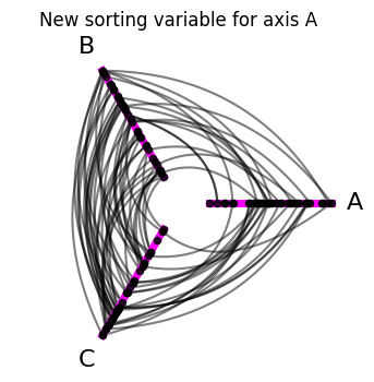
Why might you care about setting the sorting_variable value? Choosing different sorting variables allows you to clearly and intutively explore different patterns between network nodes and edges. We highly recommend trying different sorting variables as you explore your network data through hive plots!